
flexは使い物にならない。
react-nativeは、標準でflexというレスポンシブシステムを持っている。
しかし、flexによるstyleの記法は、単純なものを作るには良いけど、複雑なものを作り始めると破城する。
flexの代わりになるライブラリを見つけたので紹介します。
このライブラリを使うと、flexを一切使わずにstyleを書けるようになるので、だいぶ楽になります。
実はreact native単体で、レスポンシブデザインを実現することはできない
実は、iosの
width: 100
とandroidの
width: 100
は、画面に対しての横幅が違うデザインになる。
つまり、
const { width } = Dimensions.get('window');
...
width: width * 0.5
というように、Dimensionを使いwidthを指定しても、デザインは崩れてしまう。
解決策として、PixcelRatioを使うと、レスポンシブデザインを作成できるが、記述量が増えてしまう。
しかし、救世主が現れた!!!
react-native-responsive-screen
レスポンシブデザインを作るには、このライブラリがとても役に立つ。
わずか13行で構成されたライブラリなので、カスタマイズも簡単だ!(する必要は感じないけどねw)
二種類の関数のみでレスポンシブデザインを実現する。
wp = デバイスの横幅でレスポンシブデザイン
hp = デバイスの縦幅でレスポンシブデザイン
サンプルコードを見てみよう
import {widthPercentageToDP as wp, heightPercentageToDP as hp} from 'react-native-responsive-screen';

class Login extends Component {
  render() {
    return (
      <View style={styles.container}>
        <View style={styles.textWrapper}>
          <Text style={styles.myText}>Login</Text>
        </View>
      </View>
    );
  }
}

const styles = StyleSheet.create({
  container: { flex: 1 },
  textWrapper: {
    // height: height * 0.7,
    height: hp('70%'), // デバイスの高さの70%
    // width: width * 0.8
    width: wp('80%')   // デバイスの横幅の80%
  },
  myText: {
    // fontSize: height * 0.05
    fontSize: hp('5%') // デバイスの縦幅の5%
  }
});


export default Login;
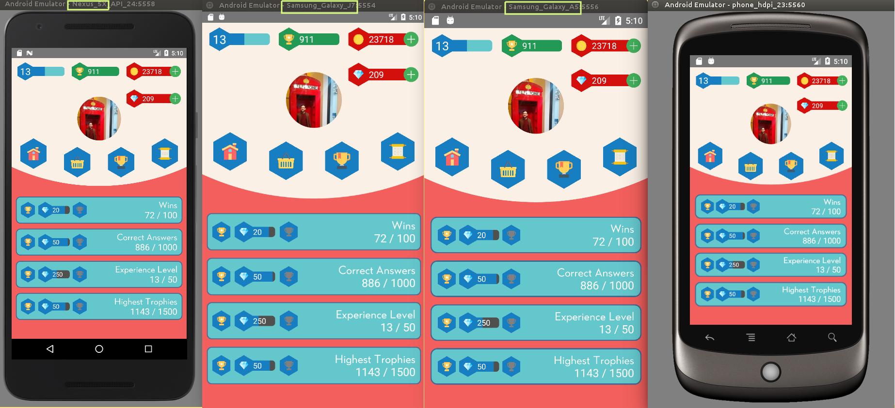
参考図
ライブラリの中身を見てみよう
pixcelRatioを使って、androidとiosの差を吸収している。
まさにコロンブスの卵的ライブラリだ!
import {Dimensions, PixelRatio} from 'react-native';
const widthPercentageToDP = widthPercent => {
  const screenWidth = Dimensions.get('window').width;
  // Convert string input to decimal number
  const elemWidth = parseFloat(widthPercent);
  return PixelRatio.roundToNearestPixel(screenWidth * elemWidth / 100);
};
const heightPercentageToDP = heightPercent => {
  const screenHeight = Dimensions.get('window').height;
  // Convert string input to decimal number
  const elemHeight = parseFloat(heightPercent);
return PixelRatio.roundToNearestPixel(screenHeight * elemHeight / 100);
};
export {
  widthPercentageToDP,
  heightPercentageToDP
};
実務で使ってるけど、パフォーマンスも問題なくていい感じ。
元記事