モーダルの表示方法
案件でボタンをクリックするとモーダルが表示され、閉じるボタンまたは背景をクリックするとモーダルが閉じる処理の実装が必要になったため、練習としてChatGPTの力を借りながらコードを書きました。
ボタンの data-modal 属性の値と、モーダルの id 属性が一致したときに、そのモーダルが表示される仕様にしています。
またページによっては背景をクリックしたときに閉じないモーダルも存在するため、特定のクラス名を持つときに背景クリックで閉じるように制御しました。
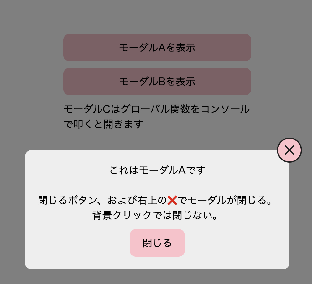
<div class="modalBtnWrap">
  <button class="modalBtn" data-modal="modalA">モーダルAを表示</button>
  <button class="modalBtn" data-modal="modalB">モーダルBを表示</button>
  <p>モーダルCはグローバル関数をコンソールで叩くと開きます</p>
</div>

<div class="modalWrap" id="modalA">
  <div class="modal">
    <button class="close-modal closeTop" data-close="modalA"></button>
    <p>
      これはモーダルAです<br>
      <br>
      閉じるボタン、および右上の❌でモーダルが閉じる。<br>
      背景クリックでは閉じない。
    </p>
    <button class="close-modal closeBottom" data-close="modalA">閉じる</button>
  </div>
</div>

<div class="modalWrap" id="modalB">
  <div class="modal">
    <p>
      これはモーダルBです<br>
      <br>
      閉じるボタンおよび背景クリックでモーダルが閉じる
    </p>
    <button class="close-modal bg-close closeBottom" data-close="modalB">閉じる</button>
  </div>
</div>

<div class="modalWrap" id="modalC">
  <div class="modal">
    <p>これはモーダルCです</p>
    <button class="close-modal bg-close closeBottom" data-close="modalC">閉じる</button>
  </div>
</div>
/* ボタンのスタイル */
.modalBtnWrap {
  width: 300px;
  margin: 150px auto;
  display: flex;
  flex-direction: column;
  align-items: center;
  gap: 10px;
}

.modalBtn {
  width: 100%;
  padding: 10px;
  border-radius: 10px;
  background-color: pink;
}

/* モーダルのスタイル */
.modalWrap {
  display: none;
  /* JSで表示、非表示を切り替えるために、ページ読み込み時にはdisplay: none;にしておく。ページ読み込み時に表示させておく場合はいらない */
  background-color: rgba(0, 0, 0, 0.5);
  width: 100vw;
  height: 100vh;
  position: fixed;
  top: 0;
  left: 0;
  z-index: 500;
}

.modal {
  background: #eee;
  border-radius: 10px;
  padding: 20px;
  position: relative;
  top: 50%;
  left: 50%;
  transform: translate(-50%, -50%);
  z-index: 600;
  width: 50%;
  text-align: center;
}

/* 閉じるボタンのスタイル */
.closeTop {
  position: absolute;
  top: -20px;
  right: -20px;
  border: 2px solid #222;
  background-color: pink;
  border-radius: 50%;
  width: 40px;
  height: 40px;
}

.closeTop:before,
.closeTop::after {
  content: "";
  display: inline-block;
  width: 20px;
  height: 2px;
  background-color: #222;
  position: absolute;
  top: 50%;
  left: 50%;
  transform: translate(-50%, -50%) rotate(-45deg);
}
.closeTop::after {
  transform: translate(-50%, -50%) rotate(45deg);
}

.closeBottom {
background-color: pink;
padding: 10px 20px;
border-radius: 10px;
margin-top: 10px;
}

// モーダルを開く処理
document.querySelectorAll('.modalBtn').forEach(button => {
  button.addEventListener('click', () => {
    const modalId = button.dataset.modal;
    //ボタンのdata属性のmodalの値(data-modal="〇〇"の値(〇〇))を取得
    const modal = document.getElementById(modalId);
    //htmlの中からmodalId(button.dataset.modalの値と同じidを探してくる)
    if (modal) {
      modal.style.display = 'block';
    } else {
      console.warn('モーダルが見つかりません:', modalId);
    }
  });
});

// モーダルを閉じる処理(ボタン)
document.querySelectorAll('.close-modal').forEach(button => {
  button.addEventListener('click', () => {
    const modalId = button.getAttribute('data-close');
    const modal = document.getElementById(modalId);
    if (modal) {
      modal.style.display = 'none';
    }
  });
});

// モーダルの外の背景をクリックで閉じる
document.querySelectorAll('.modalWrap').forEach(modalWrap => {
  modalWrap.addEventListener('click', (e) => {
    if (e.target === modalWrap) {
      if (modalWrap.querySelector('.bg-close')) {
        modalWrap.style.display = 'none';
         // 背景(modalWrap)自身がクリックされたとき、bg-closeを持っていたらモーダルを閉じる
      }
    }
  });
});

// モーダルを開くグローバル関数
function showModal(modalIdCheck) {
  const modalOp = document.getElementById(modalIdCheck);
  if (modalOp) {
    modalOp.style.display = "block";
  } else {
    console.warn("指定されたIDのモーダルが見つかりません:", modalIdCheck);
  }
}

// コンソールにこの関数を打つとmodalCが表示される。
//showModal('modalC');


今後の学習で理解を深めていきたい部分
- スコープについての理解
const modalId = button.dataset.modal;
const modal = document.getElementById(modalId);
上記の記述をモーダルを開く処理の外(スクリプトの先頭)に書いてしまうとモーダルが動かなくなりました。変数のスコープの問題であり、今後しっかり理解しておきたいです。
- e.targetについて
モーダルの背景クリックで閉じる処理に登場する e.target === modalWrap の e.target が具体的に何を指しているのかがまだ曖昧なので、ここも学習を深めたいです。