1. はじめに
Cartopy についての日本語記事の多くには cartopy.crs.PlateCarree の記載があり、つまり正距円筒図法を用いたものが多いですが、他の図法を用いて地図上にデータをプロットする方法を紹介した記事が見当たらなかったので、薄い内容ですが投下します。
本ページの内容のほとんどは、以下の参照元を解釈したものです。
Understanding the transform and projection keywords — cartopy 0.20.0 documentation
https://scitools.org.uk/cartopy/docs/latest/tutorials/understanding_transform.html
※本ページのスクリプトの利用は自己責任でお願いします。
2. 目次
1. はじめに
2. 目次
3. テストデータと環境
4. 失敗談
5. 対処法
3. テストデータと環境
使用した Cartopy のバージョンは 0.18.0 です。投稿時点での最新版ではありません。
その他、テストコードでは matplotlib, numpy, pandas を使用しています。これらのライブラリは condaで導入したものです。
テストデータとしてこれを用います。ランダムなデータです。
lon,lat
140.7235023,35.92481751
139.0467466,37.42900092
139.4633655,35.59255699
139.0235031,35.94741911
140.8968714,37.22889094
138.6579551,35.99284048
140.5921831,35.67223088
140.2147849,36.77920582
139.5495015,35.37148489
139.944276,36.28551474
140.3263667,34.79012966
139.6342651,35.28852194
138.192444,35.50419001
140.9430458,35.20601461
139.2892086,37.50433618
139.7509587,37.7226866
140.5685246,35.68174886
141.2351248,37.8997709
138.4269134,34.62109113
4. 失敗談
まず、普通のテストコードが動くことを確認します。
import numpy as np
import pandas as pd
import cartopy.crs as ccrs
import matplotlib.ticker as mticker
import matplotlib.pyplot as plt

df = pd.read_csv("sample.csv")
fig = plt.figure(figsize=(5, 5), facecolor="white", tight_layout=True)
ax = fig.add_subplot(111, projection=ccrs.Mercator(central_longitude=140.0), facecolor="white")
ax.set_global()
ax.coastlines()
ax.set_extent([138, 142, 34, 38], crs=ccrs.PlateCarree())
gl = ax.gridlines(draw_labels=True)
gl.xlocator = mticker.FixedLocator(np.arange(120, 150.1, 0.5))
gl.ylocator = mticker.FixedLocator(np.arange(20, 50.1, 0.5))

plt.show()
ほい。
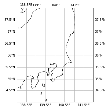
目盛がおかしいですがここでは無視します。ここにデータを散布するわけですが、matplotlib での通常の散布図の作り方をそのまま書いて、
import numpy as np
import pandas as pd
import cartopy.crs as ccrs
import matplotlib.ticker as mticker
import matplotlib.pyplot as plt

df = pd.read_csv("sample.csv")
fig = plt.figure(figsize=(5, 5), facecolor="white", tight_layout=True)
ax = fig.add_subplot(111, projection=ccrs.Mercator(central_longitude=140.0), facecolor="white")
ax.set_global()
ax.coastlines()
ax.set_extent([138, 142, 34, 38], crs=ccrs.PlateCarree())
gl = ax.gridlines(draw_labels=True)
gl.xlocator = mticker.FixedLocator(np.arange(120, 150.1, 0.5))
gl.ylocator = mticker.FixedLocator(np.arange(20, 50.1, 0.5))
# 以下を追記
ax.scatter(df["lon"], df["lat"])

plt.show()
とすると、自前環境では 警告なし で先ほどと同じ図が出てきました。データがプロットされていないただの白地図が無警告で出てきます。
5. 対処法
残念ながら cartopy 0.18.0 は座標変換を無言でやってくれるほど親切ではないようです。でも一文足せば動くことは 0.20.0 版にはちゃんと書いてありました。要するに作者がドキュメントをちゃんと読んでなかったという話に尽きます。
import numpy as np
import pandas as pd
import cartopy.crs as ccrs
import matplotlib.ticker as mticker
import matplotlib.pyplot as plt

df = pd.read_csv("sample.csv")
fig = plt.figure(figsize=(5, 5), facecolor="white", tight_layout=True)
ax = fig.add_subplot(111, projection=ccrs.Mercator(central_longitude=140.0), facecolor="white")
ax.set_global()
ax.coastlines()
ax.set_extent([138, 142, 34, 38], crs=ccrs.PlateCarree())
gl = ax.gridlines(draw_labels=True)
gl.xlocator = mticker.FixedLocator(np.arange(120, 150.1, 0.5))
gl.ylocator = mticker.FixedLocator(np.arange(20, 50.1, 0.5))
# 後ろの transform 以降を追加
ax.scatter(df["lon"], df["lat"], transform=ccrs.PlateCarree())

plt.show()
ほい。
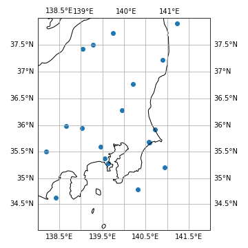
このtransform=ccrs.PlateCarree()は緯度経度データ全般に対して用いてよいそうで、おおもとの図の projection が変わってもそのままで OK だそうです。例えば、projection=ccrs.Mercator(central_longitude=140.0)のところを
projection=ccrs.NorthPolarStereo(central_longitude=140)  # 極心平射図法
projection=ccrs.AzimuthalEquidistant(central_latitude=36, central_longitude=140)  # 正距方位図法
にしても動くことを確認しました。本当にプロットの位置が合っているかについては、保証できませんが。
その他、ax.scatter() の種々の変数、例えば
- マーカーサイズを変更する
ax.scatter(..., s=10, ...) - マーカーの色を変更する
ax.scatter(..., color="red", ...) - マーカーの形を三角形に変更する
ax.scatter(..., marker='^', ...)
などはちゃんと動きました。それから、以下のように陸地に色を塗ることもできたりします。
# 新たに import
import cartopy.feature as cfeature
# ax の定義後に
ax.add_feature(cfeature.LAND, color="lightgrey")
もっと早く教えてほしかったものです。