閉じるまで他の要素を操作できないようにする、モーダルダイアログを実現する。
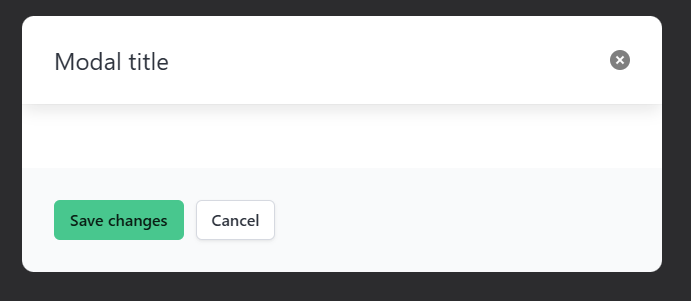
外見
実装
index.html
<!DOCTYPE html>
<html lang="ja">
<head>
  <link rel="stylesheet" href="https://cdn.jsdelivr.net/npm/bulma@1.0.3/css/bulma.min.css">
  <title>Modal Dialog</title>
</head>
<body>

<button class="js-modal-trigger" data-target="modal-js-example">
  Open JS example modal
</button>

<div id="modal-js-example" class="modal">
  <div class="modal-background"></div>
  <div class="modal-card">
    <header class="modal-card-head">
      <p class="modal-card-title">Modal title</p>
      <button class="delete" aria-label="close"></button>
    </header>
    <section class="modal-card-body">
      <!-- Content ... -->
    </section>
    <footer class="modal-card-foot">
      <div class="buttons">
        <button class="button is-success">Save changes</button>
        <button class="button">Cancel</button>
      </div>
    </footer>
  </div>
</div>

<script>
document.addEventListener('DOMContentLoaded', () => {
  // Functions to open and close a modal
  function openModal($el) {
    $el.classList.add('is-active');
  }

  function closeModal($el) {
    $el.classList.remove('is-active');
  }

  function closeAllModals() {
    (document.querySelectorAll('.modal') || []).forEach(($modal) => {
      closeModal($modal);
    });
  }

  // 指定されたクラス名の要素をクリックしたらopenModal()を呼び出すイベントを付与する
  (document.querySelectorAll('.js-modal-trigger') || []).forEach(($trigger) => {
    // js-modal-triggerのクラス名に対応するdata-targetの値を取得
    const modal = $trigger.dataset.target;
    // data-target="modal-js-example" -> id="modal-js-example"
    const $target = document.getElementById(modal);

    $trigger.addEventListener('click', () => {
      openModal($target);
    });
  });

  // 指定されたクラス名の要素をクリックしたらcloseModal()を呼び出すイベントを付与する
  (document.querySelectorAll('.modal-background, .modal-close, .modal-card-head .delete, .modal-card-foot .button') || []).forEach(($close) => {
    const $target = $close.closest('.modal');

    $close.addEventListener('click', () => {
      closeModal($target);
    });
  });

  // Add a keyboard event to close all modals
  document.addEventListener('keydown', (event) => {
    if(event.key === "Escape") {
      closeAllModals();
    }
  });
});
</script>
</body>
</html>
| クラス名 | 説明 |
|---|---|
| modal | メインコンテナ |
| modal-background | モーダルを閉じるためのクリックターゲットとして機能する透明なオーバーレイ |
| modal-content | 水平および垂直に中央揃えされたコンテナ。最大幅は640ピクセルで、任意のコンテンツ を含めることができます。 |
| modal-close | 右上隅にあるシンプルな十字 |
| .modal-card-head .delete | モーダルヘッダー右上の十字 |
| .modal-card-foot .button | モーダルフッダーのボタン |