st.bar_chart()を利用して作成。表示対象データは、DataFrameなど。
主なパラメータの使い方は以下の通り。
x_label, y_label
x軸方向、y軸方向のデータに関するラベル付け。
x
指定する場合は、表示するデータ(テーブル)の列名を指定。
x軸方向の各ラベル値として、指定した列の各セルの値が使われる。
y
指定する場合は、1つ以上のテーブルの列名を指定。
horizontal
Trueの場合、x軸を縦方向に、y軸を横方向にとる。
stack
各バーの積み重ね方を指定。
サンプル
以下のデータを使っていろいろ表示してみます。
| 月 | 降水量(mm) | 日平均(℃) | 日最高(℃) | 日最低(℃) | 最高(℃) | 最低(℃) | 平均風速(m/s) | 最大風速(m/s) | 最大瞬間風速(m/s) | 日照時間 |
|---|---|---|---|---|---|---|---|---|---|---|
| 1 | 45.5 | 4.9 | 11 | -0.3 | 16 | -3.6 | 1.8 | 7.1 | 15.5 | 201.6 |
| 2 | 58 | 6.1 | 11.4 | 1.3 | 23.2 | -3 | 1.9 | 8.2 | 17 | 154.5 |
| 3 | 144 | 8 | 13.5 | 2.8 | 26.6 | -2.4 | 2.2 | 8.6 | 17.8 | 206.1 |
| 4 | 77.5 | 15.7 | 21 | 11.2 | 28.6 | 3.7 | 1.8 | 11 | 20.7 | 141.5 |
| 5 | 151.5 | 18.8 | 23.9 | 14 | 29.5 | 7 | 2.5 | 9.9 | 18.6 | 184.7 |
| 6 | 284 | 22.1 | 27.1 | 17.9 | 34.2 | 13.9 | 1.7 | 6.6 | 13.9 | 177.5 |
| 7 | 64.5 | 27.4 | 32.9 | 23.7 | 36.9 | 20.6 | 1.8 | 10.5 | 19.7 | 209.4 |
| 8 | 159 | 28 | 33.3 | 24.4 | 36.9 | 22.8 | 1.9 | 5.8 | 13.3 | 224.6 |
| 9 | 19.5 | 25.4 | 30.5 | 21.9 | 35.3 | 15.1 | 2 | 8.1 | 16.4 | 173.4 |
| 10 | 136 | 19.2 | 23.8 | 15.2 | 31.3 | 7.8 | 1.6 | 6.6 | 12.6 | 115.3 |
| 11 | 76.5 | 12.3 | 17.7 | 7.3 | 24.2 | 0.9 | 1.3 | 5.3 | 12.6 | 163.8 |
| 12 | 0 | 6 | 13 | 0 | 18.6 | -4.3 | 1.5 | 7.3 | 15.9 | 241.8 |
作成されるグラフはこのような感じ。
※表示例として作ってみただけなので、グラフとして意味をなさないものばかりです。

1列目。左から順に、
st.bar_chart( df )
各レコードについて、全ての値を積み上げた棒グラフが表示される。
st.bar_chart( df, x='月', y=['日平均(℃)','日最低(℃)','日最高(℃)'],
            x_label='月(2024年)', y_label='気温', stack=False )
・x軸の各項目のラベルに"月"カラムの値を使用(xの指定による)
・表示されるデータを、yで指定したカラムのみに限定
・バーを積み上げず、表示対象とする各カラムをそれぞれ横に並べる形に(stack=False)
st.bar_chart( df, x='月', y=['日平均(℃)','日最低(℃)','日最高(℃)'],
            x_label='月(2024年)', y_label='気温', stack='normalize' )
・レコード毎に、そのレコード内の各値が占める割合を表現するグラフにする。
2列目。同様に左から順に。
st.bar_chart( df, x='月', y=['日平均(℃)','日最低(℃)','日最高(℃)'],
            x_label='月(2024年)', y_label='気温', stack='layered' )
・値を積み上げず、各値を重ねて表示する。
st.bar_chart( df, x='月', y=['日平均(℃)','日最低(℃)','日最高(℃)'],
            x_label='月(2024年)', y_label='気温', stack='center' )
縦型にして、男女別・年齢別の人口比率を表示するようなグラフを作成したい場合に使えそうです。
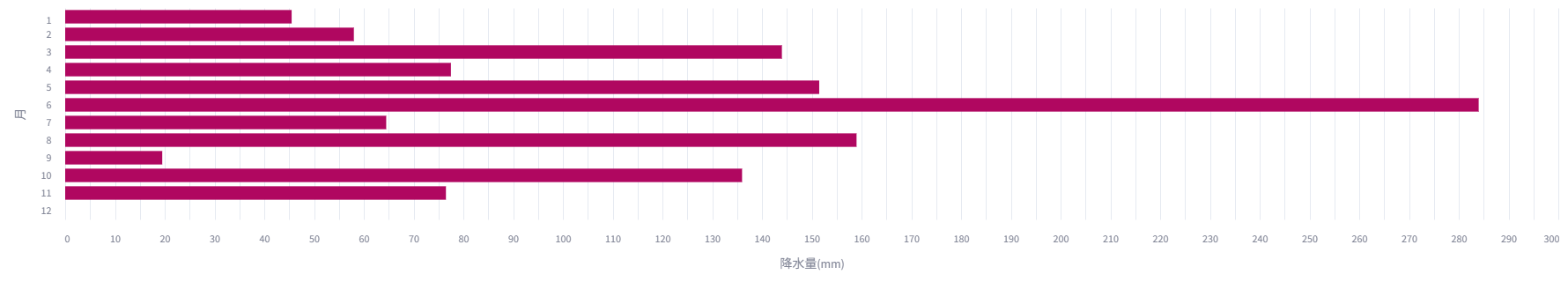
st.bar_chart( df, x='月', y=['降水量(mm)'], horizontal=True, color='#B00760' )
以下のようなグラフになります。
x軸が縦方向、バーの色も変えています。