実際に確認したい人は
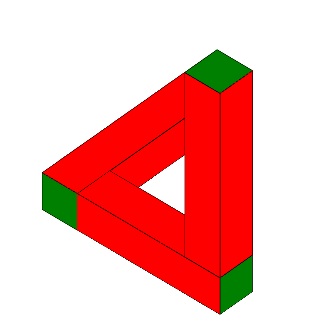
https://jsfiddle.net/junya_5102/h6yg50zf/
html
<div class="triangle">
<div class="block">
  <span class="plane1"></span>
  <span class="plane2"></span>
</div>

<div class="block">
  <span class="plane1"></span>
  <span class="plane2"></span>
</div>

<div class="block">
  <span class="plane1"></span>
  <span class="plane2"></span>
</div>
</div>
CSS
.triangle{
  position: absolute;
  top: 50%;
  left: 50%;

  width: 400px;
  height: 400px;
  /*border: 1px solid;*/

  transform-style: preserve-3d;
  transform: translate(-50%,-50%) translateZ(0px);

  transition: 5s;
}

.triangle:hover{
  transform: translate(-50%,-50%) translateZ(0px) rotateX(49.8deg) rotate(222.5deg);
}

.block{
  position: absolute;
  top: 0;
  left: 0;

  width: 400px;
  height: 80px;

  transform-style: preserve-3d;
}

.block:nth-of-type(2){
  transform-origin: bottom right;
  transform: rotate(-90deg) translateX(80px);
}

.block:nth-of-type(3){
  transform-origin: bottom left;
  transform: rotateY(-90deg);
}

/* box-shadowを指定すると構造がわかりやすくなる */
.plane1{
  position: absolute;

  width: 100%;
  height: 100%;

  background-color: red;
  box-shadow: 0 0 0 1px black inset;

  transform-style: preserve-3d;
  backface-visibility: hidden;
}

.plane1:before{
  content: "";
  position: absolute;
  top: 100%;
  left: 0;

  width: 100%;
  height: 100%;

  background-color: red;
  box-shadow: inherit;

  transform-origin: top center;
  transform: rotateX(-90deg);
  backface-visibility: hidden;
}

/* widthは'.box'のheightに合わせる */
.plane1:after{
  content: "";
  position: absolute;
  top: 0;
  left: 100%;

  width: 80px;
  height: 100%;

  background-color: green;
  box-shadow: inherit;

  transform-origin: left center;
  transform: rotateY(90deg);
  backface-visibility: hidden;
}

/* box-shadowを指定すると構造がわかりやすくなる */
.plane2{
  position: absolute;
  bottom: 100%;

  width: 100%;
  height: 100%;

  background-color: red;
  box-shadow: 0 0 0 1px black inset;

  transform-style: preserve-3d;
  transform-origin: bottom center;
  transform: rotateX(90deg);
  backface-visibility: hidden;
}

.plane2:before{
  content: "";
  position: absolute;
  bottom: 100%;

  width: 100%;
  height: 100%;

  background-color: blue;
  box-shadow: inherit;

  transform-origin: bottom center;
  transform: rotateX(90deg);
  backface-visibility: hidden;
}

.plane2:after{
  content: "";
  position: absolute;
  right: 100%;

  width: 80px;
  height: 100%;

  background-color: green;
  box-shadow: inherit;

  transform-origin: right center;
  transform: rotateY(-90deg);
  backface-visibility: hidden;
}