水 water
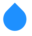
<div class="water"></div>
.water{
  width: 50px;
  height: 50px;
  border-radius: 0 100% 100% 100%;
  background-color: dodgerblue;
  transform: translateY(20%) rotate(45deg);
}
雷 lightning
<div class="lightning"></div>
.lightning{
  position: relative;
  width: 10px;
  height: 50px;
  background-color: yellow;
  transform: skewY(40deg) skewX(-15deg);
}

.lightning:before{
  position: absolute;
  content: "";
  width: 100%;
  height: 100%;
  background-color: yellow;
  transform: translate(80%,50%);
}
雪だるま snowman

<div class="snowman">._.</div>
.snowman{
  width: 50px;
  height: 50px;
  margin-bottom: 50px;
  border-radius: 100%;

  /* 顔 表情 */
  font-size: 30px;
  line-height: 30px;
  text-align: center;

  background-color: snow;

  /* 胴体  */
  box-shadow:
    -3px 35px 0 0 snow,
     3px 35px 0 0 snow;
}
box-shadowの代わりに擬似要素(:before,:after)を使っても良い。