
ここでも確認できます。
http://jsfiddle.net/skd7ssLy/
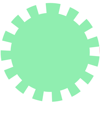
歯車1
<div class="gear1"></div>
.gear1{
  width: 300px;
  height: 300px;
  border: 30px dotted #fff;
  border-radius: 100%;
  background: #90EEB0;
  box-sizing: border-box;
}
border-styleのdottedを使って歯車の歯を表現しています。
border-colorは bodyの背景色と合わせています。
bodyの背景色と合わせないと...
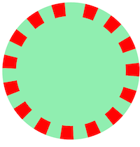
こんな感じになります。
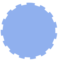
歯車2
<div class="gear3"></div>
.gear3{
  width: 300px;
  height: 300px;
  border: 10px dashed #fff;
  border-radius: 100%;
  background: #90B0EE;
  box-sizing: border-box;
}
border-styleをdashedにします。
そのほかは歯車1と同じです。
アニメーション
.gear1{
  animation: Turn 3s linear infinite;
}

.gear2{
  animation: Turn 3s 1s linear infinite reverse;
}

.gear3{
  animation: Turn 4s 2.3s infinite linear;
}

@keyframes Turn{
  from{
    transform: rotate(0deg);
  }

  to{
    transform: rotate(360deg);
  }
}
※ positionなどは省略しています。
※ 赤い歯車(.gear2)は歯車1と同じ構造なので省略します
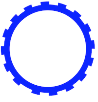
追記 歯車3
<div class="gear blue anime"></div>
/* 歯車本体 */
.gear{
  position: absolute;
  width: 300px;
  height: 300px;
  margin: 0.5em 0 0 0.5em;
  border: 20px solid;
  border-radius: 100%;
  background: transparent;
  box-sizing: border-box;
}

/* 歯車の歯 */
.gear:before{
  position: absolute;
  top: 50%;
  left: 50%;
  content: "";
  display: inline-block;
  /* 親要素から継承 */
  width: inherit;
  height: inherit;

  border: 10px dashed;
  border-color: inherit;
  border-radius: inherit;
  transform: translate(-50%,-50%);
}

.blue{
  border-color: blue;
}

/* アニメーション */
.anime{
  animation: Turn 5s linear infinite;
}

@keyframes Turn{
  100%{
    transform: rotate(360deg);
  }
}
この作り方ならborder-colorを背景色に合わせる必要がなくデザインの自由度が上がります。