ハロウィンサイト(?)とかに使えそう
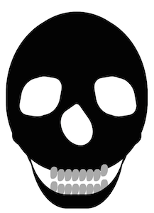
html
<div class="skeleton-head">
  <!-- 上顎 -->
  <div class="upper-jaw"></div>
  <!-- 下顎 -->
  <div class="lower-jaw1"></div>
  <div class="lower-jaw2"></div>
  <!-- 目 -->
  <div class="eye1"></div>
  <div class="eye2"></div>
  <!-- 鼻 -->
  <div class="nose"></div>
  <!-- 歯 -->
  <div class="tooth"></div>
</div>
css
.skeleton-head{
  position: relative;
  width: 280px;
  height: 330px;
  border-radius: 100% 100% 90% 90%;
  background: #000;
  box-shadow:
     8px  5px 0 0 #000,
    -8px  5px 0 0 #000;
}

.upper-jaw{
  position: absolute;
  top: 190px;
  left: 5px;
  width: 270px;
  height: 50px;
  border-bottom: 55px solid #000;
  border-radius: 100% 100% 70% 70% / 100% 100% 70% 70%;
}

.lower-jaw1,.lower-jaw2{
  position: absolute;
  top: 180px;
  width: 100px;
  height: 200px;
  border-bottom: 30px solid #000;
  border-radius: 0 0 0 80% / 0 0 0 60%;
  box-shadow: -18px -50px 0 0 #000;
  z-index: 2;
}

.lower-jaw1{
  left: 40px;
}

.lower-jaw2{
  left: 140px;
  transform: rotateY(180deg);
}


/* 目 */
.eye1,.eye2{
  position: absolute;
  top: 140px;
  width: 80px;
  height: 70px;
  border-radius: 50% 25% 50% 25%;
  background: #fff;
  box-shadow: 5px -10px 0 0 #fff;
  z-index: 3;
}

.eye1{
  left: 175px;
  transform: rotate(80deg);
}

.eye2{
  left: 30px;
  transform: rotate(-80deg) rotateY(180deg);
}

.nose{
  position: absolute;
  top: 200px;
  left: 110px;
  width: 60px;
  height: 80px;
  border-radius: 100% 20% 100% 90%;
  background: #fff;
  transform: rotate(-35deg);
  z-index: 1;
}

.tooth{
  position: absolute;
  top: 328px;
  left: 100px;
  width: 15px;
  height: 25px;
  border-radius: 50% 43% 69% 32%;
  background: #aaa;
  box-shadow:
     -15px  -5px 0 0 #aaa,
      15px     0 0 0 #aaa,
      30px     0 0 0 #aaa,
      45px     0 0 0 #aaa,
      60px     0 0 0 #aaa,
      75px     0 0 0 #aaa,
      90px -10px 0 0 #aaa,
     -15px  25px 0 0 #aaa,
       0px  30px 0 0 #aaa,
      15px  30px 0 0 #aaa,
      30px  30px 0 0 #aaa,
      45px  30px 0 0 #aaa,
      60px  30px 0 0 #aaa,
      75px  30px 0 0 #aaa,
      90px  21px 0 0 #aaa;
}