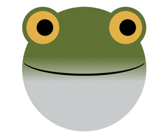
<div class="frog">
  <div class="eyes"></div>
  <div class="mouth"></div>
</div>
.frog{
  position: relative;
  width: 300px;
  height: 300px;
  border-radius: 100%;
  background: linear-gradient(to bottom,#76884B 40%,#D2D4D5 60%);
}

/* 目 */
.frog .eyes{
  position: absolute;
  width: 100%;
  height: auto;
}

.frog .eyes:before,
.frog .eyes:after{
  position: absolute;
  content: "";
  width: 100px;
  height: 100px;
  /* 体の色と合わせる */
  border: 10px solid #76884B;
  border-radius: 100%;
  /* 瞳の色 */
  background: #000;
  box-shadow: 0 0 0 20px #E2BE65 inset;
  box-sizing: border-box;

  /* アニメーション */
  animation: eyes_anim 2s linear infinite alternate;
}

.frog .eyes:before{
  top: 0;
  left: 0;
}

.frog .eyes:after{
  top: 0;
  right: 0;
}

/* 口 */
.frog .mouth{
  position: absolute;
  width: inherit;
  height: inherit;
  overflow: hidden;
}

.frog .mouth:before{
  position: absolute;
  top: 50%;
  left: 50%;
  content: "";
  width: 100%;
  height: 25%;
  border: 1px solid transparent;
  border-bottom: 5px solid #000;
  border-radius: 100%;
  transform: translate(-50%,-80%);
}

/* 目のアニメ */
@keyframes eyes_anim{
  0%{
    box-shadow: 10px 0 0 20px #E2BE65 inset;
  }

  50%{
    box-shadow: 0 0 0 20px #E2BE65 inset;
  }

  100%{
    box-shadow: -10px 0 0 20px #E2BE65 inset;
  }
}
目の作り方
瞳

widthとheightを指定して、border-radiusで丸めて、
backgroundで瞳に色を付けます。
結膜(人間で言う白目のところ)
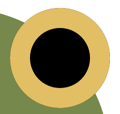
box-shadowのinsetを使って 結膜の大きさと色を指定します
大きさはbox-shadowの広がりを用いて指定します。
境界線

borderで境界線を指定したら完成です
目のアニメーション
結膜の位置(box-shadowの影の位置)を変えることで表現ができます
例えば
box-shadow: 0px 0 0 20px #E2BE65 inset; からbox-shadow: 10px 0 0 20px #E2BE65 inset; とすると...

ちょっと横目になります。