<div id="saturn" class="ring_color"></div>
body{
  background-color: black;
}

#saturn{
  position: absolute;
  top: 50%;
  left: 50%;

  width: 200px;
  height: 200px;
  border-radius: 100%;
  background-image: linear-gradient(to bottom,#9A9779,#F3BE8F,#DFBB7E,#F3BE8F,#90876A);
  box-shadow: 1px -1px 2px 2px black inset;

  transform: translate(-50%,-50%);
}

#saturn:before{
  content: '';
  position: absolute;
  top: 50%;
  left: 50%;

  width: 250%;
  height: 250%;
  border: 60px double currentColor;
  border-radius: 100%;
  box-shadow: 0 0 0 5px currentColor inset;
  box-sizing: border-box;

  transform: translate(-50%,-50%) rotateX(-100deg) rotateY(10deg);
  z-index: 1;
}

#saturn:after{
  content: '';
  position: absolute;
  top: 50%;
  left: 50%;
  width: 99%;
  height: 99%;
  border-radius: 100%;
  background-image: linear-gradient(to bottom,#9A9779,#F3BE8F,#DFBB7E,transparent 60%);

  transform: translate(-50%,-50%);
  z-index: 2;
}

.ring_color:before{
  color: #B7A77B;
}
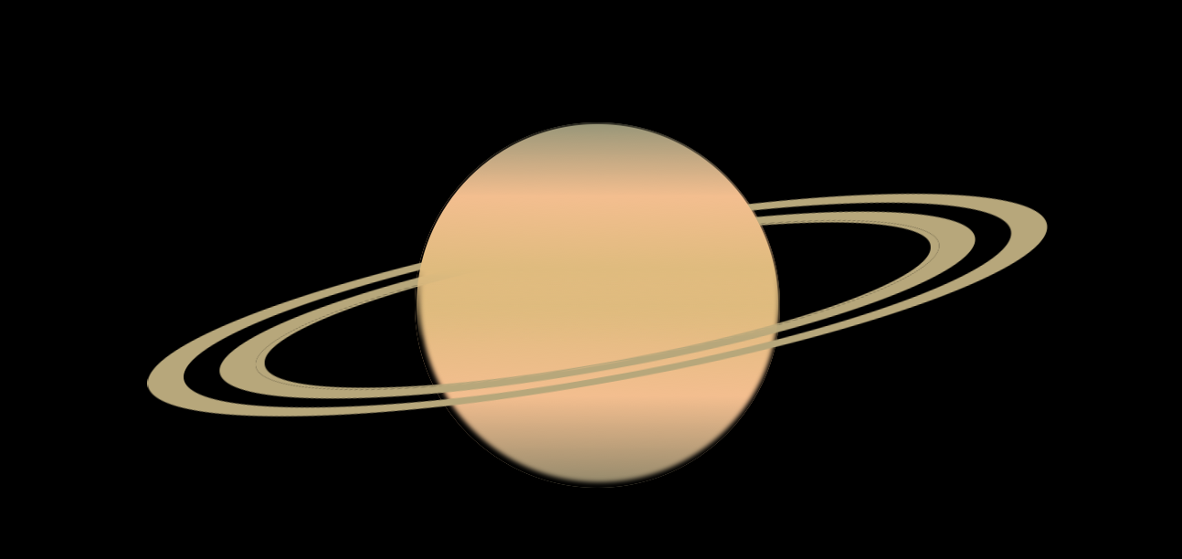
星の後ろ側に通っているリングを隠すために :after を使っています。