Styled-Componentとは
既存のstyle適用する方法のcssファイルを外に置き、tagやid、class名で書き込まず、同じコンポーネントからコンポーネント名を書くようにスタイルを指定することをstyle-componentsと呼びます。 cssファイルを外に置かず、コンポーネント内部に入れるので、cssが全域に重ならないようにしてくれるメリットがあります。
styled-componentライブラリインストール
npm install styled-components
styled-componentの基礎
import React from 'react'
import styled from 'styled-components';

export default function StyledComponentExample() {
    const Title = styled.h1`
  font-size: 1.5em;
  text-align: center;
  color: palevioletred;
`;

    const Wrapper = styled.section`
  padding: 4em;
  background: papayawhip;
`;

    return (
        <Wrapper >
            <Title >
                Hello World!
            </Title>
        </Wrapper>
    );
}
styled-componentライブラリは、スタイルだけが入っているreactコンポーネントを作成してくれます。
既存のreact component作成は、以下になりますが
const Title = () => {
    return <div> hello world </div>
}
styled-componentライブラリでは、component作成方法は以下になります。
const {Component名} = styled.{タグ名}`
   {スタイル定義}
`;

const Wrapper = styled.section`
  background: papayawhip;
`;
開発モードで確認すると、ファイルでは定義したことないclassが定義されていることがわかります。
style-componentはclass名をuniqueとして生成してくれます。
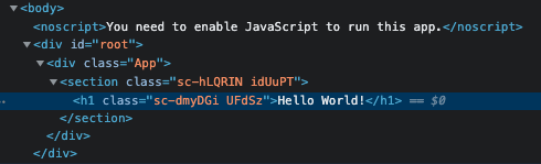
h1のclass名をstyleタブから確認すると、「const Title = styled.h1{定義}」にて定義したスタイル定義が確認できます。

styled-componentのprops
import React from 'react'
import styled from 'styled-components';

export default function StyledComponentExample() {
    const Button = styled.button`
  background: ${props => props.primary ? "palevioletred" : "white"};
  color: ${props => props.primary ? "white" : "palevioletred"};

  font-size: 1em;
  margin: 1em;
  padding: 0.25em 1em;
  border: 2px solid palevioletred;
  border-radius: 3px;
`;
    return (
        <>
            <Button>Normal</Button>
            <Button primary>Primary</Button>
        </>
    );
}
primary props有無により、background-colorとfont-colorが変わります。
styled-componetではprops値により、違うstyleを適用することが可能です。
・・・

background: ${props => props.primary ? "palevioletred" : "white"};
color: ${props => props.primary ? "white" : "palevioletred"};

・・・

<Button>Normal</Button>
<Button primary>Primary</Button>
styled-componentの拡張性
import React from 'react'
import styled from 'styled-components';
export default function StyledComponentExample() {
const Button = styled.button`
background: ${props => props.primary ? "palevioletred" : "white"};
color: ${props => props.primary ? "white" : "palevioletred"};
font-size: 1em;
margin: 1em;
padding: 0.25em 1em;
border: 2px solid palevioletred;
border-radius: 3px;
`;
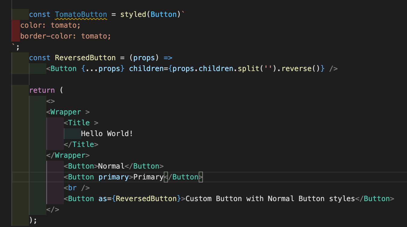
const TomatoButton = styled(Button)`
color: tomato;
border-color: tomato;
`;
const ReversedButton = (props) =>
<Button {...props} children={props.children.split('').reverse()} />
return (
<>
<TomatoButton as="a" href="#">Tomato</TomatoButton>
<Button as={ReversedButton}>Custom Button with Normal Button styles</Button>
</>
);
}
styled-componentはstyleのextends機能も持っています。
下はButton-styled-componentのstyle定義をextendして、TomatoButtonだけのstyleを定義しています。
as propsは、TomatoButtonを'Button'に加えて、’Button’をタグに拡張したい時!この時に使います。
  // Buttonをextend!
    const TomatoButton = styled(Button)`
  color: tomato;
  border-color: tomato;
`;

  // as="a"は htmlの<a>タグと同じ機能をする。
  <TomatoButton as="a" href="#">Tomato</TomatoButton>
as={ReversedButton}は、'Button'を'ReversedButton'に拡張するとの意味です。
拡張と共に、propsにてstyled-componentの動作をまた拡張していくことが可能です。
style-componentも普段のcomponentの使い方と違いはほぼありません。
普段のcomponent機能にstyleを添加する機能が追加されたのがstyle-componetです。
    const ReversedButton = (props) =>
        <Button {...props} children={props.children.split('').reverse()} />

    <Button as={ReversedButton}>Custom Button with Normal Button styles</Button>
Easier deletion of css
return()からTomatoButtonを削除しました。
そうしたら、const TomatoButtonに参照箇所なしとの表示に変わりました。
style-componentは使用しないstyleがすぐわかるので、プログラムをproductにした際に不要なstyle情報が含まれないようにすることができます。