概要
- 普通のやり方で調整 -> style, className
- 個別に調整 -> withStyles
- 全体の見た目を調整 -> MuiThemeProvider
環境
- material-ui v1.0.0-beta.17
(本質ではないけど、rails 5.1.4のwebpackerで動作させています)
最終的なフォルダ構成
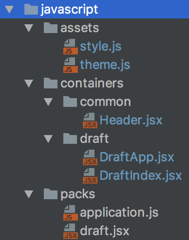
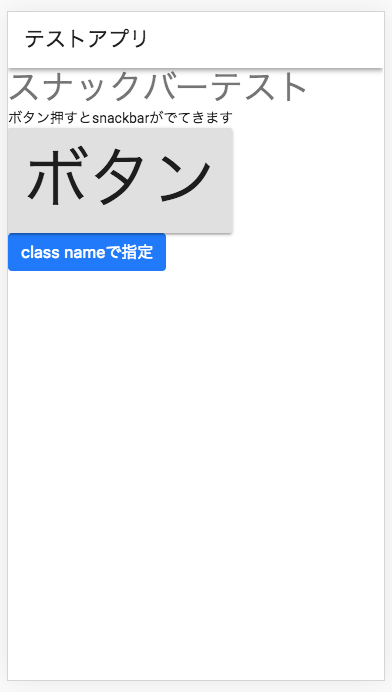
アプリ(調整前)
以下のアプリに対して、「普通のやり方」、「個別に調整」、「全体の見た目を調整」を適用していく。
import React from 'react'
import ReactDOM from 'react-dom'
import DraftApp from '../containers/draft/DraftApp'

document.addEventListener('DOMContentLoaded', () => {
  ReactDOM.render(
    <DraftApp/>
    ,
    document.getElementById('draftIndexRoot'),
  )
});
import React from 'react'
import Header from '../common/Header'
import Snackbar from 'material-ui/Snackbar';
import Slide from 'material-ui/transitions/Slide';
import DraftIndex from './DraftIndex';

class DraftApp extends React.Component {
  constructor(props) {
    super(props);
    this.state = {
      snackbarOpen: false,
      snackbarMessage: ''
    }
  }

  handleSnackbar = ({open, message, direction}) => () => {
    this.setState({
      snackbarOpen: open,
      snackbarMessage: message,
      snackbarDirection: direction
    })
  };

  render() {
    return (
      <div>
        <Header/>
        <DraftIndex
          handleSnackbar={this.handleSnackbar}
        />
        <Snackbar
          open={this.state.snackbarOpen}
          onRequestClose={
            this.handleSnackbar({
              open: false,
              message: ''
            })
          }
          message={this.state.snackbarMessage}
          transition={<Slide direction={this.state.direction}/>}
        />
      </div>
    )
  }
}

export default DraftApp
import React from 'react';
import AppBar from 'material-ui/AppBar';
import Toolbar from 'material-ui/Toolbar';
import Typography from 'material-ui/Typography';

class Header extends React.Component {
  render() {
    return (
      <div>
        <AppBar position='static'>
          <Toolbar>
            <Typography type='title'>
              テストアプリ
            </Typography>
          </Toolbar>
        </AppBar>
      </div>
    )
  }
}

export default Header
import React from 'react'
import Typography from 'material-ui/Typography';
import Button from 'material-ui/Button';

class DraftIndex extends React.Component {
  render() {
    return (
      <div>
        <Typography type='display1'>スナックバーテスト</Typography>
        <Typography type='body1'>ボタン押すとsnackbarがでてきます</Typography>
        <Button
          raised
          onClick={
            this.props.handleSnackbar({open: true, message: 'スナックバー!', direction: 'down'})
          }
        >
          ボタン
        </Button>
      </div>
    )
  }
}

export default DraftIndex
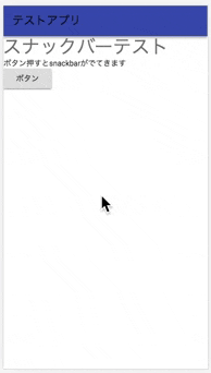
普通のやり方で調整する場合
styleで指定する場合
タグにstyle={{}}を追加して調整する。
とりあえず簡単に見た目を調整できる。
- 例 font-sizeの調整
cssのプロパティをキャメルケースで表現して指定する。font-sizeであればfontSize。
プロパティの値は''で囲んで表現する。
style={{fontSize: '4em'}}
実際に適用するとこんな感じ。
import React from 'react'
import Typography from 'material-ui/Typography';
import Button from 'material-ui/Button';

class DraftIndex extends React.Component {
  render() {
    return (
      <div>
        <Typography type='display1'>スナックバーテスト</Typography>
        <Typography type='body1'>ボタン押すとsnackbarがでてきます</Typography>
        <Button
          raised
          onClick={
            this.props.handleSnackbar({open: true, message: 'スナックバー!', direction: 'down'})
          }
          style={{fontSize: '4em'}}
        >
          ボタン
        </Button>
      </div>
    )
  }
}

export default DraftIndex
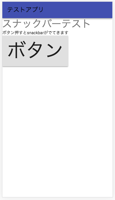
classNameで指定する場合
classNameにcssが対応するクラス名を指定すると反映される。例えば、bootstrapを導入していれば、bootstrapの独自のクラス名を記述すれば適用される。
<div
  className='btn btn-primary'
>
  class nameで指定
</div>
実際に適用するとこんな感じ。
import React from 'react'
import Typography from 'material-ui/Typography';
import Button from 'material-ui/Button';

class DraftIndex extends React.Component {
  render() {
    return (
      <div>
        <Typography type='display1'>スナックバーテスト</Typography>
        <Typography type='body1'>ボタン押すとsnackbarがでてきます</Typography>
        <Button
          raised
          onClick={
            this.props.handleSnackbar({open: true, message: 'スナックバー!', direction: 'down'})
          }
          style={{fontSize: '4em'}}
        >
          ボタン
        </Button>
        </Button>
        <div
          className='btn btn-primary'
        >
          class nameで指定
        </div>
      </div>
    )
  }
}

export default DraftIndex
個別に調整するばあい
外部のCSSを使わず、javascriptでCSSを管理するためにに、material-uiで用意されているwithStylesを利用する。
material-uiのコンポーネントの場合、classesを利用することで、スタイルを細かに指定することができる。指定できるプロパティはmaterial-ui/src/ の各コンポーネントのjsファイル内のexport const stylesを参照する。
AppBarコンポーネントの場合、material-ui/src/AppBar/AppBar.jsを見ると、下記の様になっている。
たとえば、colorPrimaryに対して、background-colorとcolorを指定できることがわかる。
export const styles = (theme: Object) => ({
  root: {
    display: 'flex',
    flexDirection: 'column',
    width: '100%',
    boxSizing: 'border-box', // Prevent padding issue with the Modal and fixed positioned AppBar.
    zIndex: theme.zIndex.appBar,
    flexShrink: 0,
  },
  positionFixed: {
    position: 'fixed',
    top: 0,
    left: 'auto',
    right: 0,
  },
  positionAbsolute: {
    position: 'absolute',
    top: 0,
    left: 'auto',
    right: 0,
  },
  positionStatic: {
    position: 'static',
    flexShrink: 0,
  },
  colorDefault: {
    backgroundColor: theme.palette.background.appBar,
    color: theme.palette.getContrastText(theme.palette.background.appBar),
  },
  colorPrimary: {
    backgroundColor: theme.palette.primary[500],
    color: theme.palette.getContrastText(theme.palette.primary[500]),
  },
  colorAccent: {
    backgroundColor: theme.palette.secondary.A200,
    color: theme.palette.getContrastText(theme.palette.secondary.A200),
  },
});
上記を踏まえて、
- 見た目を調整したいコンポーネントを選ぶ
- 上記コンポーネントのうち、material-ui/src/ をみて指定できるmaterial-uiのプロパティを選ぶ
- styleファイルに固有の名称とともにcssプロパティを記述する
- コンポーネントを含むclassにwithStylesを追加し、styleファイルを読み込む
- 変更したいコンポーネントにclassesを追加し、
{material-uiのプロパティ: this.props.classes.固有の名称}を付与する
(事例)AppBarの背景色を変更する場合
material-ui/src/AppBar/AppBar.jsを見るとAppBarの背景色はmaterial-uiのプロパティはcolorPrimaryで変更できる事がわかるのでこれを変更する。
styleファイルを作成
下記のフォーマットでオブジェクトを作成する。プロパティとプロパティの値はstyleで指定する場合参照のこと。
スタイル名 = {
	固有の名称: {
	  プロパティ: プロパティの値
	}
}
上記を受けて下記の様に作成した。
export const commonStyle = {
  appBarColorDefault: {
    backgroundColor: '#fff'
  }
};
Header.jsxにclassにwithStylesを追加
styleファイルとwithStylesをimportし、export default withStyles Headerをexport default withStyles(commonStyle)(Header)と修正する。
これにより、this.props.classesとしてcommonStyleオブジェクトを使うことができるようになる。
import React from 'react';
import AppBar from 'material-ui/AppBar';
import Toolbar from 'material-ui/Toolbar';
import Typography from 'material-ui/Typography';
import {withStyles} from 'material-ui/styles';
import {commonStyle} from '../../assets/style';

class Header extends React.Component {
  render() {
    return (
      <div>
        <AppBar position='static'>
          <Toolbar>
            <Typography type='title'>
              テストアプリ
            </Typography>
          </Toolbar>
        </AppBar>
      </div>
    )
  }
}

export default withStyles(commonStyle)(Header)
Header.jsxの調整したいコンポーネントにclassesを追加する
AppBarにclassesプロパティを追加し、変更したいmaterial-uiのプロパティcolorPrimaryに対してthis.props.classes.appBarColoDefaultを指定する
追加前
<AppBar position='static'>
追加後
<AppBar position='static' classes={{colorPrimary: this.props.classes.appBarColorDefault}}>
このような見た目になる。
全体の見た目を調整する場合
アプリ全体の見た目を調整する場合はMuiThemeProviderを使う。
MuitThemProviderで囲んだ箇所から子要素全てに一定のスタイルを適用することができる。
(事例)Typographyを変更する
変更できる箇所は、以下のページを参照のこと。現時点で変更できる箇所と初期値は以下のようにのっているので、そちらを参照して変更する。
{
  "direction": "ltr",
  "palette": {
    "common": {
      "black": "#000",
      "white": "#fff",
      "transparent": "rgba(0, 0, 0, 0)",
      "fullBlack": "rgba(0, 0, 0, 1)",
      "darkBlack": "rgba(0, 0, 0, 0.87)",
      "lightBlack": "rgba(0, 0, 0, 0.54)",
      "minBlack": "rgba(0, 0, 0, 0.26)",
      "faintBlack": "rgba(0, 0, 0, 0.12)",
      "fullWhite": "rgba(255, 255, 255, 1)",
      "darkWhite": "rgba(255, 255, 255, 0.87)",
      "lightWhite": "rgba(255, 255, 255, 0.54)"
    },
以下省略
}
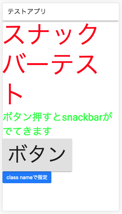
typographyのdipslay1とbody1を変更する場合は下記の様なthemeファイルを作成する。
import {createMuiTheme} from 'material-ui/styles';

export const theme = createMuiTheme({
  typography: {
    display1: {
      fontSize: '5em',
      color: 'rgba(255, 0, 0, 1)'
    },
    body1: {
      fontSize: '2em',
      color: 'rgba(0,255,0,1)'
    }
  }
});
上記ファイルを適用する
MuiThemeProviderとthemeをimportし、で囲む。
import React from 'react'
import Header from '../common/Header'
import Snackbar from 'material-ui/Snackbar';
import Slide from 'material-ui/transitions/Slide';
import DraftIndex from './DraftIndex';
import {MuiThemeProvider} from 'material-ui/styles';
import {theme} from '../../assets/theme';

省略
render() {
    return (
      <MuiThemeProvider theme={theme}>
        <div>
          <Header/>
          <DraftIndex
            handleSnackbar={this.handleSnackbar}
          />
          <Snackbar
            open={this.state.snackbarOpen}
            onRequestClose={
              this.handleSnackbar({
                open: false,
                message: ''
              })
            }
            message={this.state.snackbarMessage}
            transition={<Slide direction={this.state.direction}/>}
          />
        </div>
      </MuiThemeProvider>
    )
  }
}
結果以下のとおり。
(応用編)themeに用意されていないコンポーネントのスタイルを適用したい場合 -> override
https://material-ui-next.com/customization/themes/ で調整できないコンポーネントの場合は、overridesを使う。
指定はtheme内で行い、指定はoverrides: {Muiコンポーネント名: {}}でおこなう。
下記にSnackbarContentの背景色を変更したい場合を示す。
export const theme = createMuiTheme({
  typography: {
    display1: {
      fontSize: '5em',
      color: 'rgba(255, 0, 0, 1)'
    },
    body1: {
      fontSize: '2em',
      color: 'rgba(0,255,0,1)'
    }
  },
  overrides: {
    MuiSnackbarContent: {
      root: {
        backgroundColor: 'rgba(0,255,255,1)',
      }
    },
  },
});
アプリ(調整後)
結果以下の通りになる。
