pythonの基礎を備忘録として残しておく
summary
plt.plot(X, Y, marker='o', color='red', linestyle='--')  # 折れ線グラフ
plt.xlabel('time')  # xラベル
plt.ylabel('count')  # yラベル
plt.title('Shop A')  # タイトル
plt.grid()  # グリッド線
x= np.arange(-5, 5, 0.01)  # xデータの連続生成
plt.plot(x, food, label='food')  # 凡例'food'
plt.legend(loc='upper left')  # 凡例表示
plt.bar(x, y)  # 棒グラフ
plt.scatter(sugar_x, sugar_y, label='sugar')  # 散布図
plt.scatter(x, y, marker="o", color="green", alpha=0.5)  # 透明度
x = np.random.rand(1000)  # 0-1のランダムな数字1000個生成
plt.hist(x, bins=20, rwidth=0.7)  # ヒストグラム
fig, (ax1, ax2) = plt.subplots(nrows=1, ncols=2)  # 複数グラフ(subplots)
ax1.plot(x, food)  # 1つ目のグラフ
ax1.set_title('food')  # 1つ目のタイトル
fig = plt.figure()  # 複数グラフ(add_subplot)
ax1 = fig.add_subplot(1, 2, 1)  # 1つ目のグラフ設定
ax1.plot(x, food)  # 1つ目のグラフ
ax1.set_title('food')  # 1つ目のタイトル
ax1.set_ylabel("food")  # 1つ目のグラフのyラベル
ymin, ymax = ax1.get_ylim()  # y軸の最小・最大の取得
ax2.set_ylim(ymin, ymax)  # y軸の最小・最大の設定

fig = plt.figure()
ax1 = fig.add_subplot(1, 1, 1)
ax1.bar(tick_label, sales, label="sales", color="b", alpha=0.5)
ax2 = ax1.twinx()  # ax1の2軸目にax2を
ax2.plot(temperature, label="temperature", color="r", marker="x")
# 棒と折れ線グラフの混在

handler1, label1 = ax1.get_legend_handles_labels()  # ax1のハンドルとラベルを取得
handler2, label2 = ax2.get_legend_handles_labels()  # ax2のハンドルとラベルを取得
plt.legend(handler1+handler2, label1+label2)  # ハンドルとラベルを合成して表示
# 棒と折れ線グラフの混在の場合の凡例表示
matplotlib のインポート
import matplotlib.pyplot as plt
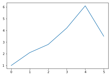
yデータのみのグラフ
data = [1.0, 2.1, 2.8, 4.2, 6.1, 3.5]
plt.plot(data)
plt.show()
マーカー指定 marker='' 'o', 'x', 'v' ...
カラー指定 color='' 'red', 'green', 'blue' ...
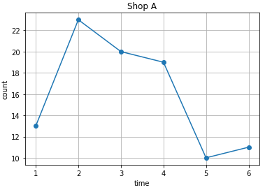
x軸'time'、y軸'count'、タイトル'Shop A'、グリッド付きでグラフを描く
X = [1, 2, 3, 4 ,5, 6]
Y = [13, 23, 20, 19, 10, 11]
plt.plot(X, Y, marker='o', color='red', linestyle='--')
plt.xlabel('time')
plt.ylabel('count')
plt.title('Shop A')
plt.grid()
plt.show()
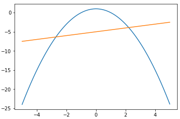
y = -x**2 + 1 y = 0.5*x - 5
の2つのグラフをxが-5から+5の範囲で描く
import numpy as np
x= np.arange(-5, 5, 0.01)
y1 = - x ** 2 + 1
y2 = 0.5 * x  - 5
plt.plot(x, y1)
plt.plot(x, y2)
plt.show()
凡例labelの表示位置指定 plt.legend(loc = '')
- upper right(デフォルト)、upper left、lower right、lower left
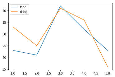
x = [1, 2, 3, 4, 5]
food = [23, 21, 42, 32, 23]
drink = [33, 25, 41, 36, 16]
plt.plot(x, food, label='food')
plt.plot(x, drink, label='drink')
plt.legend(loc='upper left')
plt.show()
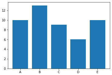
棒グラフ
x = ['A', 'B', 'C', 'D', 'E']
y = [10, 13, 9, 6, 10]
plt.bar(x, y)
plt.show()
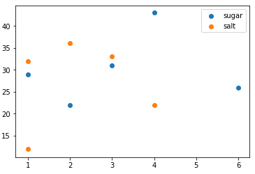
散布図
sugar_x = [1, 3, 2, 4, 6]
sugar_y = [29, 31, 22, 43, 26]
salt_x = [4, 1, 1, 3, 2]
salt_y = [22, 32, 12, 33, 36]
plt.scatter(sugar_x, sugar_y, label='sugar')
plt.scatter(salt_x, salt_y, label='salt')
plt.legend()
plt.show()
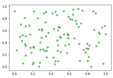
x, yともに0-1までの値をとるランダムな小数を100個散布図を作成
*色は緑、マーカーは'o'、アルファ(透明度)=0.5
import numpy as np
x, y = np.random.rand(100), np.random.rand(100)
plt.scatter(x, y, marker="o", color="green", alpha=0.5)
plt.show()
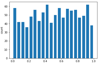
0-1までの値をとるランダムな小数を1000個ヒストグラムで表示
*バーの数は20本、線の太さは0.7、y軸のラベルに「count」と表示
import numpy as np
x = np.random.rand(1000)  # 0-1のランダムな数字1000個生成
plt.hist(x, bins=20, rwidth=0.7)
plt.ylabel("count")
plt.show()
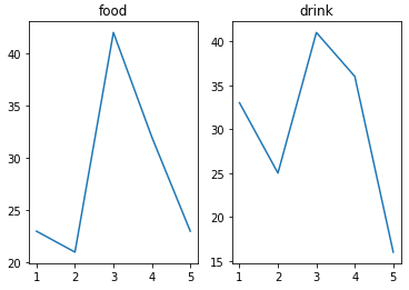
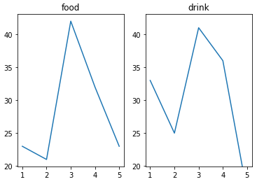
subplots による複数グラフ表示
x = [1, 2, 3, 4, 5]
food = [23, 21, 42, 32, 23]
drink = [33, 25, 41, 36, 16]

fig, (ax1, ax2) = plt.subplots(nrows=1, ncols=2)

ax1.plot(x, food)
ax1.set_title('food')

ax2.plot(x, drink)
ax2.set_title('drink')

plt.show()
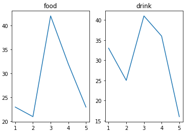
add_subplot による折れ線グラフの複数表示
x = [1, 2, 3, 4, 5]
food = [23, 21, 42, 32, 23]
drink = [33, 25, 41, 36, 16]

fig = plt.figure()

ax1 = fig.add_subplot(1, 2, 1)
ax1.plot(x, food)
ax1.set_title('food')

ax2 = fig.add_subplot(1, 2, 2)
ax2.plot(x, drink)
ax2.set_title('drink')

plt.show()
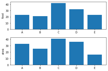
add_subplot による棒グラフの複数表示
x = ['A', 'B', 'C', 'D', 'E']
food = [23, 21, 42, 32, 23]
drink = [33, 25, 41, 36, 16]

fig = plt.figure()

ax1 = fig.add_subplot(2, 1, 1)
ax1.bar(x, food)
ax1.set_ylabel('food')

ax2 = fig.add_subplot(2, 1, 2)
ax2.bar(x, drink)
ax2.set_ylabel('drink')

plt.tight_layout()

plt.show()
add_subplot による折れ線グラフの複数表示
1行2列で、変数名をタイトルとし、y軸のレンジを統一して表示
x = [1, 2, 3, 4, 5]
food = [23, 21, 42, 32, 23]
drink = [33, 25, 41, 36, 16]

fig = plt.figure()

ax1 = fig.add_subplot(1, 2, 1)
ax1.plot(x, food)
ax1.set_title('food')
ymin, ymax = ax1.get_ylim()  # y軸の最小、最大を取得

ax2 = fig.add_subplot(1, 2, 2)
ax2.plot(x, drink)
ax2.set_title('drink')
ax2.set_ylim(ymin, ymax)  # y軸の最小、最大を設定

plt.show()
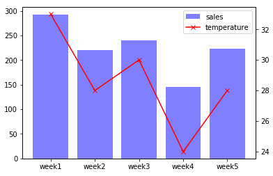
2軸でグラフ表示し、変数名を凡例として表示する
x = ['week1', 'week2', 'week3', 'week4', 'week5']
sales = [293, 221, 240, 145, 223]
temperature = [33, 28, 30, 24, 28]

fig = plt.figure()

ax1 = fig.add_subplot(1, 1, 1)
ax1.bar(x, sales, label="sales", color="b", alpha=0.5)

ax2 = ax1.twinx()  # 2軸目のグラフを設定
ax2.plot(temperature, label="temperature", color="r", marker="x")

handler1, label1 = ax1.get_legend_handles_labels()  # ハンドルとラベルを取得
handler2, label2 = ax2.get_legend_handles_labels()  # ハンドルとラベルを取得
plt.legend(handler1+handler2, label1+label2)   # 2つのハンドルとラベルを表示

plt.show()