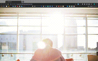
Webサイトのトップページに画面いっぱいのレスポンシブな画像を表示する
設定はCSSのみ
index.html
  <body>
    <div id="Top"></div>

    <!-- other content -->

  </body>
style.css
# Top{
 width: 100vw;
 height: 100vh;
 background-image: url(./your/path/images);
 background-size: cover;
 background-position: center;
}
ポイント
長さを指定する単位にvw, vhを設定することで画面いっぱいに要素を広げることができる。
画像のurlパスは、cssファイルからの相対パスで、index.htmlからの相対パスでないことに注意する。
background-sizeを指定しないと、画像が画面幅に合わせて配置されないので、必ず指定する
また、background-positionを"center"指定すると、画像がいい感じに真ん中でトリミングされる。
指定を"top","bottom","right","leftなど指定することで好きな位置を固定しながらリサイズできる
まとめ
backgroundで画像を指定することで、簡単に画面いっぱいまで画像を配置することができ、今時のファーストビューに画像ドーーンなWebデザインをレスポンシブに実装することができる。
また、background指定することで、Webページの表示速度が上がり、一石二鳥である。