目次
1.はじめに
2.実行環境・Pythonのバージョン
3.目的
4.使用するデータセットについて
5.実装
6.データの可視化・前処理
7.分析手法の検討
8.結果
9.今後の展望
1.はじめに
はじめまして。私はAidemyでデータ分析講座を受講しています。
現在、マーケティング関係の仕事をしており、企業の売上データを分析し、
新製品の販売予測や、販売戦略の立案に従事しています。
今後、機械学習の手法を応用し、より精度の高い分析をしたいと考え、受講を決意しました。
データ分析講座の学びの成果として、本記事を作成しました。
よろしくお願い致します。
2.実行環境、Pythonのバージョン
【実行環境】
Google colaboratory
【バーション】
Python 3.9.16
3.目的
時系列分析を利用して、エクアドルに拠点を置く大手食料品小売業者 Corporación Favorita のデータから、店舗の売上を予測します。
4.使用するデータセットについて
Kaggleのコンペ『Store Sales – Time Series Forecasting』のデータセットを
活用します(https://www.kaggle.com/competitions/store-sales-time-series-forecasting/data)。
5.実装
まずは、必要なライブラリをimportします。
import numpy as np
import pandas as pd
import seaborn as sns
import matplotlib.pyplot as plt
6.データの可視化・前処理
続いて、データの内容を確認します。
用意されているデータセットをimportします。
train_df = pd.read_csv('/content/drive/MyDrive/Dataset/train.csv')
test_df = pd.read_csv('/content/drive/MyDrive/Dataset/test.csv')
store_df = pd.read_csv('/content/drive/MyDrive/Dataset/stores.csv')
transactions_df = pd.read_csv('/content/drive/MyDrive/Dataset/transactions.csv')
oil_df = pd.read_csv('/content/drive/MyDrive/Dataset/oil.csv')
holidays_df = pd.read_csv('/content/drive/MyDrive/Dataset/holidays_events.csv')
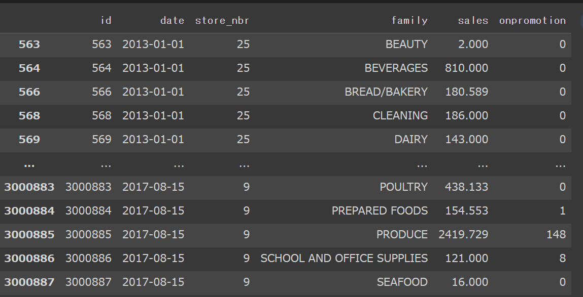
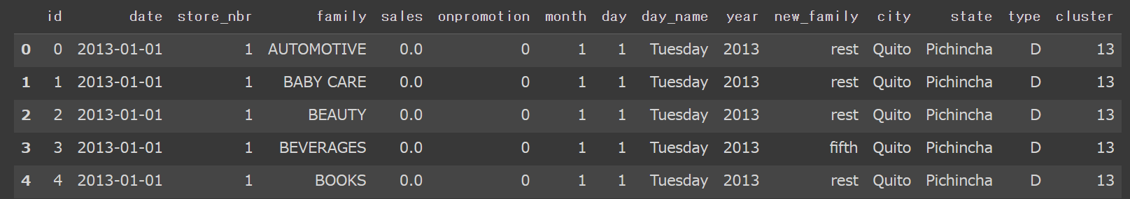
trainデータの中身を可視化してみます。
train_df

date別、str_nbr別、family別の売り上げ高が列挙されています。
データを見ると、売上が0の日もあるので、売上高が0の行を除外します。
train_df[train_df.sales>0]
続いて、store_nbrの数や種類を確認します。
np.sort(train_df.store_nbr.unique())
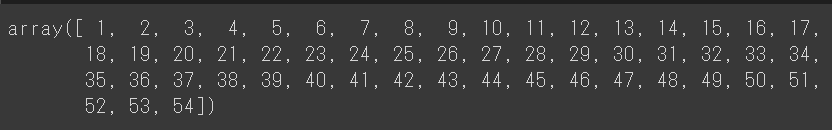
store_nbrは1~54の全54個あることがわかりました。
同じように、familyの中身も確認します。
train_df.family.unique()

familyは全33個のデータからなることがわかりました。
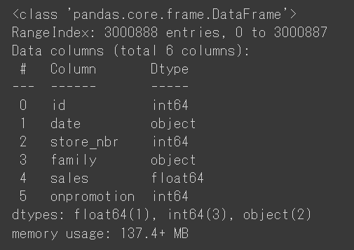
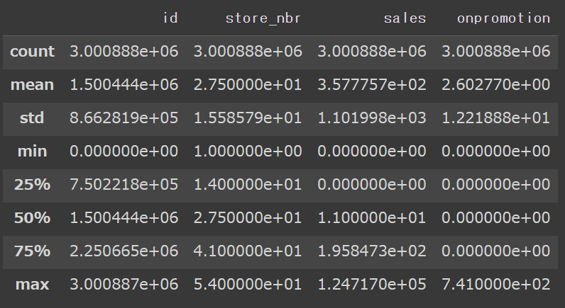
trainデータの要約情報と、基本統計量を確認します。
train_df.info()
train_df.describe()
データの概要を掴むことが出来たので、分析しやすくなるように、データを加工していきます。
まずは、店舗ごとの売り上げを合計します。
店舗数が多いので、ここでは先頭10行のみ表示します。
train_df.groupby(by='store_nbr')['sales'].sum().head(10)

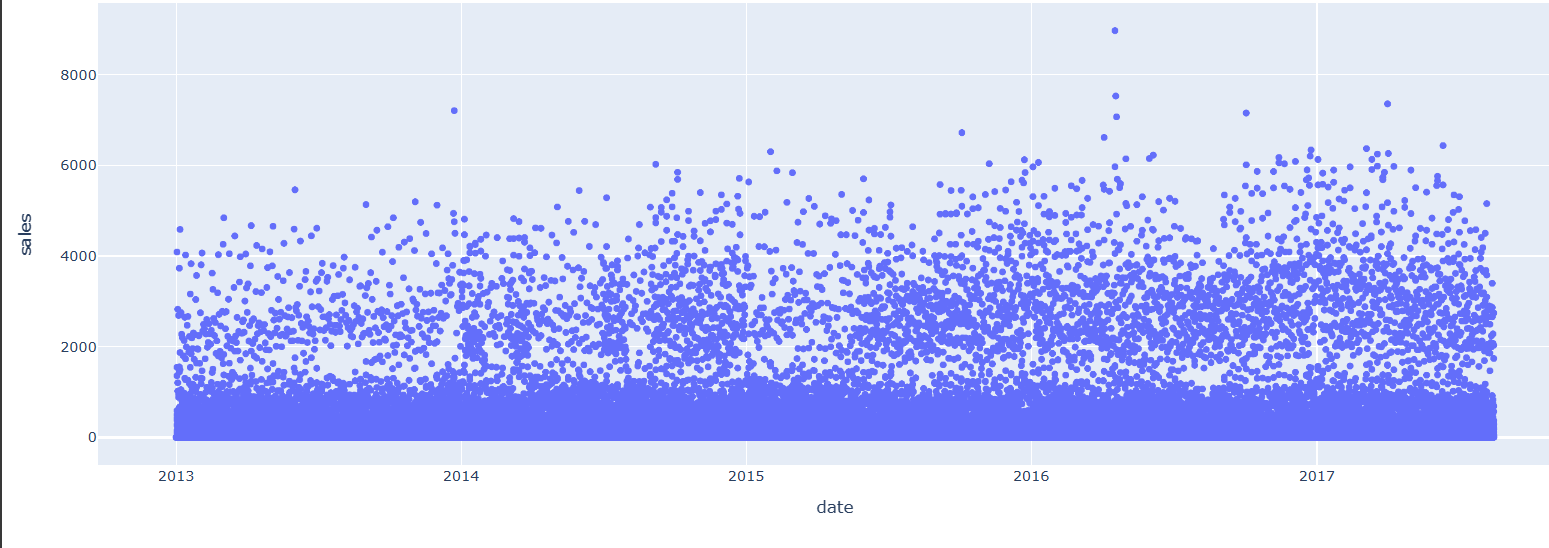
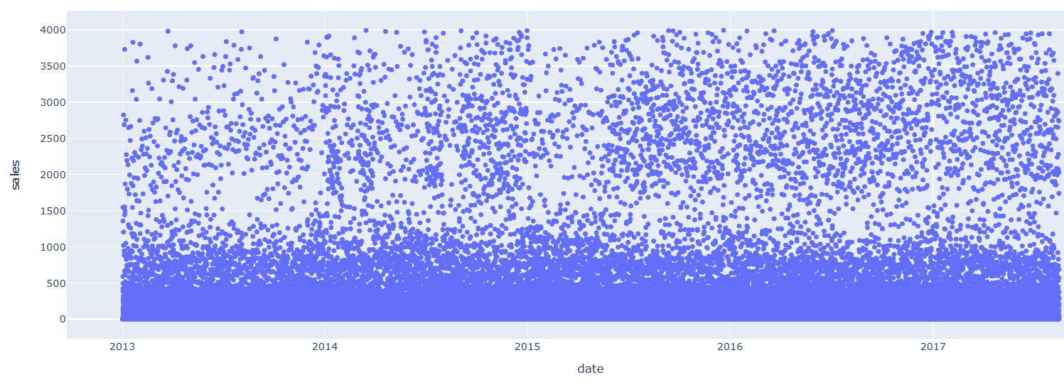
店舗1を例に、日別の売上を可視化してみます。
import plotly.express as px
fig = px.scatter(train_df[train_df.store_nbr==1], x="date", y="sales")
fig.show()

2016年4月に、売上が大きく上昇していますが、それはエクアドルで発生した地震の影響によるものと思われます。
続いて、datetimeモジュールを用いて、データを変換します。
train_df['month'] = pd.to_datetime(train_df['date']).dt.month
train_df['day'] = pd.to_datetime(train_df['date']).dt.day
train_df['day_name'] = pd.to_datetime(train_df['date']).dt.day_name()
train_df['year'] = pd.to_datetime(train_df['date']).dt.year
train_df.head(5)
店舗別・月別の売上を可視化します。
table = pd.pivot_table(train_df, values ='sales', index =['store_nbr'],
                         columns =['month'], aggfunc = np.sum)
fig, ax = plt.subplots(figsize=(15,12))
sns.heatmap(table, annot=False, linewidths=.5, ax=ax, cmap="YlGnBu")
plt.show()
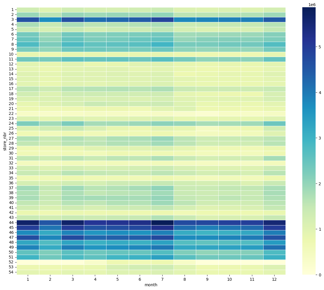
店舗の売り上げと、販売月には、特に相関は無さそうです。
商品の種類別の売り上げを可視化します。
table1 = pd.pivot_table(train_df, values ='sales', index =['family'], aggfunc = np.sum)
fig, ax = plt.subplots(figsize=(10,10))
sns.heatmap(table1, annot=True, linewidths=.5, ax=ax, cmap="YlGnBu")
plt.show()
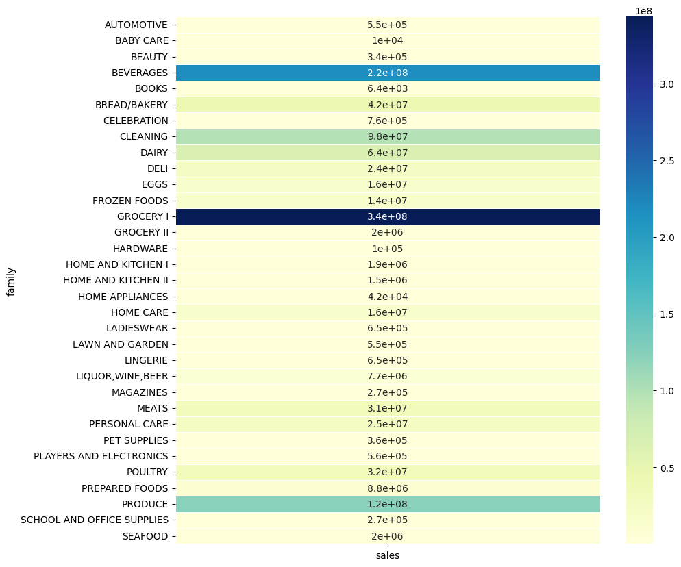
GROCERY1、BEVERAGES、PRODUCE、CLEANINGなど、一部の商品が全体の売上を引っ張っているようです。
それぞれの商品が、全体の売上にどれだけ貢献したかを計算します。
total_sum = table1.sales.sum()
table1/total_sum

売上の大きかったGROCERY1、BEVERAGES、PRODUCE、CLEANINGなどは、全体の売上への貢献度が高い傾向にあります。
次に、店舗1、店舗2を例に、プロモーションが売上に与える影響を確認します。
#店舗1
import plotly.express as px
fig = px.scatter(train_df[train_df.store_nbr==1], x="onpromotion", y="sales")
fig.show()

#店舗2
import plotly.express as px
fig = px.scatter(train_df[train_df.store_nbr==2], x="onpromotion", y="sales")
fig.show()
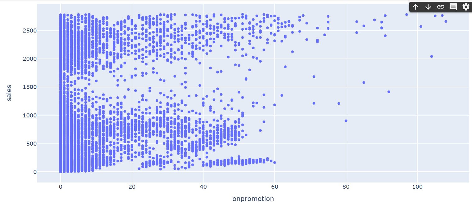
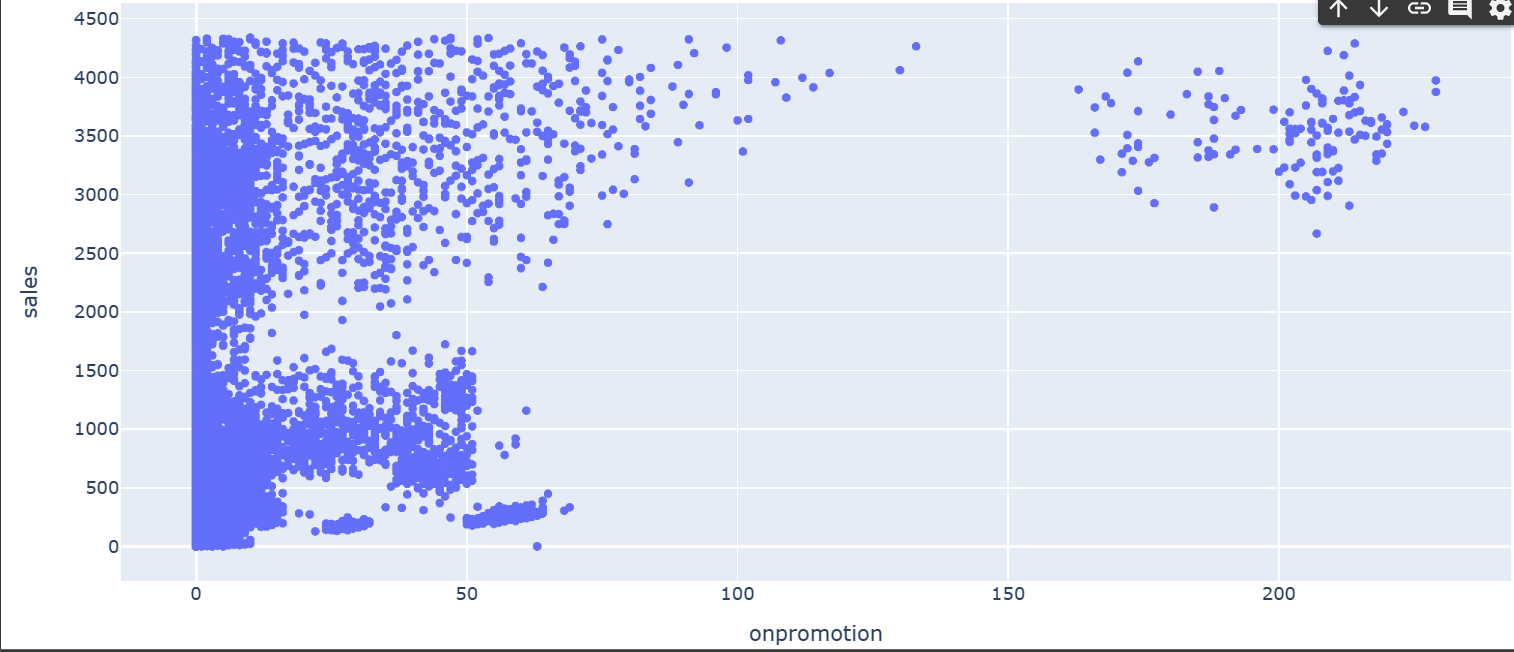
プロモーションが売上に与える影響はそれほど大きくなさそうです。
プロモーションされていた商品と、そうでない商品の数を可視化してみます。
import plotly.express as px
df = px.data.tips()
fig = px.histogram(train_df[train_df.onpromotion<200], x="onpromotion", nbins=20)
fig.show()
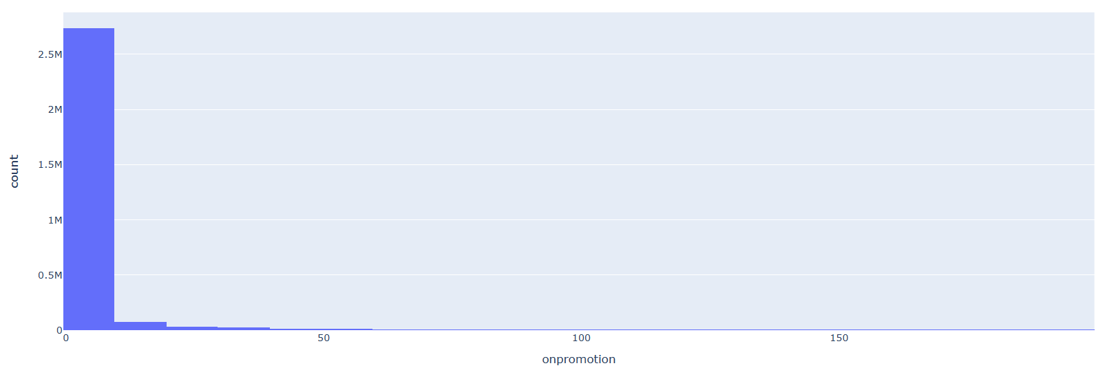
プロモーションされていた商品の数は少ないようです。
今度は、曜日が、売上に与える影響を確認します。
table3 = pd.pivot_table(train_df, values ='sales', index =['day_name'], aggfunc = np.sum)
fig, ax = plt.subplots(figsize=(10,10))
sns.heatmap(table3, annot=True, linewidths=.5, ax=ax, cmap="YlGnBu")
plt.show()
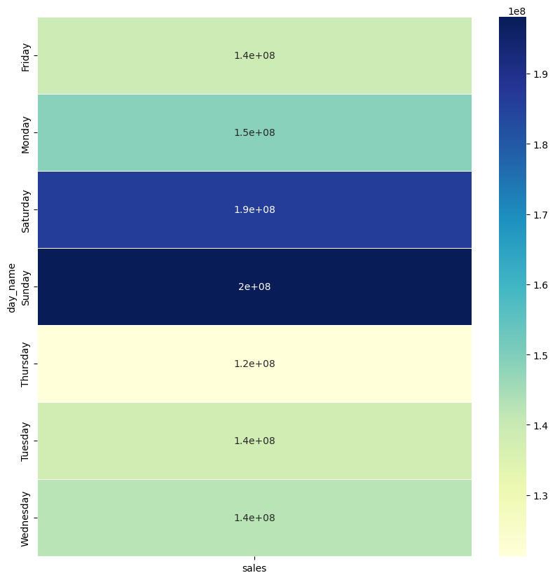
週末(土日の)売上が高くなっているのがわかります。
同様に、販売年の、売上に与える影響を確認します。
table_year = pd.pivot_table(train_df, values ='sales', index =['store_nbr'],
                         columns =['year'], aggfunc = np.sum)

fig, ax = plt.subplots(figsize=(15,12))
sns.heatmap(table_year, annot=False, linewidths=.5, ax=ax, cmap="YlGnBu")
plt.show()
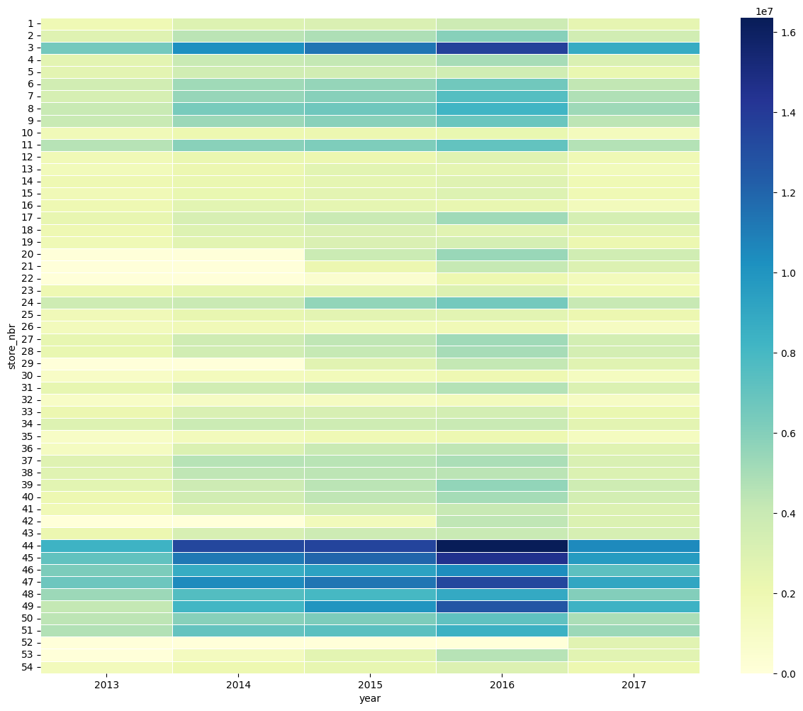
販売年による売り上げのバラつきはそれほど無さそうです。
先程、商品ごとの全体の売り上げへの影響を見たところ、一部の商品の売り上げ比率が高いことが分かったので、分析しやすくするため、familyをグループ分けします。
family_map       = {'AUTOMOTIVE': 'rest',
                   'BABY CARE': 'rest',
                   'BEAUTY': 'rest',
                   'BOOKS': 'rest',
                   'CELEBRATION': 'rest',
                   'GROCERY II': 'rest',
                   'HARDWARE': 'rest',
                   'HOME AND KITCHEN I': 'rest',
                   'HOME AND KITCHEN II': 'rest',
                   'HOME APPLIANCES': 'rest',
                   'LADIESWEAR': 'rest',
                   'LAWN AND GARDEN': 'rest',
                   'LINGERIE': 'rest',
                   'MAGAZINES': 'rest',
                   'PET SUPPLIES': 'rest',
                   'PLAYERS AND ELECTRONICS': 'rest',
                   'SCHOOL AND OFFICE SUPPLIES': 'rest',
                   'SEAFOOD': 'rest',
                   'DELI': 'first_sec',
                    'EGGS': 'first_sec',
                    'FROZEN FOODS': 'first_sec',
                    'HOME CARE': 'first_sec',
                    'LIQUOR,WINE,BEER': 'first_sec',
                    'PREPARED FOODS': 'first_sec',
                    'PERSONAL CARE': 'first_sec',
                    'BREAD/BAKERY': 'third',
                    'MEATS': 'third',
                    'POULTRY': 'third',
                    'CLEANING':'fourth',
                    'DAIRY':'fourth',
                    'PRODUCE':'seventh',
                    'BEVERAGES':'fifth',
                    'GROCERY I': 'sixth'
                   }

train_df['new_family'] = train_df['family'].map(family_map)
train_df.head(5)

外れ値を除去します。
#外れ値除去前
import plotly.express as px
fig = px.scatter(train_df[train_df.store_nbr==4], x="date", y="sales")
fig.show()

for i in range(1,len(train_df.store_nbr.unique())+1):
    val = train_df[train_df.store_nbr == i].sales.quantile(0.99)
    train_df = train_df.drop(train_df[(train_df.store_nbr==i) & (train_df.sales > val)].index)

#外れ値除去後
fig = px.scatter(train_df[train_df.store_nbr==4], x="date", y="sales")
fig.show()
【外れ値除去前】
【外れ値除去後】
storesデータの分析に移ります。
store_dfデータの型を確認します。
store_df.shape

train_dfとstore_dfを結合します。
train_df = pd.merge(train_df, store_df, on='store_nbr', how='left')
train_df.head(5)
holidaysデータを分析します。
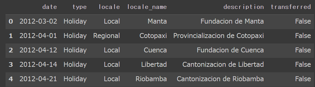
holidaysデータの中身や型を確認します。
holidays_df.head(5)

holidays_df.shape

holidaysデータの中のlocaleを確認します。
holidays_df.locale.unique()

同じく、holidaysデータの中のlocale_nameの内容を確認します。
holidays_df.locale_name.unique()

storesデータの中のcityの内容を確認します。
store_df.city.unique()

storesデータの中のstateの内容を確認します。
store_df.state.unique()

holidaysデータの中身を確認します。
holidays_df.type.unique()

holidays_dfの列名を変更します。
holidays_df.rename(columns={'type': 'day_nature'},
          inplace=True, errors='raise')
休日の種類に応じて、新しいデータを作成します。
holiday_loc = holidays_df[holidays_df.locale == 'Local']
holiday_reg = holidays_df[holidays_df.locale == 'Regional']
holiday_nat = holidays_df[holidays_df.locale == 'National']
holiday_loc.rename(columns={'locale_name': 'city'},
          inplace=True, errors='raise')
holiday_reg.rename(columns={'locale_name': 'state'},
          inplace=True, errors='raise')
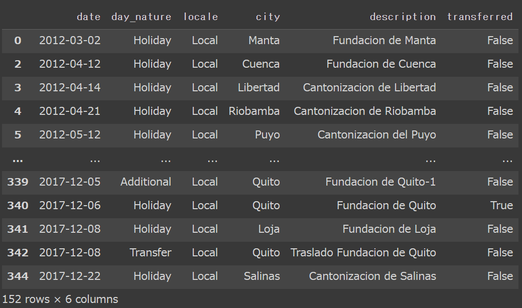
先程作成した、holiday_locデータを可視化してみます。
holiday_loc
データを結合していきます。
train_df = pd.merge(train_df, holiday_loc, on=['date', 'city'], how='left')
train_df = train_df[~((train_df.day_nature == 'Holiday') & (train_df.transferred == False))]
train_df.drop(['day_nature', 'locale', 'description','transferred'], axis=1, inplace=True)
train_df = pd.merge(train_df, holiday_reg, on=['date', 'state'], how='left')
train_df = train_df[~((train_df.day_nature == 'Holiday') & (train_df.transferred == False))]
train_df.drop(['day_nature', 'locale', 'description','transferred'], axis=1, inplace=True)
train_df = pd.merge(train_df, holiday_nat, on=['date'], how='left')
train_df = train_df[~((train_df.day_nature == 'Holiday') & (train_df.transferred == False))]
train_df.drop(['day_nature', 'locale', 'description','transferred'], axis=1, inplace=True)
train_dfというデータから、 'id', 'date', 'family', 'month', 'day','city','state','type', 'cluster', 'locale_name', 'year' という列を削除します。
train_df.drop(['id', 'date', 'family', 'month', 'day','city','state','type', 'cluster', 'locale_name', 'year'],axis=1, inplace=True)
train_df変数内のday_nameとnew_familyをダミー変数に変換します。
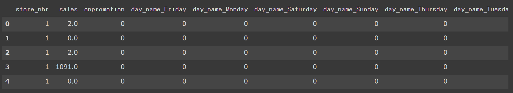
train_df = pd.get_dummies(train_df, columns = ['day_name','new_family'])
train_df.reset_index(inplace=True)
train_df.drop(['index'],axis=1, inplace=True)
train_df.head(5)
7.分析手法の検討
モデルをimportし、データを学習させます。
ここでは、ランダムフォレストよりも高い精度が出るとされている、XGboostを用います。
from sklearn.linear_model import LinearRegression
from xgboost import XGBRegressor
from sklearn import preprocessing
from sklearn.model_selection import train_test_split


size = round(len(train_df)*0.7)
train = train_df.iloc[:size, :]
test = temp.iloc[size:, :]


for i in range(1,len(train_df.store_nbr.unique())+1):
    temp_df = train_df[train_df.store_nbr == i]
    sale_out = temp_df[['sales']]
    globals()['max_%s' % i] = temp_df['onpromotion'].max()
    temp_df['onpromotion'] = (temp_df['onpromotion']/globals()['max_%s' % i])
    temp_df.onpromotion = np.where(temp_df.onpromotion<0, 0, temp_df.onpromotion)
    temp_df.drop(['sales','store_nbr'],axis=1, inplace=True)
    globals()['model_%s' % i] = XGBRegressor(verbosity=0)
    globals()['model_%s' % i].fit(temp_df, sale_out)
店舗別の売上高を予測します。
temp_df.head(5)

backup_df_1 = pd.DataFrame()

for i in range(1,len(train_df.store_nbr.unique())+1):
    temp_df = test_df[test_df.store_nbr == i]
    sales_out = temp_df[['sales']]
    print(sales_out)
    temp_df['onpromotion'] = (temp_df['onpromotion']/globals()['max_%s' % i])
    temp_df.onpromotion = np.where(temp_df.onpromotion<0, 0, temp_df.onpromotion)
    save_id = temp_df[['id', 'sales']].reset_index()
    submit = globals()['model_%s' % i].predict(temp_df)
    save_id['sales2'] = submit
    display(save_id.head(3))
    df11 = pd.DataFrame(submit, columns = ['sales2'])
    backup_df = pd.concat([save_id[['id', 'sales']], df11], axis = 1, ignore_index = True)
    backup_df_1 = backup_df_1.append(backup_df, ignore_index=True)

backup_df_1.rename(columns={0 : "id", 1 : "sales", 2 : "sales_predict"}, inplace=True, errors='raise')
test_df = pd.merge(test_df, backup_df_1, on='id', how='left')

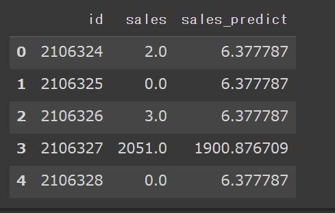
backup_dfの先頭5行を表示させます。
backup_df_1.head(5)
sample_dfのsales列の内容について、0より小さい行は0に変えておきます。
sample_df = test_df[['id', 'sales_predict']]
sample_df.sales_predict = np.where(sample_df.sales_predict<0, 0, sample_df.sales_predict)
sample_df.head(5)

最後に、RMSEによるモデルの精度評価を行います。
from sklearn.metrics import mean_squared_error
from math import sqrt
rmse = sqrt(mean_squared_error(backup_df_1['sales'], backup_df_1['sales_predict']))
print(f"{RMSE} : rmse")

8.結果
XGBoostを用いて、店舗の売上高を予測することができました。
今回のブログ作成を通し、一通りデータを取得し、前処理→モデルの選定→実装→予測までの流れを体験することができました。ただ、精度については、まだまだ改善の余地があると思いますので、引き続き勉強を続けていこうと思います。
9.今後の展望
今回、Aidemyでデータ分析講座を受講し、Pythonの基本的な文法や、ライブラリの使い方や、機械学習・ディープラーニングの概要、データ分析の流れ等を学ぶことができました。
今回学んだ技術を、今後は実務でも導入していきたいと考えておりますが、まだ理解が曖昧な箇所があったり、コーディングの経験が乏しい部分がありますので、データ分析講座の復習や、他の講座の受講による知識の定着と、Kaggleに参加し、モデルを構築する経験を積んで、さらなるスキルアップを図っていきたいと考えています。