


1、Jetpack Composeとは
Jetpack Composeは、Android のネイティブ UI を構築するための最新のツールキットです。Android の UI 開発を簡素化し、加速します。
少ないコード、パワフルなツール、直感的なKotlin APIを使用してアプリをすぐに動かすことができます。
ここ数年、業界全体が宣言型 UI モデルに移行し始め、ユーザー インターフェースの構築や更新に関連するエンジニアリングは大幅に簡素化されています。web側やモバイル側のUI構築において、Flutter、SwiftUI、reactなどに比べたら、従来のXMLの優位性がだんだん失っていってます。Googleは2019年にもJetpack Composeを発表したが、まだ実験的なもので、プロダクト環境に使用しない方が良いとその時はアナウンスしていたようです。
つい最近、Jetpack ComposeのBeta版がリリースされ、正式版が出るのはまもなくのではないかと友達の中にそう思っている人は少なくないです。
2、環境
・エディタ
Android Studio Beta 4.2版、またはCanary版では使えそうですが、私の場合はBeta版でJetpack Compose機能を利用しようとすると、下記のインフォとなり、Canary版に切り替えるしかなかったです (
( Compose UI をすぐにプレビューできる)。

・プロジェクト環境
プロジェクトで Kotlin 1.4.21 以降を使用していることを確認します。
プロジェクトの build.gradle記述:
buildscript {
    ext.kotlin_version = "1.4.31"
    ext.compose_version = "1.0.0-beta03"
    repositories {
        google()
        mavenCentral()
    }
    dependencies {
        classpath 'com.android.tools.build:gradle:7.0.0-alpha12'
        classpath "org.jetbrains.kotlin:kotlin-gradle-plugin:$kotlin_version"

        // NOTE: Do not place your application dependencies here; they belong
        // in the individual module build.gradle files
    }
}
・app環境
アプリの最小
API レベルを 21 以上に設定し、アプリのbuild.gradleファイルでJetpack Composeを有効にする必要があります。
また、Kotlinコンパイラ プラグインのバージョンも設定します。
appの build.gradle記述:
plugins {
    id 'com.android.application'
    id 'kotlin-android'
}

android {
    compileSdkVersion 30

    defaultConfig {
        applicationId "com.example.composedemo"
        minSdkVersion 21
        targetSdkVersion 30
        versionCode 1
        versionName "1.0"

        testInstrumentationRunner "androidx.test.runner.AndroidJUnitRunner"
    }

    buildFeatures {
        // Enables Jetpack Compose for this module
        compose true
    }

    buildTypes {
        release {
            minifyEnabled false
            proguardFiles getDefaultProguardFile('proguard-android-optimize.txt'), 'proguard-rules.pro'
        }
    }
    compileOptions {
        sourceCompatibility JavaVersion.VERSION_1_8
        targetCompatibility JavaVersion.VERSION_1_8
    }
    kotlinOptions {
        jvmTarget = '1.8'
        useIR = true
    }

    composeOptions {
        kotlinCompilerVersion kotlin_version
        kotlinCompilerExtensionVersion compose_version
    }
}

dependencies {
    implementation "androidx.compose.ui:ui:$compose_version"
    // Tooling support (Previews, etc.)
    implementation "androidx.compose.ui:ui-tooling:$compose_version"
    // Foundation (Border, Background, Box, Image, Scroll, shapes, animations, etc.)
    implementation "androidx.compose.foundation:foundation:$compose_version"
    // Material Design
    implementation "androidx.compose.material:material:$compose_version"
    // Compose Activity Lib
    implementation 'androidx.activity:activity-compose:1.3.0-alpha05'
    implementation "org.jetbrains.kotlin:kotlin-stdlib:$kotlin_version"
    implementation 'androidx.core:core-ktx:1.3.1'
    implementation 'androidx.appcompat:appcompat:1.2.0'
    implementation 'com.google.android.material:material:1.2.1'
    implementation 'androidx.constraintlayout:constraintlayout:2.0.1'
    testImplementation 'junit:junit:4.+'
    androidTestImplementation 'androidx.test.ext:junit:1.1.2'
    androidTestImplementation 'androidx.test.espresso:espresso-core:3.3.0'
}
これで、Jetpack Composeを使ってアプリを開発する準備が整いました。いよいよ、コーディングが始まります。
ComposeUIは他のクラスファイルを新たに起こして記述した方がいいかもしれません。

3、コーディング スタート
Jetpack Composeは、コンポーズ可能な関数に基づいて構築されています。これらの関数を使用すると、UI の形状とデータの依存関係を記述することで、アプリの UI をプログラムで定義できます。UI の構築プロセスを重視する必要はありません。関数名に@Composableアノテーションを追加するだけでコンポーズ可能な関数を作成できます。
ここで、注意しなければいけないのはコンポーズ可能な関数の命名は大文字で始まる必要があります。それは何?クラス?オブジェクト?と思われるかもしれないが、実はそれは組み合わせ可能な関数です。@Composableアノテーションをマークにし、カスタムKotlinコンパイラ プラグインは、コンポーズ可能な関数をアプリのUI要素に変換します。
Flutter、SwiftUI、Compose...皆一緒ですが、基本のText、ImageなどのUIコンポーネント及び、Row、Columnのようなレイアウトコンポーネントを使いこなせば、ほとんどの画面を書けます。
・Text
基本なTextコンポーネントを例に、ソースコードをたどり着いたら、@Composableアノテーションがついており、内部にはいろいろ開発者に使われそうな属性が提供しています。
@Composable
fun Text(
    text: String,
    modifier: Modifier = Modifier,
    color: Color = Color.Unspecified,
    fontSize: TextUnit = TextUnit.Unspecified,
    fontStyle: FontStyle? = null,
    fontWeight: FontWeight? = null,
    fontFamily: FontFamily? = null,
    letterSpacing: TextUnit = TextUnit.Unspecified,
    textDecoration: TextDecoration? = null,
    textAlign: TextAlign? = null,
    lineHeight: TextUnit = TextUnit.Unspecified,
    overflow: TextOverflow = TextOverflow.Clip,
    softWrap: Boolean = true,
    maxLines: Int = Int.MAX_VALUE,
    onTextLayout: (TextLayoutResult) -> Unit = {},
    style: TextStyle = LocalTextStyle.current
) {
    Text(
        AnnotatedString(text),
        modifier,
        color,
        fontSize,
        fontStyle,
        fontWeight,
        fontFamily,
        letterSpacing,
        textDecoration,
        textAlign,
        lineHeight,
        overflow,
        softWrap,
        maxLines,
        emptyMap(),
        onTextLayout,
        style
    )
}
さあ、Textをいじてみます。

@Preview(name = "text")
@Composable
fun TextView() {
    Box(
        modifier = Modifier.border(
            border = BorderStroke(
                width = 2.dp,
                color = Color(44, 190, 110),
            ),
            shape = RoundedCornerShape(20f, 20f, 20f, 20f),
        )
    ) {
        Row(
            modifier = Modifier
                .padding(5.dp), verticalAlignment = Alignment.CenterVertically
        ) {
            Text(
                text = "Hello", style = TextStyle(color = Color(2, 32, 49))
            )
            Box(modifier = Modifier.width(3.dp))
            Text(
                text = "Compose", style = TextStyle(color = Color(46, 106, 247))
            )
        }
    }
}
そこにModifierといったモノが出てきたが、SwiftUIのModifierと同じように、Android Jetpack ComposeのModifierもUIやEventの定義ができます。
修飾子を使用すると、コンポーザブルの表示方法を微調整できます。修飾子では、次のようなことができます。
・コンポーザブルの動作と外観を変更する
・ユーザー補助ラベルなどの情報を追加する
・ユーザー入力を処理する
・要素をクリック可能、スクロール可能、ドラッグ可能、ズーム可能にするなど、高レベルの操作を追加する
修飾子は標準の
Kotlinオブジェクトです。Modifierクラス関数のいずれかを呼び出して修飾子を作成します。こうした関数を連鎖させてコンポーズできます。
・Image
まずはImageのソースコードを見てみます。
@Composable
fun Image(
    bitmap: ImageBitmap,
    contentDescription: String?,
    modifier: Modifier = Modifier,
    alignment: Alignment = Alignment.Center,
    contentScale: ContentScale = ContentScale.Fit,
    alpha: Float = DefaultAlpha,
    colorFilter: ColorFilter? = null
) {
    val bitmapPainter = remember(bitmap) { BitmapPainter(bitmap) }
    Image(
        painter = bitmapPainter,
        contentDescription = contentDescription,
        modifier = modifier,
        alignment = alignment,
        contentScale = contentScale,
        alpha = alpha,
        colorFilter = colorFilter
    )
}
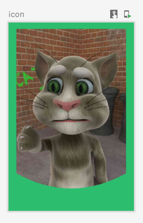
使いそうな属性を活用し、以下のネコ写真を飾ってみました。
@Preview(name = "icon")
@Composable
fun IconView() {
    val imageBitmap: ImageBitmap = ImageBitmap.imageResource(R.drawable.cat)
    Image(
        bitmap = imageBitmap,
        contentScale = ContentScale.Inside,
        contentDescription = "Cat Image",
        modifier = Modifier
            .background(Color(44, 190, 110))
            .height(150.dp)
            .width(100.dp)
            .padding(horizontal = 5.dp, vertical = 5.dp)
            .clip(
                RectangleImageShapes()
            )
    )
}
RectangleImageShapesはShapeを継承し、写真・画面をラジアン(弧度)によってトリミングするクラスです。角丸だけでなく、必要に応にて各種大胆、モダンなデザインが実現可能です。さあ、@Stableアノテーションはどういう意味?
ソースコードのコメントを覗いてみると、
Stable is used to communicate some guarantees to the compose compiler about how a certain type or function will behave...
When applied to a function or a property, the Stable annotation indicates that the function will return the same result if the same parameters are passed in. This is only meaningful if the parameters and results are themselves Stable, Immutable, or primitive.
The invariants that this annotation implies are used for optimizations by the compose compiler, and have undefined behavior if the above assumptions are not met. As a result, one should not use this annotation unless they are certain that these conditions are satisfied.
長いですが、簡単に言えば、@Stableアノテーションで声明したアイテムは不可変属性のため、再コンポーズするプロセスを省略できます。不要なUIやデータ状態の更新が削減されます。
詳しくは↓
@Stable
class RectangleImageShapes(var radian: Float = 70f) : Shape {
    override fun createOutline(
        size: Size,
        layoutDirection: LayoutDirection,
        density: Density
    ): Outline {
        val path = Path()
        path.moveTo(0f, 0f)
        path.lineTo(0f, size.height - radian)
        path.quadraticBezierTo(size.width / 2f, size.height, size.width, size.height - radian)
        path.lineTo(size.width, 0f)
        path.close()
        return Outline.Generic(path)
    }
}
・組み合わせView (ログインページ)
Box、Column、Row、Text、Image、TextField、Buttonなどのコンポーネント使って、ログインページを作成します。
@Preview(name = "loginPage")
@Composable
fun LoginPage() {
    val imageBitmap: ImageBitmap = ImageBitmap.imageResource(R.drawable.jetpack_compose)
    val userIcon: ImageBitmap = ImageBitmap.imageResource(R.drawable.user_icon)
    var idValue by remember { mutableStateOf(TextFieldValue("")) }
    var pwValue by remember { mutableStateOf(TextFieldValue("")) }
    var checkedState by remember { mutableStateOf(true) }
    Box(contentAlignment = Alignment.Center) {
        Column() {
            Box(contentAlignment = Alignment.Center) {
                Image(
                    bitmap = imageBitmap,
                    contentDescription = "Jetpack Compose",
                    contentScale = ContentScale.FillWidth,
                    modifier = Modifier
                        .padding(top = 0.dp)
                        .fillMaxWidth()
                        .height(210.dp)
                        .clip(RectangleImageShapes(170f))
                )
                Box(
                    contentAlignment = Alignment.Center,
                    modifier = Modifier
                        .padding(0.dp)
                        .clip(CircleShape)
                        .background(Color(206, 236, 250, 121))
                        .width(130.dp)
                        .height(130.dp)
                ) {
                    Image(
                        bitmap = userIcon,
                        contentDescription = "User Icon",
                        contentScale = ContentScale.FillBounds,
                        modifier = Modifier
                            .height(80.dp)
                            .width(80.dp)
                            .background(color = Color(44, 190, 110), shape = CircleShape)
                            .padding(3.dp)
                            .clip(
                                CircleShape
                            )
                            .shadow(elevation = 100.dp, clip = true)
                    )
                }
            }
            Box(
                contentAlignment = Alignment.Center, modifier = Modifier
                    .fillMaxWidth()
                    .padding(top = 20.dp)
            ) {
                Column(horizontalAlignment = Alignment.CenterHorizontally) {
                    Text(text = "JetPack Compose", fontSize = 18.sp)
                    Text(
                        text = "Less code, Intuitive, Accelerate Development, Powerful~",
                        fontSize = 12.sp,
                        color = Color.Gray
                    )

                }
            }
            Box(
                contentAlignment = Alignment.Center, modifier = Modifier
                    .fillMaxWidth()
                    .padding(top = 30.dp)
            ) {
                TextField(
                    value = idValue,
                    onValueChange = { idValue = it },
                    placeholder = {
                        Text("PlayCompose")
                    },
                    shape = RoundedCornerShape(18.dp),
                    colors = TextFieldDefaults.textFieldColors(
                        focusedIndicatorColor = Color.Transparent,
                        unfocusedIndicatorColor = Color.Transparent,
                        disabledIndicatorColor = Color.Transparent,
                        backgroundColor = Color.White
                    ),
                    modifier = Modifier.border(
                        1.dp,
                        Color(111, 111, 111, 66),
                        shape = RoundedCornerShape(18.dp)
                    ),
                    leadingIcon = { Icon(Icons.Default.Person, "account") })
            }
            Box(
                contentAlignment = Alignment.Center, modifier = Modifier
                    .fillMaxWidth()
                    .padding(top = 10.dp)
            ) {
                TextField(
                    value = pwValue,
                    onValueChange = { pwValue = it },
                    placeholder = {
                        Text("Password")
                    },
                    shape = RoundedCornerShape(18.dp),
                    colors = TextFieldDefaults.textFieldColors(
                        focusedIndicatorColor = Color.Transparent,
                        unfocusedIndicatorColor = Color.Transparent,
                        disabledIndicatorColor = Color.Transparent,
                        backgroundColor = Color.White
                    ),
                    visualTransformation = PasswordVisualTransformation(),
                    modifier = Modifier.border(
                        1.dp,
                        Color(111, 111, 111, 66),
                        shape = RoundedCornerShape(18.dp)
                    ),
                    leadingIcon = { Icon(Icons.Default.Lock, "password") },
                    trailingIcon = {
                        Icon(Icons.Rounded.Close, "delete", modifier = Modifier.clickable {
                            pwValue = TextFieldValue("")
                        })
                    })
            }
            Box {
                Row(
                    horizontalArrangement = Arrangement.SpaceBetween, modifier = Modifier
                        .fillMaxWidth()
                        .padding(horizontal = 62.dp, vertical = 10.dp)
                ) {
                    Box {
                        Row {
                            Checkbox(
                                checked = checkedState,
                                onCheckedChange = { checkedState = it },
                                colors = CheckboxDefaults.colors(checkedColor = Color(44, 190, 110))
                            )
                            Text(
                                "Remember me",
                                color = Color(44, 190, 110),
                                modifier = Modifier.padding(start = 3.dp)
                            )
                        }
                    }
                    Text(
                        "Privacy Policy",
                        modifier = Modifier.clickable {
                            //ToDo go to Privacy Policy Page etc...

                        },
                        style = TextStyle(textDecoration = TextDecoration.Underline),
                        color = Color(44, 190, 110)
                    )
                }
            }
            Button(
                onClick = { /* Do something like get textField's value, checkbox's value, and validate it to enter the homepage...*/ },
                shape = RoundedCornerShape(18.dp),
                modifier = Modifier
                    .fillMaxWidth()
                    .padding(top = 30.dp, start = 100.dp, end = 100.dp, bottom = 50.dp),
                colors = ButtonDefaults.buttonColors(backgroundColor = Color(44, 190, 110))
            ) {
                Text("Come In", color = Color.White)
            }
        }
    }
}
特に考えてもらいたいのは、Jetpack ComposeのUIやStateの更新方式です。宣言型UIモデルと言われているが、命令型UIモデルとどう違いますか。
命令型 UIモデルでウィジェットを変更するには、ウィジェットでセッターを呼び出して内部状態を変更します。Composeでは、コンポーズ可能な関数を新しいデータで再度呼び出します。すると、関数が再コンポーズされます。関数によって出力されるウィジェットは、必要に応じて新しいデータで再描画されます。Composeフレームワークでは、変更されたコンポーネントのみをインテリジェントに再コンポーズできます。
再コンポーズは可能な限りスキップするのは宣言型UIモデルだと思います。これにより、アプリのUIレンダリング性能やデータ交換効率が大幅に上がります。さらに更新必要なところだけ自動で再コンポーズする方式では、従来命令型のSet、Show、hiddenなどの手動更新手法に比べてUI管理漏れによる表示間違いが削減されます。これは我々開発者にとっては魅力的です。
コンポーズ可能な関数でデータが必要な場合は、データ用のパラメータを定義する必要があります。すると、コストの高い処理をコンポーズ外の別のスレッドに移動でき、
mutableStateOfまたはLiveDataを使用してデータをComposeに渡せます。
例えば、ログインページのアカウント入力にある値「idValue」は最初に声明したときはmutableStateOfを使用しています。それにより、自動サブスクリプションが適用されます。
var idValue by remember { mutableStateOf(TextFieldValue("")) }
「idValue」の値が変化すると、アカウントIDの表示が追従します。
4、運用性
真新しいアプリをビルドする場合、Compose を使用して UI 全体を実装することはもちろん、Compose と既存の UI デザインの実装を組み合わせることも可能です。
ビューベースの UI と
Composeを組み合わせる方法は主に 2 つあります。
・Composeの要素を既存の UI に追加するには、まったく新しいComposeベースの画面を作成するか、既存のアクティビティ、フラグメントまたはビュー レイアウトにCompose要素を追加します。
・ビューベースの UI 要素をコンポーズ可能な関数に追加できます。これにより、Android ビューをComposeベースのデザインに追加できます。
Compose ベースのログインページをMainActivityにセットします。
class MainActivity : AppCompatActivity() {
    override fun onCreate(savedInstanceState: Bundle?) {
        super.onCreate(savedInstanceState)
        //setContentView(R.layout.activity_main)
        setContent {
            LoginPage()
        }

    }

}
アプリをビルドしたら、MainActivity画面にCompose ベースのログインページが表示されます。操作性も通常のビューベースの UI と違いがありません。
5、終わり
Androidネイティブアプリの開発者にとってはJetpack Composeは非常に重要かつ示唆的なものでしょう。Flutter、SwiftUI、react、Jetpack Composeなど、業界全体が宣言型 UI モデルに移行しつつあり、その分野の宣言型 UI構築手法を理解、学習しないとついて行けなくなるかもしれません。