円グラフ
基本形
import matplotlib.pyplot as plt

sizes = [15, 30, 35, 10]

fig1, ax1 = plt.subplots()
ax1.pie(sizes)

plt.show()
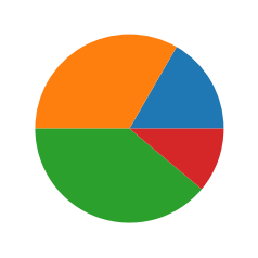
パラメータを指定しない場合、0度から半時計周りで描画される。
また、size(グラフの値)の合計が100ではない場合でも、比率で割合が算出される。
import matplotlib.pyplot as plt

# 合計で60の場合
sizes = [10, 20, 30]

fig1, ax1 = plt.subplots()
ax1.pie(sizes)

plt.show()
ラベル表示
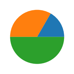
import matplotlib.pyplot as plt

labels = 'label1', 'label2', 'label3', 'label4'
sizes = [10, 20, 30, 40]

fig1, ax1 = plt.subplots()
ax1.pie(sizes, labels=labels)

plt.show()

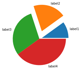
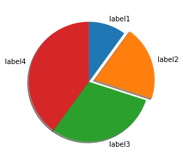
一部を円から切り離して表示
import matplotlib.pyplot as plt

labels = 'label1', 'label2', 'label3', 'label4'
sizes = [10, 20, 30, 40]
explode = (0, 0.1, 0, 0)

fig1, ax1 = plt.subplots()
ax1.pie(sizes, explode=explode, labels=labels)

plt.show()

explodeの値を大きくすることで、切り離す際の幅が大きくなる。
explode = (0.1, 0.3, 0, 0)
90度位置から時計回りに描画
個人的に普段見慣れている円グラフの描画に合わせる。

import matplotlib.pyplot as plt
labels = 'label1', 'label2', 'label3', 'label4'
sizes = [10, 20, 30, 40]
explode = (0, 0.1, 0, 0)
fig1, ax1 = plt.subplots()
ax1.pie(sizes, explode=explode, labels=labels, counterclock=False, startangle=90)
plt.show()
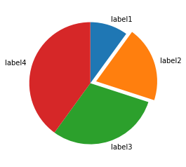
conterclockパラメータをFalseにすることで、時計回りの描画になる。
startangleパラメータで開始位置を調整する。
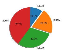
影をつける
import matplotlib.pyplot as plt

labels = 'label1', 'label2', 'label3', 'label4'
sizes = [10, 20, 30, 40]
explode = (0, 0.1, 0, 0)

fig1, ax1 = plt.subplots()
ax1.pie(sizes, explode=explode, labels=labels, shadow=True, counterclock=False, startangle=90)

plt.show()
値をグラフ内に表示
import matplotlib.pyplot as plt

labels = 'label1', 'label2', 'label3', 'label4'
sizes = [10, 20, 30, 40]
explode = (0, 0.1, 0, 0)

fig1, ax1 = plt.subplots()
ax1.pie(sizes, explode=explode, labels=labels, shadow=True, autopct='%1.1f%%', counterclock=False, startangle=90)

plt.show()
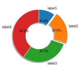
ドーナツ
import matplotlib.pyplot as plt

labels = 'label1', 'label2', 'label3', 'label4'
sizes = [10, 20, 30, 40]
explode = (0, 0.1, 0, 0)
size = 0.5

fig1, ax1 = plt.subplots()
ax1.pie(sizes, explode=explode, labels=labels, shadow=True, autopct='%1.1f%%', counterclock=False,wedgeprops=dict(width=size, edgecolor='w'), startangle=90)

plt.show()
半径
import matplotlib.pyplot as plt

labels = 'label1', 'label2', 'label3', 'label4'
sizes = [10, 20, 30, 40]
explode = (0, 0.1, 0, 0)
size = 0.5

fig1, ax1 = plt.subplots()
ax1.pie(sizes, explode=explode, labels=labels, shadow=True, radius=2, autopct='%1.1f%%', counterclock=False,wedgeprops=dict(width=size, edgecolor='w'), startangle=90)

plt.show()
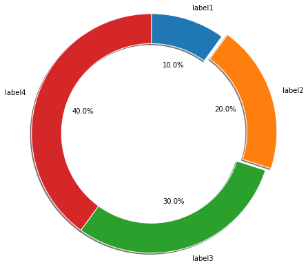
radiusで半径を変更する。デフォルトは1。
入れ子の円グラフ
import matplotlib.pyplot as plt
import numpy as np

fig, ax = plt.subplots()

labels = 'label1', 'label2', 'label3'
size = 0.3
vals = np.array([[60., 32.], [37., 40.], [29., 10.]])

cmap = plt.get_cmap("tab20c")
outer_colors = cmap(np.arange(3)*4)
inner_colors = cmap(np.array([1, 2, 5, 6, 9, 10]))

ax.pie(vals.sum(axis=1), labels=labels, radius=1, colors=outer_colors, autopct='%1.1f%%', wedgeprops=dict(width=size, edgecolor='w'))
ax.pie(vals.flatten(), radius=1-size, colors=inner_colors, wedgeprops=dict(width=size, edgecolor='w'))
ax.set(aspect="equal", title='Pie plot with `ax.pie`')

plt.show()

円グラフを2つ描画している感じ。radiusとwidthでサイズ調整して、入れ子に見えるようにしている。