1.線形回帰モデル
回帰問題とは?
ある入力から出力を予測する問題
直線で予測 ⇒ 線形回帰
曲線で予測 ⇒ 非線形回帰
線形回帰モデルとは
・線形回帰モデルは回帰問題を解くための機械学習モデルの一つ
・教師あり学習(教師データから学習)
・線形回帰モデルは入力とm次元パラメータの線形結合を出力するモデル。
入力(説明変数、特徴量) ⇒ m次元のベクトル
出力(目的変数) ⇒ スカラー値
入力をx,パラメータをw,予測値をŷとすると
{ŷ =w^Tx+w_0=\sum_{j=1}^{m}w_jx_j+w_0
}
●平均二乗誤差(残差平方和)
・データとモデル出力の二乗誤差の和
小さいほど直線とデータの距離が近い
・パラメータのみに依存する関数
データは既知の値でパラメータのみ未知
●最小二乗法
・学習データの平均二乗誤差(MSE:真値と予測値の二乗誤差の平均)を最小とするパラメータを探索
・学習データの平均二乗誤差の最小化は、その勾配が0になる点を求めれば良い(MSEをwで微分した値が0となる点を求める。)
MSE_{\rm train}=\frac{1}{n_{\rm train}}\sum_{k=1}^{n_{\rm train}}\Big(\hat{y_k}-y_k\Big)^2
\frac{\partial}{\partial w}MSE_{\rm train}=0
演習
<ボストンの住宅データセットを線形回帰モデルで分析>
課題:部屋数が4で犯罪率が0.3の物件はいくらになるか
結果:部屋数が4で犯罪率が0.3の物件の価格は4240ドルと予想される。
コード
# 必要モジュールとデータのインポート
from sklearn.datasets import load_boston
from pandas import DataFrame
import numpy as np

# ボストンデータを"boston"というインスタンスにインポート
boston = load_boston()

# データフレームの作成
#  説明変数をDataFrameへ変換
df = DataFrame(data=boston.data, columns = boston.feature_names)
# 目的変数をDataFrameへ追加
df['PRICE'] = np.array(boston.target)

## sklearnモジュールからLinearRegressionをインポート
from sklearn.linear_model import LinearRegression

## 重回帰分析(2変数)

# カラムを指定してデータを表示
df[['CRIM', 'RM']].head()

# 説明変数
data2 = df.loc[:, ['CRIM', 'RM']].values
# 目的変数
target2 = df.loc[:, 'PRICE'].values

# オブジェクト生成
model2 = LinearRegression()

# fit関数でパラメータ推定
model2.fit(data2, target2)
model2.predict([[0.3, 4]])
実行結果
array([4.24007956])
<結果>
部屋数が4で犯罪率が0.3の物件の価格は4240ドル
2.非線形回帰モデル
線形回帰モデルと同様に教師あり学習
線形回帰モデルでは複雑な非線形構造のデータを捉えられないため、非線形回帰モデルで表現する。
●基底展開法
・回帰関数として、基底関数と呼ばれる既知の非線形関数とパラメータベクトルの線型結合を使用
・未知パラメータは線形回帰モデルと同様に最小2乗法や最尤法により推定
●よく使われる基底関数
・多項式関数
・ガウス型基底関数
・スプライン関数/ Bスプライン関数
未知パラメータは線形回帰モデルと同様に最小2乗法により推定する。
未学習と過学習
・回帰を実行するにあたり、未学習と過学習の対策が必要
・未学習(underfitting):学習データに対して、十分小さな誤差が得られないこと。
⇒ モデルの表現力が低いため、表現力の高いモデルを利用する
・過学習(overfitting):学習データへの当てはまりが良すぎて、逆にテストデータに対する誤差が大きいこと。
⇒ 学習データの数を増やす
⇒ 不要な基底関数(変数)を削除して表現力を抑止
⇒ 正則化法(誤差関数に複雑さに対する罰則項を加える)を利用して表現力を抑止
正則化
正則化とは、損失関数に罰則項を組み込むことで、次数が大きくなった時のパラメータを抑えモデルの複雑さを緩和すること。
正則化法(罰則化法)
「モデルの複雑さに伴って、その値が大きくなる正則化項(罰則項)を課した関数」を最小化
正則化項(罰則項):形状によっていくつもの種類があり、それぞれ推定量の性質が異なる
L1ノルムを利用する場合の回帰をLasso回帰、L2ノルムを利用する場合の回帰をRidge回帰と呼ぶ
L1ノルムを利用 ⇒ Lasso推定量(いくつかのパラメータを正確に0に推定)
R(w)=\sum_{k=1}^m|w_k|=|w_1|+|w_2|+|w_3|+\cdots +|w_m|
L2ノルムを利用 ⇒ Ridge推定量(パラメータを0に近づけるよう推定)
R(w)=\sqrt{\sum_{k=1}^m w_k^2}=\sqrt{w_1^2+w_2^2+w_3^2+\cdots +w_m^2}
正則化(平滑化)パラメータ:モデルの曲線のなめらかさを調節▶適切に決める必要あり
S_{\gamma}=(y-\Phi w)^T(y-\Phi w)+\gamma R(w)
汎化性能の検証
・汎化性能とは学習に使用した入力だけでなく、これまで見たことのない新たな入力に対する予測。
・作成されたモデルの汎化性能を検証するためにホールドアウト法や交差検証法が存在する。
・学習データや検証データの相性が偶然にもよいまたは悪い場合があるため、交差検証を行うことが推奨される。
●ホールドアウト
・データを学習用データと検証用データの2つに分割し、学習用データで学習し検証用データで予測精度をチェックする。
・学習用データを多くすれば検証用データが減り学習精度は良くなるが、性能評価の精度は悪くなる
・逆に検証用データを多くすれば学習用データが減少するので、学習そのものの精度が悪くなることになる。
・手元にデータが大量にある場合を除いて、良い性能評価を与えないという欠点がある。
●クロスバリデーション(交差検証)
・データをいくつかのブロックに分割し、1つのブロックを検証用データ、他を学習用データとする。
・学習データでモデルを学習させ、検証データで各モデルの予測精度を計測する、ということを分割数だけ繰り返す。
・精度評価は各モデルの結果の平均とするため、外れ値の影響を受けづらい。
演習
課題: コードを変更し出力結果の違いを確認する。
コードと結果
# Googleドライブのマウント

from google.colab import drive
drive.mount('/content/drive')

import numpy as np
import matplotlib.pyplot as plt
import seaborn as sns

%matplotlib inline

# seaborn設定
sns.set()
# 背景変更
sns.set_style("darkgrid", {'grid.linestyle': '--'})
# 大きさ(スケール変更)
sns.set_context("paper")

n=100

def true_func(x):
    z = 1-48*x+218*x**2-315*x**3+145*x**4
    return z

def linear_func(x):
    z = x
    return z

# 真の関数からノイズを伴うデータを生成

# 真の関数からデータ生成
data = np.random.rand(n).astype(np.float32)
data = np.sort(data)
target = true_func(data)

#  ノイズを加える
noise = 0.5 * np.random.randn(n)
target = target  + noise

# ノイズ付きデータを描画
plt.scatter(data, target)

plt.title('NonLinear Regression')
plt.legend(loc=2)

from sklearn.linear_model import LinearRegression

clf = LinearRegression()
data = data.reshape(-1,1)
target = target.reshape(-1,1)
clf.fit(data, target)

p_lin = clf.predict(data)

plt.scatter(data, target, label='data')
plt.plot(data, p_lin, color='darkorange', marker='', linestyle='-', linewidth=1, markersize=6, label='linear regression')
plt.legend()
print(clf.score(data, target))
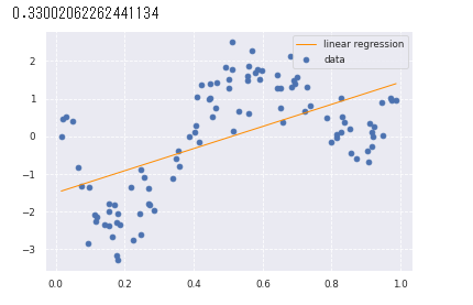
線形回帰をやってみた。
以下の図の通り直線ではうまくデータの特徴をつかめていない。
from sklearn.kernel_ridge import KernelRidge

clf = KernelRidge(alpha=0.0002, kernel='rbf')
clf.fit(data, target)

p_kridge = clf.predict(data)

plt.scatter(data, target, color='blue', label='data')

plt.plot(data, p_kridge, color='orange', linestyle='-', linewidth=3, markersize=6, label='kernel ridge')
plt.legend()
# plt.plot(data, p, color='orange', marker='o', linestyle='-', linewidth=1, markersize=6)
非線形回帰をやってみた。
以下の図の通り線形回帰と比べてデータの特徴をうまくつかんでいる。

3.ロジスティクス回帰モデル
・分類問題を解くための教師あり学習
・ロジスティック回帰はある事象が起こる確率を学習し、ある事象が起こる(y=1)/起こらない(y=0)の2値分類を行うモデル。
・入力とm次元パラメータの線形結合をシグモイド関数に入力することにより、y=1となる確率の値が出力される。
ロジスティック回帰モデル:
{P(Y=1|X=x)=\sigma(w_o+\sum_{j=1}^dx_jw_j)
}
シグモイド関数が用いられる理由は
・シグモイド関数の出力は0~1となるため、そのまま確率として扱える。
・シグモイド関数の微分は、シグモイド関数自身で表現することが可能。後述の尤度関数の微分を行う際にこの事実を利用すると計算が容易
シグモイド関数の式:
\sigma(x)=\frac{1}{1+\exp(-ax)}=\frac{1}{1+e^{-ax}}
シグモイド関数の微分:
\sigma^{\prime}(x)=a\sigma(x)\big(1-\sigma(x) \big)
最尤推定
・ロジスティック回帰モデルではベルヌーイ分布という確率分布を利用する。
・ロジスティック回帰では、未知のパラメータwを推定する際、最尤推定を利用する。
・最尤推定は以下の尤度関数(尤もらしさを表す指標)が最大になるパラメータを探索することで求めることができる。
{\boldsymbol{L}(\boldsymbol{w})=\prod_{i=1}^n \hat{y}_{i}^{y_i}(1-\hat{y}_{i})^{(1-y_i)}
}
尤度関数が最大になるパラメータを求めるためには、尤度関数を微分する必要がある。
その計算の際、尤度関数の対数をとると積の式が和の式に変換されるため、簡単になる。
対数をとった尤度関数を対数尤度関数という。
対数尤度関数:
{E(\boldsymbol{w})=-\log{\boldsymbol{L}(\boldsymbol{w})}=-\sum_{i=1}^n (y_{i}\log{\hat{y}_{i}}+(1-y_{i})\log{(1-\hat{y}_{i})})
}
上記の対数尤度関数の微分が0になる値を求めれば、尤度関数が最大になるパラメータが求められると考えられる。
しかし解析的に求めるのは難しいため、勾配降下法などにより求める。
勾配降下法
・勾配降下法は傾きを求め下がる方向に最小値を探索すること。
・その際、反復学習によりパラメータを逐次的に更新している。
・ηは学習率と呼ばれるハイパーパラメータでモデルのパラメータの収束しやすさを調整
w^{(k+1)}=w^{(k)}-\eta\sum_{i=1}^n (y_i-p_i)x_i
勾配降下法はn個すべてのデータに対する和を求める必要があるため、nが増えると必要な計算資源が増加してしまう。
そのため、データを1つずつランダムに選択してパラメータを更新する「確率的勾配降下法」を用いる。
演習
タイタニックの乗客データを利用しロジスティック回帰モデルを作成、特徴量抽出をしてみる
課題:年齢が30歳で男の乗客は生き残れるか?
結果:30歳男性の生存確率は約19%で生き残ることは困難
コード
## Googleドライブのマウント
from google.colab import drive
drive.mount('/content/drive')

# from モジュール名 import クラス名(もしくは関数名や変数名)
import pandas as pd
from pandas import DataFrame
import numpy as np
import matplotlib.pyplot as plt
import seaborn as sns

# matplotlibをinlineで表示するためのおまじない (plt.show()しなくていい)
%matplotlib inline

# タイタニックデータ csvファイルの読み込み
titanic_df = pd.read_csv('/content/drive/My Drive/study_ai_ml_google/data/titanic_train.csv')

# 不要なデータの削除・欠損値の補完
# 予測に不要と考えるからうをドロップ (本当はここの情報もしっかり使うべきだと思っています)
titanic_df.drop(['PassengerId', 'Name', 'Ticket', 'Cabin'], axis=1, inplace=True)

# 一部カラムをドロップしたデータを表示
# titanic_df.head()
# nullを含んでいる行を表示
# titanic_df[titanic_df.isnull().any(1)].head(10)

# Ageカラムのnullを中央値で補完
titanic_df['AgeFill'] = titanic_df['Age'].fillna(titanic_df['Age'].mean())

# 再度nullを含んでいる行を表示 (Ageのnullは補完されている)
# titanic_df[titanic_df.isnull().any(1)]

# titanic_df.dtypes

########## 実装(チケット価格から生死を判別) ##########

# 運賃だけのリストを作成
data1 = titanic_df.loc[:, ["Fare"]].values
# 生死フラグのみのリストを作成
label1 =  titanic_df.loc[:,["Survived"]].values

from sklearn.linear_model import LogisticRegression

# オブジェクト生成
model=LogisticRegression()

# fit関数でパラメータ推定
model.fit(data1, label1)

print("チケット価格 61ドル")
print(model.predict([[61]]))
print(model.predict_proba([[61]]))

print("チケット価格 62ドル")
print(model.predict([[62]]))
print(model.predict_proba([[62]]))

########## 実装(年齢、性別から生死を判別) ##########

# 年齢、性別のリストを作成
titanic_df['Gender'] = titanic_df['Sex'].map({'female': 0, 'male': 1}).astype(int)
data2 = titanic_df.loc[:, ['Gender','AgeFill']].values
# 生死フラグのみのリストを作成
label2 =  titanic_df.loc[:,'Survived'].values

# オブジェクト生成
model2=LogisticRegression()

# fit関数でパラメータ推定
model2.fit(data2, label2)

print("男性 30歳")
print(model2.predict([[1,30]]))
print(model2.predict_proba([[1,30]]))

print("女性 30歳")
print(model2.predict([[0,30]]))
print(model2.predict_proba([[0,30]]))
実行結果
チケット価格 61ドル
[0]
[[0.50358033 0.49641967]]
チケット価格 62ドル
[1]
[[0.49978123 0.50021877]]
男性 30歳
[0]
[[0.80668102 0.19331898]]
女性 30歳
[1]
[[0.26744115 0.73255885]]
<結果>
61ドルのチケットの乗客は生存率49.6%
62ドルのチケットの乗客は生存率50.0%
30歳男性の乗客は生存率19.3%
30歳女性の乗客は生存率73.2%
4.主成分分析(PCA)
・教師なし学習
・データの次元を削減する手法の一つ。
・多変量データをより少数個の指標に圧縮
・情報の損失をなるべく小さくしつつ、変量の個数を減らす。
・次元削減により3次元以下することで可視化が実現可能。
・主成分ごとに計算される固有値を固有値の総和で割ると、主成分の重要度を割合で表すことが可能。
寄与率:第k主成分の分散の全分散に対する割合(第k主成分が持つ情報量の割合)
累積寄与率:第1-k主成分まで圧縮した際の情報損失量の割合
演習
乳がん検査データを利用しロジスティック回帰モデルを作成
主成分を利用し2次元空間上に次元圧縮してみる
課題:32次元のデータを2次元上に次元圧縮した際に、うまく判別できるかを確認する
結果:2次元に次元圧縮したことで判別しやすい形になった。
第2主成分までの累積寄与率は60%を超えた。
コード
## Googleドライブのマウント
from google.colab import drive
drive.mount('/content/drive')

import pandas as pd
from sklearn.model_selection import train_test_split
from sklearn.preprocessing import StandardScaler
from sklearn.linear_model import LogisticRegressionCV
from sklearn.metrics import confusion_matrix
from sklearn.decomposition import PCA
import matplotlib.pyplot as plt
%matplotlib inline

## sys.pathの設定
cancer_df = pd.read_csv('/content/drive/My Drive/study_ai_ml_google/data/cancer.csv')

print('cancer df shape: {}'.format(cancer_df.shape))

# データを確認すると、欠損の列があるため、削除する。
cancer_df.drop('Unnamed: 32', axis=1, inplace=True)

print('cancer df shape: {}'.format(cancer_df.shape))
cancer df shape: (569, 32)
データは569件、次元数は32。
# 目的変数の抽出
y = cancer_df.diagnosis.apply(lambda d: 1 if d == 'M' else 0)

# 説明変数の抽出
X = cancer_df.loc[:, 'radius_mean':]

# 学習用とテスト用でデータを分離
X_train, X_test, y_train, y_test = train_test_split(X, y, random_state=0)

# 標準化
scaler = StandardScaler()
X_train_scaled = scaler.fit_transform(X_train)
X_test_scaled = scaler.transform(X_test)

# ロジスティック回帰で学習
logistic = LogisticRegressionCV(cv=10, random_state=0)
logistic.fit(X_train_scaled, y_train)

# 検証
print('Train score: {:.3f}'.format(logistic.score(X_train_scaled, y_train)))
print('Test score: {:.3f}'.format(logistic.score(X_test_scaled, y_test)))
# print('Confustion matrix:\n{}'.format(confusion_matrix(y_true=y_test, y_pred=logistic.predict(X_test_scaled))))
Train score: 0.988
Test score: 0.972
# PCAによる次元削減(次元数30)
pca = PCA(n_components=30)
pca.fit(X_train_scaled)
plt.bar([n for n in range(1, len(pca.explained_variance_ratio_)+1)], pca.explained_variance_ratio_)
PCAによる次元削減(次元数30)
第2主成分までで60%を超えている。
第4主成分までで80%を超えている。

# PCA
# 次元数2まで圧縮
pca = PCA(n_components=2)
X_train_pca = pca.fit_transform(X_train_scaled)
print('X_train_pca shape: {}'.format(X_train_pca.shape))
# X_train_pca shape: (426, 2)

# 寄与率
print('explained variance ratio: {}'.format(pca.explained_variance_ratio_))
# explained variance ratio: [ 0.43315126  0.19586506]

# 散布図にプロット
temp = pd.DataFrame(X_train_pca)
temp['Outcome'] = y_train.values
b = temp[temp['Outcome'] == 0]
m = temp[temp['Outcome'] == 1]
plt.scatter(x=b[0], y=b[1], marker='o') # 良性は○でマーク
plt.scatter(x=m[0], y=m[1], marker='^') # 悪性は△でマーク
plt.xlabel('PC 1') # 第1主成分をx軸
plt.ylabel('PC 2') # 第2主成分をy軸
実行結果

5.アルゴリズム
k近傍法
・教師あり学習
・分類のための機械学習手法
・入力データについて、最近傍のデータをk個取り、それらのデータが最も多く所属するクラスに識別する。
・kの値により結果が変わる。k=1の場合を最近傍法と呼ぶ。
・kを大きくすると決定境界は滑らかになり、外れ値に強くなる。
・2値分類の場合にはkを奇数にとり、多数決の結果がどちらかに決まるようにすることが一般的。
<k近傍法のアルゴリズム>
①入力データと学習データの距離を計算する。
②入力データに近いほうからk個の学習データを取得する。
③学習データのラベルで多数決を行い、分類結果とする。
k-means法
・教師なし学習
・クラスタリングのための機械学習手法
・与えられたデータをk個のクラスタに分類する
<k-means法のアルゴリズム>
①各クラスタの中心の初期値を設定する
②各データ点に対して、各クラスタ中心との距離を計算し、最も距離が近いクラスタを割り当てる
③各クラスタの平均ベクトル(中心)を計算する
④収束するまで2), 3)の処理を繰り返す
・初期値が近いと適切にクラスタリングされない場合がある。
・k-means++というアルゴリズムにより初期値をうまく決めることができる。
演習
課題: コードを変更し出力結果の違いを確認する。
5-1 k近傍法
コード
%matplotlib inline
import numpy as np
import matplotlib.pyplot as plt
from scipy import stats

# 訓練データ生成
def gen_data():
    x0 = np.random.normal(size=50).reshape(-1, 2) - 1
    x1 = np.random.normal(size=50).reshape(-1, 2) + 1.
    x_train = np.concatenate([x0, x1])
    y_train = np.concatenate([np.zeros(25), np.ones(25)]).astype(np.int)
    return x_train, y_train

X_train, ys_train = gen_data()
plt.scatter(X_train[:, 0], X_train[:, 1], c=ys_train)

# 学習なし

# 予測
# 予測するデータ点との、距離が最も近い k 個の、訓練データのラベルの最頻値を割り当てる

def distance(x1, x2):
    return np.sum((x1 - x2)**2, axis=1)

def knc_predict(n_neighbors, x_train, y_train, X_test):
    y_pred = np.empty(len(X_test), dtype=y_train.dtype)
    for i, x in enumerate(X_test):
        distances = distance(x, X_train)
        nearest_index = distances.argsort()[:n_neighbors]
        mode, _ = stats.mode(y_train[nearest_index])
        y_pred[i] = mode
    return y_pred

def plt_resut(x_train, y_train, y_pred):
    xx0, xx1 = np.meshgrid(np.linspace(-5, 5, 100), np.linspace(-5, 5, 100))
    xx = np.array([xx0, xx1]).reshape(2, -1).T
    plt.scatter(x_train[:, 0], x_train[:, 1], c=y_train)
    plt.contourf(xx0, xx1, y_pred.reshape(100, 100).astype(dtype=np.float), alpha=0.2, levels=np.linspace(0, 1, 3))

n_neighbors = 5
print('  K=',n_neighbors)
xx0, xx1 = np.meshgrid(np.linspace(-5, 5, 100), np.linspace(-5, 5, 100))
X_test = np.array([xx0, xx1]).reshape(2, -1).T

y_pred = knc_predict(n_neighbors, X_train, ys_train, X_test)
plt_resut(X_train, ys_train, y_pred)
実行結果
nの値が大きいほど境界線は滑らかになっている。


5-2 k-means法
コード
# k平均クラスタリング(k-means)

%matplotlib inline
import numpy as np
import matplotlib.pyplot as plt

# データ生成
def gen_data():
    x1 = np.random.normal(size=(100, 2)) + np.array([-5, -5])
    x2 = np.random.normal(size=(100, 2)) + np.array([5, -5])
    x3 = np.random.normal(size=(100, 2)) + np.array([0, 5])
    return np.vstack((x1, x2, x3))

# データ作成
X_train = gen_data()

# データ描画
plt.scatter(X_train[:, 0], X_train[:, 1])

## 学習

def distance(x1, x2):
    return np.sum((x1 - x2)**2, axis=1)

n_clusters = 3
iter_max = 100

# 各クラスタ中心をランダムに初期化
centers = X_train[np.random.choice(len(X_train), n_clusters, replace=False)]

for _ in range(iter_max):
    prev_centers = np.copy(centers)
    D = np.zeros((len(X_train), n_clusters))
    # 各データ点に対して、各クラスタ中心との距離を計算
    for i, x in enumerate(X_train):
        D[i] = distance(x, centers)
    # 各データ点に、最も距離が近いクラスタを割り当
    cluster_index = np.argmin(D, axis=1)
    # 各クラスタの中心を計算
    for k in range(n_clusters):
        index_k = cluster_index == k
        centers[k] = np.mean(X_train[index_k], axis=0)
    # 収束判定
    if np.allclose(prev_centers, centers):
        break

## クラスタリング結果

def plt_result(X_train, centers, xx):
    # データを可視化
    plt.scatter(X_train[:, 0], X_train[:, 1], c=y_pred, cmap='spring')
    # 中心を可視化
    plt.scatter(centers[:, 0], centers[:, 1], s=200, marker='X', lw=2, c='black', edgecolor="white")
    # 領域の可視化
    pred = np.empty(len(xx), dtype=int)
    for i, x in enumerate(xx):
        d = distance(x, centers)
        pred[i] = np.argmin(d)
    plt.contourf(xx0, xx1, pred.reshape(100, 100), alpha=0.2, cmap='spring')

y_pred = np.empty(len(X_train), dtype=int)
for i, x in enumerate(X_train):
    d = distance(x, centers)
    y_pred[i] = np.argmin(d)

xx0, xx1 = np.meshgrid(np.linspace(-10, 10, 100), np.linspace(-10, 10, 100))
xx = np.array([xx0, xx1]).reshape(2, -1).T

plt_result(X_train, centers, xx)
実行結果
各クラスタ中心の初期値によっては学習がうまくすすまず、適切にクラスタリングが出来ない場合がある。


6.サポートベクターマシーン
・教師あり学習
・2クラス分類のための機械学習手法
・線形判別関数(決定境界)と最も近いデータ点との距離(マージン)が最大化されるように線形判別関数を求める。
{y=w^Tx+b=\sum_{j=1}^mw_jx_j+b
}
・サポートベクター
データを分割する直線に最も近いデータ点
・ハードマージン・ソフトマージン
ハードマージンは境界(基準)に例外なく分類しようという考え方
ソフトマージンは境界(基準)に対して多少の例外を許容しつつ分類しようという考え方
ソフトマージンを導入することで、線形分離可能でないデータについても学習可能になる。
・非線形分離
線形分離できないとき特徴空間に写像し、その空間で線形に分類する
カーネルトリックを利用することで、複雑な決定境界を学習することができる。
目的関数の求め方
各点と決定境界との距離
{\frac{|w^Tx_i+b|}{||w||}=\frac{t_i(w^Tx_i+b)}{||w||}
}
したがって、マージンとは決定境界と最も距離の近い点との距離なので次の式となる
{\min_i\frac{t_i(w^Tx_i+b)}{||w||}
}
サポートベクターマシーンは、マージンを最大化することが目標なので目的関数は次の式となる
{\max_{w,b}[\min_i\frac{t_i(w^Tx_i+b)}{||w||}]
}
また、マージン上の点においては ${t_i(w^Tx_i+b)\geqq 1
}$ の条件が成り立つため、
目的関数は以下のようになる。
{\max_{w,b}\frac{1}{||w||}
}
演習
課題: コードを変更し出力結果の違いを確認する。
①線形分離可能
コード
%matplotlib inline
import numpy as np
import matplotlib.pyplot as plt

## 訓練データ生成① (線形分離可能)

def gen_data():
    x0 = np.random.normal(size=50).reshape(-1, 2) - 2.
    x1 = np.random.normal(size=50).reshape(-1, 2) + 2.
    X_train = np.concatenate([x0, x1])
    ys_train = np.concatenate([np.zeros(25), np.ones(25)]).astype(np.int)
    return X_train, ys_train

X_train, ys_train = gen_data()
plt.scatter(X_train[:, 0], X_train[:, 1], c=ys_train)

## 学習

t = np.where(ys_train == 1.0, 1.0, -1.0)

n_samples = len(X_train)
# 線形カーネル
K = X_train.dot(X_train.T)

eta1 = 0.01
eta2 = 0.001
n_iter = 500

H = np.outer(t, t) * K

a = np.ones(n_samples)
for _ in range(n_iter):
    grad = 1 - H.dot(a)
    a += eta1 * grad
    a -= eta2 * a.dot(t) * t
    a = np.where(a > 0, a, 0)

## 予測
index = a > 1e-6
support_vectors = X_train[index]
support_vector_t = t[index]
support_vector_a = a[index]

term2 = K[index][:, index].dot(support_vector_a * support_vector_t)
b = (support_vector_t - term2).mean()

xx0, xx1 = np.meshgrid(np.linspace(-5, 5, 100), np.linspace(-5, 5, 100))
xx = np.array([xx0, xx1]).reshape(2, -1).T

X_test = xx
y_project = np.ones(len(X_test)) * b
for i in range(len(X_test)):
    for a, sv_t, sv in zip(support_vector_a, support_vector_t, support_vectors):
        y_project[i] += a * sv_t * sv.dot(X_test[i])
y_pred = np.sign(y_project)

# 訓練データを可視化
plt.scatter(X_train[:, 0], X_train[:, 1], c=ys_train)
# サポートベクトルを可視化
plt.scatter(support_vectors[:, 0], support_vectors[:, 1],
                    s=100, facecolors='none', edgecolors='k')
# 領域を可視化
# plt.contourf(xx0, xx1, y_pred.reshape(100, 100), alpha=0.2, levels=np.linspace(0, 1, 3))
# マージンと決定境界を可視化
plt.contour(xx0, xx1, y_project.reshape(100, 100), colors='k',
                     levels=[-1, 0, 1], alpha=0.5, linestyles=['--', '-', '--'])


# マージンと決定境界を可視化
plt.quiver(0, 0, 0.1, 0.35, width=0.01, scale=1, color='pink')
実行結果

②線形分離不可能
コード
## 訓練データ生成② (線形分離不可能)

factor = .2
n_samples = 50
linspace = np.linspace(0, 2 * np.pi, n_samples // 2 + 1)[:-1]
outer_circ_x = np.cos(linspace)
outer_circ_y = np.sin(linspace)
inner_circ_x = outer_circ_x * factor
inner_circ_y = outer_circ_y * factor

X = np.vstack((np.append(outer_circ_x, inner_circ_x),
               np.append(outer_circ_y, inner_circ_y))).T
y = np.hstack([np.zeros(n_samples // 2, dtype=np.intp),
               np.ones(n_samples // 2, dtype=np.intp)])
X += np.random.normal(scale=0.15, size=X.shape)
x_train = X
y_train = y

plt.scatter(x_train[:,0], x_train[:,1], c=y_train)

## 学習

def rbf(u, v):
        sigma = 0.8
        return np.exp(-0.5 * ((u - v)**2).sum() / sigma**2)

X_train = x_train
t = np.where(y_train == 1.0, 1.0, -1.0)

n_samples = len(X_train)
# RBFカーネル
K = np.zeros((n_samples, n_samples))
for i in range(n_samples):
    for j in range(n_samples):
        K[i, j] = rbf(X_train[i], X_train[j])

eta1 = 0.01
eta2 = 0.001
n_iter = 5000

H = np.outer(t, t) * K

a = np.ones(n_samples)
for _ in range(n_iter):
    grad = 1 - H.dot(a)
    a += eta1 * grad
    a -= eta2 * a.dot(t) * t
    a = np.where(a > 0, a, 0)

## 予測

index = a > 1e-6
support_vectors = X_train[index]
support_vector_t = t[index]
support_vector_a = a[index]

term2 = K[index][:, index].dot(support_vector_a * support_vector_t)
b = (support_vector_t - term2).mean()

xx0, xx1 = np.meshgrid(np.linspace(-1.5, 1.5, 100), np.linspace(-1.5, 1.5, 100))
xx = np.array([xx0, xx1]).reshape(2, -1).T

X_test = xx
y_project = np.ones(len(X_test)) * b
for i in range(len(X_test)):
    for a, sv_t, sv in zip(support_vector_a, support_vector_t, support_vectors):
        y_project[i] += a * sv_t * rbf(X_test[i], sv)
y_pred = np.sign(y_project)

# 訓練データを可視化
plt.scatter(x_train[:, 0], x_train[:, 1], c=y_train)
# サポートベクトルを可視化
plt.scatter(support_vectors[:, 0], support_vectors[:, 1],
                    s=100, facecolors='none', edgecolors='k')
# 領域を可視化
plt.contourf(xx0, xx1, y_pred.reshape(100, 100), alpha=0.2, levels=np.linspace(0, 1, 3))
# マージンと決定境界を可視化
plt.contour(xx0, xx1, y_project.reshape(100, 100), colors='k',
                     levels=[-1, 0, 1], alpha=0.5, linestyles=['--', '-', '--'])
実行結果
