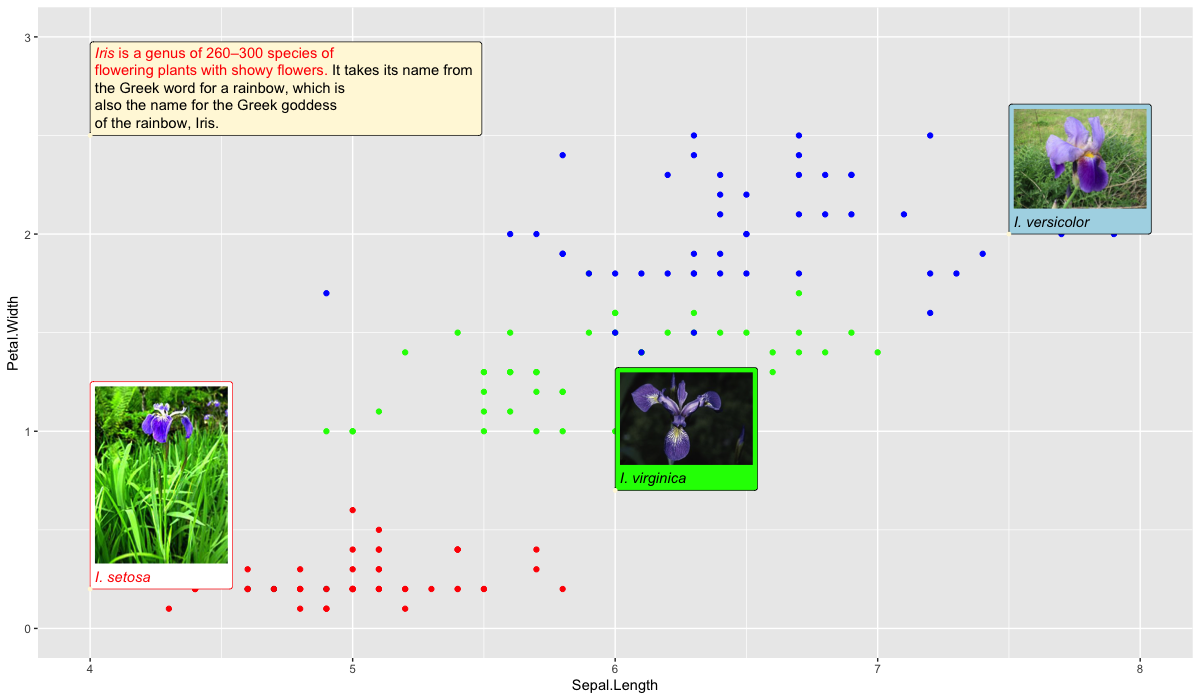
画像のようにデータポイントの位置と無関係に、テキスト等を図に表示させたい時がある。
これはggtextを少し工夫して使えば実現できる。
サンプルコード(irisデータ)
library(tidyverse)
library(ggplot)
library(ggtext)
lack_num = dim(iris)[1]-4
gg_text.df <- tibble(
  label = c(
    setosa = "<img src='https://upload.wikimedia.org/wikipedia/commons/thumb/8/86/Iris_setosa.JPG/180px-Iris_setosa.JPG'
    width='100' /><br>*I. setosa*",
    virginica = "<img src='https://upload.wikimedia.org/wikipedia/commons/thumb/3/38/Iris_virginica_-_NRCS.jpg/320px-Iris_virginica_-_NRCS.jpg'
    width='100' /><br>*I. virginica*",
    versicolor = "<img src='https://upload.wikimedia.org/wikipedia/commons/thumb/2/27/20140427Iris_versicolor1.jpg/320px-20140427Iris_versicolor1.jpg'
    width='100' /><br>*I. versicolor*",
    note = "<span style = 'color:red;'>*Iris* is a genus of 260–300 species of<br> flowering plants with showy flowers.</span> It takes its name from <br>the Greek word for a rainbow, which is <br>also the name for the Greek goddess <br>of the rainbow, Iris. "
    ),
  x = c(4, 6, 7.5, 4),
  y = c(0.2, 0.7, 2, 2.5),
  hjust = c(0, 0, 0, 0),
  vjust = c(0, 0, 0, 0),
  angle = c(0, 0, 0, 0),
  color = c("white", "green", "lightblue", "cornsilk"),
  fill = c("red", "black", "black", "black")
) %>%
  add_row(label=rep("",lack_num), x=rep(-10, lack_num), y=rep(-10, lack_num),
          hjust=rep(-10, lack_num), vjust=rep(-10, lack_num), angle=rep(-10, lack_num),
          color=rep("blue", lack_num), fill=rep("white", lack_num))

multi.df <- cbind(gg_text.df, iris) %>%
  mutate(color=ifelse(Species == "setosa", "red", color)) %>%
  mutate(color=ifelse(Species == "versicolor", "green", color)) %>%
  mutate(color=ifelse(Species == "virginica", "blue", color))
multi.df[1:4,]$fill = c("white", "green", "lightblue", "cornsilk")
multi.df[1:4,]$color = c("red", "black", "black", "black")

g <-
  ggplot(multi.df) +
  geom_point(aes(x= Sepal.Length, y=Petal.Width)) +
  aes(
    x, y, label = label, angle = angle, color = color, fill = fill,
    hjust = hjust, vjust = vjust
  ) +
  geom_richtext() +
  geom_point(color = "cornsilk", size = 1) +
  scale_color_identity() +
  scale_fill_identity() + xlim(4,8) + ylim(0,3) +
  guides(alpha=FALSE) +
  xlab("Sepal.Length") + ylab("Petal.Width")
g
*図は1200 x 700 くらいの大きさで見ないと正常に表示されません
解説
- ggtextの使い方
ggtextのREADMEより引用
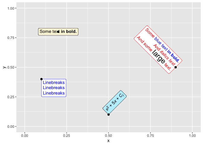
これを作るコードは以下の通り
ggtext_tutorial.R
df <- tibble(
  label = c(
    "Some text **in bold.**",
    "Linebreaks<br>Linebreaks<br>Linebreaks",
    "*x*<sup>2</sup> + 5*x* + *C*<sub>*i*</sub>",
    "Some <span style='color:blue'>blue text **in bold.**</span><br>And *italics text.*<br>
    And some <span style='font-size:18pt; color:black'>large</span> text."
  ),
  x = c(.2, .1, .5, .9),
  y = c(.8, .4, .1, .5),
  hjust = c(0.5, 0, 0, 1),
  vjust = c(0.5, 1, 0, 0.5),
  angle = c(0, 0, 45, -45),
  color = c("black", "blue", "black", "red"),
  fill = c("cornsilk", "white", "lightblue1", "white")
)

ggplot(df) +
  aes(
    x, y, label = label, angle = angle, color = color, fill = fill,
    hjust = hjust, vjust = vjust
  ) +
  geom_richtext() +
  geom_point(color = "black", size = 2) +
  scale_color_identity() +
  scale_fill_identity() +
  xlim(0, 1) + ylim(0, 1)
入力データ df は以下のようになっている (簡潔さのため、labelの値は変えている)
# A tibble: 4 x 8
  label      x     y hjust vjust angle color fill
  <chr>  <dbl> <dbl> <dbl> <dbl> <dbl> <chr> <chr>
1 Label1   0.2   0.8   0.5   0.5     0 black cornsilk
2 Label2   0.1   0.4   0     1       0 blue  white
3 Label3   0.5   0.1   0     0      45 black lightblue1
4 Label4   0.9   0.5   1     0.5   -45 red   white
- label: 任意の文字列や、HTMLコードを入れる
- x, y: labelの重心をどこに打つか
- hjust, vjust: labelの重心の位置
- angle: labelの角度
- color: 文字色
- fill: labelの背景色
これはラベルがデータポイントに付属しているのであって、今回の目的 データポイントに関係のないラベルをグラフに描くを達成できない。
そこでggplotは同じデータフレームであれば異なるデータを重ねることができることを利用し、以下の方針をとる。
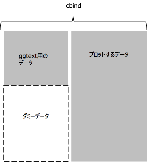
ダミーデータはグラフ上に現れてはいけないものだが、NAとかInfとかだとエラーになるので、xlim, ylimを指定して、枠外の値を入れるのが良い。
以下に示すmulti.dfの、label ~ fill まではgg_text用、それ以降はirisデータの列となっている。
gg_text用の列において5行目以降のlabelには""が入っており他の列も同様に適当な値を入れている。
> multi.df %>% head()
   label     x     y hjust vjust angle color      fill Sepal.Length Sepal.Width Petal.Length Petal.Width Species
1 label1   4.0   0.2     0     0     0   red     white          5.1         3.5          1.4         0.2  setosa
2 label2   6.0   0.7     0     0     0 black     green          4.9         3.0          1.4         0.2  setosa
3 label3   7.5   2.0     0     0     0 black lightblue          4.7         3.2          1.3         0.2  setosa
4 label4   4.0   2.5     0     0     0 black  cornsilk          4.6         3.1          1.5         0.2  setosa
5        -10.0 -10.0   -10   -10   -10   red     white          5.0         3.6          1.4         0.2  setosa
6        -10.0 -10.0   -10   -10   -10   red     white          5.4         3.9          1.7         0.4  setosa
>