奈良文化財研究所で9月10日〜11日に開催された「考古学・文化財のためのデータサイエンス研究集会」で発表した資料考古学のためのデータビジュアライゼーション(ggplot2を使用したデータ可視化)について、Ben Marwick先生から指導をいただきましたので、備忘録として公開します。
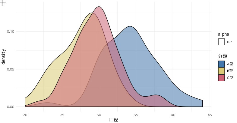
alphaはaes()の外に出す
下記のコードではalpha=0.7に設定していますが、alphaの指定をaes()の中で行っているので、無意味な凡例がついてしまっています。
あと、pirnt(p)は明示しなくても良いのでは?という提案もいただきました。
p<-pot%>%
	ggplot(aes(x=口径,fill=分類,alpha=0.7))+
		geom_density()+
		scale_fill_ptol()+
		theme_minimal()
print(p)
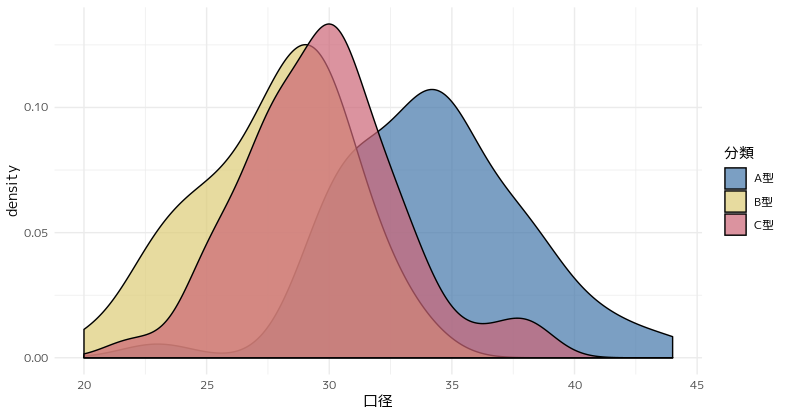
修正したのがこれ。alphaをaes()の中に入れるのではなく、geom_density()の引数として指定しました。コードもスッキリしています。
pot%>%
	ggplot(aes(x=口径,fill=分類))+
		geom_density(alpha=0.7)+
		scale_fill_ptol()+
		theme_minimal()
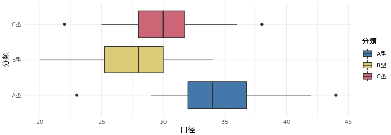
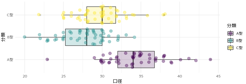
箱ひげ図を改良する
次の指摘はこちらの箱ひげ図。Marwick先生のご指摘は2点。
- ggforceパッケージの
geom_sina()を使って箱ひげ図とドットを重ねて表示する。 - カラーパレットは viridis colour palettesを使ったほうが良い。
ggforceパッケージは初めて知りました。viridis colourは連続量のイメージがありますが、離散的なデータにも対応しているようです。
pot%>%
	ggplot(aes(x=分類,y=口径,fill=分類))+
		geom_boxplot()+
		scale_fill_ptol()+
		coord_flip()+
		theme_minimal()
ということで改良してみました。
viridisカラーパレットを使用する理由として、単に見やすいということだけではなく、ユニバーサルなカラーパレットであるということが挙げられます。brewerやptolも優れたカラーパレットですが、viridisカラーが現時点では一日の長があるようです。
pot%>%
	ggplot(aes(x=分類,y=口径,fill=分類))+
		geom_boxplot(alpha = 0.2)+		#不透明度を0.2
    	geom_sina(aes(colour = 分類),		#geom_sina()関数でaes()の引数にcolour=分類を指定
              alpha = 0.4,
              size = 3) +
		scale_fill_viridis_d() +		#viridis_d()は離散量、連続量ならviridis_c()を指定する
  		scale_colour_viridis_d() +
		coord_flip()+
		theme_minimal()
統計データは小数点2〜3桁で表示すれば十分
分散分析の結果を表示した表に対してのコメントです。こうした統計表の表示には小数点2〜3桁で十分とのこと。
# aov関数の結果をTukeyHSD関数に渡す
tkh<-aov(口径~分類,data=pot)%>%TukeyHSD()
tkh$分類%>%kable(format="markdown")
| diff | lwr | upr | p adj | |
|---|---|---|---|---|
| B型-A型 | -6.58 | -8.1885528 | -4.971447 | 0.0000000 |
| C型-A型 | -4.54 | -6.1485528 | -2.931447 | 0.0000000 |
| C型-B型 | 2.04 | 0.4314472 | 3.648553 | 0.0087802 |
改良したのがこちら。小数点3桁でまるめられて良い感じ。ただ、もともとあった変数の組み合わせ("B型-A型"の部分)が消えてしまっているのが少し残念です。
tkh <-
	aov(口径 ~ 分類, data = pot) %>%
	TukeyHSD() %>%
	.$分類 %>%	#TukeyHSD関数の結果から$分類を選択
	as_tibble() %>% 	#tibble_df形式に変換
	mutate_if(is.numeric, round,3)		#mutate_if()でnumericクラスのカラムにround関数を適用する。
tkh%>%kable(format="markdown")
| diff | lwr | upr | p adj |
|---|---|---|---|
| -6.58 | -8.189 | -4.971 | 0.000 |
| -4.54 | -6.149 | -2.931 | 0.000 |
| 2.04 | 0.431 | 3.649 | 0.009 |
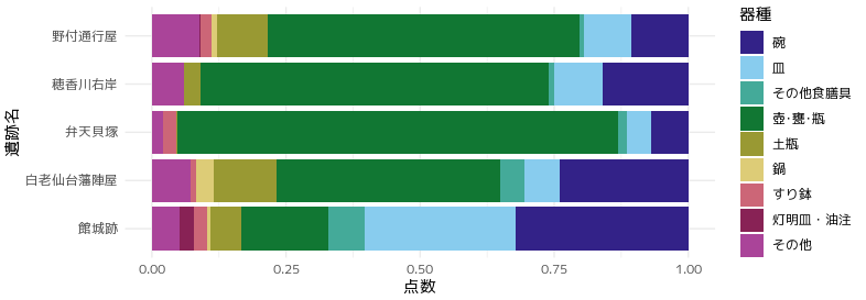
集計表タイプのデータはgeom_barのかわりにgeom_colを使う
geom_bar(stat="identity")を指定していますが、geom_col(position="fill")とするべき、との提案です。結果はどちらも同じですが、geom_colはstat="identity"がデフォルトとなっていますので、集計表タイプのデータ描画に利用しやすくなっています。
befor
toj%>%
	ggplot(aes(x=遺跡名,y=点数,fill=器種))+
		geom_bar(stat="identity",position="fill")+
		coord_flip()+
		scale_fill_ptol()+
		theme_minimal()
after
toj%>%
	ggplot(aes(x=遺跡名,y=点数,fill=器種))+
		geom_bar(stat="identity",position="fill")+
		coord_flip()+
		scale_fill_ptol()+
		theme_minimal()
tidyverseだけでデータ整形
細別器種を大別器種に再分類していますが、コードが冗長です。Marwick先生は次のように指摘します。
-
grepl()を多用しているが、もっとシンプルに記述できる。 -
tidyverseで全てを処理したいならglepl()ではなくstringr::str_detect()を使っても良い。
toj2<-toj%>%
	mutate(大別器種 = case_when(
		grepl("碗",器種)|grepl("皿",器種)|grepl("その他の食膳具",器種)	 == TRUE ~ "食膳具",
		grepl("壺・甕・瓶",器種) == TRUE ~ "貯蔵具",
		grepl("灯明皿・油注",器種)|grepl("その他",器種)|grepl("すり鉢",器種)|
			grepl("鍋",器種)|grepl("土瓶",器種) == TRUE ~ "その他",
		))
次のように修正します。シンプル。
toj2<-toj%>%
	mutate(
		大別器種 = case_when(
			str_detect(器種,"碗 | 皿 | その他食膳具") ~ "食膳具",
			str_detect(器種,"壺・甕・瓶") ~ "貯蔵具",
			str_detect(器種,"灯明皿・油注 | その他 | すり鉢 | 鍋 | 土瓶") ~ "その他",
		)
	)
大別器種というカラムが作られます。
| 遺跡名 | 器種 | 点数 | 大別器種 |
|---|---|---|---|
| 弁天貝塚 | 碗 | 134 | 食膳具 |
| 弁天貝塚 | 皿 | 84 | 食膳具 |
| 弁天貝塚 | その他食膳具 | 34 | 食膳具 |
| 弁天貝塚 | 土瓶 | 6 | その他 |
| 弁天貝塚 | 鍋 | 0 | その他 |
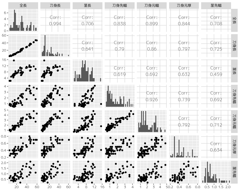
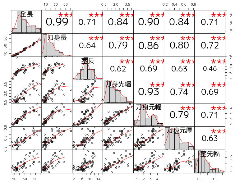
散布図行列に有意性の評価を入れる
GGally::ggpairs()は見栄えのよい表現ですが、有意性の評価を図中に入れるためPerformanceAnalytics::chart.Correlation()を使用してはどうか、という提案をいただきました。
GGally::ggpairs()による描画
PerformanceAnalytics::chart.Correlation()による描画です。文字サイズの調整のやり方などがうまくできていませんが、有意性の評価が星印で示されています。
library(PerformanceAnalytics)
iron %>%
	select(全長, 刀身長, 茎長, 刀身先幅, 刀身元幅, 刀身元厚, 茎先幅) %>%
		chart.Correlation(histogram = TRUE, pch = 19)
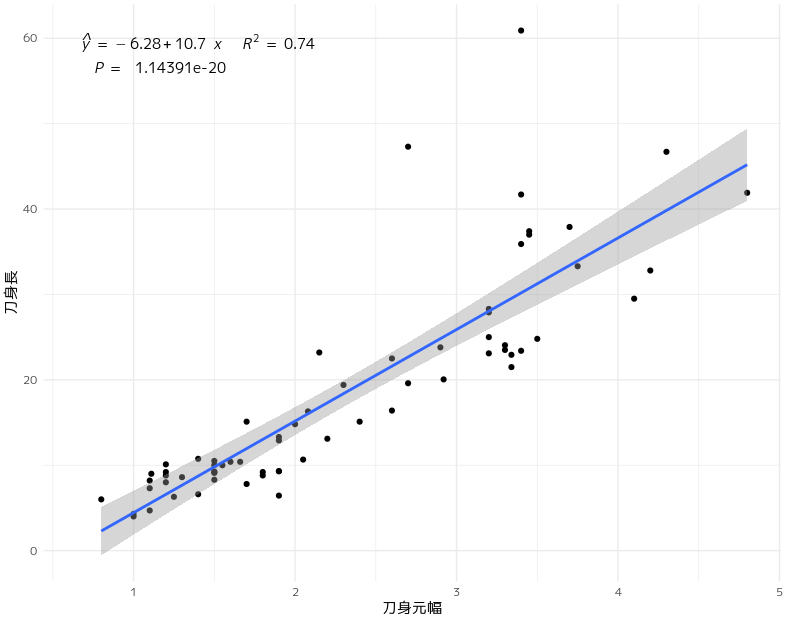
図中に数式を描画する
研修では以下のようにlm()を適用して必要なパラメーターを算出して手動で回帰式を表示していました。
icoe<-lm(刀身長 ~ 刀身元幅,data=iron)%>%summary()
icoe$coefficients%>%kable()
| Estimate | Std. Error | t value | Pr(>|t|) | |
|---|---|---|---|---|
| (Intercept) | -6.280888 | 1.9780720 | -3.175257 | 0.0022892 |
| 刀身元幅 | 10.723991 | 0.7889999 | 13.591878 | 0.0000000 |
y=10.72399X-6.280888
ggpmisc::stat_poly_eq()とggpmisc::stat_fit_glance()を利用して回帰式、相関係数、p値をプロットに記述する手法を教えていただきました。
複雑な記述になるので、引数やパラメーターの意味が理解できていませんが、再現性を保つためにはこの手法が欠かせないところです。
library(ggpmisc)
iron %>%
	ggplot(aes(x=刀身元幅,y=刀身長))+
		geom_point()+
		geom_smooth(method="lm")+
		theme_minimal() +
		stat_poly_eq(formula = y ~ x,
			eq.with.lhs = "italic(hat(y))~`=`~",
			aes(label = paste(stat(eq.label),
				stat(rr.label),
				sep = "~~~")
			), parse = TRUE
		) +
		stat_fit_glance(label.y = 0.9,
			method = "lm",
			method.args = list(formula = y ~ x),
			aes(label = sprintf(
				'~~italic(P)~"="~~%.25f',
				stat(p.value)
				)
			),parse = TRUE
		)