犬クジラです。
初投稿の今回はAngularで簡単なアニメーションを動かす内容について投稿します。
多くのWEBアニメーションはCSSを使って動かしていますがAngularでも簡単に作ることができます。
手順公開のためStackblitz上にて作業を行っています。
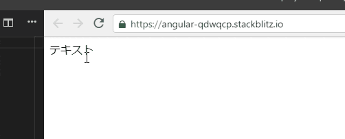
今回の完成デモ
app.module.tsにAnimationsモジュール追加
Angularでアニメーションを利用するにはBrowserAnimationsModuleが必要なので追加します。
モジュールの追加インストールが必要な場合は追加してください。
import { NgModule } from '@angular/core';
import { BrowserModule } from '@angular/platform-browser';
import { BrowserAnimationsModule } from '@angular/platform-browser/animations'; // 追加

import { AppComponent } from './app.component';

@NgModule({
  imports:      [
    BrowserModule,
    BrowserAnimationsModule // 追加
  ],
  declarations: [ AppComponent ],
  bootstrap:    [ AppComponent ]
})
export class AppModule { }
アニメーションで動かす対象を設定する
アニメーションがいつ開始するか検知するために、Angularはトリガーを必要とします。
trigger()関数は、変更を監視するためにプロパティ名を記述します。変更が発生すると、トリガーはその定義に含まれるアクションを開始します。ここではトリガー名を「fadein-left」をしておきます。
<div @fadein-left>
  <div>テキスト</div>
</div>
コンポーネントファイル内にアニメーション関数をインポートする
今回は以下の関数を利用します。
import {
  trigger,
  style,
  animate,
  transition,
  query,
  sequence,
} from '@angular/animations';

// …省略
アニメーションメタデータプロパティを追加する
コンポーネントファイル内の@Component()デコレーター内にanimations:というメタデータプロパティを追加してください。アニメーションを定義したトリガーをanimationsメタデータプロパティ内に配置します。その中に今回のトリガーとなる「fadein-left」を設定します。
// …省略

@Component({
  selector: 'my-app',
  templateUrl: './app.component.html',
  styleUrls: [ './app.component.css' ],
  animations: [
    trigger('fadein-left', [

     // -----------------------------
     // ここにアニメーション内容を書く
     // -----------------------------

    ]),
  ]
})

// …省略
動かす内容を書く
いよいよアニメーションさせたい内容を記述します。
今回のストーリーでは画面左からフワッとフェードインする流れになるので以下のように設定
// …省略

  animations: [
    trigger('fadein-left', [

      transition('void => *', [
        sequence([

          // アニメーション1:初期表示位置は不可視化しておく
          query('div', style({
            opacity: 0, // 不可視化
            "margin-left": '-20px'
          })),

          // アニメーション2:スタート開始時間調整(ここでは1秒後に開始)
          query('div', animate('1000ms', style({}))),

          // アニメーション3:2秒かけて左から可視化される
          query('div', animate('2000ms ease-out', style({
            opacity: 1,
            "margin-left": '0px',
          }))),

        ]),
      ]),

    ]),
  ]

// …省略
アニメーション内容の補足として、「transition('void => *'」はHTML要素というかDOM内に指定のトリガーが現れた際に未定義("void")からは定義済み*(アスタリスク)に処理されたという解釈となり後続の処理が自動実行される仕組みとなります。queryはトリガー定義されているHTML要素内のdivに対して処理が行われます。
あとは簡単に
- 初期表示として移動元となる距離から不可視化の状態にします。
- アニメーションの開始ミリ秒を指定します。
- 実際にアニメーションが開始され2秒かけて左に移動しつつopacityによって可視化が行われます。
となるだけです。
非常に簡単ですね。