はじめに
Popover の表示とカスタマイズ方法について調査したので、備忘のために残しておきます。
環境
- Xcode 10.3 (iOS SDK 12.4)
- Swift 5
サンプルコード
Popover の表示
UIPopoverPresentationController を利用します。UIViewController のプロパティからアクセスできます。
    @available(iOS 8.0, *)
    open var popoverPresentationController: UIPopoverPresentationController? { get }
UIBarButtonItem に Popover を表示する場合は、barButtonItem プロパティを使用します。
class ViewController: UIViewController {

    @IBAction func barButtonItemTapped(_ sender: UIBarButtonItem) {

        let vc = ... // Popover で表示したい ViewController を生成

        vc.modalPresentationStyle = .popover
        vc.popoverPresentationController?.barButtonItem = sender
        vc.popoverPresentationController?.permittedArrowDirections = .up // 矢印の向きを制限する場合
        vc.popoverPresentationController?.delegate = self // Phone で Popover を表示するために必要
        present(vc, animated: true)
    }
}
UIButton など任意の UIView に Popover を表示する場合は、sourceRect プロパティと sourceView プロパティを使用します。
class ViewController: UIViewController {

    @IBAction func buttonTapped(_ sender: UIButton) {

        let vc = ... // Popover で表示したい ViewController を生成

        vc.modalPresentationStyle = .popover
        vc.popoverPresentationController?.sourceView = sender.superview
        vc.popoverPresentationController?.sourceRect = sender.frame
        vc.popoverPresentationController?.permittedArrowDirections = .up // 矢印の向きを制限する場合
        vc.popoverPresentationController?.delegate = self // Phone で Popover を表示するために必要
        present(vc, animated: true)
    }
}
Phone で Popover を表示するためには、UIPopoverPresentationControllerDelegate(が継承しているUIAdaptivePresentationControllerDelegate)の下記メソッドの実装が必要になります。
extension ViewController: UIPopoverPresentationControllerDelegate {
    // Phone で Popover を表示するために必要
    func adaptivePresentationStyle(for controller: UIPresentationController,
                                   traitCollection: UITraitCollection) -> UIModalPresentationStyle {
        return .none
    }
}
以上が基本的な Popover の表示方法になります。
Popover のカスタマイズ
ここからが本題。
背景色
まずは背景色のカスタマイズです。
    // Set popover background color. Set to nil to use default background color. Default is nil.
    @NSCopying open var backgroundColor: UIColor?
UIPopoverPresentationController に backgroundColor というプロパティがあるので、これを設定することで背景色を変更できます。
vc.modalPresentationStyle = .popover
vc.popoverPresentationController?.barButtonItem = sender
vc.popoverPresentationController?.permittedArrowDirections = .any
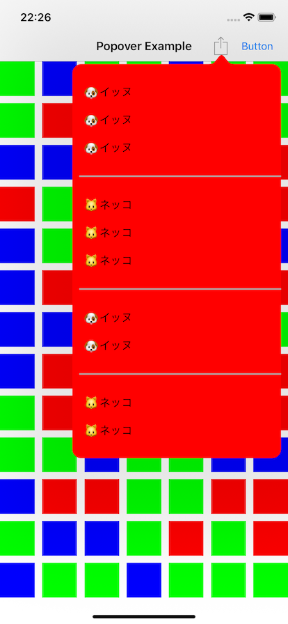
+ vc.popoverPresentationController?.backgroundColor = .red
vc.popoverPresentationController?.delegate = self
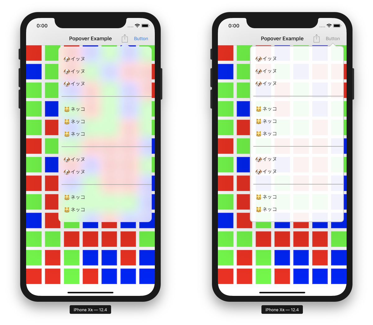
backgroundColor を設定しても、表示するコンテンツの背景色を透過にしなければ下記のように矢印部分しか赤くなりません。(当然といえば当然ですが...)

View の階層は下記の通り。

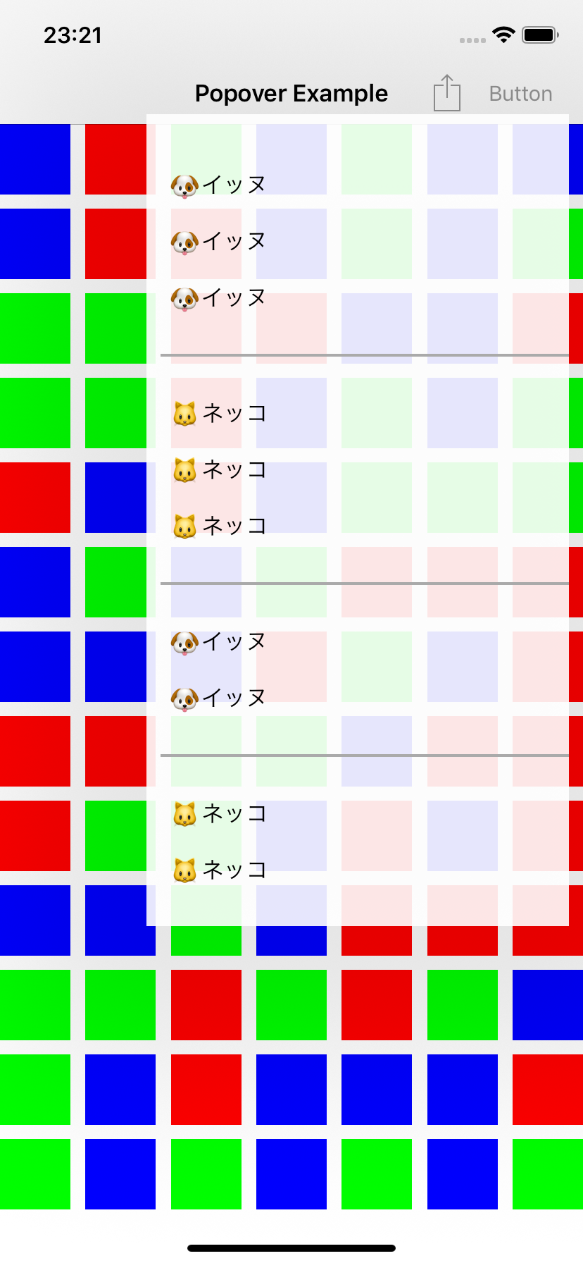
Popover で表示する ViewController の背景色を透過にすれば、下記の通り全体が背景色つきで表示されます。
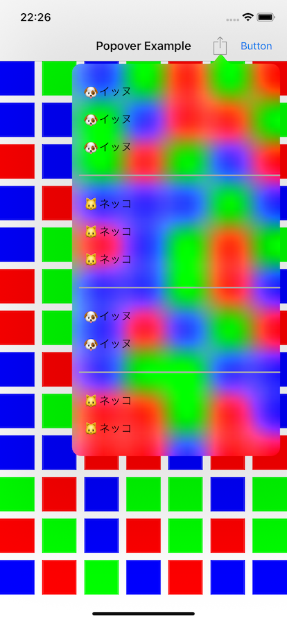
なお、背景の View には UIVisualEffectView が使用されているため、透過色を指定した場合ブラーがかかります。(下記は UIColor.clear を指定した場合)
ブラーがかかっても問題ない場合は backgroundColor プロパティを使用すれば十分ですが、ブラーを避けたい場合は次に紹介する BackgroundView をカスタマイズする方法を選択する必要があります。
BackgroundView のカスタマイズ
UIPopoverBackgroundView のサブクラスを作成し、UIPopoverPresentationController の popoverBackgroundViewClass に指定することで、独自の BackgroundView を利用することができます。
    // Clients may customize the popover background chrome by providing a class which subclasses `UIPopoverBackgroundView`
    // and which implements the required instance and class methods on that class.
    open var popoverBackgroundViewClass: UIPopoverBackgroundViewMethods.Type?
        vc.modalPresentationStyle = .popover
        vc.popoverPresentationController?.barButtonItem = sender
        vc.popoverPresentationController?.permittedArrowDirections = .any
+       vc.popoverPresentationController?.popoverBackgroundViewClass = MyPopoverBackgroundView.self
        vc.popoverPresentationController?.delegate = self
カスタム BackgroundView クラスでは、適宜必要なメソッドを override する必要があります。最低限必要なメソッドは下記の通りです。(これらを実装しないと実行時にクラッシュします)
class MyPopoverBackgroundView: UIPopoverBackgroundView {

    // MARK: - UIPopoverBackgroundViewMethods

    override static func arrowBase() -> CGFloat {
        return 20
    }

    override static func arrowHeight() -> CGFloat {
        return 10
    }

    override static func contentViewInsets() -> UIEdgeInsets {
        return .zero
    }

    // MARK: - UIPopoverBackgroundView properties

    private var _arrowOffset: CGFloat = 0
    override var arrowOffset: CGFloat {
        get { return _arrowOffset }
        set { _arrowOffset = newValue }
    }

    private var _arrowDirection: UIPopoverArrowDirection = .unknown
    override var arrowDirection: UIPopoverArrowDirection {
        get { return _arrowDirection }
        set { _arrowDirection = newValue }
    }
}
上記最小構成だけ実装した場合の Popover は下記の通りです。

(なんか黒い...)
デフォルトで layer の shadowOpacity が設定されるので、layoutSubviews などで 0 を設定します。
class MyPopoverBackgroundView: UIPopoverBackgroundView {
    override func layoutSubviews() {
        super.layoutSubviews()
        layer.shadowOpacity = 0
    }
}

さらに backgroundColor を指定します。
    override func layoutSubviews() {
        super.layoutSubviews()
        layer.shadowOpacity = 0
+       backgroundColor = UIColor(white: 1, alpha: 0.9)
    }
ここで、実際の Popover のコンテンツの領域は下記赤枠で囲われた部分になります。上の余白は、矢印を描画するための領域となります。

矢印の大きさ(arrowHeight および arrowBase)は、カスタム BackgroundView クラスで実装したクラスメソッドの固定値となります。矢印を描画する方向(arrowDirection)と位置(arrowOffset)は状況に応じて Popover コントローラにより設定されるため、これらの値をもとに矢印を描画します。

下記は CAShapeLayer を用いて角丸と矢印を描画するサンプルになります。(矢印は上方向のみ対応)
class MyPopoverBackgroundView: UIPopoverBackgroundView {

    override func layoutSubviews() {
        super.layoutSubviews()
        layer.shadowOpacity = 0
        setupPathLayer()
    }

    // MARK: - UIPopoverBackgroundViewMethods

    override static func arrowBase() -> CGFloat {
        return 20
    }

    override static func arrowHeight() -> CGFloat {
        return 10
    }

    override static func contentViewInsets() -> UIEdgeInsets {
        return .zero
    }

    // MARK: - Overriding UIPopoverBackgroundView properties

    private var _arrowOffset: CGFloat = 0
    override var arrowOffset: CGFloat {
        get { return _arrowOffset }
        set { _arrowOffset = newValue }
    }

    private var _arrowDirection: UIPopoverArrowDirection = .up
    override var arrowDirection: UIPopoverArrowDirection {
        get { return _arrowDirection }
        set { _arrowDirection = newValue }
    }

    // MARK: - Drawing

    private func setupPathLayer() {
        layer.sublayers?.forEach { $0.removeFromSuperlayer() }

        let rect = bounds
        let pathLayer = CAShapeLayer()
        pathLayer.frame = rect
        pathLayer.path = generatePath(rect, cornerRadius: 10).cgPath
        pathLayer.fillColor = UIColor(white: 1, alpha: 0.95).cgColor
        pathLayer.strokeColor = UIColor(white: 0.8, alpha: 1).cgColor
        pathLayer.lineWidth = 2
        layer.addSublayer(pathLayer)
    }

    private func generatePath(_ rect: CGRect, cornerRadius: CGFloat) -> UIBezierPath {
        let insets: UIEdgeInsets = {
            var insets = MyPopoverBackgroundView.contentViewInsets()
            if _arrowDirection == .up {
                insets.top += MyPopoverBackgroundView.arrowHeight()
            }
            return insets
        }()
        let topLeft     = CGPoint(x: insets.left,               y: insets.top)
        let topRight    = CGPoint(x: rect.maxX - insets.right,  y: insets.top)
        let bottomRight = CGPoint(x: rect.maxX - insets.right,  y: rect.maxY - insets.bottom)
        let bottomLeft  = CGPoint(x: insets.left,               y: rect.maxY - insets.bottom)

        let path = UIBezierPath()
        path.move(to: CGPoint(x: topLeft.x + cornerRadius, y: topLeft.y))
        if _arrowDirection == .up {
            let arrowBase = MyPopoverBackgroundView.arrowBase()
            let arrowCenterX = rect.size.width / 2 + _arrowOffset
            path.addLine(to: CGPoint(x: arrowCenterX - arrowBase / 2, y: insets.top))
            path.addLine(to: CGPoint(x: arrowCenterX, y: 0))
            path.addLine(to: CGPoint(x: arrowCenterX + arrowBase / 2, y: insets.top))
        }
        path.addLine(to: CGPoint(x: topRight.x - cornerRadius, y: topRight.y))
        path.addQuadCurve(to: CGPoint(x: topRight.x, y: topRight.y + cornerRadius), controlPoint: topRight)

        path.addLine(to: CGPoint(x: bottomRight.x, y: bottomRight.y - cornerRadius))
        path.addQuadCurve(to: CGPoint(x: bottomRight.x - cornerRadius, y: bottomRight.y), controlPoint: bottomRight)

        path.addLine(to: CGPoint(x: bottomLeft.x + cornerRadius, y: bottomLeft.y))
        path.addQuadCurve(to: CGPoint(x: bottomLeft.x, y: bottomLeft.y - cornerRadius), controlPoint: bottomLeft)

        path.addLine(to: CGPoint(x: topLeft.x, y: topLeft.y + cornerRadius))
        path.addQuadCurve(to: CGPoint(x: topLeft.x + cornerRadius, y: topLeft.y), controlPoint: topLeft)

        return path
    }
}
実行結果

以上です。