今回は凡例です。
まず、以下のグラフに凡例を出すことから始めます。
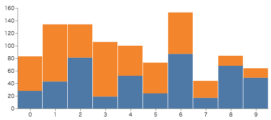
データは以下のような感じです。
[
        {"x": 0, "y": 28, "c": 0}, {"x": 0, "y": 55, "c": 1},
        {"x": 1, "y": 43, "c": 0}, {"x": 1, "y": 91, "c": 1},
        {"x": 2, "y": 81, "c": 0}, {"x": 2, "y": 53, "c": 1},
        {"x": 3, "y": 19, "c": 0}, {"x": 3, "y": 87, "c": 1},
        {"x": 4, "y": 52, "c": 0}, {"x": 4, "y": 48, "c": 1},
        {"x": 5, "y": 24, "c": 0}, {"x": 5, "y": 49, "c": 1},
        {"x": 6, "y": 87, "c": 0}, {"x": 6, "y": 66, "c": 1},
        {"x": 7, "y": 17, "c": 0}, {"x": 7, "y": 27, "c": 1},
        {"x": 8, "y": 68, "c": 0}, {"x": 8, "y": 16, "c": 1},
        {"x": 9, "y": 49, "c": 0}, {"x": 9, "y": 15, "c": 1}
]
とりあえず出してみる
凡例を設定するには、legends を使います。
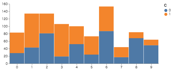
  "legends": [
    {
      "title": "C",
      "fill": "color"
    }
  ]
-
fillはscaleの名前を設定します。
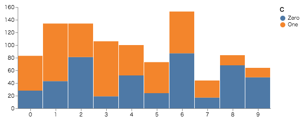
labelを変更してみる
色を決定しているデータの値が0,1 なので、凡例も0,1になっています。
実際のデータの場合、便宜上数値に設定しているだけだったりするので、その対応データを渡して、凡例のラベルを変更してみます。
手順は
-
対応データを追加
{ "name": "clabel", "values": [ {"label": "Zero", "value": 0},{"label": "One", "value": 1}] } -
追加したデータの
scaleを作成
domainが、元の凡例の0,1に合致する為に、fieldのvalueを設定します。{ "name": "legends_label", "type": "ordinal", "range": {"data": "clabel", "field": "label"}, "domain": {"data": "clabel", "field": "value"} } -
legendのテキストに上のscaleを利用するように設定{ "title": "C", "fill": "color", "encode": { "labels": { "update":{ "text": {"scale": "legends_label", "field": "label"} } } } }
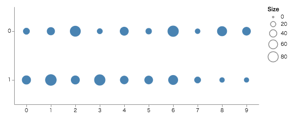
大きさで表現する凡例
データは一緒ですが、y軸をcにし、yの値によって、大きさを変更するグラフにします。
  "scales": [
...
    {
      "name": "size",
      "type": "linear",
      "range": [10, 500],
      "domain": {"data": "table", "field": "y"}
    }
  ],
...
  "legends": [
    {
      "title": "Size",
      "size": "size"
    }
  ]
}
- domain にyを指定した、
size scaleを作成します。- range は直接値を指定しています。 0始まりにすると(
[0,500]) yが0の時、ポイントを表示しなくできます。
- range は直接値を指定しています。 0始まりにすると(
- legendのsize プロパティに 作成した
size scaleを指定します。
連続した色で表現する
先ほど、サイズで表現した部分を連続した色で表現します。
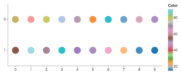
  "scales": [
...
    {
      "name": "color",
      "type":"linear",
      "range": {"scheme": "category20"},
      "domain": {"data": "table", "field": "y"}
    }
  ],
...
  "legends": [
    {
      "title": "Color",
      "fill": "color"
    }
  ]
}
- type にlinear を、range に color スキーマである
{"scheme": "category20"}を設定したcolor scaleを作成します。 color schema - legendの fill に作成した
color scaleを指定します。
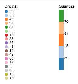
color scale のtypeを変更することで、凡例の見え方も変わってきます。
(左: "type": "ordinal", 右: "type": "quantize")