最近Pandas の勉強をしはじめたのでそのメモです。
怪しいところの編集リクエストやコメントをいただけるとありがたいです。
実行環境
- Python version 3.6.4
- Pandas version 0.22.0
- Matplotlib version 2.1.2
今回の目的
以下のような時系列のイベントデータに対して、特定の期間ごとにイベントの数を集計しグラフ化します。
2017-07-02 23:17:02,3
2017-07-11 17:48:55,2
2017-11-01 16:50:22,0
.
.
.
2018-01-18 15:48:58,2
2018-01-18 23:47:19,1
2018-01-19 12:37:00,2
2018-01-31 14:04:48,3
2018-02-01 07:46:54,1
実行
まずはライブラリをimport
import pandas as pd
import matplotlib.pyplot as plt
import matplotlib.dates as mdates
%matplotlib inline
次にヘッダーなしのcsvファイルから、一列目をdate型として、かつindexとして読み込み
df = pd.read_csv('data.csv', parse_dates=[0], header=None, index_col=[0])
df.head()
[Out]
                     1
0
2017-07-02 23:17:02  3
2017-07-11 17:48:55  2
2017-11-01 16:50:22  0
2017-11-15 13:34:05  5
2017-11-19 14:59:14  2
出現回数を数えたいので、1を追加
df['count'] = 1
df.head()
[Out]
                     1  count
0
2017-07-02 23:17:02  3      1
2017-07-11 17:48:55  2      1
2017-11-01 16:50:22  0      1
2017-11-15 13:34:05  5      1
2017-11-19 14:59:14  2      1
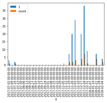
一週間ごとにまとめて、各グループを合計する。
Wを、2Wにすると2週間ごとに、Mにするとー月ごとにまとまる。
df2 = df.resample('W').sum()
df2.head()
[Out]
            1  count
0
2017-07-02  3      1
2017-07-09  0      0
2017-07-16  2      1
2017-07-23  0      0
2017-07-30  0      0
単純に描画
df2.plot(kind='bar')
x軸のラベルがごちゃごちゃしているとの、countだけ出したいので軸設定をし描画
fig, ax = plt.subplots(figsize=(10,7))
ax.xaxis.set_major_locator(mdates.MonthLocator())
ax.xaxis.set_major_formatter(mdates.DateFormatter('%b %d'))
ax.bar(df2.index, df2['count'])
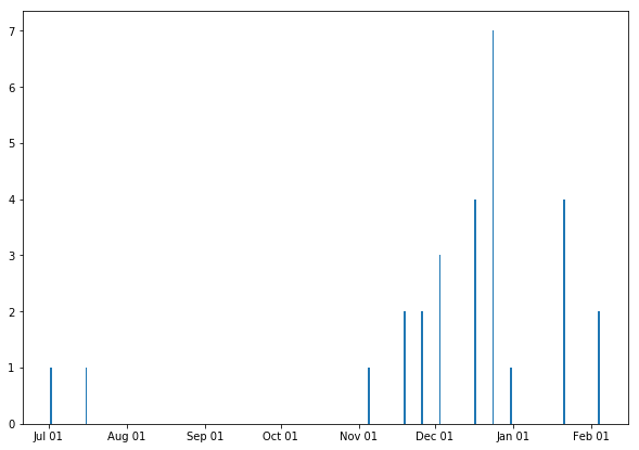
とりあえず目的は達成。
count あたりの処理は、もっとうまい方法がありそう。。。