はじめに
display:flexを使った横並びメニューの書き方をまとめました。
事前準備
ulタグにメニューの内容を記述し「list-style:none」を指定して縦に並べておきます。
見やすいようにデザインも少し整えておきます。
<ul>
    <li class="btn">menu1</li>
    <li class="btn">menu2</li>
    <li class="btn">menu3</li>
    <li class="btn">menu4</li>
    <li class="btn">menu5</li>
</ul>
/**list-styleを指定する**/
ul{
    list-style: none;
}

/** 見た目を整える **/
body,ul,li{
    margin:0px;
    padding:0px;
}

.btn{
    padding:10px 30px;
    margin:2.5px;

    background-color: rgba(135, 206, 235,1);
    border-radius: 5px;

    text-align: center;
    color:white;
}
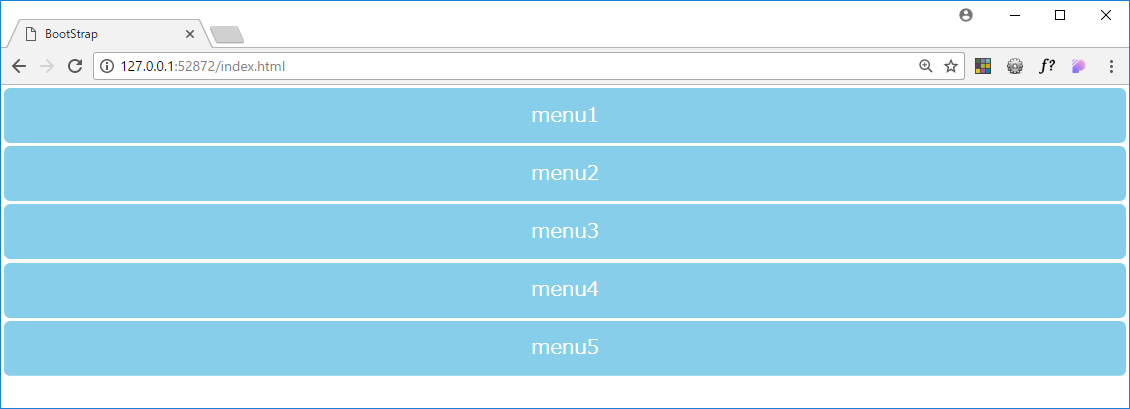
この状態でのブラウザの表示は、こんな感じです。
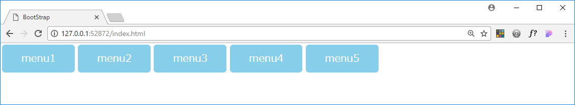
display:flexを使って横並びメニューを作る。
display:flexを一行追加します。
これで横並びメニューの出来上がりです。
ul{
    list-style: none;
    display:flex;
}

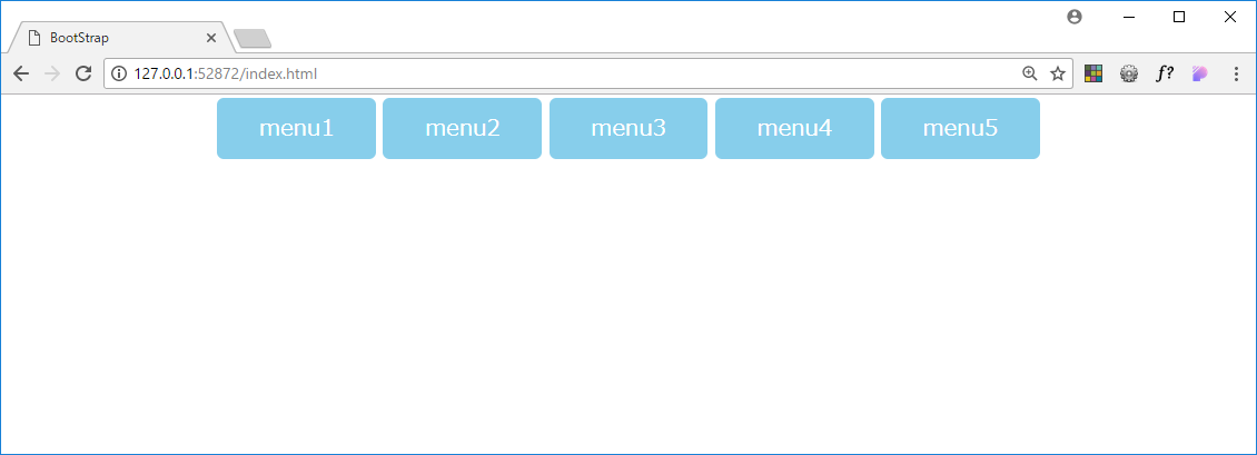
左右の表示位置を変更する
justify-contentを指定することで左右の表示位置を変更できます。
左寄せ(デフォルト)
ul{
    list-style: none;
    display:flex;
    justify-content: flex-start; // 省略可
}
中央寄せ
ul{
    list-style: none;
    display:flex;
    justify-content: center;
}
右寄せ
ul{
    list-style: none;
    display:flex;
    justify-content: flex-end;
}

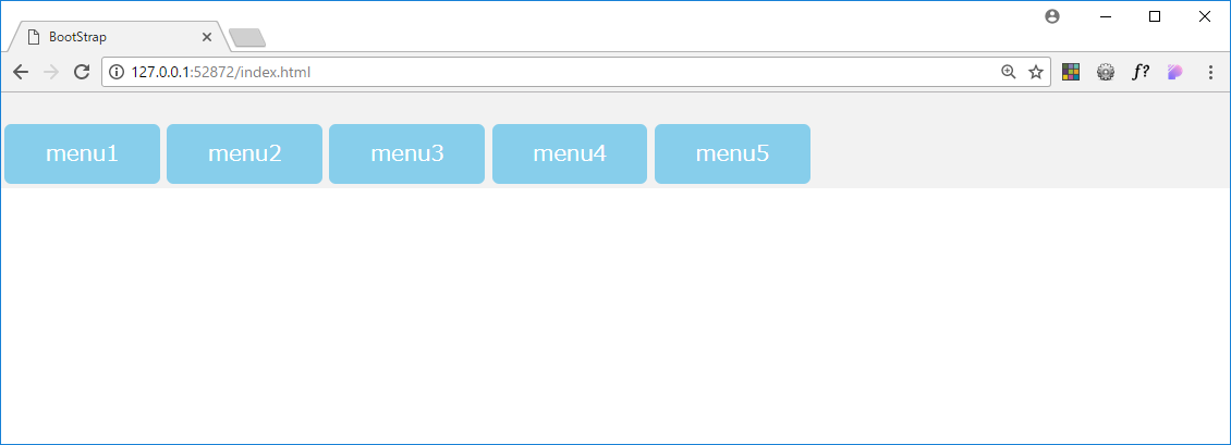
上下の表示位置を変更する
align-itemsを指定することで左右の表示位置を変更できます。
align-itemsは、高さを指定しないと上手く動かないので高さの指定を忘れないようにしましょう。
上寄せ
ul{
    list-style: none;
    display:flex;

    height:70px;
    align-items: flex-start;

    background-color: rgba(211, 211, 211,0.3); // 分かりやすいように背景色を指定
}

中央寄せ
ul{
    list-style: none;
    display:flex;

    height:70px;
    align-items: center;

    background-color: rgba(211, 211, 211,0.3); // 分かりやすいように背景色を指定
}

下寄せ
ul{
    list-style: none;
    display:flex;

    height:70px;
    align-items: flex-end;

    background-color: rgba(211, 211, 211,0.3); // 分かりやすいように背景色を指定
}
以上です。