基本のグラフ
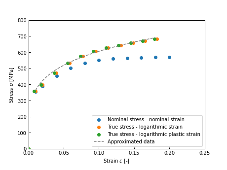
単独の散布図と折れ線グラフの重ね合わせは下記のように書ける。
single_graph.py
#パッケージのインポート
import pandas as pd
import matplotlib.pyplot as plt

#基本のグラフ
def draw_graph(df_scatter, df_plot):
    #体裁の設定
    plt.rcParams['font.family'] ='sans-serif'#使用するフォント
    plt.rcParams['xtick.direction'] = 'in'#x軸の目盛線が内向き('in')か外向き('out')か双方向か('inout')
    plt.rcParams['ytick.direction'] = 'in'#y軸の目盛線が内向き('in')か外向き('out')か双方向か('inout')
    plt.rcParams['xtick.major.width'] = 1.0#x軸主目盛り線の線幅
    plt.rcParams['ytick.major.width'] = 1.0#y軸主目盛り線の線幅
    plt.rcParams['font.size'] = 10 #フォントの大きさ
    plt.rcParams['axes.linewidth'] = 1.0# 軸の線幅edge linewidth。囲みの太さ

    #グラフの描画
    plt.figure(figsize=(6.4,4.8)) #グラフの大きさ
    plt.scatter( #散布図
        df_scatter['nominal_strain'], #x軸
        df_scatter['nominal_stress'], #y軸
        label="Nominal stress - nominal strain", #ラベル
        #color='grey', #色
        #marker=",", #マーカーの形
    )
    plt.scatter( #散布図
        df_scatter['logarithmic_strain'], #x軸
        df_scatter['true_stress'], #y軸
        label="True stress - logarithmic strain", #ラベル
        #color='grey', #色
        #marker=",", #マーカーの形
    )
    plt.scatter( #散布図
        df_scatter['log_plastic_strain'], #x軸
        df_scatter['true_stress'], #y軸
        label="True stress - logarithmic plastic strain", #ラベル
        #color='grey', #色
        #marker=",", #マーカーの形
    )
    plt.plot( #折れ線グラフ
        df_plot['log_plastic_strain'], #x軸
        df_plot['true_stress'], #y軸
        label="Approximated data", #ラベル
        color='grey', #色
        linestyle="dashed", #線種
    )

    plt.legend(loc=4) #凡例の位置
    plt.xlabel("Strain $\epsilon$ [-]") #x軸ラベル
    plt.ylabel("Stress $\sigma$ [MPa]") #y軸ラベル
    plt.xlim(0, 0.25) #x軸範囲
    plt.ylim(0, 800) #y軸範囲


#実験データ
df_exp = pd.read_csv('exp.csv')
display(df_exp.head())

#近似曲線データ
df_approx = pd.read_csv('approx.csv')
display(df_approx.head())

#グラフ描画
draw_graph(df_exp, df_approx)
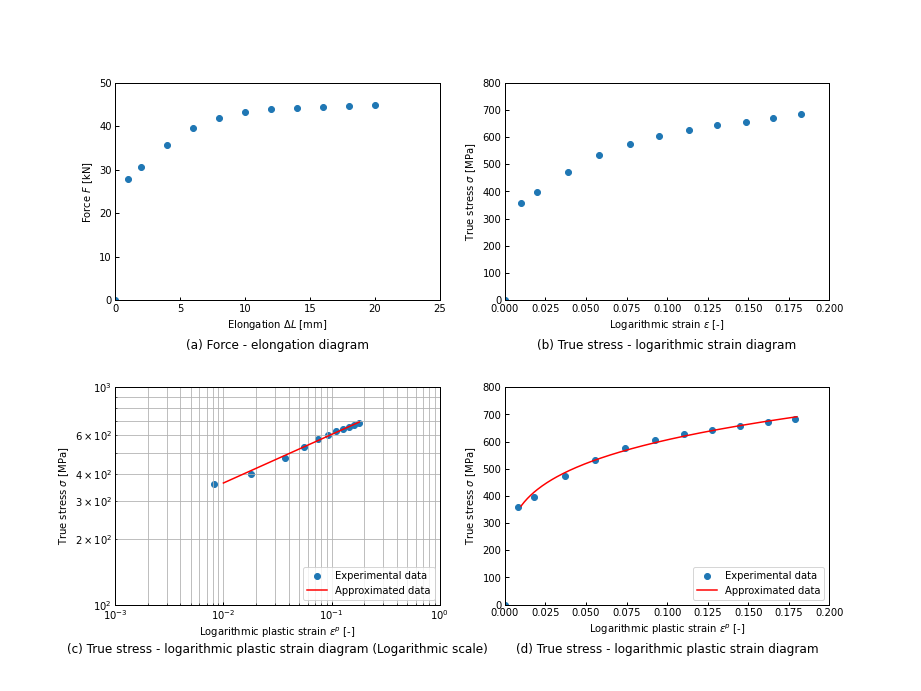
複数グラフを並べる
multiple_graph.py
#グラフを並べる
def draw_multi_graph(df_scatter, df_plot):

    #体裁の設定
    plt.rcParams['font.family'] ='sans-serif'#使用するフォント
    plt.rcParams['xtick.direction'] = 'in'#x軸の目盛線が内向き('in')か外向き('out')か双方向か('inout')
    plt.rcParams['ytick.direction'] = 'in'#y軸の目盛線が内向き('in')か外向き('out')か双方向か('inout')
    plt.rcParams['xtick.major.width'] = 1.0#x軸主目盛り線の線幅
    plt.rcParams['ytick.major.width'] = 1.0#y軸主目盛り線の線幅
    plt.rcParams['font.size'] = 10 #フォントの大きさ
    plt.rcParams['axes.linewidth'] = 1.0# 軸の線幅edge linewidth。囲みの太さ

    #グラフ全体(figure)の領域の作成
    fig = plt.figure(figsize=(12.8,9.6))

    #グラフの間隔の設定
    plt.subplots_adjust(hspace=0.4, wspace=0.2) #グラフの間隔
    place_subtitle = -0.25

    #各グラフ(axes)の領域の作成
    ax1 = fig.add_subplot(2, 2, 1) #縦2つ, 横2つあるうちの1つ目という意味
    ax2 = fig.add_subplot(2, 2, 2) #2つ目
    ax3 = fig.add_subplot(2, 2, 3) #3つ目
    ax4 = fig.add_subplot(2, 2, 4) #4つ目

    #グラフ1つ目
    ax1.scatter( #荷重-伸び線図の描画
        df_scatter['elongation'], #x軸
        df_scatter['force_kn'], #y軸
    )
    ax1.set_xlabel('Elongation $\Delta L$ [mm]') #x軸ラベル
    ax1.set_ylabel('Force $F$ [kN]') #y軸ラベル
    ax1.set_xlim(0, 25) #x軸範囲
    ax1.set_ylim(0, 50) #y軸範囲
    ax1.set_title(
        '(a) Force - elongation diagram',
        y=place_subtitle,
    )

    #グラフ2つ目
    ax2.scatter( #真応力-対数ひずみ線図の描画
        df_scatter['logarithmic_strain'], #x軸
        df_scatter['true_stress'], #y軸
    )
    ax2.set_xlabel('Logarithmic strain $\epsilon$ [-]') #x軸ラベル
    ax2.set_ylabel('True stress $\sigma$ [MPa]') #y軸ラベル
    ax2.set_xlim(0, 0.2) #x軸範囲
    ax2.set_ylim(0, 800) #y軸範囲
    ax2.set_title(
        '(b) True stress - logarithmic strain diagram',
        y=place_subtitle,
    )

    #グラフ3つ目
    ax3.scatter( #真応力-対数塑性ひずみ線図の描画
        df_scatter['log_plastic_strain'], #x軸
        df_scatter['true_stress'], #y軸
        label = 'Experimental data',
    )
    ax3.plot(
        df_plot['log_plastic_strain'],
        df_plot['true_stress'],
        label = 'Approximated data',
        color = 'red'
    )
    ax3.set_xscale('log')
    ax3.set_yscale('log')
    ax3.set_xlabel('Logarithmic plastic strain $\epsilon ^p$ [-]') #x軸ラベル
    ax3.set_ylabel('True stress $\sigma$ [MPa]') #y軸ラベル
    ax3.set_xlim(0.001, 1) #x4範囲
    ax3.set_ylim(100, 1000) #y軸範囲
    ax3.set_title(
        '(c) True stress - logarithmic plastic strain diagram (Logarithmic scale)',
        y=place_subtitle,
    )
    ax3.grid(which='major') #主目盛のグリッド
    ax3.grid(which='minor') #副目盛のグリッド
    ax3.legend(loc=4) #凡例の表示

    #グラフ4つ目
    ax4.scatter( #真応力-対数塑性ひずみ線図の描画
        df_scatter['log_plastic_strain'], #x軸
        df_scatter['true_stress'], #y軸
        label = 'Experimental data',
    )
    ax4.plot(
        df_plot['log_plastic_strain'],
        df_plot['true_stress'],
        label = 'Approximated data',
        color = 'red',
    )
    ax4.set_xlabel('Logarithmic plastic strain $\epsilon ^p$ [-]') #x軸ラベル
    ax4.set_ylabel('True stress $\sigma$ [MPa]') #y軸ラベル
    ax4.set_xlim(0, 0.2) #x軸範囲
    ax4.set_ylim(0, 800) #y軸範囲
    ax4.set_title(
        '(d) True stress - logarithmic plastic strain diagram',
        y=place_subtitle,
    )
    ax4.legend(loc=4) #凡例の表示

    #保存
    fig.savefig('multi_grpah.png')


draw_multi_graph(df_exp, df_approx)
参考