はじめに
shadcn/uiではダークモードUIを簡単に実装できます。
ぜひ試してみてください。
今回は、Next.jsを使って、実装しています。
実装
「next-themes」をインストール
next-themes は、Next.js フレームワークにおけるテーマ管理を簡単にするためのライブラリです。
next-themes を使用することで、ダークモードやライトモードなど、異なるテーマを簡単に切り替えることができます。
npm
npm install next-themes
yarn
yarn add next-themes
コンポーネントを作成
テーマプロバイダーを作成をします。
components/theme-provider.tsx
"use client"

import * as React from "react"
import { ThemeProvider as NextThemesProvider } from "next-themes"
import { type ThemeProviderProps } from "next-themes/dist/types"

export function ThemeProvider({ children, ...props }: ThemeProviderProps) {
  return <NextThemesProvider {...props}>{children}</NextThemesProvider>
}
layout.tsxをRoot Layoutを囲む
ThemeProvider をルート レイアウトに追加します。
app/layout.tsx
import { ThemeProvider } from "@/components/theme-provider"

export default function RootLayout({ children }: RootLayoutProps) {
  return (
    <>
      <html lang="en" suppressHydrationWarning>
        <head />
        <body>
          <ThemeProvider
            attribute="class"
            defaultTheme="system"
            enableSystem
            disableTransitionOnChange
          >
            {children}
          </ThemeProvider>
        </body>
      </html>
    </>
  )
}
dropdown-menuをインストール
メニューを切り替えるボタンをドロップダウンメニューで実装するので、以下のコマンドでdropdown-menuをインストールします。
npm
npx shadcn-ui@latest add dropdown-menu
モードを切り替えるためのコンポーネントを作成
以下のコードは、モードを切り替えるためのドロップダウンメニューのコンポーネントです。
components/toggle.tsx
"use client"

import * as React from "react"
import { MoonIcon, SunIcon } from "@radix-ui/react-icons"
import { useTheme } from "next-themes"

import { Button } from "@/components/ui/button"
import {
  DropdownMenu,
  DropdownMenuContent,
  DropdownMenuItem,
  DropdownMenuTrigger,
} from "@/components/ui/dropdown-menu"

export function ModeToggle() {
  const { setTheme } = useTheme()

  return (
    <DropdownMenu>
      <DropdownMenuTrigger asChild>
        <Button variant="outline" size="icon">
          <SunIcon className="h-[1.2rem] w-[1.2rem] rotate-0 scale-100 transition-all dark:-rotate-90 dark:scale-0" />
          <MoonIcon className="absolute h-[1.2rem] w-[1.2rem] rotate-90 scale-0 transition-all dark:rotate-0 dark:scale-100" />
          <span className="sr-only">Toggle theme</span>
        </Button>
      </DropdownMenuTrigger>
      <DropdownMenuContent align="end">
        <DropdownMenuItem onClick={() => setTheme("light")}>
          Light
        </DropdownMenuItem>
        <DropdownMenuItem onClick={() => setTheme("dark")}>
          Dark
        </DropdownMenuItem>
        <DropdownMenuItem onClick={() => setTheme("system")}>
          System
        </DropdownMenuItem>
      </DropdownMenuContent>
    </DropdownMenu>
  )
}
これで実装は完了です!
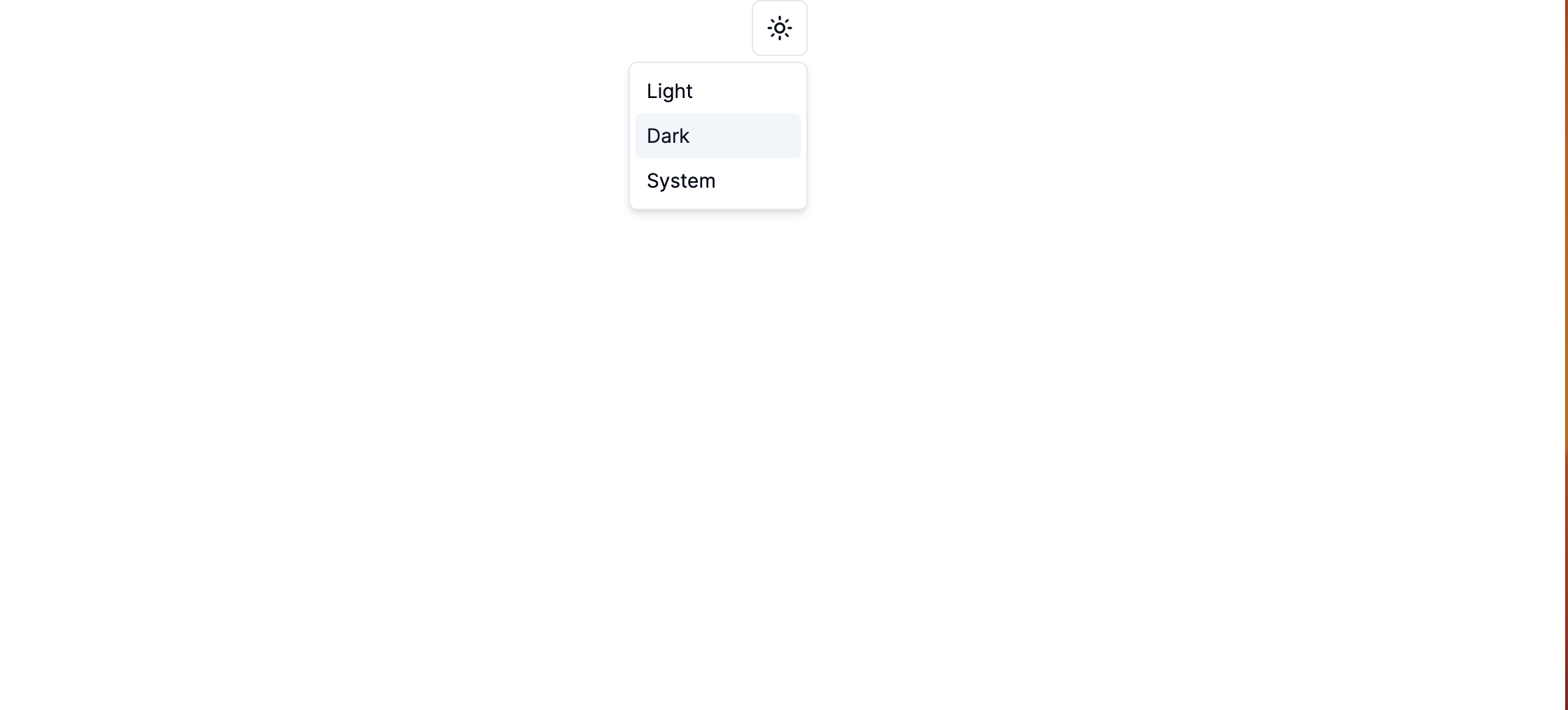
動作確認
- 初期表示時は画面は明るいです。

2.ボタンを押すとメニューが表示されます。
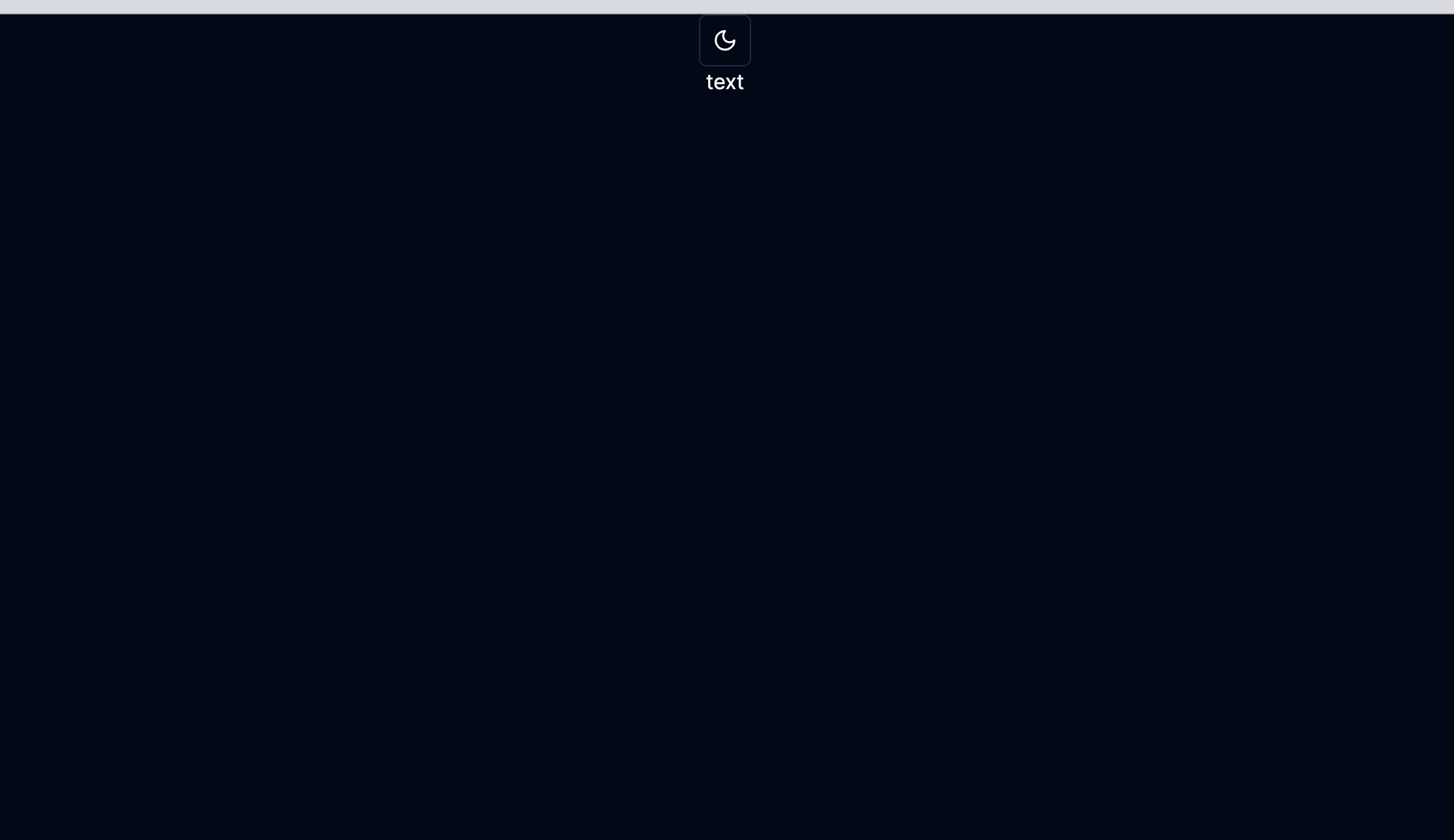
3.「Dark」を選択すると、以下のように画面の色が切り替わりました!
テキストの色も、画面の色に合わせて変化しています!
参考
最後に
他にも色々な記事を書いているので、よければ読んでいってください、、、