アプリケーション作成中に色々なbootstrap4のクラスを使わせていただいたので自分なりのまとめです。
といっても、アプリの中で使わせていただいたものに限定しています。
今後、項目を増やしていく予定です。
注意
-
bootstrap4のみのメモとなりますのでbootstrap3で排除されたクラスについては記述しません。
-
フロントは基本的にhamlで記述しているのでhamlの方式で書かせていただきます。
HTMLにする場合は、
sample.html.haml
.sample.d-flex.align-items-center
sample.html
<div class="sample d-flex align-items-center"></div>
のように「.」ではなく、スペースで離して記述してください。
ブレークポイント
bootstrap4のグリッドシステムのブレークポイントは
| デバイスの幅 | 極小 縦モバイルサイズ <576px |
小 横モバイルサイズ ≥576px |
中 タブレットサイズ ≥768px |
大 デスクトップサイズ ≥992px |
特大 大画面サイズ ≥1200px |
|---|---|---|---|---|---|
| クラス名 | .col- | .col-sm- | .col-md- | .col-lg- | .col-xl- |
| というように別れていますが、例えば、下に記述しているような上下中央寄せのクラスを極小サイズだけには適用させたくない時は |
sample.html.haml
.sample.d-md-flex.align-items-center // 元々はd-flex(全サイズ適用)をd-md-flexにして小サイズ以上に適用させている
のようにクラス名の中にブレークポイントの記述を組み込めばだいたいなんとかなります。
1. 上下中央寄せ
sample.html.haml
.sample.d-flex.align-items-center // .d-flex.align-items-centerで上下中央寄せ
この場合は、sampleクラス内の要素を上下中央寄せ
2. 左右中央寄せ
sample.html.haml
.sample.mx-auto
sampleクラス内の要素を左右中央寄せ
3-1. 左寄せ(d-flex)
sample.html.haml
.sample.d-flex
  .box1
    hako1
  .box2
    hako2
css3から使えるflexboxプロパティをクラス指定で使えるようになっている。
親要素であるsampleクラスにd-flexを記述するだけで子要素のbox1・box2クラスが自動的に左寄せになる。
d-flexはこれ以外にも様々な効果があるのでこのサイトも参考にしてみてください。
3-2. 左寄せ(float-left)
sample.html.haml
.sample.float-left
cssでもおなじみのfloatで、こちらは要素単体に使うようなイメージでしょうか。
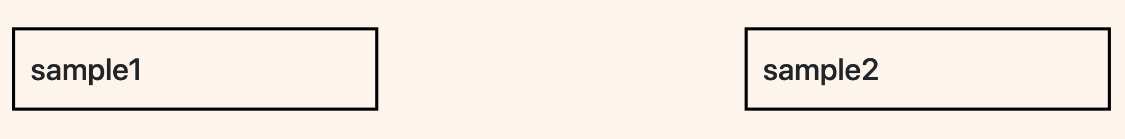
4. 空白の挿入
sample.html.haml
.sample1.col-4
  sample1
.sample2.col-4.offset-4
  sample2
この場合、sample2の左に4カラム分の空白ができます。
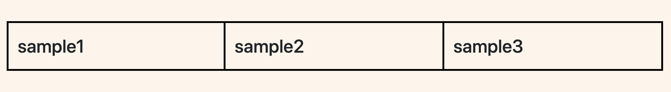
5. 表示・非表示
sample.html.haml
.sample1
  sample1
.sample2.d-none.d-md-block
  sample2
.sample3
  sample3
d-◯◯で表示・非表示の指定ができます。
sample2は、極小~小サイズでは非表示で、中サイズ以上では表示させています。
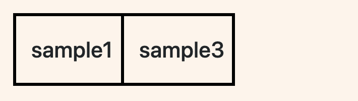
| 極小~小サイズ | 中サイズ以上 |
|---|---|
 |
 |