これを
こうするのぢゃ![]()
やり方
plot_treeで可視化
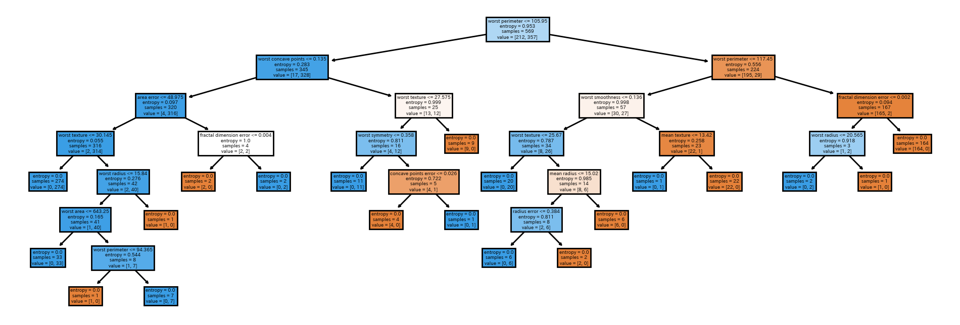
まず普通に決定木を作ってplot_treeで可視化してみます。
import numpy as np
import pandas as pd
import matplotlib.pyplot as plt
from sklearn.datasets import load_breast_cancer
from sklearn.tree import DecisionTreeClassifier, plot_tree

data = load_breast_cancer()
X, y = data['data'], data['target']
feature_names = data['feature_names']

model = DecisionTreeClassifier(criterion='entropy').fit(X,y)

plt.figure(figsize=(12, 4), dpi=200)
plot_tree(model, feature_names=feature_names, filled=True)
plt.show()
普通です。
Treemapで可視化
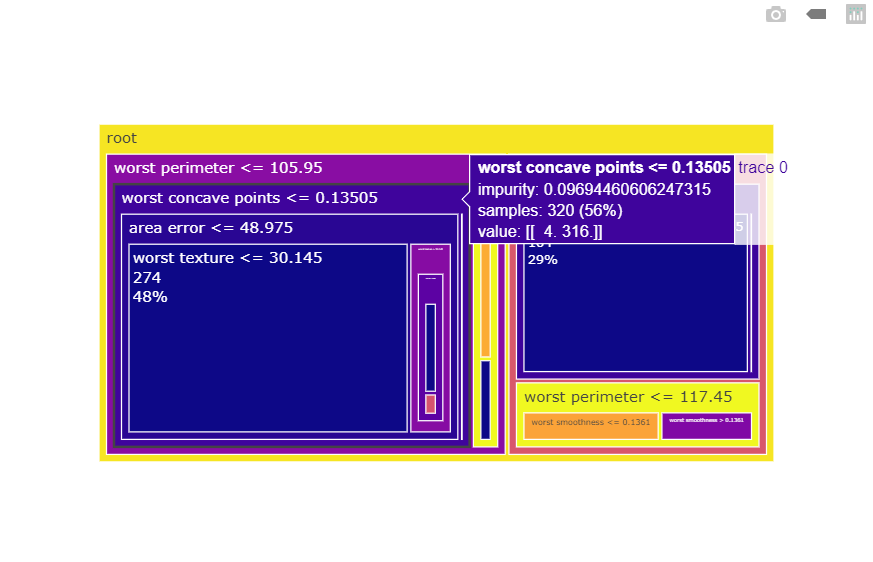
次に作った決定木を解体してTreemapで可視化してみます。
import plotly.graph_objects as go

labels = [''] * model.tree_.node_count
parents = [''] * model.tree_.node_count
labels[0] = 'root'
for i, (f, t, l, r) in enumerate(zip(
    model.tree_.feature,
    model.tree_.threshold,
    model.tree_.children_left,
    model.tree_.children_right,
)):
    if l != r:
        labels[l] = f'{feature_names[f]} <= {t:g}'
        labels[r] = f'{feature_names[f]} > {t:g}'
        parents[l] = parents[r] = labels[i]

fig = go.Figure(go.Treemap(
    branchvalues='total',
    labels=labels,
    parents=parents,
    values=model.tree_.n_node_samples,
    textinfo='label+value+percent root',
    marker=dict(colors=model.tree_.impurity),
    customdata=list(map(str, model.tree_.value)),
    hovertemplate='''
<b>%{label}</b><br>
impurity: %{color}<br>
samples: %{value} (%{percentRoot:%.2f})<br>
value: %{customdata}'''
))
fig.show()
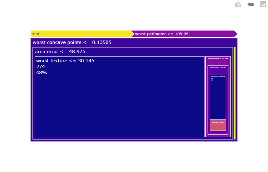
潰れて見えないノードは、セクタをクリックすると見えるようになります。
終わり
plot_treeと違ってクラスごとに色を付けることができないので、2値分類か回帰じゃないと使いにくいかもしれません![]()