Q.
確率密度関数を線で描いて95%区間を塗りつぶしたいのですが。
A.
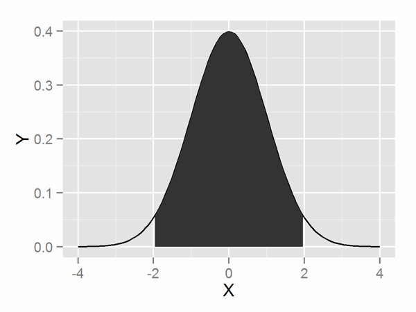
確率密度関数が正規分布など数式で与えられている場合
正規分布など好きな関数の曲線を描きたいを参考に以下のように書きます。
OK_example1.R
library(ggplot2)

q <- qnorm(c(0.025, 0.975))

p <- ggplot()
p <- p + geom_path(data=data.frame(X=x<-seq(-4,4,len=101), Y=dnorm(x)), aes(x=X, y=Y))
p <- p + geom_ribbon(data=data.frame(X=x<-seq(q[1],q[2],len=101), Y=dnorm(x)), aes(x=X, y=Y, ymin=0, ymax=Y))
確率密度関数がデータから計算される場合
以下のように書きます。
OK_example2.R
library(ggplot2)

q <- quantile(iris$Sepal.Length, prob=c(0.025, 0.975))
dens <- density(iris$Sepal.Length)
d <- data.frame(X=dens$x, Y=dens$y)

p <- ggplot()
p <- p + geom_line(data=d, aes(x=X, y=Y))
p <- p + geom_ribbon(data=subset(d, X>=q[1] & X<=q[2]), aes(x=X, ymin=0, ymax=Y))
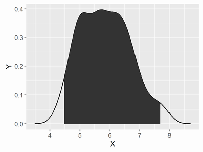
しかしながら、データの分位点と確率密度関数の分位点が必ずしも一致しないので、あまり好ましい図ではないと思います。
参考資料
http://stackoverflow.com/questions/26266246/ggplot2-stat-function-can-we-use-the-generated-y-values-on-other-layers
http://stackoverflow.com/questions/4542438/adding-summary-information-to-a-density-plot-created-with-ggplot
http://stackoverflow.com/questions/3494593/shading-a-kernel-density-plot-between-two-points