はじめに
6/30まで実施しているキャンペーンに滑り込みすべく、AmazonQCLIで早押しITト◯ッコアドベンチャー風ゲームを作成してみました!
このゲームを作成した理由としては、最近Duolingoをはじめて、IT知識もゲーム感覚で学べたらいいなと思い、作成しました。
目次
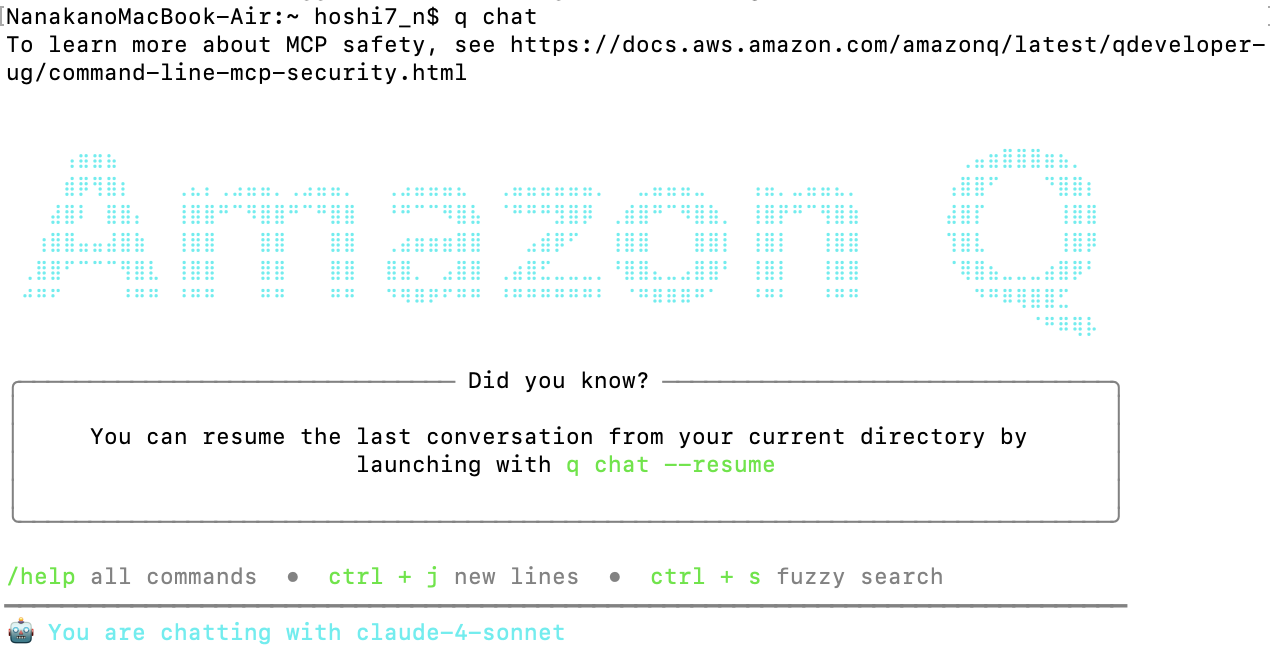
Amazon Q CLIの始め方
上記リンクからQをダウンロードして始めました。
q chatと入力するとチャットが始まります。とっても簡単!
プロンプト一覧
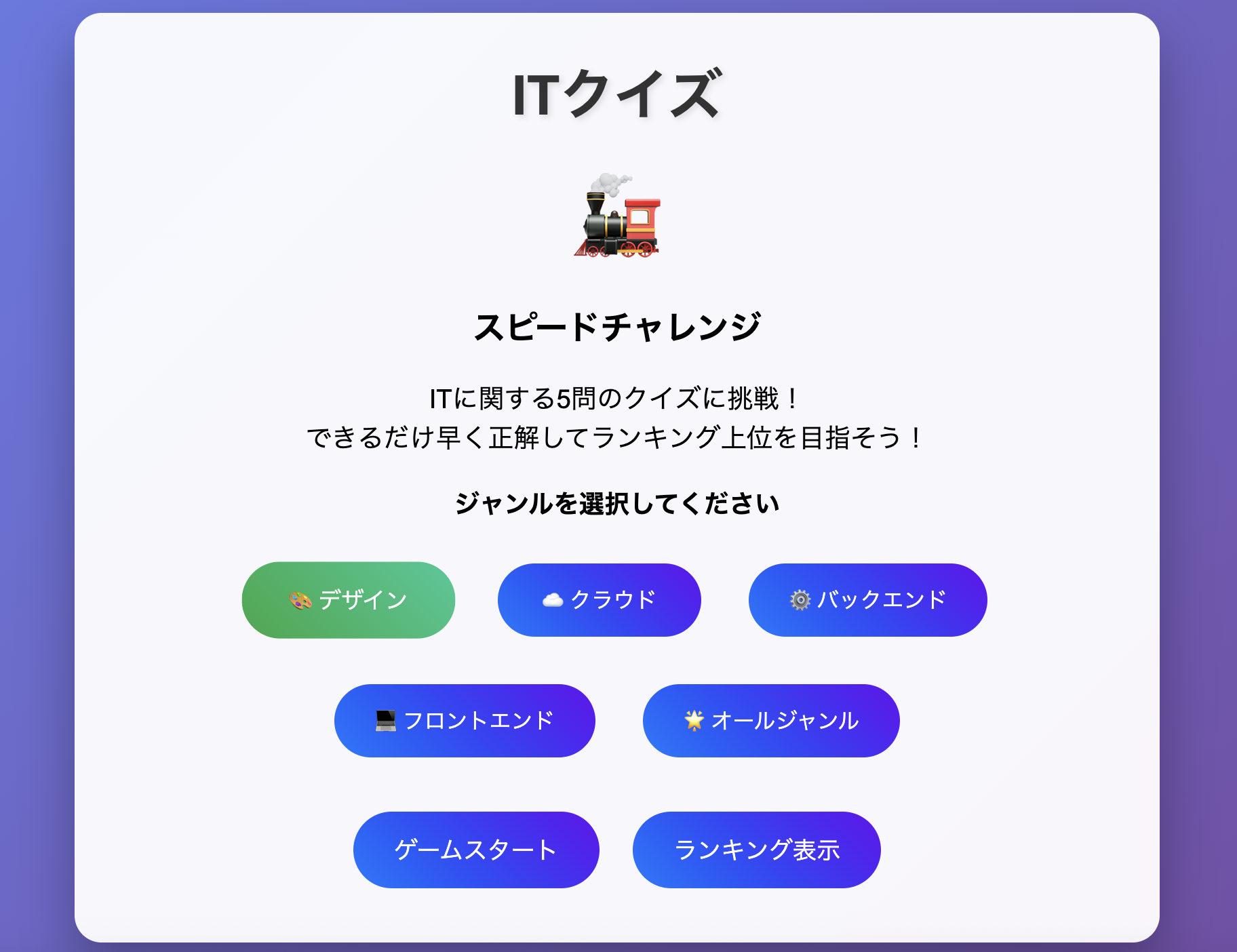
初回のプロンプト
初回のプロンプトとして以下を入れてみました。
- 以下の要件でローカルPCで動かせるゲームを作成したいです
  - ITに関する問題が5問出る丸バツクイズ
  - RTAでランキング形式
  - デザインは、ネ◯リーグのト◯ッコアドベンチャーのような感じ
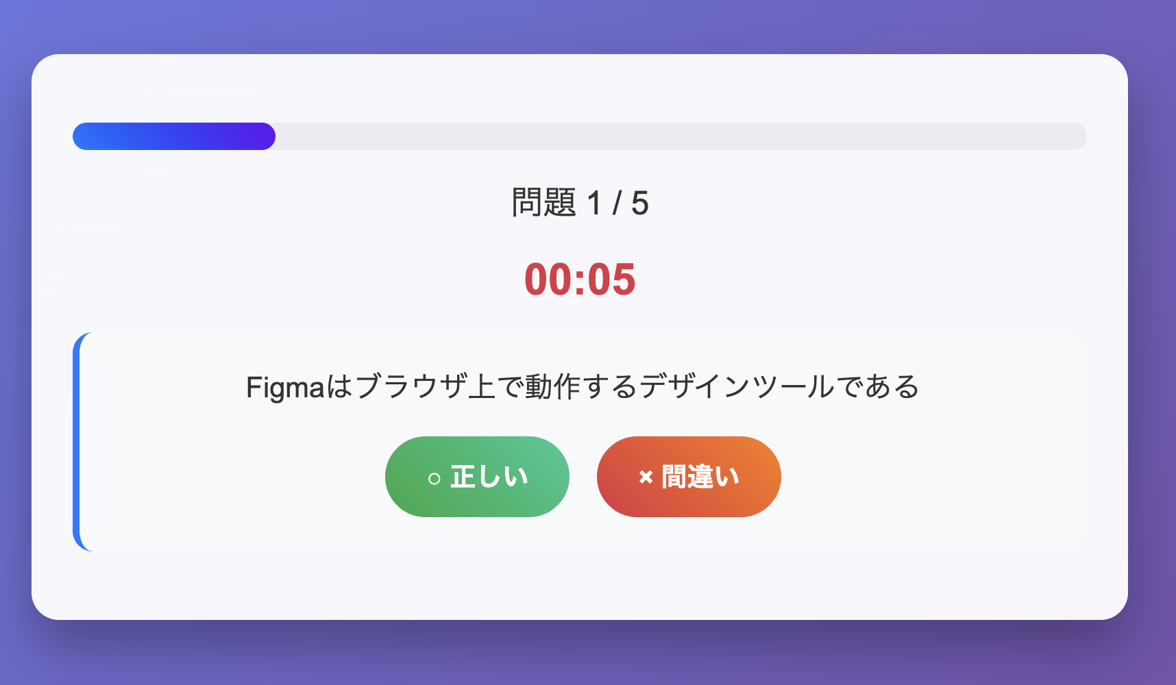
すると、以下のようなコード生成が始まりました。
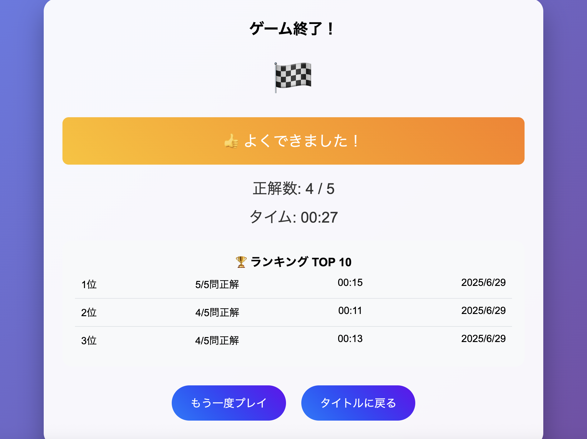
そして3分ほどして処理が完了。なんと1回目でかなりいい感じのゲームができあがりました。すごい!
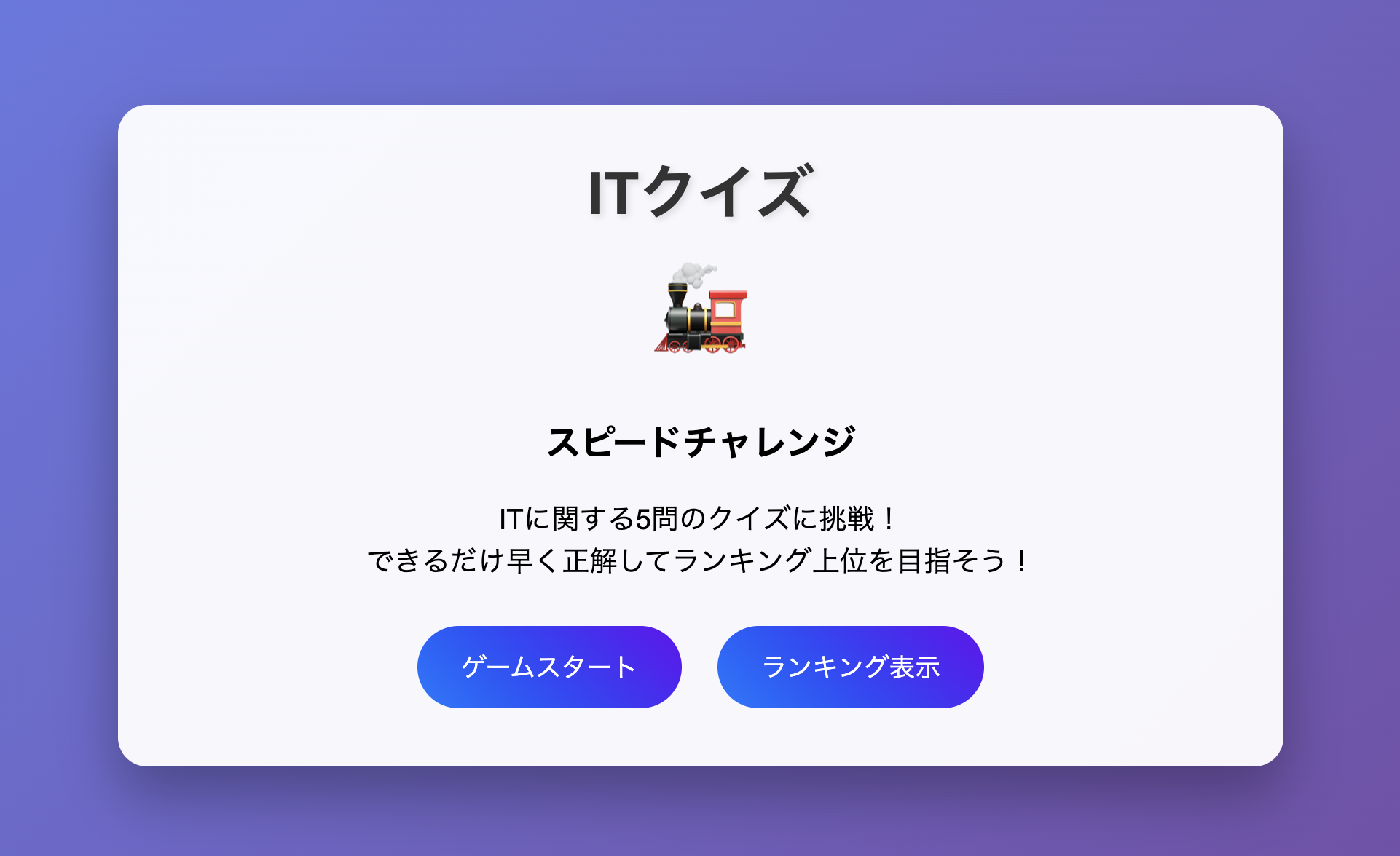
ちゃんとランキング機能も動いていました。
2回目のチャレンジ
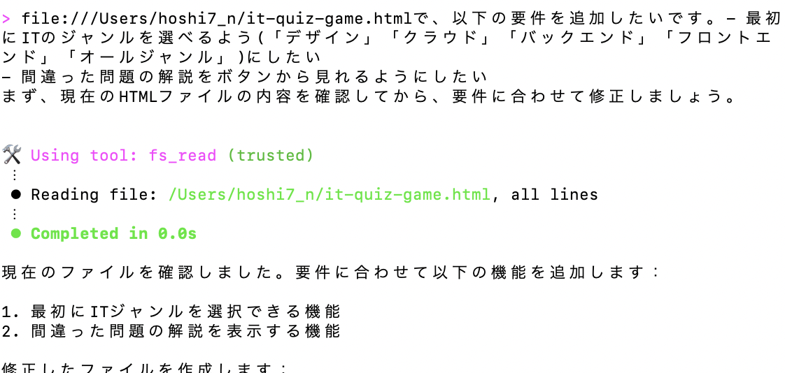
少し物足りなかったので、以下の要件を追加してみました。
- 最初にITのジャンルを選べるよう(「デザイン」「クラウド」「バックエンド」「フロントエンド」「オールジャンル」)にしたい
- 間違った問題の解説をボタンから見れるようにしたい
今度は5分ほど経って処理が完了しました。
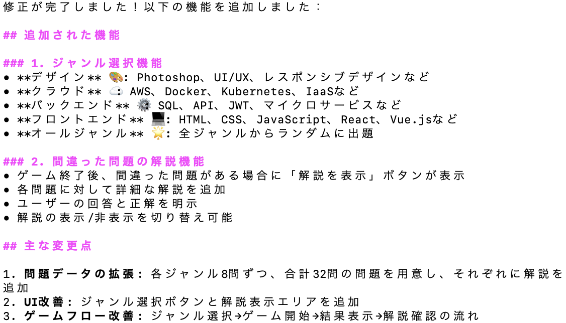
見た目はめちゃめちゃAIが作りました感が強いですが、要件に加えたジャンル選択ができるようになっていました。
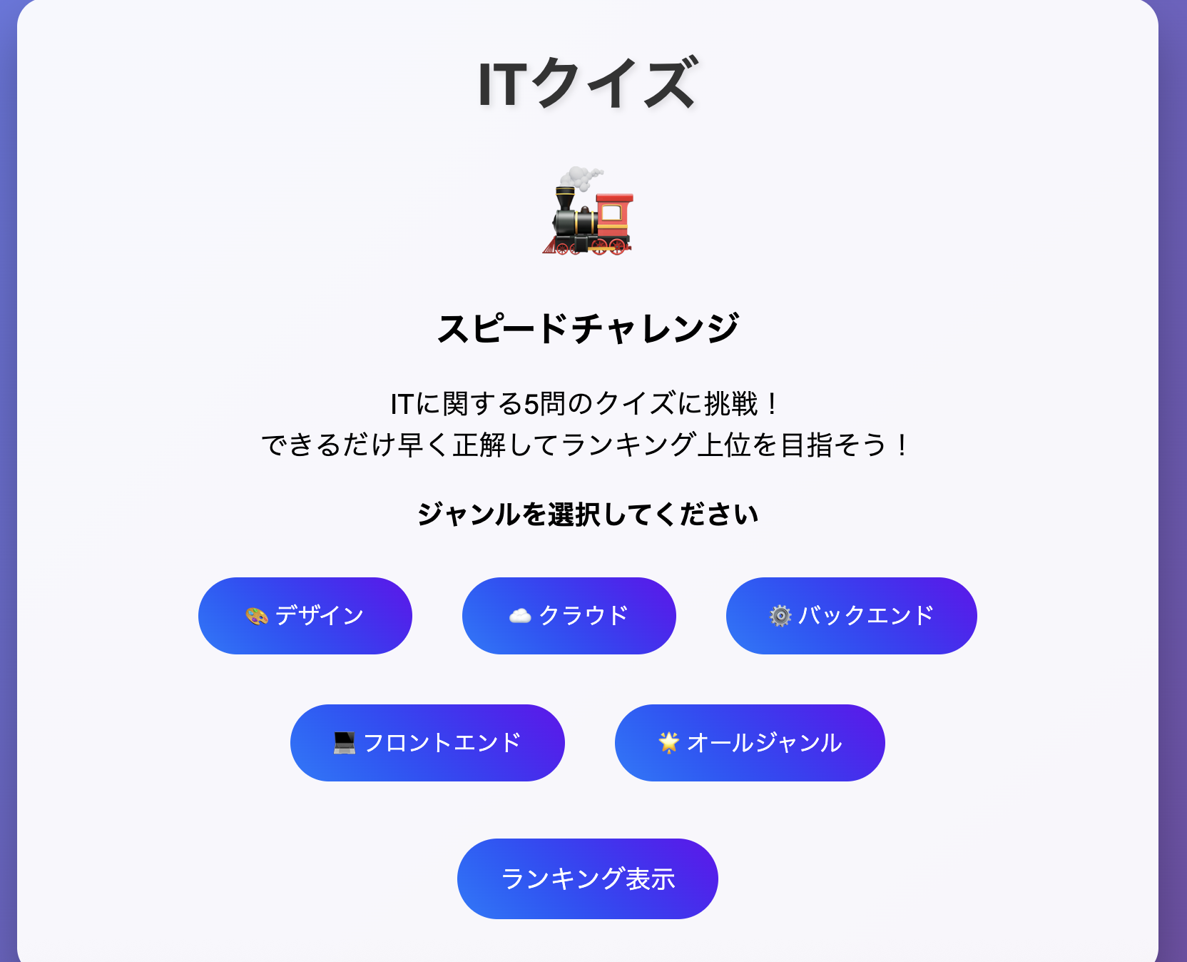
ジャンルを選択すると以下のように色が変わります。
選択したジャンルに応じた問題が出題されるように修正されていました。
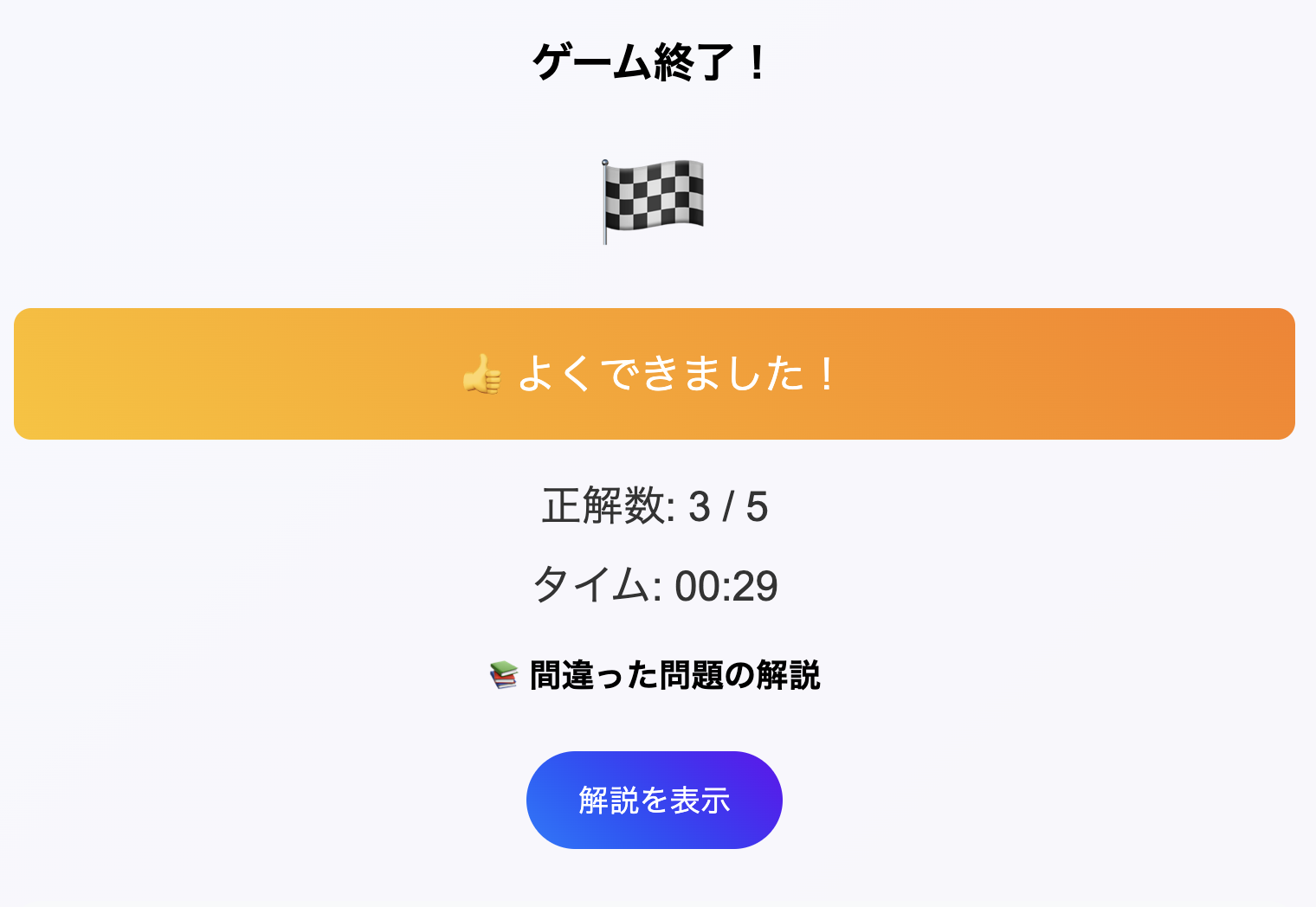
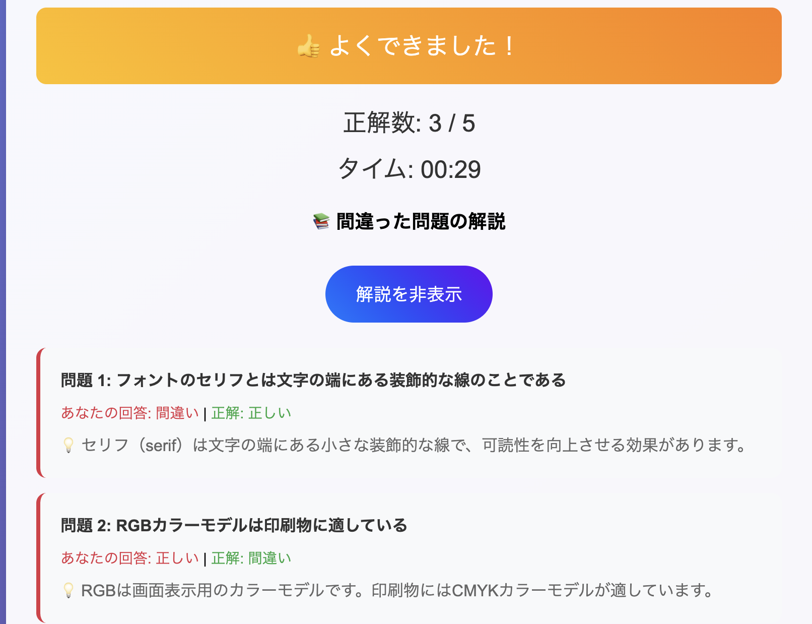
そして5問解いた後には、解説を表示/非表示ボタンが追加されており、表示にすると問題の解説が見れるようになっていました。すごい!
3回目のチャレンジ
ここまできて、「元々ト◯ッコアドベンチャーっぽくしたかったんだよな、、?」ということを思い出し、以下の要件を追加するよう指示しました。
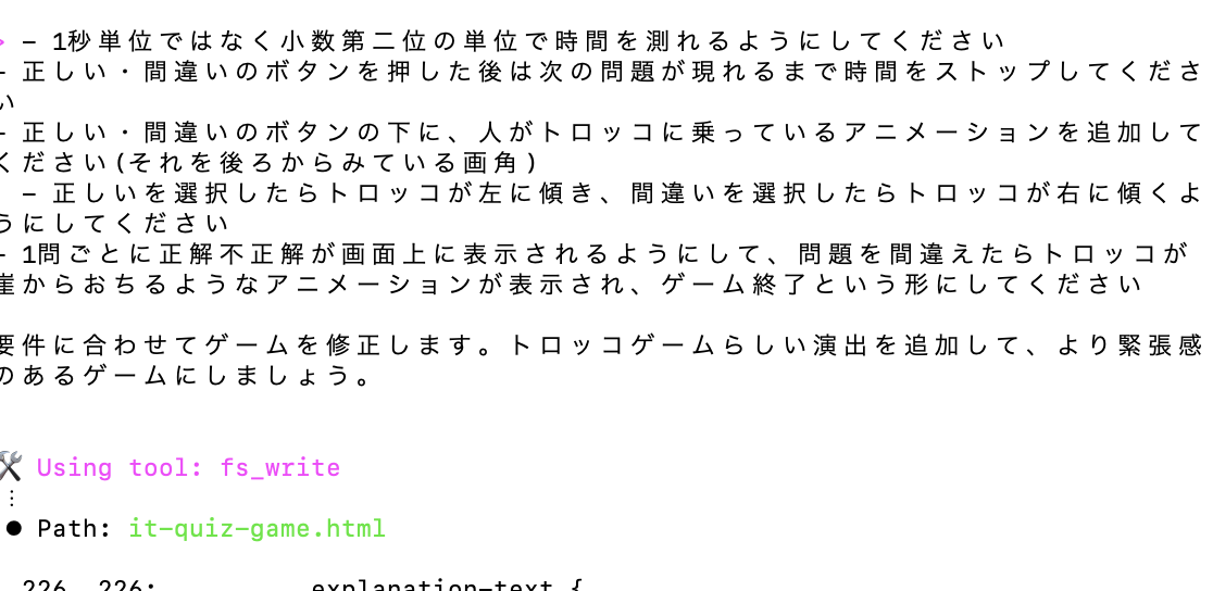
- 1秒単位ではなく小数第二位の単位で時間を測れるようにしてください
- 正しい・間違いのボタンを押した後は次の問題が現れるまで時間をストップしてください
- 正しい・間違いのボタンの下に、人がトロッコに乗っているアニメーションを追加してください(それを後ろからみている画角)
  - 正しいを選択したらトロッコが左に傾き、間違いを選択したらトロッコが右に傾くようにしてください
- 1問ごとに正解不正解が画面上に表示されるようにして、問題を間違えたらトロッコが崖からおちるようなアニメーションが表示され、ゲーム終了という形にしてください
するとまた3分ほどして処理が終了しました。
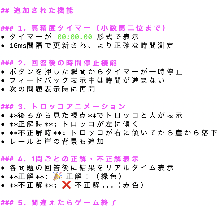
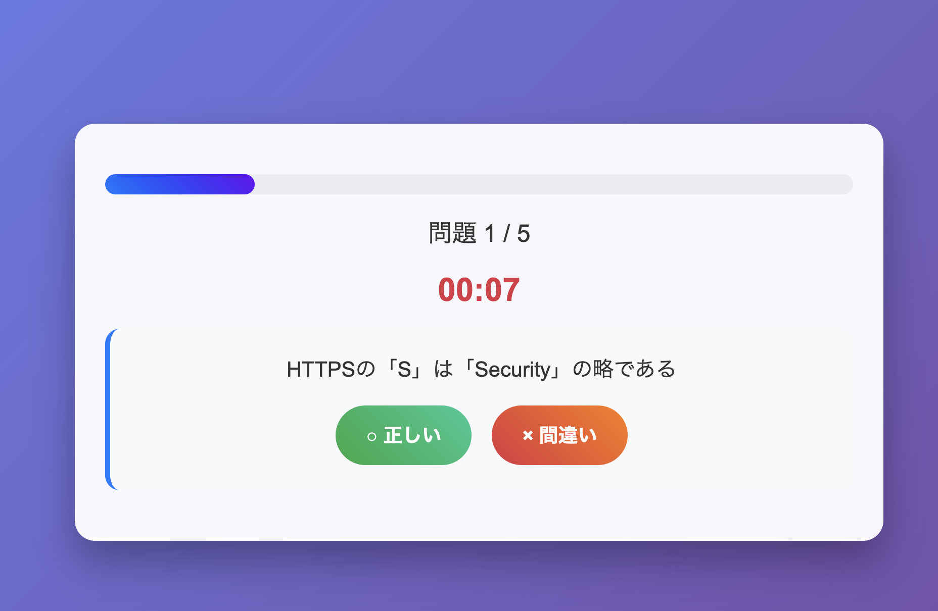
問題に進むと、先ほど要件に追加したトロッコのアニメーションが追加されていました。
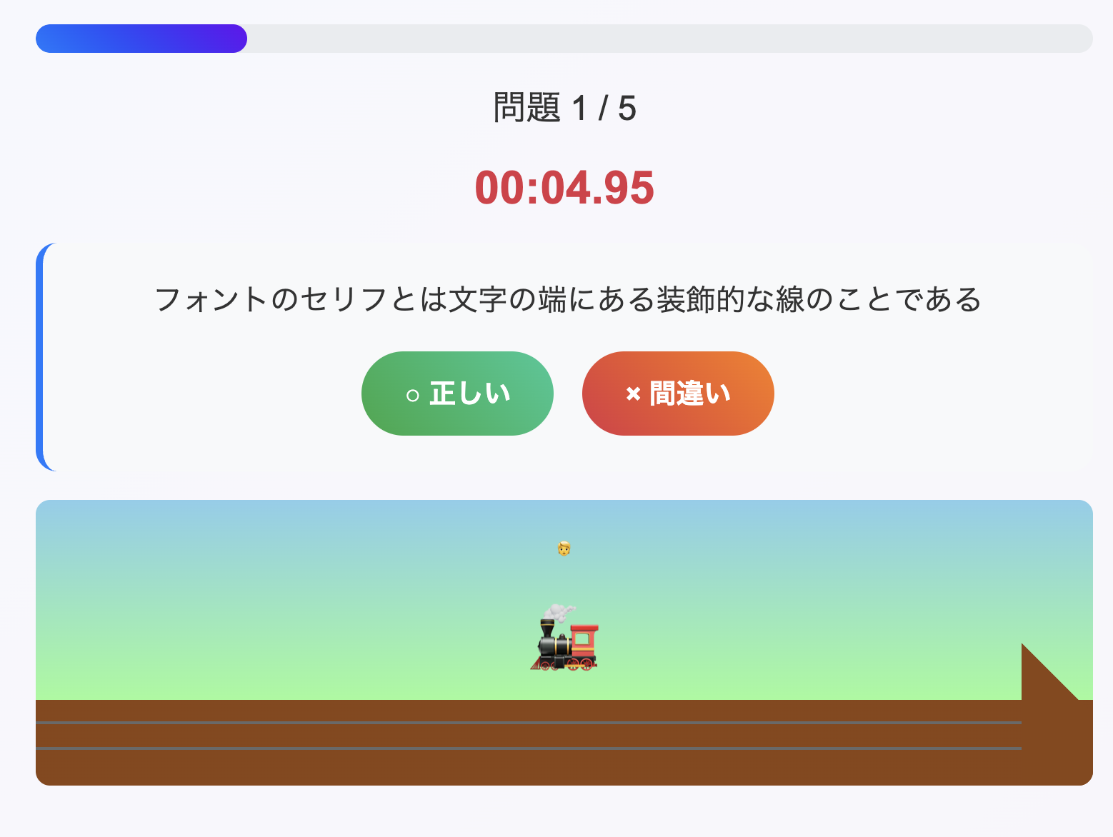
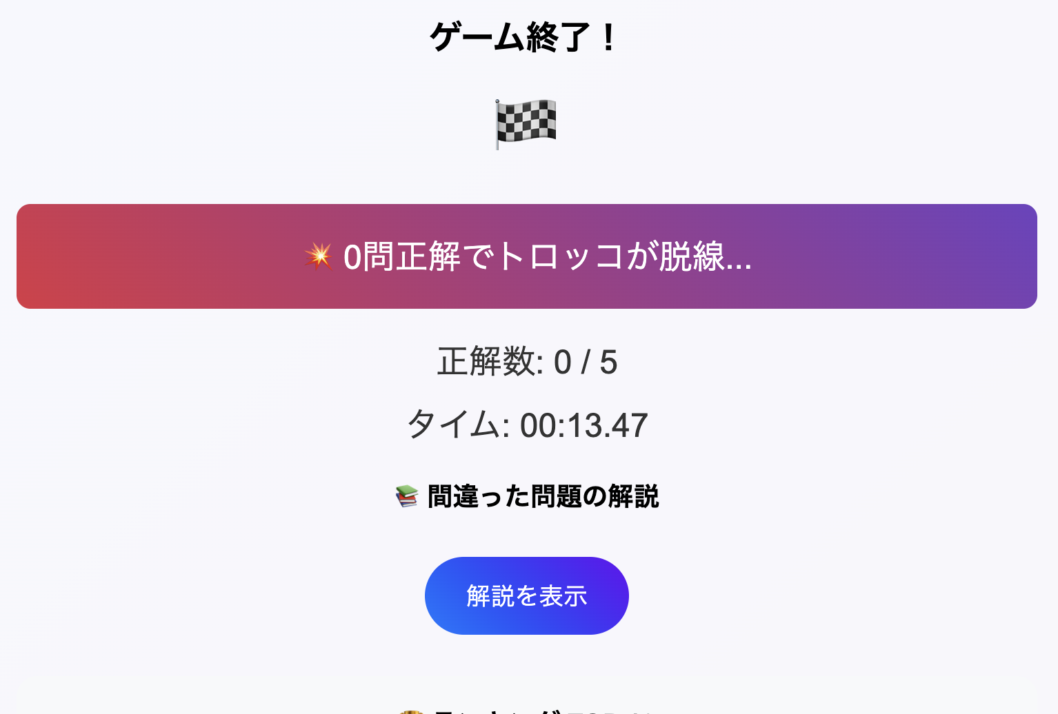
問題を間違えると落ちるアニメーションが追加されており、間違えた瞬間にゲームが終了するようになっていました。
効果的なプロンプトテクニック
初回のプロンプトで割とうまくいったのは、箇条書きで要件を書いたことがポイントなのかなと思いました。
特に3回目のプロンプトでは、ゲームのルール自体を変えたのにもかかわらず、デグレせずきちんと動いていたので、プロンプトに箇条書きを入れていくのを今後も使っていきたいです。
時間を節約した開発自動化の例
今回はローカルで動かせるようにという指示だったため、わずか15分程度で理想のものが完成したことが驚きでした。
コードの中身は気にしていない&ある程度どんなものを作りたいかが頭にあれば、かなりの時間の節約につながるなと思いました。
AIが古典的なプログラミング課題をどのように処理したか
以下のような、問題をミスしたときのトロッコのアニメーションの処理は、AIなしではどう実現したら良いか迷う部分だと思いますが、AIを使ったことで実現方法のヒントが得られたのが、魅力的だなと思いました。
        .trolley-container.fall {
            transform: translateX(-50%) translateY(200px) rotate(45deg);
            transition: all 1.5s ease-in;
        }
AIが生成した興味深いソリューションのコード例
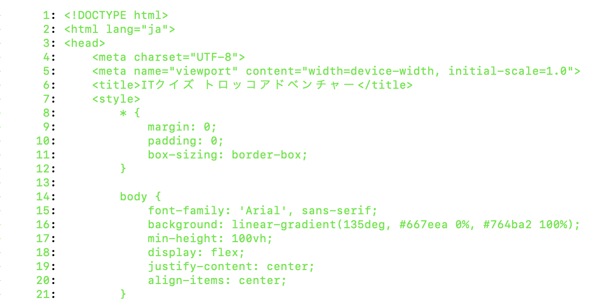
以下のリポジトリにも載せているのですが、HTMLファイル1枚でゲームを作っていたのが驚きでした。
スタイルに関しては以下のように書かれていました。
    <style>
        * {
            margin: 0;
            padding: 0;
            box-sizing: border-box;
        }

        body {
            font-family: 'Arial', sans-serif;
            background: linear-gradient(135deg, #667eea 0%, #764ba2 100%);
            min-height: 100vh;
            display: flex;
            justify-content: center;
            align-items: center;
        }

        .game-container {
            background: rgba(255, 255, 255, 0.95);
            border-radius: 20px;
            padding: 30px;
            box-shadow: 0 20px 40px rgba(0, 0, 0, 0.3);
            max-width: 800px;
            width: 90%;
            text-align: center;
        }

        .title {
            font-size: 2.5em;
            color: #333;
            margin-bottom: 20px;
            text-shadow: 2px 2px 4px rgba(0, 0, 0, 0.1);
        }

        .trolley {
            font-size: 4em;
            margin: 20px 0;
            animation: bounce 2s infinite;
        }

        @keyframes bounce {
            0%, 20%, 50%, 80%, 100% { transform: translateY(0); }
            40% { transform: translateY(-10px); }
            60% { transform: translateY(-5px); }
        }

        .start-screen, .game-screen, .result-screen {
            display: none;
        }

        .start-screen.active, .game-screen.active, .result-screen.active {
            display: block;
        }

        .question-container {
            background: #f8f9fa;
            border-radius: 15px;
            padding: 25px;
            margin: 20px 0;
            border-left: 5px solid #007bff;
        }

        .question {
            font-size: 1.3em;
            margin-bottom: 20px;
            color: #333;
            line-height: 1.5;
        }

        .answer-buttons {
            display: flex;
            gap: 20px;
            justify-content: center;
            margin-top: 20px;
        }

        .answer-btn {
            padding: 15px 30px;
            font-size: 1.2em;
            border: none;
            border-radius: 50px;
            cursor: pointer;
            transition: all 0.3s ease;
            font-weight: bold;
            min-width: 120px;
        }

        .answer-btn.correct {
            background: linear-gradient(45deg, #28a745, #20c997);
            color: white;
        }

        .answer-btn.incorrect {
            background: linear-gradient(45deg, #dc3545, #fd7e14);
            color: white;
        }

        .answer-btn:hover {
            transform: translateY(-3px);
            box-shadow: 0 10px 20px rgba(0, 0, 0, 0.2);
        }

        .progress {
            background: #e9ecef;
            border-radius: 10px;
            height: 20px;
            margin: 20px 0;
            overflow: hidden;
        }

        .progress-bar {
            background: linear-gradient(45deg, #007bff, #6610f2);
            height: 100%;
            transition: width 0.5s ease;
            border-radius: 10px;
        }

        .timer {
            font-size: 2em;
            font-weight: bold;
            color: #dc3545;
            margin: 20px 0;
        }

        .score {
            font-size: 1.5em;
            margin: 10px 0;
            color: #333;
        }

        .ranking {
            background: #f8f9fa;
            border-radius: 15px;
            padding: 20px;
            margin: 20px 0;
        }

        .ranking-item {
            display: flex;
            justify-content: space-between;
            padding: 10px;
            border-bottom: 1px solid #dee2e6;
        }

        .ranking-item:last-child {
            border-bottom: none;
        }

        .btn {
            background: linear-gradient(45deg, #007bff, #6610f2);
            color: white;
            border: none;
            padding: 15px 30px;
            font-size: 1.1em;
            border-radius: 50px;
            cursor: pointer;
            transition: all 0.3s ease;
            margin: 10px;
        }

        .btn:hover {
            transform: translateY(-2px);
            box-shadow: 0 8px 16px rgba(0, 0, 0, 0.2);
        }

        .result-message {
            font-size: 1.5em;
            margin: 20px 0;
            padding: 20px;
            border-radius: 10px;
        }

        .excellent {
            background: linear-gradient(45deg, #28a745, #20c997);
            color: white;
        }

        .good {
            background: linear-gradient(45deg, #ffc107, #fd7e14);
            color: white;
        }

        .poor {
            background: linear-gradient(45deg, #dc3545, #6f42c1);
            color: white;
        }

        .genre-buttons {
            display: flex;
            flex-wrap: wrap;
            gap: 15px;
            justify-content: center;
            margin: 20px 0;
        }

        .genre-btn {
            min-width: 150px;
            font-size: 1em;
        }

        .genre-btn.selected {
            background: linear-gradient(45deg, #28a745, #20c997);
            transform: scale(1.05);
        }

        .explanation-item {
            background: #f8f9fa;
            border-radius: 10px;
            padding: 20px;
            margin: 15px 0;
            border-left: 4px solid #dc3545;
            text-align: left;
        }

        .explanation-question {
            font-weight: bold;
            color: #333;
            margin-bottom: 10px;
        }

        .explanation-text {
            color: #666;
            line-height: 1.5;
        }

        .trolley-animation {
            position: relative;
            height: 200px;
            margin: 20px 0;
            overflow: hidden;
            background: linear-gradient(to bottom, #87CEEB 0%, #98FB98 70%, #8B4513 70%, #8B4513 100%);
            border-radius: 10px;
        }

        .trolley-container {
            position: absolute;
            bottom: 50px;
            left: 50%;
            transform: translateX(-50%);
            transition: all 0.8s ease;
        }

        .trolley-container.tilt-left {
            transform: translateX(-50%) rotate(-15deg);
        }

        .trolley-container.tilt-right {
            transform: translateX(-50%) rotate(15deg);
        }

        .trolley-container.fall {
            transform: translateX(-50%) translateY(200px) rotate(45deg);
            transition: all 1.5s ease-in;
        }

        .trolley {
            font-size: 3em;
            position: relative;
        }

        .person {
            position: absolute;
            top: -20px;
            left: 50%;
            transform: translateX(-50%);
            font-size: 0.6em;
        }

        .rails {
            position: absolute;
            bottom: 30px;
            left: 0;
            right: 0;
            height: 10px;
            background: repeating-linear-gradient(
                90deg,
                #8B4513 0px,
                #8B4513 20px,
                transparent 20px,
                transparent 40px
            );
        }

        .rails::before {
            content: '';
            position: absolute;
            top: -5px;
            left: 0;
            right: 0;
            height: 2px;
            background: #696969;
        }

        .rails::after {
            content: '';
            position: absolute;
            bottom: -5px;
            left: 0;
            right: 0;
            height: 2px;
            background: #696969;
        }

        .cliff {
            position: absolute;
            bottom: 0;
            right: -50px;
            width: 100px;
            height: 100px;
            background: #8B4513;
            clip-path: polygon(0 0, 100% 100%, 0 100%);
        }

        .result-feedback {
            font-size: 2em;
            font-weight: bold;
            margin: 20px 0;
            padding: 15px;
            border-radius: 10px;
            opacity: 0;
            transition: opacity 0.5s ease;
        }

        .result-feedback.show {
            opacity: 1;
        }

        .result-feedback.correct {
            background: linear-gradient(45deg, #28a745, #20c997);
            color: white;
        }

        .result-feedback.incorrect {
            background: linear-gradient(45deg, #dc3545, #fd7e14);
            color: white;
        }

        .game-over-message {
            font-size: 1.5em;
            color: #dc3545;
            font-weight: bold;
            margin: 20px 0;
            opacity: 0;
            transition: opacity 0.5s ease;
        }

        .game-over-message.show {
            opacity: 1;
        }
    </style>
ちなみにですが、HTML、CSS、JavaScriptに分けてという指示をしたらきちんと分けてくれ、問題なく動作しました。
おわりに
15分程度でこのレベルのゲームができてしまうのが驚きでした。また違うゲームも作ってみたいです!
最後までご覧いただきありがとうございました!