SwiftUI2.0で追加されたAPI
SwiftUI2.0で追加された新機能のうち、Heroアニメーションを簡単に作れるAPIがあったのでちょっと触ってみました。
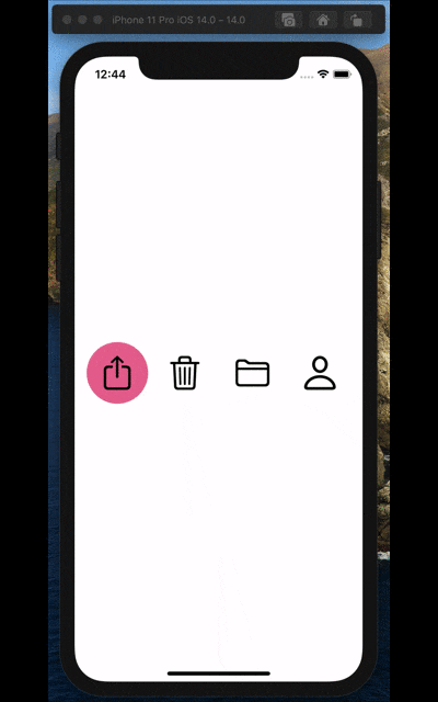
とりあえず完成形
こんな感じのSegmentControlっぽいUIを作ってみます。
Githubはこちらです。
https://github.com/hoshi005/matched-geometry-animation
開発環境
- Xcode 12.0.1
- iOS 14.0.1
ボタンを作る
選択に使うボタンのViewを作ります。
そのまえに、適当にenumを定義しておきました。SF Symbolsから、適当に4つほど選出しています。
enum ButtonType: String, CaseIterable {
    case share = "square.and.arrow.up"
    case trash = "trash"
    case folder = "folder"
    case person = "person"
}
ボタンのビューはこんな感じで作ります。
AccentColorについては、適宜Assetsで好きな色を定義してください。
struct CustomButton: View {
    // 選択状態を表すプロパティ.
    @Binding var selected: ButtonType
    // 自分自身のボタンタイプ.
    let type: ButtonType

    var body: some View {
        ZStack {
            // 選択中だったら背景に円を描画する.
            if selected == type {
                Circle()
                    .fill(Color.accentColor) // AccentColorはAssetsで定義すること.
            }

            Button(action: {
                selected = type // ボタンをタップしたら、選択状態を自分自身に切り替える.
            }, label: {
                // enumから画像を表示する.
                Image(systemName: type.rawValue)
                    .resizable()
                    .renderingMode(.original)
                    .aspectRatio(contentMode: .fit)
                    .frame(width: 44, height: 44)
            })
        }
        .frame(width: 80, height: 80)
    }
}
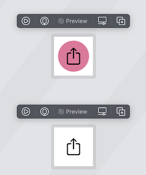
選択状態の場合とそうじゃない場合で、見た目を確認してみます。
プレビューはこんな感じ。
struct ContentView_Previews: PreviewProvider {
    static var previews: some View {
        Group {
            CustomButton(selected: .constant(.share), type: .share) // 選択状態.
            CustomButton(selected: .constant(.trash), type: .share) // 非選択状態.
        }
        .previewLayout(.fixed(width: 100, height: 100))
    }
}
画面上にボタンを並べる
では、画面上にボタンを並べてみます
struct ContentView: View {

    @State private var selected = ButtonType.share // 選択状態の初期値.

    var body: some View {
        HStack {
            // enumをforeachで回して、CustomButtonを横に並べる.
            ForEach(ButtonType.allCases, id: \.self) { type in
                CustomButton(selected: $selected, type: type)
            }
        }
    }
}
プレビューはこんな感じ
struct ContentView_Previews: PreviewProvider {
    static var previews: some View {
        Group {
            ContentView()
            Group {
                CustomButton(selected: .constant(.share), type: .share)
                CustomButton(selected: .constant(.trash), type: .share)
            }
            .previewLayout(.fixed(width: 100, height: 100))
        }
    }
}
では動かしてみます。
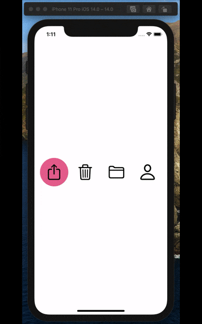
選択状態を切り替えて、見た目も変わるようになりましたね。
では、ここからアニメーションを追加していきましょう。
アニメーションさせる
まずはボタンの選択時の状態変化がアニメーションを伴うように、ボタンタップ時の挙動を一部修正します。
// 一部抜粋.

Button(action: {
    // ボタンタップ時の処理を、withAnimationメソッドのクロージャに渡す.
    withAnimation {
        selected = type
    }
}, label: {
    // enumから画像を表示する.
    Image(systemName: type.rawValue)
        .resizable()
        .renderingMode(.original)
        .aspectRatio(contentMode: .fit)
        .frame(width: 44, height: 44)
})
.matchedGeometryEffectを設定する
アニメーションさせたいViewに対して.matchedGeometryEffectを指定します。
これは、識別子とNamespaceを与えて、同期したいアニメーションをグルーピングする感じです。
まずはnamespaceを宣言します。
struct CustomButton: View {
    // 省略

    var namespace: Namespace.ID // namespaceを追加する.

    // 省略
}
次に、アニメーションさせたい背景ビューに対して.matchedGeometryEffectを指定します。
// 選択中だったら背景に円を描画する.
if selected == type {
    Circle()
        .fill(Color.accentColor) // AccentColorはAssetsで定義すること.
        // 識別子は、アニメーションを同期したいグループ間で一致していれば何でもいいです.
        .matchedGeometryEffect(id: "CustomButton", in: namespace)
}
次に、呼び出しているView側に修正を加えます
struct ContentView: View {

    @State private var selected = ButtonType.share

    // @Namespaceプロパティラッパーを使って、namespaceを宣言.
    @Namespace var namespace

    var body: some View {
        HStack {
            ForEach(ButtonType.allCases, id: \.self) { type in
                // 引数にnamespaceを与えるように修正する.
                CustomButton(selected: $selected, type: type, namespace: namespace)
            }
        }
    }
}
以上で完成です!
とても簡単にできちゃいますね!
プレビューは、こんな感じで修正しておけば動きます
struct ContentView_Previews: PreviewProvider {
    @Namespace static var namespace // static を忘れずに.
    static var previews: some View {
        Group {
            ContentView()
            Group {
                CustomButton(selected: .constant(.share), type: .share, namespace: namespace)
                CustomButton(selected: .constant(.trash), type: .share, namespace: namespace)
            }
            .previewLayout(.fixed(width: 100, height: 100))
        }
    }
}
まとめ
Heroアニメーションはテンション上がるので、他にも色々と試してみたいですね。