Webアプリのフロントエンド開発をしているときによくあるケースのCSSのTips集です。
私はWebエンジニアをしていてCSSもたまに書くのですがたまにしかないため、「こういう時どうやってCSSを書けばいいんだっけ?」となることが多く、都度、調べています。
自分の備忘録的な目的でまとめていますが、もし同じような問題に遭遇してやり方がわからないという方のお役に立てれば幸いです。
環境
以下の環境で確認をしています。(2020年9月時点で最新版の環境です。)
- macOS Catalina :10.15.6
- Chrome:85.0.4183.102
1. 一行に収まらない長さのテキストの場合は「...」で切る
やりたいこと

解決策
テキストのスタイルにoverflow-x: hidden;、text-overflow: ellipsis;、white-space: nowrap;を指定する
HTML
<div class="cut-long-text">
  一行に収まらない長さのテキストの場合は、途中でテキストを切って「...」で表示する
</div>
CSS
.cut-long-text{
  overflow-x: hidden;      /* はみ出る部分は非表示 */
  text-overflow: ellipsis; /* はみ出る部分を...で表示 */
  white-space: nowrap;     /* 行の折り返しをしない */
}
参考:APIリファレンス
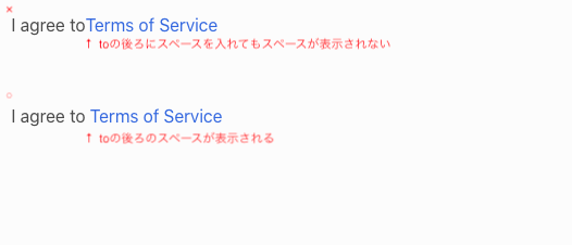
2. タグ内の最後のスペースを表示する
やりたいこと
<div>I agree to </div><a>Terms of Service</a>
のように、テキストの後ろにaタグのリンクテキストをつなげる場合。
この場合、toの後ろにスペースを入れたい。
(よくあるケースとしては下にある図のように、利用規約部分だけをリンクにしたい。)
解決策
white-space: pre;を指定する
HTML
<div>
  <div class="text-show-space">I agree to </div><a>Terms of Service</a>
</div>
CSS
.text-show-space {
  white-space: pre;
}
参考:APIリファレンス
3. 文字とアイコンの位置を揃える
やりたいこと
テキストとSVGアイコンを同じ行に表示するときに、テキストとアイコンの上下方向の位置を揃えたい

解決策
アイコンのline-heightをテキストと同じ高さに指定し、vertical-align: middle; を指定する
HTML
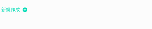
<div class="text-with-icon">新規作成</div>
<div class="icon-wrapper-alignment">
  <div class="icon">
    <svg width="16px" height="16px" aria-hidden="true" >
			...
    </svg>
  </div>
</div>
CSS
.text-with-icon {
  line-height: 30px;
}

.icon-wrapper-alignment {
  line-height: 30px;      /* テキストと同じline-heightにする */
}

.icon {
  vertical-align: middle; /* 上下中央に配置する */
}
参考:APIリファレンス
4. SVGアイコンの色をCSSから指定する
やりたいこと
SVGアイコンの色をCSSで指定したい
(テキストの色が状態によって変わるのでそれに合わせてアイコンの色も変えたい場合など)
解決策
svgアイコンのfillやstrokeの値にfill="currentColor"を指定する
HTML
<div class="text-info-color">新規作成</div>
<div class="icon-wrapper">
  <div class="icon text-info-color">
    <svg width="16px" height="16px" aria-hidden="true" focusable="false" data-prefix="fas"
         data-icon="plus-circle" class="svg-inline--fa fa-plus-circle fa-w-16" role="img"
         xmlns="http://www.w3.org/2000/svg" viewBox="0 0 512 512">
      <path fill="currentColor"
            d="...">
      </path>
    </svg>
  </div>
</div>
CSS
.text-info-color {
  color: turquoise;
}
参考:APIリファレンス
5. 両端にボタンを配置する
やりたいこと
Flexboxを使ってボタンを両端に配置したい
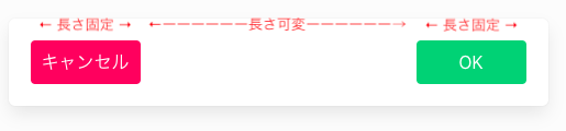
解決策
ボタンを囲む親要素にjustify-content: space-betweenを指定する
HTML
<div class="flex-container">
  <button>キャンセル</button>
  <button>OK</button>
</div>
CSS
.flex-container {
  display: flex;
  justify-content: space-between;
  width: 100%;
}
参考:APIリファレンス
6. ポップアップメニューを表示する
やりたいこと
ボタンを押したらそのすぐ横にポップアップメニューを表示したい。そのような場合のpositionの指定方法。

解決策
getBoundingClientRectでボタンの位置を取得して、ポップアップメニューの位置をabsoluteにする
HTML
<button class="button" id="button-menu">メニュー</button>
<div class="box menu" id="menu">
  <div class="menu-item">新規作成</div>
  <hr>
  <div class="menu-item">削除</div>
  <hr>
  <div class="menu-item">設定</div>
</div>
CSS
.menu {
  visibility: hidden;
  position: absolute;
}

.menu-item {
  line-height: 40px;
}
JavaScript
const buttonMenu = document.getElementById('button-menu')
const menu = document.getElementById('menu')

buttonMenu.addEventListener('click', () => {
  // ボタンの座標を取得する
  const buttonPosition = buttonMenu.getBoundingClientRect()

  // メニューの座標を設定する
  const style = menu.style;
  style.visibility = 'visible'
  style.top = `${buttonPosition.top + window.scrollY}px`
  style.left = `${buttonPosition.right + 20}px`
})
参考:APIリファレンス
7. 画像の縦横比を変えずに表示する
やりたいこと
画像を縦横比を変えずに表示させたい。
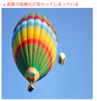
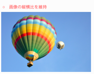
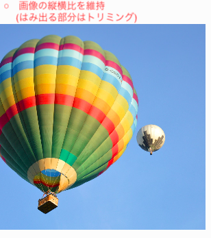
解決策
object-fitを利用する
HTML
<!-- 縦横比が変わってしまう -->
<img class="img-fill" src="images/hot-air-balloon-5390487_1920.jpg">

<!-- 縦横比を維持 -->
<img class="img-contain" src="images/hot-air-balloon-5390487_1920.jpg">

<!-- 縦横比を維持(はみ出る部分はトリミング) -->
<img class="img-cover" src="images/hot-air-balloon-5390487_1920.jpg">
CSS
.img-fill{
  object-fit: fill;    /* 縦横比が変わる */
  width: 300px;
  height: 300px;
}

.img-contain{
  object-fit: contain; /* 縦横比を維持 */
  width: 300px;
  height: 300px;
}

.img-cover{
  object-fit: cover;   /* 縦横比を維持(はみ出る部分はトリミング) */
  width: 300px;
  height: 300px;
}
参考:APIリファレンス
8. 画面全体を半透過でオーバーレイする
やりたいこと
ローディングやモーダルダイアログなどを出したいときに、背景となる画面全体を半透過でオーバーレイする

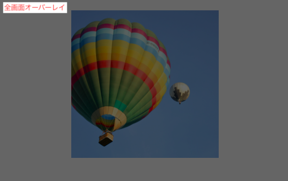
解決策
疑似要素(::before)を使用する
HTML
<div class="overlay"></div>
CSS
.overlay {
  position: fixed;
  top: 0;
  left: 0;
  background-color: rgba(0, 0, 0, 0.6);
}

.overlay::before {
  content: "";
  display: inline-block;
  height: 100vh;
  width: 100vw;
}
参考:APIリファレンス