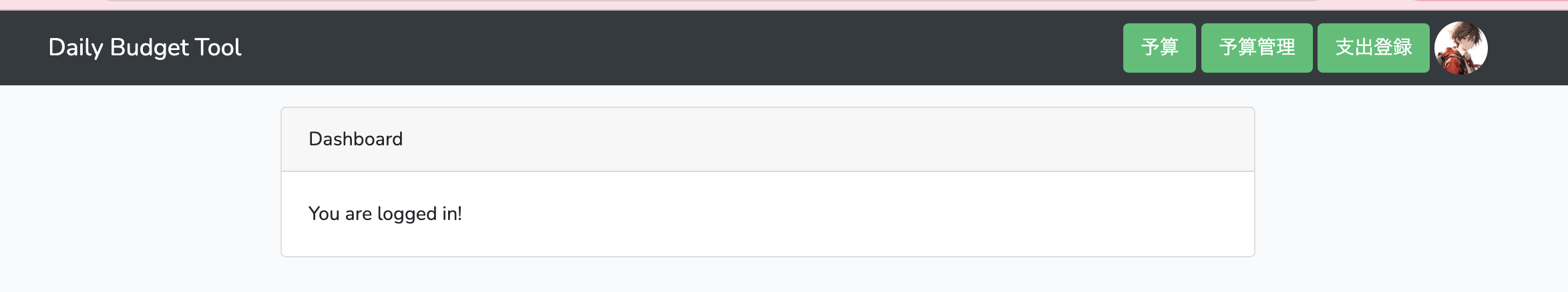
0
0

Delete article

Deleted articles cannot be recovered.

Draft of this article would be also deleted.

Are you sure you want to delete this article?

More than 1 year has passed since last update.

Bootstrapで画像をレスポンシブ&枠の中で綺麗に表示する

Posted at

目標

スクリーンショット 2024-04-11 18.53.21.png

右上のアイコンのようなものを表示したい

方法

header.blade.php
<div class="container-fluid bg-dark mb-3">
    <div class="container">
        <nav class="navbar navbar-dark">
            <span class="navbar-brand mb-0 h1">Daily Budget Tool</span>
            <div>
                <button class="btn btn-success">予算</button>
                <button class="btn btn-success">予算管理</button>
                <button class="btn btn-success">支出登録</button>
                <div class="profile-picture">
                    <!-- ⭐️↓ここ img-fluid -->
                    <img class="img-fluid" src="/assets/sample.jpg" alt="Profile Picture">
                </div>
            </div>
        </nav>
    </div>
</div>

img-fluidについて

max-width:100%;, height:auto; で表示され、親要素と同じ大きさになるように画像に適用される

参考

独自CSSも一応記載

style.css
.profile-picture {
  width: 40px;
  height: 40px;
  border-radius: 50%;
  overflow: hidden;
  vertical-align: middle;
  display: inline-block;
}
0
0
0

Register as a new user and use Qiita more conveniently

  1. You get articles that match your needs
  2. You can efficiently read back useful information
  3. You can use dark theme
What you can do with signing up
0
0

Delete article

Deleted articles cannot be recovered.

Draft of this article would be also deleted.

Are you sure you want to delete this article?