環境は以前の記事で作った環境を使用しています。 → Windows10でAnaconda python環境構築
numpyの使い方に関しては以前の記事を参考にしてください。
→ #Python基礎(#Numpy 1/2)
→ #Python基礎(#Numpy 2/2)
1.Matplotlibインポート
グラフ描画 : pyplotモジュールを使用
jupyter lab上で描画 : %matplotlib inline
%matplotlib inline

import numpy as np
import matplotlib.pyplot as plt
import numpy as np

x = np.linspace(-5, 5, num=10)  # -5から5まで10に区切る
# x = np.linspace(-5, 5) # デフォルトは50分割

print(x)
print(len(x))  # xの要素数
実行結果
[-5.         -3.88888889 -2.77777778 -1.66666667 -0.55555556  0.55555556
  1.66666667  2.77777778  3.88888889  5.        ]
10
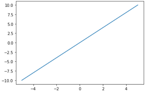
2.グラフ描画
import numpy as np
import matplotlib.pyplot as plt

x = np.linspace(-5, 5)  # -5から5まで
y = 2 * x  # xに2をかけてy座標とする

plt.plot(x, y)
plt.show()
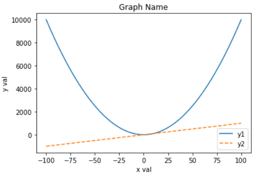
3.タイトル、凡例、線のスタイル
import numpy as np
import matplotlib.pyplot as plt

x = np.linspace(-100, 100, num=1000)
y_1 = x * x.T # x.T : 1行1000列 → 1000行1列に転置
y_2 = 10 * x

# 軸のラベル
plt.xlabel("x val")
plt.ylabel("y val")

# グラフのタイトル
plt.title("Graph Name")

# プロット 凡例と線のスタイルを指定
plt.plot(x, y_1, label="y1")
plt.plot(x, y_2, label="y2", linestyle="dashed")
plt.legend() # 凡例を表示

plt.show()
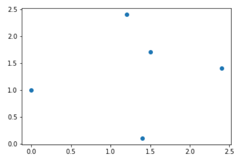
4.散布図
import numpy as np
import matplotlib.pyplot as plt

x = np.array([1.2, 2.4, 0.0, 1.4, 1.5])
y = np.array([2.4, 1.4, 1.0, 0.1, 1.7])

plt.scatter(x, y)  # 散布図のプロット
plt.show()
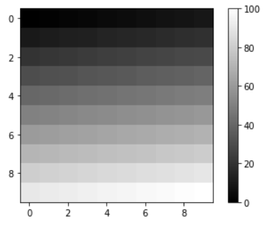
5.画像の表示
import numpy as np
import matplotlib.pyplot as plt

img = np.linspace(0, 100,num=100)  # 0から100までを100等分
print(img)
img = img.reshape(10,10) # 10 * 10 行列に変形
plt.imshow(img, "gray")  # グレースケールで表示
plt.colorbar()   # カラーバーの表示
plt.show()