時系列データを解析するとき、目的変数がどのように変化しているかを
時系列で確認するために、グラフとして可視化します。
手順
①日付カラムをインデックス化
df.set_index('Date')
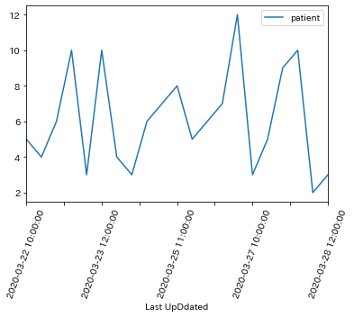
②プロット
df.plot()
plt.xticks(rotation=70)
③後の処理のために元に戻す
df = df.reset_index()
date.py
import pandas as pd
import matplotlib.pyplot as plt

df = pd.read_csv('dataset.csv')
df.head()

""" 出力
	patient	Last UpDdated
0	5.0	    2020-03-22 10:00:00
1	4.0	    2020-03-22 11:00:00
2	6.0	    2020-03-22 12:00:00
3	10.0	2020-03-23 10:00:00
4	3.0	    2020-03-23 11:00:00
"""

# 日付をインデックスにする
df = df.set_index('Last UpDdated')
df.head(3)

"""出力

Last UpDdated     patient
2020-03-22 10:00:00	 5.0
2020-03-22 11:00:00	 4.0
2020-03-22 12:00:00	 6.0
"""

# プロット
df.plot()
# X軸のラベルの角度をかえる
plt.xticks(rotation=70)
date.py
# 後の処理のためインデックスを戻しておく
df = df.reset_index()
df.head(3)

"""出力
    Last UpDdated	    patient
0	2020-03-22 10:00:00	5.0
1	2020-03-22 11:00:00	4.0
2	2020-03-22 12:00:00	6.0
"""