はじめに
自然言語処理を少し触ってみたかったので、簡単に使えそうなGoogle Cloud Natural Language APIを使ってみました。このAPIは与えられたデータの「エンティティ分析」や「構文解析」など行うことができるのですが、今回はぱっと見面白そうな「感情分析」を使用してみました。
解析するデータ
どの言語データの感情を分析するか迷ったのですが、一番身近な自分のtweetを使用してみました。おそらくtweetが一番自然な言葉の使い方をしているので、感情分析するには結構面白いと思います。
tweetのデータを取得するには以下のコードを書きました。
require 'twitter'
require 'uri'

class TwitterContent

  def initialize()
    client = Twitter::REST::Client.new do |config|
      config.consumer_key        = "YOUR_CONSUMER_KEY"
      config.consumer_secret     = "YOUR_CONSUMER_SECRET"
      config.access_token        = "YOUR_ACCESS_TOKEN"
      config.access_token_secret = "YOUR_ACCESS_SECRET"
    end

  end

  def get_tweets(count)

    tweets = [@client.user_timeline(count: 1)][0]
    remaining = count
    roop_count = 200

    until remaining == 0 do
      @client.user_timeline(count: roop_count, max_id: tweets.last.id-1).each do |t|
        remaining -= 1
        if remaining == 0
          break
        end

        unless URI.extract(t.text).empty?
          next
        end
        tweets << t

      end

      if remaining < 200
        roop_count = remaining
      end
    end
    tweets.map! {|t| t.text}
  end

end
ちなみに僕のtwitterはnewspickをシェアしてるものが多かったので、urlを含んでいるものは除外することにしました。
(#get_tweetsはtweetをほしい数だけ取得するのに書いたメソッドですが、我ながらとても汚いコードになっています... 改良したい...)
Google Natural Language API
このAPIの使い方は殆どドキュメントに記載されているクイックスタートと同様なので説明は省略します。データをjavascriptで扱いたかったので、Sinatraを使ってテンプレートに渡しています。
感情分析APIの返り値としては、scoreとmagnitudeが返ってきて、定義は次の様になっています。
- score: ドキュメントの全体的な感情 (-1.0~1.0:ネガティブ~ポジティブ)
- magnitude: ドキュメントに感情的な内容がどのくらい含まれているか
本来は分析対象のデータに合わせて、それぞれの値を解釈すると良いみたいです。今回はさっと概観したいだけなので、scoreのみを用います。
require 'sinatra'
require 'sinatra/reloader' if development?
require 'json'

require './twitter_content'
require "google/cloud/language"

get '/' do

  t = TwitterContent.new()
  tweets = t.get_tweets(500)

  language = Google::Cloud::Language.new
  sentiment_scores = []
  tweets.each do |t|
    sentiment_scores << language.analyze_sentiment( content: t, type: :PLAIN_TEXT).document_sentiment.score
  end

  scores = sentiment_scores.map! {|s| s.round(1)}

  #下記
end
google apiの認証に関してはいくつか方法があるみたいですが、今回はサービスアカウントによる認証を行っています。詳しくはこちら。
グラフ用のデータ前処理
今回はjsのC3.jsを使用してグラフ描画を試みました。以下のコードはグラフ描画用に値を前処理しています。x軸用のカテゴリ カテゴリごとのtweet数 全体に対してのカテゴリごとの割合をグラフ用に処理しているだけなので、もっとスマートがやり方もあると思います。
get '/' do

  #上記

  # [-1.0..1.0]を0.1刻みで作成
  categorical = []
  -1.0.step(1.0,0.1).each do |f|
    categorical << f.round(1)
  end

  # カテゴリごとの数を集計
  count_hash = Hash.new(0)
  scores.each do |s|
    count_hash[s.to_s] += 1
  end

  # カテゴリの値それぞれに値を貼り付ける。なかったら0
  scores_hash = {}
  categorical.each do |c|
    scores_hash[c] = count_hash.has_key?(c.to_s) ? count_hash[c.to_s] : 0
  end

  # 全体に関するそれぞれの値の割合
  scores_ratio = []
  scores_sum = scores_hash.values.inject(:+)
  scores_hash.values.each do |v|
    scores_ratio << ((v.to_f / scores_sum.to_f)*100).round(1)
  end


  @scores = scores_hash.values
  @categorical = categorical
  @count = tweets.count
  @scores_ratio = scores_ratio

  erb :index

end
C3.jsによるグラフ描画
あとはview側でグラフを描画するだけです。今回は二種類描画してみました。
※ C3.jsはD3のラッパーなので、D3.jsを入れる必要がありますが、D3.js v3が必要です。D3.js v4では動きません。
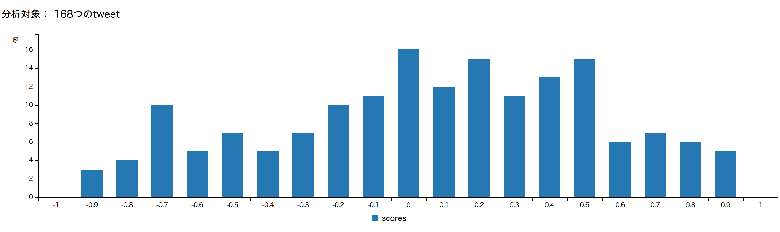
スコアごとの数
<!DOCTYPE html>
<html>
  <head>
    <link href="/css/c3.css" rel="stylesheet">
    <script src="https://d3js.org/d3.v3.min.js"></script>
    <script src="/js/c3.min.js"></script>
  </head>
  <body>
    <p>分析対象: <%= @count %>つのtweet</p>
    <div id="chart"></div>
    <div id="c2"></div>
    <script>
    window.onload = function(){
      const scores = <%= @scores %>
      const categorical = <%= @categorical %>
      const scores_ratio = <%= @scores_ratio%>

      const chart = c3.generate({
        data: {
             columns: [
                 ['scores'].concat(scores)
             ],
             type: 'bar'
         },
         axis: {
           x: {
               type: 'category',
               categories: categorical
           },
              y: {
                label: {
                  text: '個',
                  position: 'outer-top'
                }
              }
        }
      });
    }
    </script>
  </body>
</html>
全体に対するカテゴリごとの割合
ちょっと絶対数だけ見えてもよく分からないので、その割合を見てみましょう。
以下のように変更することで割合が見やすくなります。
<!DOCTYPE html>
<html>
  <head>
    <link href="/css/c3.css" rel="stylesheet">
    <script src="https://d3js.org/d3.v3.min.js"></script>
    <script src="/js/c3.min.js"></script>
  </head>
  <body>
    <p>分析対象: <%= @count %>つのtweet</p>
    <div id="chart"></div>
    <div id="c2"></div>
    <script>
    window.onload = function(){
      const scores = <%= @scores %>
      const categorical = <%= @categorical %>
      const scores_ratio = <%= @scores_ratio%>

      const chart = c3.generate({
          data: {
              columns: [
                  ['scores_ratio'].concat(scores_ratio)
              ],
              types: {
                  scores_ratio: 'area'
              }
          },
          axis: {
            x: {
              type: 'category',
              categories: categorical
            },
            y: {
              label: {
                text: '%(パーセント)',
                position: 'outer-top'
              }

            }
          }
      });

    }
    </script>
  </body>
</html>

今回は最新500件のtweetの内、urlを含まない168つのtweetが分析対象になりました。
こう概観してみると、微妙にポジティブな方が多いかな?という感じですね。もちろんmagnitudeなど度外視しているので実際のところはなんとも言えませんが、大体でも可視化できると結構楽しいものです。皆さんもぜひやってみて下さい。
やってみて
なんとなく思いついたことでしたが、とても楽しかったです。けど、それにも増してコードの書けなさを実感しました。特にeachしかブロック扱えていないのが、素人感にじみ出ていますね... データの処理もっと上手くなりたい。
参考
D3 Document
C3 Document
Google Natural Language API
Twitter Gem