Stripe Elementsで描画される決済フォームは、セキュリティなどの目的でiframeの中に配置されます。
そのため、CSSでの内容・見た目のカスタマイズはElement Appearance APIを利用して行う必要があります。
この記事では、Payment Elementsの見た目を調整する方法を紹介します。
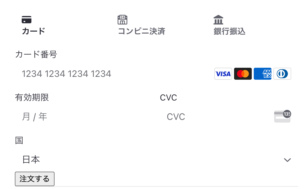
プリセットスタイル(テーマ)で設定する
StripeのPayment Elementsでは、いくつかのスタイルプリセットが用意されています。
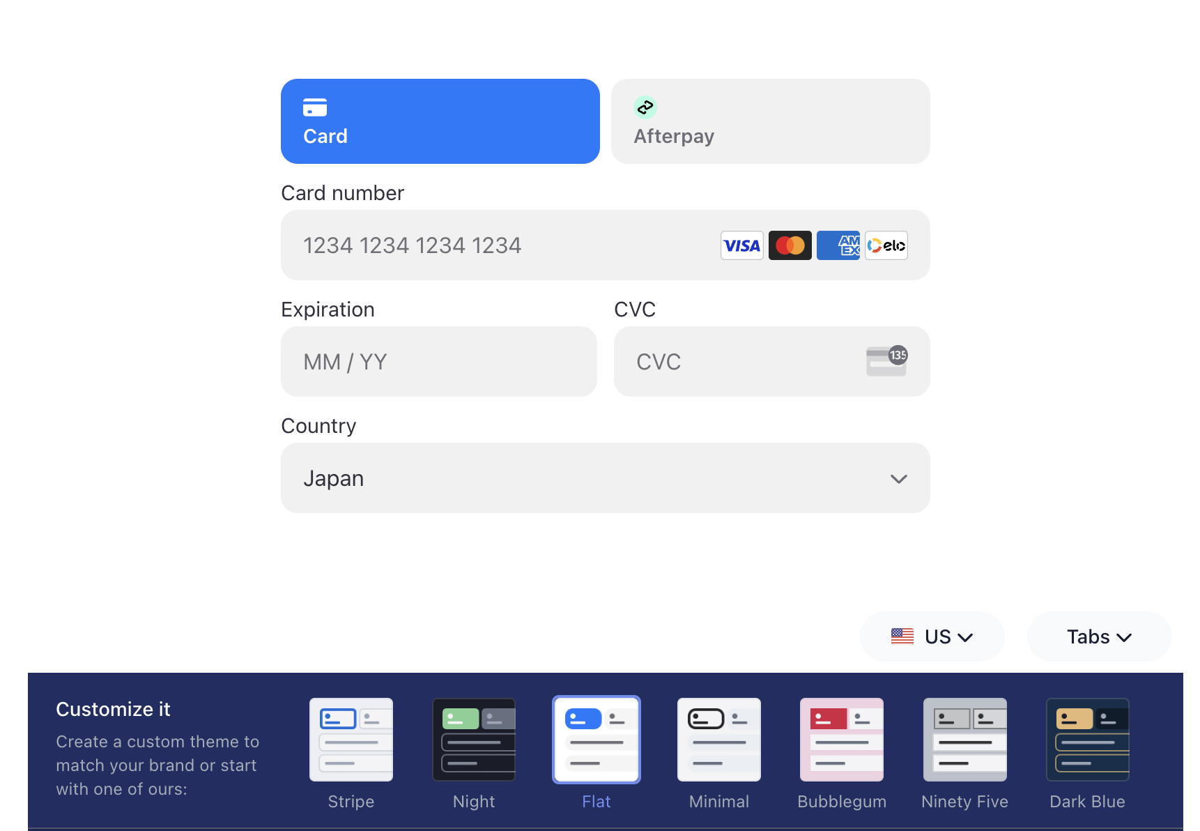
これらは、<Elements/>のoptions.appearanceで設定します。
    <Elements
      stripe={loadStripe(process.env.NEXT_PUBLIC_STRIPE_PUBLISHABLE_API_KEY)}
      options={{
        appearance: {
          theme: 'stripe'
        },
        clientSecret: piClientSecret,
      }}
    >
Darkモード用のテーマも用意されています。
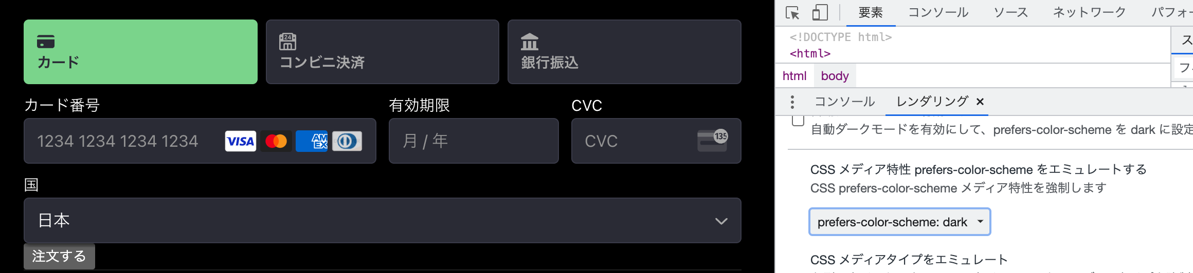
以下のサンプルでは、prefers-color-schemeを利用して、動的にテーマを切り替えます。
export default function Root() {

  /**
   * Payment Intentを作成する処理
   * React v18以降でのuseEffectが2回実行される挙動を、useRefを利用して抑止するワークアラウンドを追加
   **/
  const hasAPICalledRef = useRef(false)
  const [piClientSecret, setPiClientSecret] = useState('')
  useEffect(() => {
    if (hasAPICalledRef.current) return
    hasAPICalledRef.current = true
    fetch('http://localhost:3000/create_payment_intent', {
      method: 'post'
    }).then(data => data.json())
      .then(response => setPiClientSecret(response.clientSecret))
  }, [])

  /**
   * ブラウザの設定がダークモードか否かを判定する処理
   **/
  const [isDarkMode, setIsDarkMode] = useState(false)
  useEffect(() => {
    // Next.jsを想定したSSR対策
    if (!window) return

    // Stateを更新する処理
    const onSelectColorScheme = (e: {matches:boolean}) => {
      setIsDarkMode(e.matches)
    }

    // ブラウザの設定が変わったことを検知するイベントリスナーを追加
    window.matchMedia('(prefers-color-scheme: dark)')
      .addEventListener('change', onSelectColorScheme)

    // 初回読み込み時の判定処理
    const isDarkMode = window?.matchMedia('(prefers-color-scheme: dark)').matches
    onSelectColorScheme({
      matches: isDarkMode
    })

    return () => {
      // unmount時にイベントリスナーを解除
      window.matchMedia('(prefers-color-scheme: dark)').removeEventListener('change', onSelectColorScheme)
    }
  },[])


  if (!piClientSecret) return null;
  return (
    <Elements
      stripe={loadStripe(process.env.NEXT_PUBLIC_STRIPE_PUBLISHABLE_API_KEY as string)}
      options={{
        appearance: {
          // 通常とダークモードでテーマが変わるように設定
          theme: isDarkMode ? 'night' : 'stripe',
        },
        clientSecret: piClientSecret,
      }}
    >
      <Home />
    </Elements>
  )
}
CSS変数をカスタマイズする
ElementsのCSSには、CSS Variablesが設定されています。
この値をAppearance APIから変更することで、フォントや色・マージンなどを調整できます。
    <Elements
      stripe={loadStripe(process.env.NEXT_PUBLIC_STRIPE_PUBLISHABLE_API_KEY)}
      options={{
        appearance: {
          theme: 'stripe',
          variables: {
            colorPrimary: '#2b8501',
            colorBackground: '#eeeeee',
            colorText: '#54883c',
            colorDanger: '#654321',
            fontFamily: 'Osaka',
            spacingUnit: '5px',
            borderRadius: '4px',
            spacingTab: '10px',
            spacingGridRow: '20px',
            spacingGridColumn: '50px'
          },
        },
        clientSecret: piClientSecret,
      }}
    >
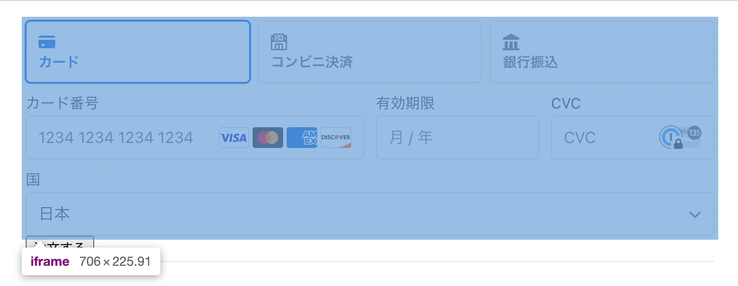
テキストやフォームの背景色を変更できました。

利用できる変数名は、ドキュメントのCommonly used bariablesとLess commonly used variablesをご確認ください。
RulesでCSSを上書きする
CSS変数だけではカスタマイズできない箇所がある場合、CSSをJSオブジェクトとして上書きできます。
options.appearance.rulesに、「クラス名 - ルール」で定義しましょう。
    <Elements
      stripe={loadStripe(process.env.NEXT_PUBLIC_STRIPE_PUBLISHABLE_API_KEY)}
      options={{
        appearance: {
          theme:  'stripe',
          rules: {
            '.Tab': {
              borderRadius: '0',
              border: '1px solid #E0E6EB',
              boxShadow: '0px 1px 1px rgba(0, 0, 0, 0.03), 0px 3px 6px rgba(18, 42, 66, 0.02)',
            },
            '.Tab:hover': {
              color: 'var(--colorText)',
            },
            '.Tab--selected': {
              borderColor: '#E0E6EB',
              boxShadow: '0px 1px 1px rgba(0, 0, 0, 0.03), 0px 3px 6px rgba(18, 42, 66, 0.02), 0 0 0 2px var(--colorPrimary)',
            },
            '.Input': {
              borderRadius: '0',
            },
            '.Input--invalid': {
              boxShadow: '0 1px 1px 0 rgba(0, 0, 0, 0.07), 0 0 0 2px var(--colorDanger)',
            },
          }
        },
        clientSecret: piClientSecret,
      }}
    >
このサンプルでは、borderの色や曲がり具合などをカスタマイズしています。
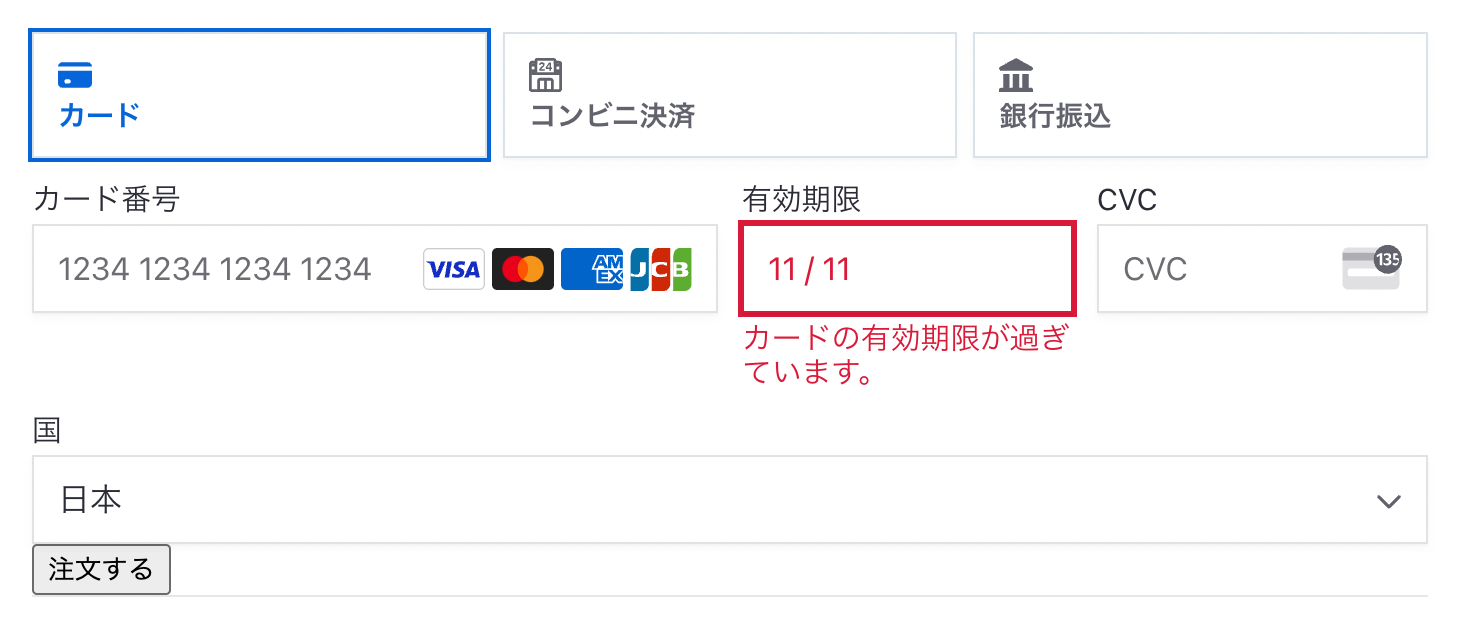
利用できるルール(クラス名やステートなど)は、ドキュメントにて確認できます。
プリセット(テーマ)を使わずに見た目を調整する
VariablesとRulesを利用して、独自のデザインを設定することもできます。
その場合、theme: 'none'設定しましょう。
    <Elements
      stripe={loadStripe(process.env.NEXT_PUBLIC_STRIPE_PUBLISHABLE_API_KEY)}
      options={{
        appearance: {
-          theme: 'stripe'
+          theme: 'none'
        },
        clientSecret: piClientSecret,
      }}
    >
Stripe側による見た目の装飾が最小限になります。
あとはoptions.appearance.variablesとoptions.appearance.rulesを利用してカスタマイズしましょう。
    <Elements
      stripe={loadStripe(process.env.NEXT_PUBLIC_STRIPE_PUBLISHABLE_API_KEY)}
      options={{
        appearance: {
          theme:  'none',
          variables: {
            colorPrimary: '#2b8501',
            colorDanger: '#654321',
            fontFamily: 'Osaka',
            spacingUnit: '5px',
            borderRadius: '4px',
            spacingGridColumn: '50px'
          },
          rules: {
            '.Tab': {
              border: '1px solid #E0E6EB',
              boxShadow: '0px 1px 1px rgba(0, 0, 0, 0.03), 0px 3px 6px rgba(18, 42, 66, 0.02)',
            },
            '.Tab:hover': {
              color: 'var(--colorText)',
            },
            '.Tab--selected': {
              borderColor: '#E0E6EB',
              boxShadow: '0px 1px 1px rgba(0, 0, 0, 0.03), 0px 3px 6px rgba(18, 42, 66, 0.02), 0 0 0 2px var(--colorPrimary)',
            },
            '.Input': {
              border: '1px solid #E0E6EB',
              boxShadow: '0px 1px 1px rgba(0, 0, 0, 0.03), 0px 3px 6px rgba(18, 42, 66, 0.02, 0 0 0 2px var(--colorPrimary))',
            },
            '.Input--invalid': {
              boxShadow: '0 1px 1px 0 rgba(0, 0, 0, 0.07), 0 0 0 2px var(--colorDanger)',
            },
          }
        },
        clientSecret: piClientSecret,
      }}
    >

[PR] Stripe開発者向け情報をQiitaにて配信中!
- [Stripe Updates]:開発者向けStripeアップデート紹介・解説
- ユースケース別のStripe製品や実装サンプルの紹介
- Stripeと外部サービス・OSSとの連携方法やTipsの紹介
- 初心者向けのチュートリアル(予定)
など、Stripeを利用してオンラインビジネスを始める方法について週に2〜3本ペースで更新中です。