これは
Plotlyは少ないコードで綺麗なグラフがかけますが, matplotlibばかり使っていてあまりよく知らなかったので調べながら入門してみた人の備忘録です
環境
Google colaboratory
インストール
colabであればインストールはありませんが、必要な場合はpipでインストールできます
pip install plotly
データの準備
seabornですぐ使える時系列データがあったのでそれを使ってみます. 以下はデータの準備なので飛ばしてください
import seaborn as sns
import pandas as pd
from calendar import month_name

month_name_mappings = {name[:3]: n for n, name in enumerate(month_name)}

# ただのデータの準備
df = sns.load_dataset('flights')
df["month"] = df.month.apply(lambda x: month_name_mappings[x])
df["year-month"] = pd.to_datetime(df.year.astype(str) + "-" + df.month.astype(str))
ts_data = df[["passengers", "year-month"]].set_index("year-month")["passengers"]
ts_data
year-month
1949-01-01    112
1949-02-01    118
1949-03-01    132
1949-04-01    129
1949-05-01    121
             ...
1960-08-01    606
1960-09-01    508
1960-10-01    461
1960-11-01    390
1960-12-01    432
Name: passengers, Length: 144, dtype: int64
月ごとの乗客数のシンプルなデータです.
基本操作
グラフを作成してみます
import plotly.graph_objects as go

fig = go.Figure()
fig.show()
グラフができた. ここに色々追加していくのですね
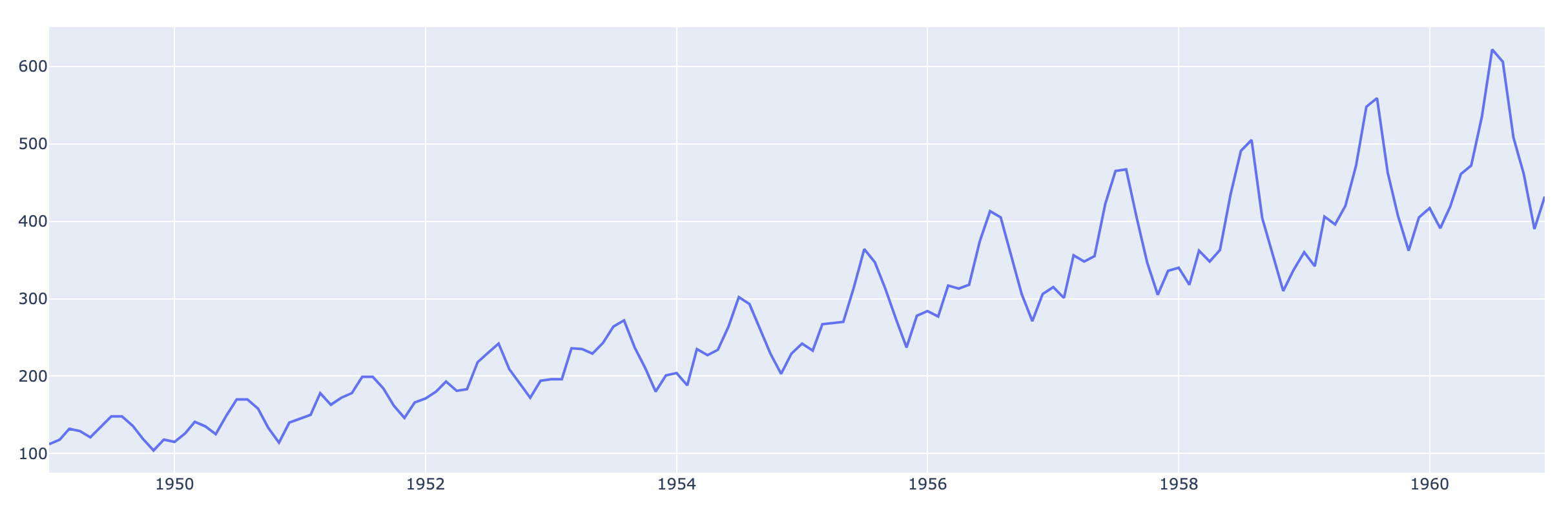
# 折れ線グラフ
fig = go.Figure()
fig.add_trace(go.Scatter(x=ts_data.index, y=ts_data.values, name="passengers"))
fig.show()
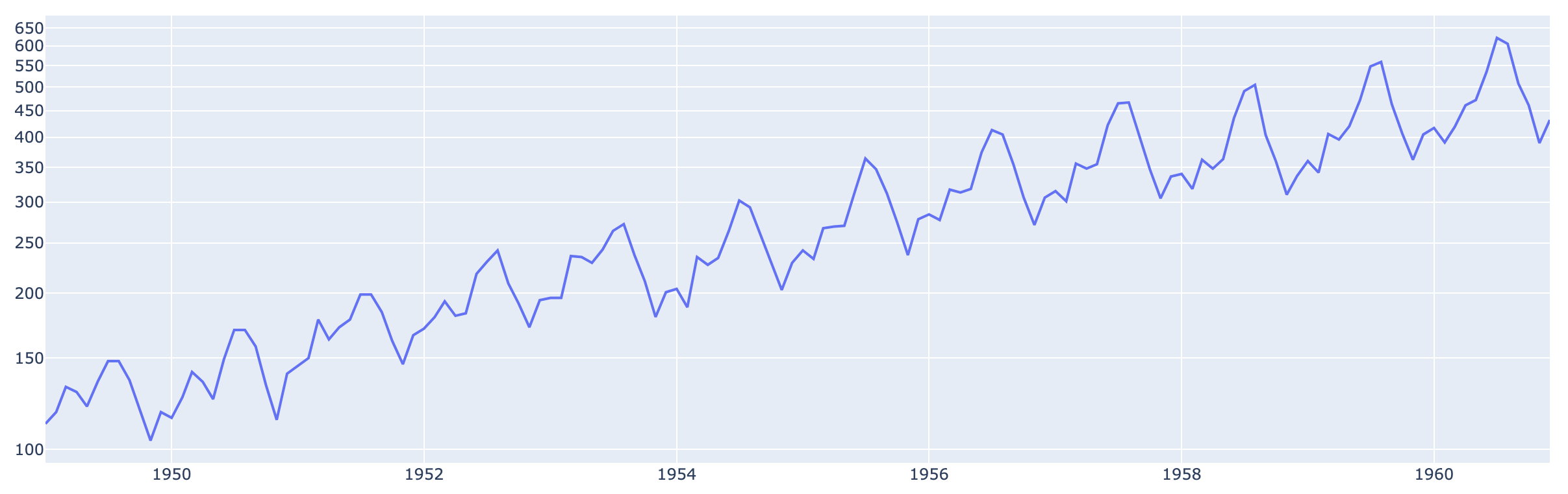
メモリを対数表示にしてみる
# 折れ線グラフ
fig = go.Figure()
fig.add_trace(go.Scatter(x=ts_data.index, y=ts_data.values, name="passengers"))

# 見た目のカスタマイズはlayoutをいじる
fig.update_layout(yaxis_type="log")
fig.show()
豪華なグラフを描きたい
もっと豪華にしたくなってきたので, 無理やり色々可視化してみます
- 月ごとにデータを分割?して, 各データの変化を折れ線グラフにする
- 年ごとの合計乗客数を棒グラフにしてみる
# 少しデータをこねこねする
ts_data_monthly = df.groupby("month")["passengers"].apply(list)
ts_sum_yearly = df.groupby("year")["passengers"].sum()
# 複数の折れ線グラフにしたい
ts_data_monthly
month
1     [112, 115, 145, 171, 196, 204, 242, 284, 315, ...
2     [118, 126, 150, 180, 196, 188, 233, 277, 301, ...
3     [132, 141, 178, 193, 236, 235, 267, 317, 356, ...
4     [129, 135, 163, 181, 235, 227, 269, 313, 348, ...
5     [121, 125, 172, 183, 229, 234, 270, 318, 355, ...
6     [135, 149, 178, 218, 243, 264, 315, 374, 422, ...
7     [148, 170, 199, 230, 264, 302, 364, 413, 465, ...
8     [148, 170, 199, 242, 272, 293, 347, 405, 467, ...
9     [136, 158, 184, 209, 237, 259, 312, 355, 404, ...
10    [119, 133, 162, 191, 211, 229, 274, 306, 347, ...
11    [104, 114, 146, 172, 180, 203, 237, 271, 305, ...
12    [118, 140, 166, 194, 201, 229, 278, 306, 336, ...
Name: passengers, dtype: object
# 棒グラフにしたい
ts_sum_yearly
year
1949    1520
1950    1676
1951    2042
1952    2364
1953    2700
1954    2867
1955    3408
1956    3939
1957    4421
1958    4572
1959    5140
1960    5714
Name: passengers, dtype: int64
# ラベル(x軸)
ts_labels = ts_sum_yearly.index
ts_labels
Int64Index([1949, 1950, 1951, 1952, 1953, 1954, 1955, 1956, 1957, 1958, 1959,
            1960],
           dtype='int64', name='year')
可視化してみます. layoutを少しいじってみました
fig = go.Figure()

# 月ごとの時系列データは折れ線グラフにする
for month, passengers in ts_data_monthly.iteritems():
    fig.add_trace(go.Scatter(x=ts_labels, y=passengers, name=str(month)+"月", yaxis='y2'))

# 年ごとの合計は棒グラフにする
fig.add_trace(go.Bar(x=ts_labels, y=ts_sum_yearly.values, name="合計", yaxis="y1"))

# 見た目のカスタマイズはlayoutをいじる
# 軸が2つあるのでメモリは無しにする
fig.update_layout(
    title={
        "text": "乗客数時系列データ",
        "x":0.5,
        "y": 0.9
    },
    legend={
        "orientation":"h",
        "x":0.5,
        "xanchor":"center"
    },
    yaxis1={
        "title": "乗客数(合計)",
        "side": "left",
        "showgrid":False
    },
    yaxis2={
        "title": "乗客数(月ごと)",
        "side": "right",
        "overlaying": "y",
        "showgrid":False
    }
)
fig.show()
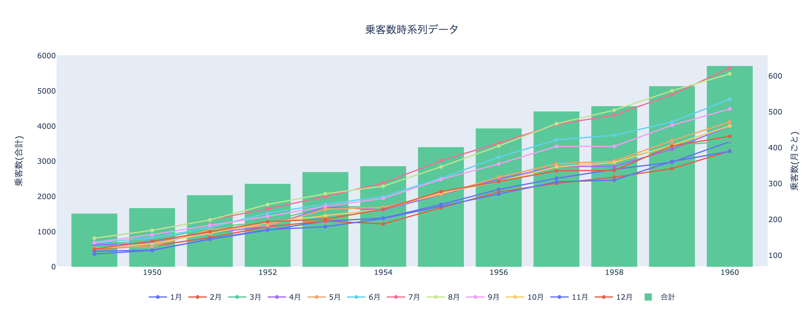
凡例をぽちぽちしたりできます. こんな少ないコードでちょっと動かせるグラフが書けるのは感動です...
その他
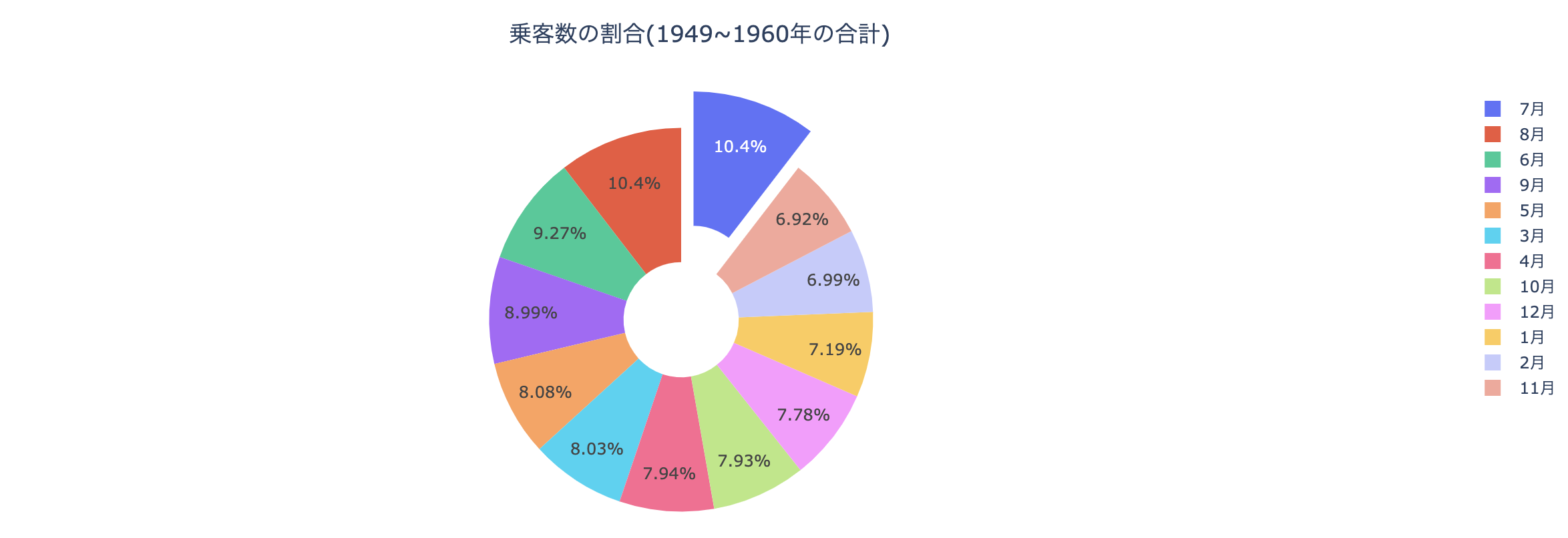
ドーナッツ(かわいい)
import numpy as np

ts_sum_monthly = df.groupby("month")["passengers"].sum()
# 一番乗客が多い月を切ったピザみたいにする
pull=[0]*12
pull[np.argmax(ts_sum_monthly.values)] = 0.2

fig = go.Figure()
fig.add_trace(go.Pie(
    labels=[str(month) + "月" for month in ts_sum_monthly.index],
    values=ts_sum_monthly.values,
    hole=.3,
    pull=pull
    )
)
fig.update_layout(
    title={
        "text": "乗客数の割合(1949~1960年の合計)",
        "x":0.5,
        "y": 0.9
    }
)
fig.show()
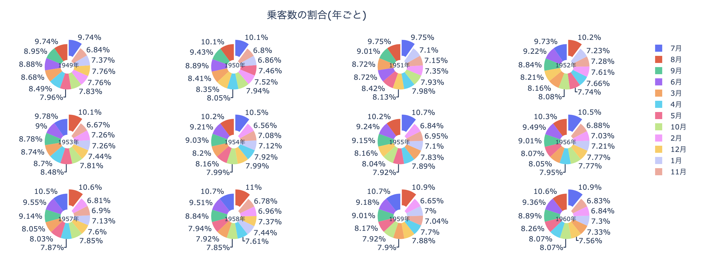
年ごとに合計乗客数求めて円グラフを作成
from plotly.subplots import make_subplots

specs = [[{'type':'domain'}, {'type':'domain'}, {'type':'domain'}, {'type':'domain'}] for _ in range(3)]
# 3*4のグリッドにグラフを分割する
fig = make_subplots(rows=3, cols=4, specs=specs)

# ラベルの各円グラフのラベルのタイトルの位置
pos_x = [0.09, 0.37, 0.63, 0.91]
pos_y = [0.9, 0.5, 0.1]
annotations = []

# (row, col)の位置に円グラフを載せる
row = 0
for i, (year, df_yearly) in enumerate(df.groupby(["year"])[["month","passengers"]]):
    pull=[0]*12
    pull[np.argmax(df_yearly.passengers.values)] = 0.2
    col = i%4+1
    if col == 1:
        row += 1
    annotations.append({
        "text": str(year)+"年",
        "x": pos_x[col-1],
        "y": pos_y[row-1],
        "font_size": 10,
        "showarrow":False
    })
    fig.add_trace(go.Pie(
        labels=[str(month) + "月" for month in df_yearly.month.values],
        values=df_yearly.passengers.values,
        name=str(year)+"年",
        hole=.3,
        pull=pull
    ),
    row, col
    )

fig.update_layout(
    title={
        "text": "乗客数の割合(年ごと)",
        "x":0.5,
        "y": 0.9
    },
    annotations=annotations
)
fig.show()
終わり
グラフが動くと嬉しいのは私だけでしょうか. 次回はplotlyでダッシュボードが作れるdashというWebフレームワークについてまとめたいと思います.