実験やフィールドワークで得た、2D座標(x,y)とdataの組から
2D分布図をつくりたい。
サンプルデータ
python3.6.py
import numpy as np

n    = 100                            # 100ポイントのデータ
x    = np.random.rand(n)              # x座標
y    = np.random.rand(n)              # y座標
data = np.sin( x * np.pi + y * np.pi) # 例えばsinデータとします
| x | y | data |
|---|---|---|
| 0.414107 | 0.258962 | 0.855795 |
| 0.746765 | 0.106237 | 0.445567 |
| 0.886290 | 0.200612 | -0.269632 |
| ... | ... | ... |
| このようなデータとします。 | ||
| 格子点上のデータでもよい |
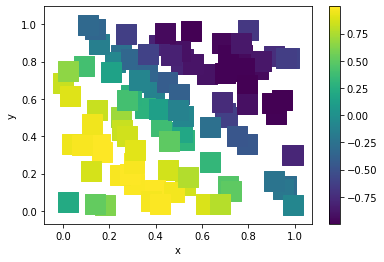
散布図を使った例
散布図の各点の色をデータに対応させます。
格子点上のデータだとマーカーを四角にするときれいに見えるかもしれない。
python3.6.py
import matplotlib.pyplot as plt

plt.scatter(x,y,c=data,s=400,marker="s")
plt.xlabel("x")
plt.ylabel("y")
plt.colorbar()
pcolorを使った例
格子点上にデータがあればnp.meshgridがいい感じに使えるかもしれないが、
そうでないときはmeshgrid上にデータを補完してpcolorで描画する。
補完には scipy.interpolate の Rbf を使う
python3.6.py
from scipy.interpolate import Rbf

def rbf_plot( x, y, z,
              xlim=[],ylim=[],epsilon=2, n=100,
              markersize= 200, file = ""
            ):
    # x          : x座標        numpy.array
    # y          : y座標        numpy.array
    # z          : データ       numpy.array
    # xlim       : 図のx軸範囲   list / numpy.array
    # ylim       : 図のy軸範囲   list / numpy.array
    # epsilon    : Rbfのパラメタ int
    # n          : 補完点数      int
    # markersize : 散布図マーカーのサイズ int
    # file       : 保存図のファイル名    str

    if not xlim: xlim=[np.min(x),np.max(x)]
    if not ylim: ylim=[np.min(y),np.max(y)]

    tx = np.linspace(*xlim,n)
    ty = np.linspace(*ylim,n)
    XI, YI = np.meshgrid(tx, ty)
    rbf = Rbf(x, y, z, epsilon=epsilon)
    ZI = rbf(XI, YI)

    plt.subplot(1, 1, 1)
    plt.pcolor(XI, YI, ZI)
    plt.scatter(x, y, c=z, s=markersize,edgecolor="white")
    plt.title('RBF interpolation - multiquadrics')
    plt.xlim(xlim)
    plt.ylim(ylim)
    plt.colorbar()
    if file: plt.savefig(file)
    plt.show()

# 実行
rbf_plot(x,y,data,xlim=[0,1],ylim=[0,1],file="output.png")

注意:分布が滑らかであるという確証があるときだけ使うこと。
python3.6.py
rbf_plot(x,y,data,
         xlim=[-4,4],ylim=[-4,4],
         markersize=0,file="output.png"
        )

当然データの座標より広い範囲を指定してはいけない