目標
こんな図をRで書けるようになります。

データフレームの用意
標本の分布を描くにはデータフレームの準備が必要です。例えば次のようなデータを持っていたとします。
X <- c(1,2,3,4,5)
Y <- c(6,7,8,9,10)
Z <- c(11,12,13,14,15)
X
[1] 1 2 3 4 5
Y
[1]  6  7  8  9 10
Z
[1] 11 12 13 14 15
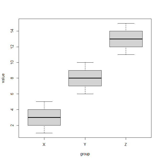
簡単に箱ひげ図(ボックスプロット)が書けます。
boxplot(X, Y, Z, names=c("X","Y","Z"))

標本のグループ数が、4個、5個と増えていくと長くなって大変なので、データフレームにするのが基本です。また、今後使うggplotでは、基本的にデータフレームです。
value <- c(X, Y, Z) # 3つのグループを結合させる
value
 [1]  1  2  3  4  5  6  7  8  9 10 11 12 13 14 15
group <- c(rep("X",5), rep("Y",5), rep("Z",5)) # valueが対応するグループ情報を作る
group
 [1] "X" "X" "X" "X" "X" "Y" "Y" "Y" "Y" "Y" "Z" "Z" "Z" "Z" "Z"
dat <- data.frame(value,group) # データフレームを作成
dat
   value group
1      1     X
2      2     X
3      3     X
4      4     X
5      5     X
6      6     Y
7      7     Y
8      8     Y
9      9     Y
10    10     Y
11    11     Z
12    12     Z
13    13     Z
14    14     Z
15    15     Z
これで値とグループの情報がひとまとめになったデータフレームdatができました。これを使ってふたたびボックスプロットを書きます。
boxplot(value~group, data=dat)
同じボックスプロットが書けました。value~groupはgroupの情報に分けてvalueでボックスプロットを書けという意味の式です。data=で使用するデータフレームを指定します。
使用する標本データ
今回はRに組み込まれているirisを使います。
head(iris)
  Sepal.Length Sepal.Width Petal.Length Petal.Width Species
1          5.1         3.5          1.4         0.2  setosa
2          4.9         3.0          1.4         0.2  setosa
3          4.7         3.2          1.3         0.2  setosa
4          4.6         3.1          1.5         0.2  setosa
5          5.0         3.6          1.4         0.2  setosa
6          5.4         3.9          1.7         0.4  setosa
とりあえずirisのボックスプロット
データフレームからボックスプロットを書く記法に従って、ボックスプロットを書きましょう。
boxplot(Sepal.Length~Species, data=iris)
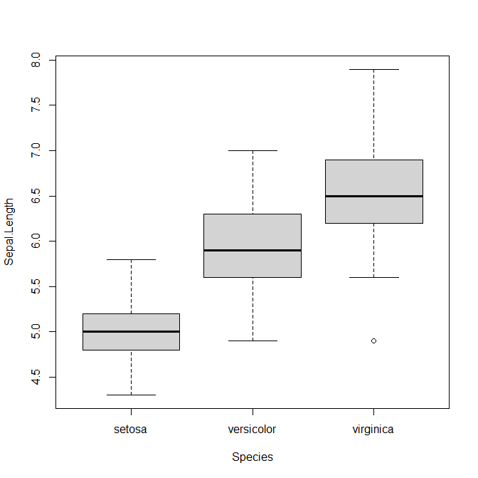
簡単に書けました。
でも、もっと高度なプロットを書きたいというユーザーのために、ggplot2というパッケージが開発されていますので、使ってみましょう。
とりあえずパッケージをインストール
パッケージggplot2、ggbeeswarm、gridExtraを使うので、それぞれインストールしておいてください。インストールしたら読み込んでおきましょう。
library(ggplot2)
library(ggbeeswarm)
library(gridExtra)
ggplotでボックスプロットを書く
ggplot(data=iris, aes(x=Species, y=Sepal.Length)) +
 geom_boxplot()
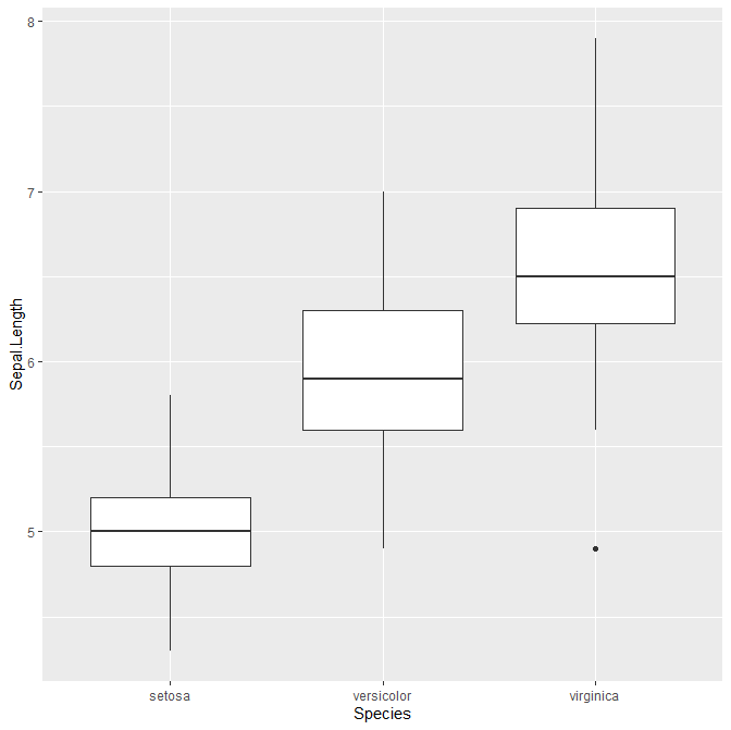
これでちょっとオシャレなボックスプロットを書けました。ggplot()でデータを指定して、+に続けてgeom_boxplot()と書くことでボックスプロットが書けます。
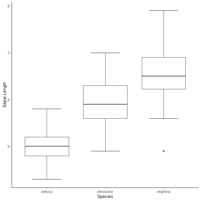
背景を逆にシンプルにしたいという方は、さらに+に続けてtheme_classic()を入れておくと、シンプルな画面になります。
ggplot(data=iris, aes(x=Species, y=Sepal.Length)) +
 geom_boxplot() +
 theme_classic()
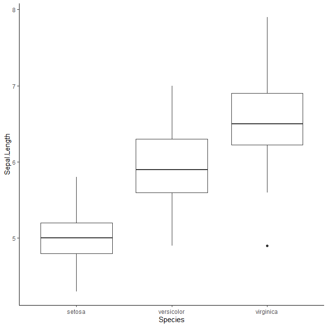
Rのデフォルトのboxplotで書いたのとの違いは、ひげの両端にある横棒がないことです。この横棒のことはstaplewexと言います。ggplotでも書きたい場合は、エラーバーで代用することができます。
ggplot(data=iris, aes(x=Species, y=Sepal.Length)) +
 stat_boxplot(geom="errorbar", width=0.5) +
 geom_boxplot() +
 theme_classic()
stat_boxplot(geom="errorbar")でstaplewex(のようなもの)を作ることができました。widthで長さを指定できます。
箱に色を付けたい場合はfillを加えます。
ggplot(data=iris, aes(x=Species, y=Sepal.Length, fill=Species)) +
 stat_boxplot(geom="errorbar", width=0.5) +
 geom_boxplot() +
 theme_classic()
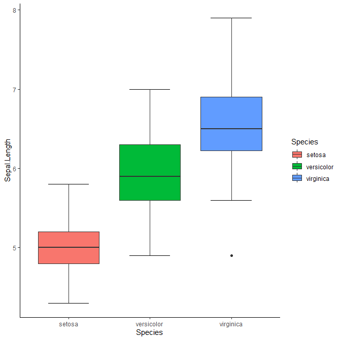
凡例が邪魔だなという方は、theme(legend.position = "none")を加えます。
ggplot(data=iris, aes(x=Species, y=Sepal.Length, fill=Species)) +
 stat_boxplot(geom="errorbar", width=0.5) +
 geom_boxplot() +
 theme_classic() +
 theme(legend.position = "none")

色分けをせず、同じ色で塗りつぶしたい場合は、geom_boxplot()の方にfillを加えます。
ggplot(data=iris, aes(x=Species, y=Sepal.Length)) +
 stat_boxplot(geom="errorbar", width=0.5) +
 geom_boxplot(fill="grey") +
 theme_classic()
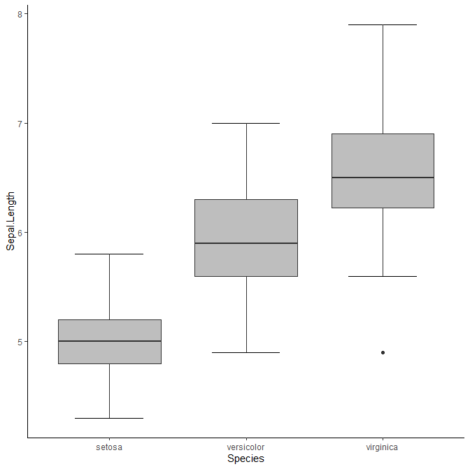
これで、Rのデフォルトで入っているboxplot()と同じような図を作ることができました。
バイオリンプロットを描く
最近はボックスプロットでも分布の本質がわかりにくいということで、いくつか違う描き方が提案されてます。まずはバイオリンプロットです。
ggplot(data=iris, aes(x=Species, y=Sepal.Length)) +
 geom_violin()

ボックスプロットよりも分布が滑らかにイメージできます。背景や色塗りなどの記法は同じです。
ggplot(data=iris, aes(x=Species, y=Sepal.Length)) +
 geom_violin(fill="grey") +
 theme_classic()

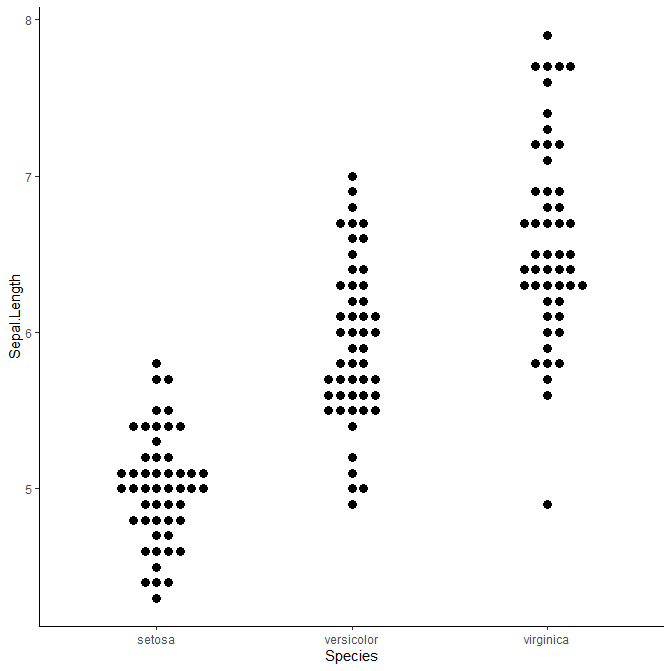
ジッタープロットを描く
すべてのデータ点を表示してしまうというジッタープロットもあります。
ggplot(data=iris, aes(x=Species, y=Sepal.Length)) +
 geom_jitter() +
 theme_classic()

横方向の点の配置はランダムです。
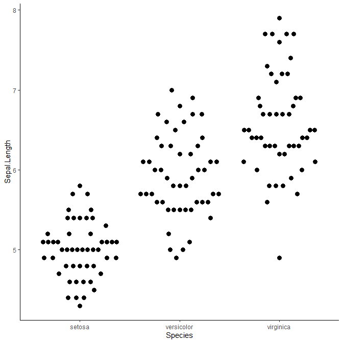
スウォームプロットを描く
ジッタープロットよりももっとデータ点を整列させたのがスウォームプロットです。
ggplot(data=iris, aes(x=Species, y=Sepal.Length)) +
 geom_beeswarm() +
 theme_classic()

点のサイズや間隔を調整することもできます。
ggplot(data=iris, aes(x=Species, y=Sepal.Length)) +
 geom_beeswarm(size=3, cex=2) +
 theme_classic()
データ点を上手に配置して躍動的に見せることもできます。たとえばmethod="smiley"を加えることで、笑っているような感じになります。
ggplot(data=iris, aes(x=Species, y=Sepal.Length)) +
 geom_quasirandom(size=3, method="smiley") +
 theme_classic()
複数のプロットを重ねる
ggplotの真骨頂は、複数のプロットを簡単に重ねられることです。ここまで描いてきたボックスプロット、バイオリンプロット、スウォームプロットを全部重ねましょう。
ggplot(data=iris, aes(x=Species, y=Sepal.Length)) +
 geom_violin() +
 geom_boxplot(fill="grey", width=0.3) +
 geom_beeswarm(size=3, cex=2) +
 theme_classic()
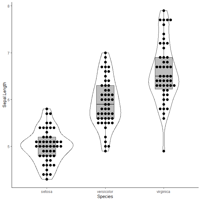
それぞれのプロットには一長一短があるので、全部重ねてしまうのも一つの可視化の手段です。
おまけ:複数のプロットを並べる
grid.arrangeで複数のプロットを並べて表示できます。論文の図として複数並べるときなどに便利です。
p1 <- ggplot(data=iris, aes(x=Species, y=Sepal.Length)) +
      stat_boxplot(geom="errorbar", width=0.5) +
      geom_boxplot(fill="grey") +
      theme_classic()

p2 <- ggplot(data=iris, aes(x=Species, y=Sepal.Length)) +
       geom_violin(fill="grey") +
       theme_classic()

p3 <- ggplot(data=iris, aes(x=Species, y=Sepal.Length)) +
       geom_beeswarm(size=3, cex=2) +
       theme_classic()

p4 <- ggplot(data=iris, aes(x=Species, y=Sepal.Length)) +
       geom_violin() +
       geom_boxplot(fill="grey", width=0.3) +
       geom_beeswarm(size=3, cex=2) +
       theme_classic()

grid.arrange(p1, p2, p3, p4, nrow = 2)
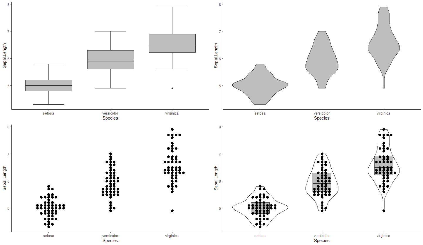
4種のプロットを、それぞれp1、p2、p3、p4に格納し、これをgrid.arrangeでまとめて表示しました。nrowで一行あたりの図の数を指定できます。
(2023年9月26日、了)