目的
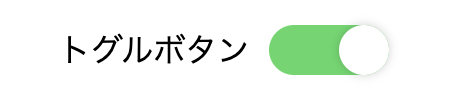
- 以下のようなトグルボタンをNextjsに追加したい。
コード
親
import React from 'react'
import ToggleSwitchButton from './components/ToggleSwitchButton'

const index: React.FC = () => {
  ...省略...
  return (
    <>
      <ToggleSwitchButton />
    </>
  )
}
子コンポーネント(./components/ToggleSwitchButton)
import React from 'react'
import styles from './components/button.module.css'

const ToggleSwitchButton = () => (
  <div>
    <div className={styles.toggle_button}>
      <span className={styles.toggle_text}>トグルボタン</span>
      <input id="toggle" className={styles.toggle_input} type='checkbox' />
      <label className={styles.toggle_label}/>
    </div>
  </div>
)

export default ToggleSwitchButton
components/button.module.cssのコード
.toggle_input {
  position: absolute;
  left: 0;
  top: 0;
  width: 100%;
  height: 100%;
  z-index: 5;
  opacity: 0;
  cursor: pointer;
}

.toggle_label {
  width: 60px;
  height: 25px;
  background: #ccc;
  position: relative;
  display: inline-block;
  border-radius: 40px;
  transition: 0.4s;
  box-sizing: border-box;
}

.toggle_label:after {
  content: "";
  position: absolute;
  width: 25px;
  height: 25px;
  border-radius: 100%;
  left: 0;
  top: 0;
  z-index: 2;
  background: #fff;
  box-shadow: 0 0 5px rgba(0, 0, 0, 0.2);
  transition: 0.4s;
}

.toggle_input:checked + .toggle_label {
  background-color: #4BD865;
}

.toggle_input:checked + .toggle_label:after {
  left: 35px;
}

.toggle_button {
  position: relative;
  width: 265px;
  height: 25px;
  margin: 0 auto 10px auto;
}

.toggle_text {
  height:35px;
  line-height:25px;
  padding:0 10px 0 0;
  vertical-align:top;
}
うまく表示されました。
めでたし、めでたし。