はじめに
Next.js で開発を始める際にやるべきことを記録しておきます。
最初の環境構築について、他にもいくつか記事を書いているので、よろしければこちらもご覧ください。
あと、Next.js は公式ドキュメントがめちゃくちゃわかりやすいので、軽く目を通してみるのもいいと思います。
何はともあれ create next-app
公式が出してくれてるのでこれを使わない手はないでしょう。
yarn create next-app --typescript
node のバージョン指定
nodenv
anyenv で入れた nodenv を使用しています。
cd {{app}}
nodenv local nodenv local 16.13.0
yarn add -D @types/node@"16.11.6"
package.json で engines を指定
...
  "engines": {
    "node": ">=16.13.0"
  },
...
vercel CLI を使用する
vercel の CLI があるので、そちらを使用するようにします。
インストール
ESLint, Prettier の設定
11.0.0 以降、ESLint が標準で入るようになったみたいです。最高ですね👏
ですので、Prettier の追加と ESLint で一部ルールの追加のみを行います。
具体的には、
- import の順番を決める
- 返り値の型を明示するルールを追加する
- prettier を導入し、フォーマットできるようになる
- 使用されていない import や変数で warning を出す
というようにします。
@typescript-eslint/eslint-plugin の追加
返り値の型を明示的にするために入れます。
yarn add -D @typescript-eslint/eslint-plugin
eslint-plugin-unused-importsの追加
使用していない import が入り込むのを防ぐために
を追加します。
yarn add -D eslint-plugin-unused-imports
prettier の追加
yarn add -D prettier eslint-config-prettier
次に、prettierrc.jsと.prettierignoreを追加します
echo "module.exports = {\\n\\tprintWidth: 120\\n}" > .prettierrc.js
echo ".next\\ntsconfig.json" > .prettierignore
.eslintrc.jsonの書き換え
{
  "extends": "next/core-web-vitals"
}
↓
{
  "extends": ["next/core-web-vitals", "prettier"],
  "plugins": ["@typescript-eslint", "unused-imports"], // unused-imports を追加
  "rules": {
    "no-shadow": "error", // https://eslint.org/docs/rules/no-shadow
    "@typescript-eslint/explicit-function-return-type": "warn", // 返り値の型を明示するためのルール
    "unused-imports/no-unused-imports": "error",
    "unused-imports/no-unused-vars": [
      "warn",
      { "vars": "all", "varsIgnorePattern": "^_", "args": "after-used", "argsIgnorePattern": "^_" }
    ],
    "import/order": [ // import の順番を決めます
      "error",
      {
        "groups": ["builtin", "external", "parent", "sibling", "index", "object", "type"],
        // pathGroups: [
        //   {
        //     pattern: "@alias/**",
        //     group: "parent",
        //     position: "before",
        //   },
        // ],
        "alphabetize": {
          "order": "asc"
        },
        "newlines-between": "always"
      }
    ]
  }
}
package.jsonの scriptsに追記
"scripts": {
  // ...
  "format": "prettier --write './**/*.{js,jsx,ts,tsx,json}'"
},
format & lint
yarn format
yarn lint --fix
ESLint で 自動で fix 出来ない Warning が出ていればそれも修正します。
Stylelint の導入
stylelint, stylelint-config-standard, stylelint-config-idiomatic-order, stylelint-prettier, stylelint-config-prettier をインストール
stylelint-config-idiomatic-order は css の順番を決めてくれます。
yarn add -D stylelint stylelint-config-standard stylelint-config-idiomatic-order stylelint-prettier stylelint-config-prettier
.stylelintrc.json を作成
echo '{\n\t"extends": ["stylelint-config-standard", "stylelint-config-idiomatic-order", "stylelint-prettier/recommended"]\n}' > .stylelintrc.json
VSCode の拡張機能を追加
を使用します。
設定には以下を追加します。
"settings": {
  // ...
  "css.validate": false,
  "less.validate": false,
  "scss.validate": false,
  "editor.codeActionsOnSave": {
    "source.fixAll.stylelint": true
  }
}
フォルダ構成等変更
src下に移動
pagesディレクトリやstylesディレクトリをsrc下に置きます。
src下に移動させても、何も設定する必要はありません。
mkdir src
mv pages styles src
Absolute Imports にする
srcを@として import できるようにします。
tsconfig.json を変更します。
{
  // ...
  "baseUrl": ".",
  "paths": {
    "@/*": ["src/*"]
  },
  // ...
}
ファイル内で相対パスで import している部分を @を使うように変更します。
/pages に page 以外のファイルも置けるようにする
こちらを参考に .pages.tsx などの拡張子を使うように設定します。
Material UI(v5) の導入
Material UI だけでなく、Emotion も使いたいと思っていたのですが、v5 から Material UI が Emotion を使うようになるようです。
ですので、2021-09-03 段階ではまだ pre-release ですが、 v5 を使ってみます。
2021-09-16 に v5 が正式にリリースされたようです👏👏
公式の example も参考にします。
ちなみに、以下で書かれている変更を加えても反映されないことがありますが、その場合はルートの .nextフォルダを消してしまえば反映されます。
ちゃんと調べたわけではないのでおそらくですが、設定ファイルだけ変更した時などに変更が反映されない場合があるのかな?と思っています。
Materiai UI のインストール
yarn add @mui/material @mui/icons-material @emotion/react @emotion/styled @emotion/cache @emotion/server
theme.ts,createEmotionCache.ts ファイルの作成
rm -rf src/styles
mkdir src/styles
touch src/styles/theme.ts src/styles/createEmotionCache.ts
をそのままコピーしてきます。(型を多少つけました)
import { red } from "@mui/material/colors";
import { createTheme } from "@mui/material/styles";

// Create a theme instance.
const theme = createTheme({
  palette: {
    primary: {
      main: "#556cd6",
    },
    secondary: {
      main: "#19857b",
    },
    error: {
      main: red.A400,
    },
  },
});

export default theme;
import createCache, { EmotionCache } from "@emotion/cache";

export default function createEmotionCache(): EmotionCache {
  return createCache({ key: "css" });
}
Link.tsxの作成
を作成します。
Next の Link コンポーネントと Material UI の Link コンポーネントをいい感じに使うためのものです。
mkdir src/components
touch src/components/Link.tsx
import MuiLink, { LinkProps as MuiLinkProps } from "@mui/material/Link";
import clsx from "clsx";
import NextLink, { LinkProps as NextLinkProps } from "next/link";
import { useRouter } from "next/router";
import * as React from "react";

interface NextLinkComposedProps
  extends Omit<React.AnchorHTMLAttributes<HTMLAnchorElement>, "href">,
    Omit<NextLinkProps, "href" | "as"> {
  to: NextLinkProps["href"];
  linkAs?: NextLinkProps["as"];
  href?: NextLinkProps["href"];
}

export const NextLinkComposed = React.forwardRef<HTMLAnchorElement, NextLinkComposedProps>(function NextLinkComposed(
  props,
  ref
) {
  const { to, linkAs, href, replace, scroll, passHref, shallow, prefetch, locale, ...other } = props;

  return (
    <NextLink
      href={to}
      prefetch={prefetch}
      as={linkAs}
      replace={replace}
      scroll={scroll}
      shallow={shallow}
      passHref={passHref}
      locale={locale}
    >
      <a ref={ref} {...other} />
    </NextLink>
  );
});

export type LinkProps = {
  activeClassName?: string;
  as?: NextLinkProps["as"];
  href: NextLinkProps["href"];
  noLinkStyle?: boolean;
} & Omit<NextLinkComposedProps, "to" | "linkAs" | "href"> &
  Omit<MuiLinkProps, "href">;

// A styled version of the Next.js Link component:
// https://nextjs.org/docs/#with-link
const Link = React.forwardRef<HTMLAnchorElement, LinkProps>(function Link(props, ref) {
  const {
    activeClassName = "active",
    as: linkAs,
    className: classNameProps,
    href,
    noLinkStyle,
    role, // Link don't have roles.
    ...other
  } = props;

  const router = useRouter();
  const pathname = typeof href === "string" ? href : href.pathname;
  const className = clsx(classNameProps, {
    [activeClassName]: router.pathname === pathname && activeClassName,
  });

  const isExternal = typeof href === "string" && (href.indexOf("http") === 0 || href.indexOf("mailto:") === 0);

  if (isExternal) {
    if (noLinkStyle) {
      return <a className={className} href={href as string} ref={ref as any} {...other} />;
    }

    return <MuiLink className={className} href={href as string} ref={ref} {...other} />;
  }

  if (noLinkStyle) {
    return <NextLinkComposed className={className} ref={ref as any} to={href} {...other} />;
  }

  return <MuiLink component={NextLinkComposed} linkAs={linkAs} className={className} ref={ref} to={href} {...other} />;
});

export default Link;
_document.tsxの作成
を作成します。
touch src/pages/_document.tsx
基本的に上の例そのままですが、
- lang の変更
- 型付け
- import 周り少し修正
などの変更を行なっています。
import createEmotionServer from "@emotion/server/create-instance";
import { RenderPageResult } from "next/dist/shared/lib/utils";
import Document, { Html, Head, Main, NextScript, DocumentInitialProps } from "next/document";
import * as React from "react";

import createEmotionCache from "@/styles/createEmotionCache";
import theme from "@/styles/theme";

export default class MyDocument extends Document {
  render(): JSX.Element {
    return (
      <Html lang="ja">
        <Head>
          {/* PWA primary color */}
          <meta name="theme-color" content={theme.palette.primary.main} />
          <link rel="stylesheet" href="https://fonts.googleapis.com/css?family=Roboto:300,400,500,700&display=swap" />
        </Head>
        <body>
          <Main />
          <NextScript />
        </body>
      </Html>
    );
  }
}

// `getInitialProps` belongs to `_document` (instead of `_app`),
// it's compatible with static-site generation (SSG).
MyDocument.getInitialProps = async (ctx): Promise<DocumentInitialProps> => {
  // Resolution order
  //
  // On the server:
  // 1. app.getInitialProps
  // 2. page.getInitialProps
  // 3. document.getInitialProps
  // 4. app.render
  // 5. page.render
  // 6. document.render
  //
  // On the server with error:
  // 1. document.getInitialProps
  // 2. app.render
  // 3. page.render
  // 4. document.render
  //
  // On the client
  // 1. app.getInitialProps
  // 2. page.getInitialProps
  // 3. app.render
  // 4. page.render

  const originalRenderPage = ctx.renderPage;

  // You can consider sharing the same emotion cache between all the SSR requests to speed up performance.
  // However, be aware that it can have global side effects.
  const cache = createEmotionCache();
  const { extractCriticalToChunks } = createEmotionServer(cache);

  ctx.renderPage = (): RenderPageResult | Promise<RenderPageResult> =>
    originalRenderPage({
      enhanceApp:
        (App: any) =>
        // eslint-disable-next-line react/display-name
        (props): JSX.Element =>
          <App emotionCache={cache} {...props} />,
    });

  const initialProps = await Document.getInitialProps(ctx);
  // This is important. It prevents emotion to render invalid HTML.
  // See https://github.com/mui-org/material-ui/issues/26561#issuecomment-855286153
  const emotionStyles = extractCriticalToChunks(initialProps.html);
  const emotionStyleTags = emotionStyles.styles.map((style) => (
    <style
      data-emotion={`${style.key} ${style.ids.join(" ")}`}
      key={style.key}
      // eslint-disable-next-line react/no-danger
      dangerouslySetInnerHTML={{ __html: style.css }}
    />
  ));

  return {
    ...initialProps,
    // Styles fragment is rendered after the app and page rendering finish.
    styles: [...React.Children.toArray(initialProps.styles), ...emotionStyleTags],
  };
};
_app.tsxの変更
をコピーしてきます。
Head は削除しました。
import { CacheProvider, EmotionCache } from "@emotion/react";
import CssBaseline from "@mui/material/CssBaseline";
import { ThemeProvider } from "@mui/material/styles";
import { AppProps } from "next/app";
import Head from "next/head";
import * as React from "react";

import createEmotionCache from "@/styles/createEmotionCache";
import theme from "@/styles/theme";

// Client-side cache, shared for the whole session of the user in the browser.
const clientSideEmotionCache = createEmotionCache();

interface MyAppProps extends AppProps {
  emotionCache?: EmotionCache;
}

export default function MyApp(props: MyAppProps): JSX.Element {
  const { Component, emotionCache = clientSideEmotionCache, pageProps } = props;
  return (
    <CacheProvider value={emotionCache}>
      <ThemeProvider theme={theme}>
        {/* CssBaseline kickstart an elegant, consistent, and simple baseline to build upon. */}
        <CssBaseline />
        <Component {...pageProps} />
      </ThemeProvider>
    </CacheProvider>
  );
}
index.tsxの変更
をコピーしてきます。
若干修正しています。
import { Box, Container, Typography } from "@mui/material";

import type { NextPage } from "next";

import Link from "@/components/Link";

const Index: NextPage = () => {
  return (
    <Container maxWidth="sm">
      <Box sx={{ my: 4 }}>
        <Typography variant="h4" component="h1" gutterBottom>
          Next.js v5-beta with TypeScript example
        </Typography>

        <Link href="/about" color="secondary">
          Go to the about page
        </Link>
      </Box>
    </Container>
  );
};

export default Index;
about.tsxの作成
を作成します。
若干変更を加えています。
touch src/pages/about.tsx
import { Box, Button, Container, Typography } from "@mui/material";
import { NextPage } from "next";

import Link from "@/components/Link";

const About: NextPage = () => {
  return (
    <Container maxWidth="sm">
      <Box sx={{ my: 4 }}>
        <Typography variant="h4" component="h1" gutterBottom>
          Next.js v5-beta with TypeScript example
        </Typography>
        <Button variant="contained" component={Link} noLinkStyle href="/">
          Go to the main page
        </Button>
      </Box>
    </Container>
  );
};

export default About;
Emotion でのスタイリング
Emotion で css プロパティ を使用してスタイリングをするために、少し設定等を修正します。
などを参考にしています。
ちなみに、css プロパティを使いたい理由は
- 「styled-component のやり方だと、定義したコンポーネントなのか、スタイルがつけられているだけなのかパッとわからない」というのを避けたかった
- Material UI の
makeStylesを使用する方法ではコードジャンプが出来ない
などです。
Material UI の v4 であれば、<StylesProvider injectFirst>を_app.tsxに追加しなければいけなかったのですが、v5 からは要らなくなったようです。
@emotion/babel-plugin のインストール
yarn add -D @emotion/babel-plugin
.babelrcの作成
を作成します。
touch .babelrc
{
  "presets": [
    [
      "next/babel",
      {
        "preset-react": {
          "runtime": "automatic",
          "importSource": "@emotion/react"
        }
      }
    ]
  ],
  "plugins": ["@emotion/babel-plugin"]
}
tsconfig.tsの修正
を参考にします。
{
  "compilerOptions": {
    // ...
    "jsx": "preserve",
    "jsxImportSource": "@emotion/react", //追加
    // ...
  },
  // ..
}
index.tsxの変更
スタイリングできるか試してみます。
import { css } from "@emotion/react";
import { Box, Container, Typography, Button } from "@mui/material";

import type { NextPage } from "next";

import Link from "@/components/Link";

const yellowButtonCss = css`
  color: green;
  background-color: yellow;

  :hover {
    background-color: #919100;
  }
`;

const Index: NextPage = () => {
  return (
    <Container maxWidth="sm">
      <Box sx={{ my: 4 }}>
        <Typography variant="h4" component="h1" gutterBottom>
          Next.js v5-beta with TypeScript example
        </Typography>

        <Link href="/about" color="secondary">
          Go to the about page
        </Link>
      </Box>
      <Box>
        <Button variant="contained" color="primary">
          Css
        </Button>
        <Button variant="contained" css={yellowButtonCss}>
          Css
        </Button>
      </Box>
    </Container>
  );
};

export default Index;
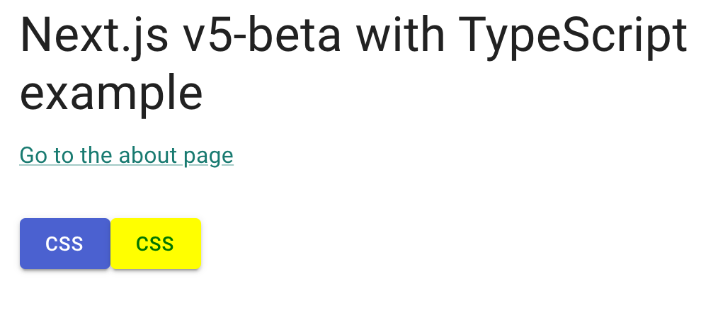
yarn dev 実行後http://localhost:3000/ にアクセスすると、下のような画面が表示されるはずです🙆♂️
depcheck, husky の導入
では lint-staged も導入したのですが、今回は一旦入れません。
一人で開発をしている内は、prettier・ESLint のどちらもエディタで適用されるので、意味もなくlint-staged が走っている時間が無駄だと思ったからです。
以下の設定をすることで、使用していないパッケージが入り込んだり、不要になったパッケージがいつまでも残ることがなくなります🙆♂️
depcheck のインストール & 設定
グローバルに入れたくないなぁと思ったので、devDependencies としてインストールします。
yarn add -D depcheck
設定ファイル(.depcheckrc)を作成する。
こちらは適宜修正してください。
echo 'ignores: ["@mui/icons-material", "@types/node", "depcheck", "stylelint*", "clsx"]\nignore-patterns: [".history", ".vscode", "dist", "node_modules"]' > .depcheckrc
husky のインストール & 設定
npx husky-init && yarn
.husky/pre-commitを書き換えます。
#!/bin/sh
. "$(dirname "$0")/_/husky.sh"

eval "$(nodenv init -)" # git の GUI クライアントで node を正しく読み込んでくれない問題の対策
yarn run depcheck
.husky/pre-pushを作成します。
yarn husky add .husky/pre-push
#!/bin/sh
. "$(dirname "$0")/_/husky.sh"

eval "$(nodenv init -)" # git の GUI クライアントで node を正しく読み込んでくれない問題の対策
yarn lint --max-warnings 0
vercel.json を作成する
Vercel がメッセージを書くたびに、github の notification に通知が来るので、コメントしないように設定します。
echo '{\n\t"github": {\n\t\t"silent": true\n\t}\n}' > vercel.json
デプロイ
公式ドキュメントの通りに、Vercelにデプロイします。
簡単な作業を数回するだけでデプロイすることができました👏
プルリクを作成すればプレビューサイトも作成してくれるみたいですね、最高です。
Dependabot の導入
ついでに Dependabot も入れてみます。
Dependabot を Enable する
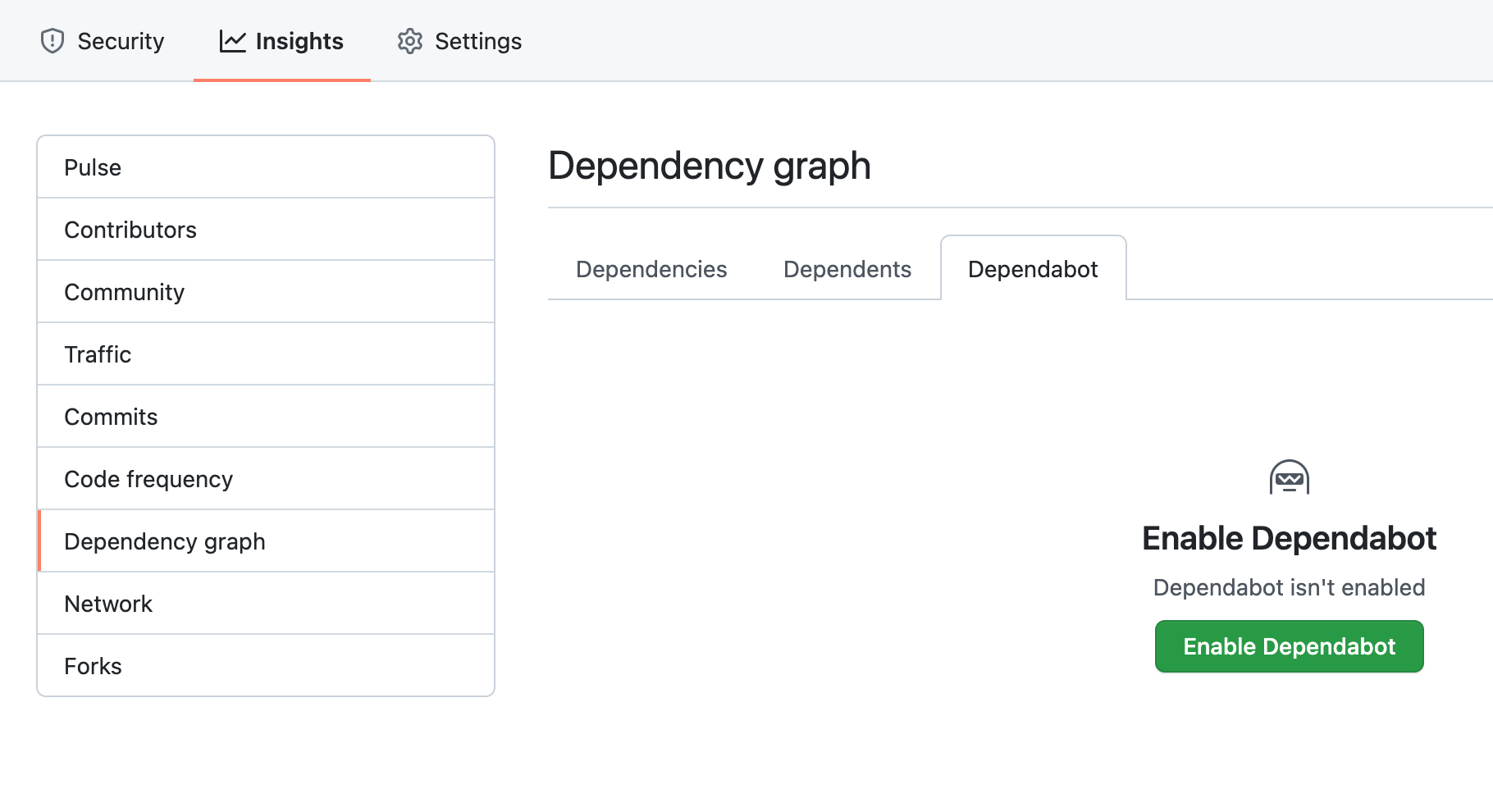
GitHub の画面から Enable Dependabot を選択します。
Config ファイルの作成
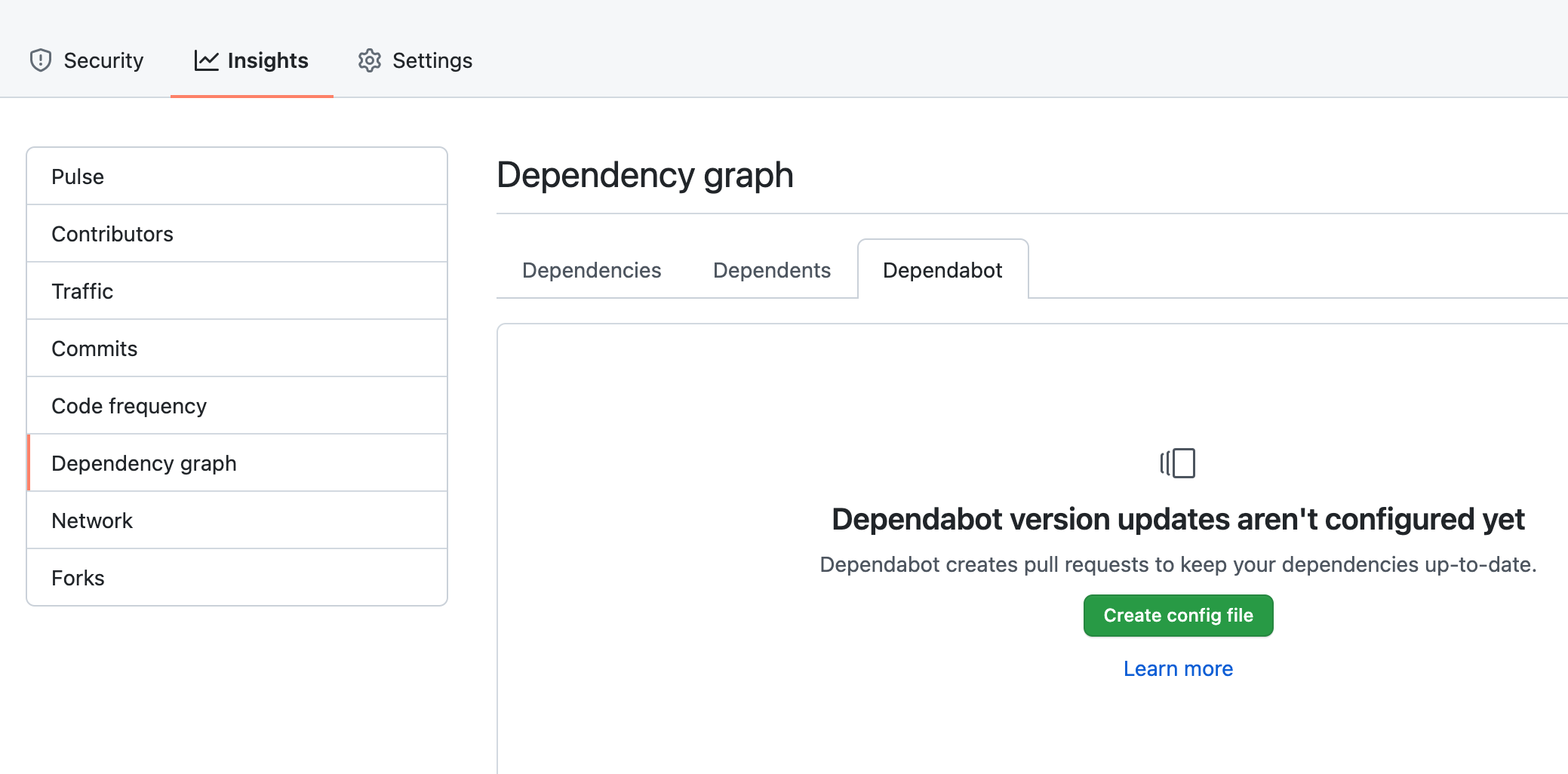
続いて、Create config file を選択します。
dependabot.yamlの作成画面に遷移するので、説明とドキュメントを読んで設定します。
私の場合、今回はこんな感じになりました。
# To get started with Dependabot version updates, you'll need to specify which
# package ecosystems to update and where the package manifests are located.
# Please see the documentation for all configuration options:
# https://help.github.com/github/administering-a-repository/configuration-options-for-dependency-updates

version: 2
updates:
  - package-ecosystem: "npm" # See documentation for possible values
    directory: "/" # Location of package manifests
    schedule:
      interval: "weekly"
      day: "saturday"
      time: "09:00"
      timezone: "Asia/Tokyo"
    reviewers:
      - "hasehiro0828"
Security & analysis を有効化
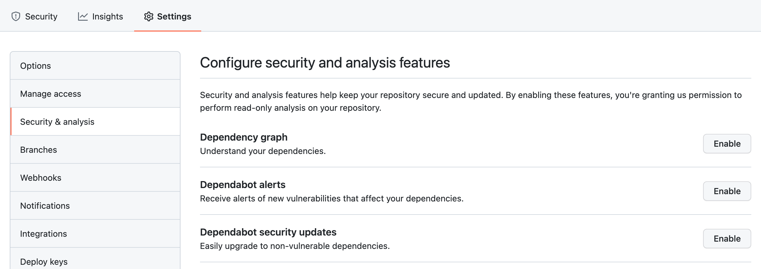
これらの設定を全て Enabledにしました。
dependabot が作成するプルリクはプレビューを作成しないようにする
デフォルトの状態では、dependabot が作成するプルリク全てでプレビューが作成されてしまうので、dependabot のプルリクは無視するように設定します。
ignoreBranchScript.shの作成
touch ignoreBranchScript.sh
#!/bin/bash

# dependabot が作成したブランチはデプロイしない
echo "📝 VERCEL_GIT_COMMIT_REF: $VERCEL_GIT_COMMIT_REF"
if [[ `echo "$VERCEL_GIT_COMMIT_REF" | grep "dependabot/"` ]]; then
  exit 0;
fi

# dependabot が作成したブランチがマージされた時はデプロイしない
echo "📝 VERCEL_GIT_COMMIT_AUTHOR_LOGIN: $VERCEL_GIT_COMMIT_AUTHOR_LOGIN"
if [[ `echo "$VERCEL_GIT_COMMIT_AUTHOR_LOGIN" | grep "dependabot"` ]]; then
  exit 0;
fi
exit 1;
Ignored Build Stepの設定
Vercel のプロジェクトの Settings > Gitに移動します。
Ignored Build Stepに以下を入力します。
bash ignoreBranchScript.sh
Dependabot が作成したプルリクを自動でマージする
を使用します。
で Personal access token を作成する。
リポジトリの /settings/secrets/actions/new で DEPENDABOT_AUTO_MERGE_TOKEN という名前で先ほど作成した token を登録する。
.github/auto-merge.ymlを作成する
- match:
    dependency_type: development
    update_type: all

- match:
    dependency_type: production
    update_type: security:minor # includes patch updates!

- match:
    dependency_type: production
    update_type: semver:patch
.github/workflows/main.ymlを作成する
name: Auto merge pull request from dependabot

on:
  pull_request_target:

jobs:
  auto-merge:
    runs-on: ubuntu-latest
    steps:
      - uses: actions/checkout@v2
      - name: Dependabot Auto Merge
        uses: ahmadnassri/action-dependabot-auto-merge@v2.3.1
        with:
          # The GitHub token used to merge the pull-request
          github-token: ${{ secrets.DEPENDABOT_AUTO_MERGE_TOKEN }}
おわりに
以上で、Next.js で開発を快適に進めていくための環境構築が完了しました👏👏
開発を開始してからコードの品質を担保しようとすると結構大変になってしまうので、最初の土台作りが肝心だと思っています。
建物をいくらまっすぐに建てることができても、土台が傾いてしまっていてはいずれ倒壊してしまいますからね;;
自分なりのテンプレートをある程度拘って作って、あとはガンガン開発していきましょう💪
おまけ ー Material UI (v4)の導入
最初は v4 での環境構築をしていたので、折角なので残しておきます。
Materiai UI のインストール
yarn add @material-ui/core @material-ui/icons
theme.ts ファイルの作成
rm -rf src/styles
mkdir src/styles
touch src/styles/theme.ts
をそのままコピーしてきます。
import { red } from "@material-ui/core/colors";
import { createTheme } from "@material-ui/core/styles";

// Create a theme instance.
const theme = createTheme({
  palette: {
    primary: {
      main: "#556cd6",
    },
    secondary: {
      main: "#19857b",
    },
    error: {
      main: red.A400,
    },
    background: {
      default: "#fff",
    },
  },
});

export default theme;
_document.tsxの作成
を作成します。
touch src/pages/_document.tsx
langを変えたり、型をつけたりしていますが、基本的に上の例そのままです。
import { ServerStyleSheets } from "@material-ui/core/styles";
import { RenderPageResult } from "next/dist/shared/lib/utils";
import Document, { Html, Head, Main, NextScript, DocumentInitialProps } from "next/document";
import React from "react";

import theme from "@/styles/theme";

export default class MyDocument extends Document {
  render(): JSX.Element {
    return (
      <Html lang="ja">
        <Head>
          {/* PWA primary color */}
          <meta name="theme-color" content={theme.palette.primary.main} />
          <link rel="stylesheet" href="https://fonts.googleapis.com/css?family=Roboto:300,400,500,700&display=swap" />
          <link rel="icon" href="/favicon.ico" />
        </Head>
        <body>
          <Main />
          <NextScript />
        </body>
      </Html>
    );
  }
}

// `getInitialProps` belongs to `_document` (instead of `_app`),
// it's compatible with server-side generation (SSG).
MyDocument.getInitialProps = async (ctx): Promise<DocumentInitialProps> => {
  // Resolution order
  //
  // On the server:
  // 1. app.getInitialProps
  // 2. page.getInitialProps
  // 3. document.getInitialProps
  // 4. app.render
  // 5. page.render
  // 6. document.render
  //
  // On the server with error:
  // 1. document.getInitialProps
  // 2. app.render
  // 3. page.render
  // 4. document.render
  //
  // On the client
  // 1. app.getInitialProps
  // 2. page.getInitialProps
  // 3. app.render
  // 4. page.render

  // Render app and page and get the context of the page with collected side effects.
  const sheets = new ServerStyleSheets();
  const originalRenderPage = ctx.renderPage;

  ctx.renderPage = (): RenderPageResult | Promise<RenderPageResult> =>
    originalRenderPage({
      // eslint-disable-next-line react/display-name, @typescript-eslint/explicit-function-return-type
      enhanceApp: (App) => (props) => sheets.collect(<App {...props} />),
    });

  const initialProps = await Document.getInitialProps(ctx);

  return {
    ...initialProps,
    // Styles fragment is rendered after the app and page rendering finish.
    styles: [...React.Children.toArray(initialProps.styles), sheets.getStyleElement()],
  };
};
_app.tsxの変更
import CssBaseline from "@material-ui/core/CssBaseline";
import { ThemeProvider } from "@material-ui/core/styles";
import React, { useEffect } from "react";

import type { AppProps } from "next/app";

import theme from "@/styles/theme";

function MyApp({ Component, pageProps }: AppProps): JSX.Element {
  useEffect(() => {
    // Remove the server-side injected CSS.
    const jssStyles = document.querySelector("#jss-server-side");
    if (jssStyles && jssStyles.parentElement) {
      jssStyles.parentElement.removeChild(jssStyles);
    }
  }, []);

  return (
    <ThemeProvider theme={theme}>
      {/* CssBaseline kickstart an elegant, consistent, and simple baseline to build upon. */}
      <CssBaseline />
      <Component {...pageProps} />
    </ThemeProvider>
  );
}
export default MyApp;
index.tsxの変更
import { Container, Box, Typography, Button } from "@material-ui/core";
import Head from "next/head";

import type { NextPage } from "next";

const Index: NextPage = () => {
  return (
    <>
      <Head>
        <title>Index</title>
        <meta name="description" content="Index Page" />
      </Head>

      <main>
        <Container maxWidth="sm">
          <Box my={4}>
            <Typography variant="h4" component="h1" gutterBottom>
              Next.js example
            </Typography>

            <Button variant="contained" color="primary">
              primary
            </Button>
            <Button variant="contained" color="secondary">
              secondary
            </Button>
          </Box>
        </Container>
      </main>
    </>
  );
};

export default Index;
Warning: Prop 'className' did not matchについて
上記の変更後yarn devを実行すると、Warning: Prop 'className' did not match. Server: "MuiBox-root MuiBox-root-1" Client: "MuiBox-root MuiBox-root-2"といったエラーが発生します。
このエラーが発生しないようにするのが、_app.tsxのuseEffectなどでの処理だと思うのですが、上手くいきません。調べてもそれっぽい情報が見つかりませんでした。
babel-plugin-styled-componentsを使うみたいな方法はあったのですが、改善しませんでした。
最近のアップデートによる影響かなぁと思い、一旦スルーしました。(v5 ではエラーが出ませんでした)
参考にさせていただいたサイト