Plotlyで散布図
この記事では plotly 2.3.0を利用しています。
はじめに
Plotlyは大変便利です。
実際に業務で利用する上で設定している項目などまとめてみました。ここでは散布図。
なお、チャートは静止画です。
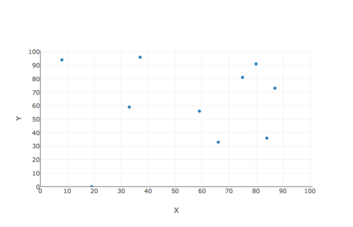
普通の散布図
# coding:utf-8

import pandas as pd
import numpy as np

import plotly.plotly as py
import plotly.graph_objs as go
import datetime

import plotly.offline as offline
offline.init_notebook_mode()

# データの作成
X = np.random.randint(0,100,10)
Y = np.random.randint(0,100,10)

trace = go.Scatter(x = X, y = Y, mode = 'markers')

# レイアウトの指定
layout = go.Layout(
    xaxis = dict(title="X", range = [0,101], dtick=10),   # rangeで範囲、dtick で区間幅
    yaxis = dict(title="Y", range = [0,101], dtick=10))


fig = dict(data = [trace], layout = layout)
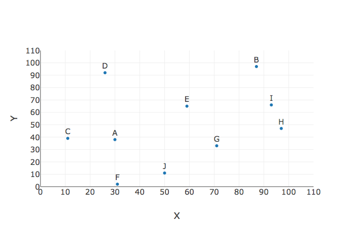
散布図 ラベルつき
X = np.random.randint(0,100,10)
Y = np.random.randint(0,100,10)
LABEL = [chr(i) for i in range(65,65+10)] # ラベル。アルファベットのリスト

trace = go.Scatter(x = X, y = Y,mode='markers+text', text =LABEL, textposition='top') # mode='markers+text' でラベルも表示

layout = go.Layout(
    xaxis = dict(title="X", range = [0,110], dtick=10),   # rangeで範囲、dtick で区間幅
    yaxis = dict(title="Y", range = [0,110], dtick=10),
    font = dict(size = 15)) # フォントサイズ

fig = dict(data = [trace], layout = layout)
offline.iplot(fig)
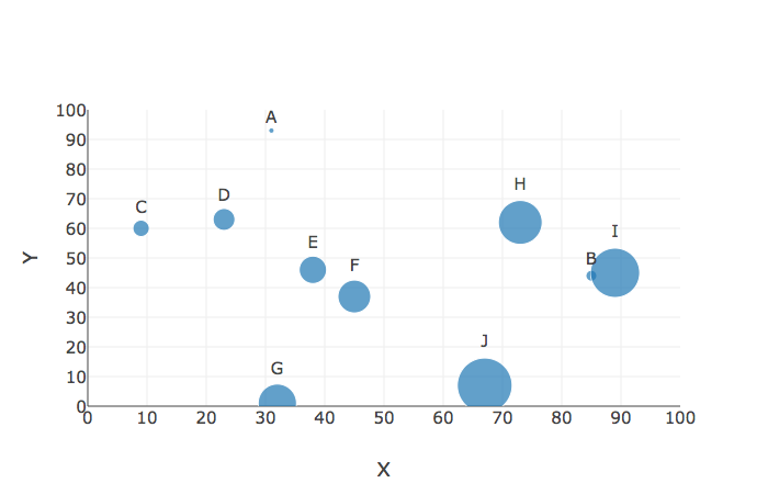
バブルチャート
X = np.random.randint(0,100,10)
Y = np.random.randint(0,100,10)
LABEL = [chr(i) for i in range(65,65+10)] # ラベル。アルファベットのリスト
SIZE = [ i * 5 for i in range(1,11)]             # サイズのデータ

trace = go.Scatter(x = X, y = Y,mode='markers+text', text =LABEL, textposition='top',
                  marker = dict(size = SIZE)) # マーカーサイズ

layout = go.Layout(
    xaxis = dict(title="X", range = [0,100], dtick=10),
    yaxis = dict(title="Y", range = [0,100], dtick=10),
    font = dict(size = 15))

fig = dict(data = [trace], layout = layout)
offline.iplot(fig)
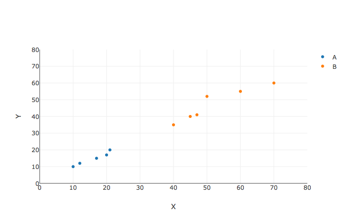
要素によって色分けるような散布図
df = pd.DataFrame({
    'X':[10,12,17,20,21,40,45,47,50,60,70],
    'Y':[10,12,15,17,20,35,40,41,52,55,60],
    'area':['A','A','A','A','A', 'B','B','B','B','B','B']})


trace0 = go.Scatter(x = df['X'][df['area'] == 'A'], y = df['Y'][df['area'] == 'A'], mode='markers', name ='A')
trace1 = go.Scatter(x = df['X'][df['area'] == 'B'], y = df['Y'][df['area'] == 'B'], mode='markers', name ='B')


layout = go.Layout(xaxis = dict(title="X", range = [0,80], dtick=10),
                   yaxis = dict(title="Y", range = [0,80], dtick=10))

fig = dict(data = [trace0, trace1], layout = layout)
offline.iplot(fig)