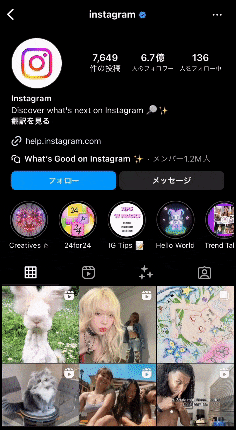
Instagramで使用されているTabBarとは?
Instagramなどで使用されているような、タブバーが上部に固定され、スクロール可能なものは、一般的に "Sticky Tab Bar" や "Scrollable Tab Bar" と呼ばれます。
このタイプの TabBar は、通常、ページングやスワイプと組み合わせて使用され、ユーザーが異なるコンテンツやセクションにスムーズに移動できるようにします。
文字だけだとイメージが付きにくいかと思いますので、gif画像を用意しました。
"Sticky Tab Bar" を実装した場合、以下のような動きをします。
TabBarView の内容をスクロールした際、 TabBar が上部に固定され、タブバーより上のWidgetを表示する際は、通常通り表示されるというものです。
サンプル
今回は上記のような Sticky Tab Bar を実装していきます。
サンプルとしては以下のようなものになります。

サンプルコード①
    body: DefaultTabController(
      length: 4,
      child: NestedScrollView(
        headerSliverBuilder:
            (BuildContext context, bool innerBoxIsScrolled) {
          return [
            const _MyInformation(),
            const _TabBar(),
          ];
        },
        body: TabBarView(
          children: [
            ColorfulGridView(),
            ColorfulGridView(),
            ColorfulGridView(),
            ColorfulGridView(),
          ],
        ),
      ),
    ),
DefaultTabController:
DefaultTabController は、タブのコントローラーになります。 length プロパティには、タブの数を指定します。今回の例では、4つのタブがあるため、lengthは4に設定されています。
NestedScrollView:
NestedScrollView は、ヘッダーとスクロール可能なスクロールビューを作成する際に使われます。headerSliverBuilder プロパティには、タブバーを構築するための関数が指定され、 body プロパティには、タブバーの下に表示される本文の部分が指定されます。
headerSliverBuilder:
headerSliverBuilder は、 タブのスクロールビュー(TabBarView)より上のアイテムを構築するための関数です。今回の例では、アカウントの情報を示す _MyInformation と タブバーを表している _TabBar を設定しています。この関数は、 BuildContext と innerBoxIsScrolled の2つの引数を取ります。 innerBoxIsScrolled は、ネストされたスクロールビュー内のコンテンツがスクロールされているかどうかを示すブール値で、スクロール時にヘッダー部分のUIを動的に変更したい場合に使用します。
TabBarView:
TabBarView は、タブバーで選択されたタブのコンテンツを表示するためのウィジェットです。 children プロパティには、各タブのコンテンツとして表示するウィジェットのリストを指定します。この例では、 ColorfulGridView ウィジェットを4つのタブに設定しているため、4つタブそれぞれに ColorfulGridView が表示されます。
ColorfulGridView:
ColorfulGridView は、今回のサンプル用に作成したカラフルなグリッドビューを表示するためのカスタムウィジェットです。このウィジェットは、各タブのコンテンツとして使用されています。
サンプルコード②
class _MyInformation extends StatelessWidget {
  const _MyInformation();

  @override
  Widget build(BuildContext context) {
    return SliverList(
      delegate: SliverChildListDelegate(
        [
          Padding(...),
        ],
      ),
    );
  }
}
SliverList:
SliverList は、 ScrollView の一種で、スクロール可能なリストを作成するためのウィジェットです。リスト内の要素が変わらない場合に使用します。
スクロール可能なリストの内容を決定するために、 delegate プロパティには SliverChildDelegateのインスタンスを指定する必要があります。
NestedScrollView の headerSliverBuilder の中で使用されることが多く、ヘッダー部分にスクロール可能なコンテンツを配置するために使用されます。
delegate:
delegate プロパティには、 SliverList の子ウィジェットを指定するためのデリゲートを設定します。SliverChildDelegate のインスタンスが指定する必要があります。これにより、リスト内の子要素がどのように構築されるかが定義されます。今回の例では、 SliverChildListDelegate を使用しています。
デリゲートとは、特定のタスクや処理を別のオブジェクトに受け渡すためのオブジェクトのことです。Flutterの場合、UIの構築や更新の際にデリゲートが多用されています。例えば、 ListView などのスクロールビューでは、子Widgetをビルドするタイミングやスクロール位置の計算などの処理をデリゲートに受け渡しています。
デリゲートを使うことで、メインロジックから特定の処理を分離でき、コードの保守性と柔軟性を高めることができます。
デリゲートについてもっと詳しく知りたい方はこちらをご覧ください。
SliverChildListDelegate:
SliverChildListDelegate は、リストに表示する子ウィジェットのリストを指定するためのデリゲートクラスです。
SliverChildListDelegate のコンストラクタには、ウィジェットのリストが渡されます。
サンプルコード③
class _TabBar extends StatelessWidget {
  const _TabBar();

  @override
  Widget build(BuildContext context) {
    return const SliverPersistentHeader(
      pinned: true,
      delegate: _StickyTabBarDelegate(
        tabBar: TabBar(...),
      ),
    );
  }
}
SliverPersistentHeader:
SliverPersistentHeader は、スクロール可能なヘッダーを指定するためのウィジェットです。このウィジェットを実装することで、固定された位置にあるヘッダーを作成することができます。
通常、 NestedScrollView の headerSliverBuilder 内で使用されます。
pinned:
pinned プロパティは、ヘッダーがスクロール中に固定されるかどうかを指定します。このプロパティが true に設定されている場合、ヘッダーはスクロール中に画面上部に固定されます。
delegate:
delegate プロパティには、ヘッダーのレイアウトと動作を制御するためのデリゲートが指定されます。この例では、カスタムデリゲートとして、 _StickyTabBarDelegate が使用されています。
_StickyTabBarDelegate:
_StickyTabBarDelegate は、タブバーをヘッダーに配置するためのカスタムデリゲートです。この例では、タブバーは TabBar ウィジェットで設定しています。
サンプルコード④
class _StickyTabBarDelegate extends SliverPersistentHeaderDelegate {
  const _StickyTabBarDelegate({required this.tabBar});

  final TabBar tabBar;

  @override
  double get minExtent => tabBar.preferredSize.height;

  @override
  double get maxExtent => tabBar.preferredSize.height;

  @override
  Widget build(
    BuildContext context,
    double shrinkOffset,
    bool overlapsContent,
  ) {
    return Container(
      color: Colors.white,
      child: tabBar,
    );
  }

  @override
  bool shouldRebuild(_StickyTabBarDelegate oldDelegate) {
    return tabBar != oldDelegate.tabBar;
  }
}
_StickyTabBarDelegate は、ピン留め可能なヘッダーに TabBar ウィジェットを配置するためのデリゲートクラスです。ヘッダーの最小・最大の高さは TabBar の preferredSize.heightで決まり、ヘッダーには白い背景に TabBar ウィジェットが表示され、 TabBar ウィジェットが変更された場合のみ再ビルドが行われます。
_StickyTabBarDelegateクラス:
_StickyTabBarDelegate クラスは、 SliverPersistentHeaderDelegate を継承しています。これにより、ヘッダーのデリゲートをカスタマイズすることが可能になります。
コンストラクタでは、 required キーワードを使用して tabBar パラメータを必須にしており、 tabBar はウィジェットツリーにレンダリングするための TabBarウィジェットになります。
minExtent:
このゲッターは、ヘッダーの最小の高さを指定します。
SliverPersistentHeaderDelegate から継承された minExtentゲッターをオーバーライドしており、今回の場合、 TabBar の preferredSize.height (タブバーの高さ) が最小の高さとなります。
maxExtent:
このゲッターは、ヘッダーの最大の高さを指定します。
SliverPersistentHeaderDelegate から継承された maxExtent ゲッターをオーバーライドしており、この場合も、 TabBar の preferredSize.height (タブバーの高さ) が最大の高さとなります。
build:
このメソッドは、ヘッダーのレンダリングを行います。
SliverPersistentHeaderDelegate から継承された build メソッドをオーバーライドしており、今回の実装では、 Container ウィジェットの child として tabBar を渡しています。つまり、白い背景に TabBar ウィジェットを表示する設定になっています。
shouldRebuild:
このメソッドは、デリゲートが再ビルドする必要があるかどうかを判断します。
SliverPersistentHeaderDelegate から継承された shouldRebuild メソッドをオーバーライドしており、この実装では、 tabBar が変更された場合にのみ再ビルドが必要であると判断しています。
全体のコード
import 'dart:math';
import 'package:flutter/material.dart';

void main() => runApp(const MyApp());

class MyApp extends StatelessWidget {
  const MyApp({super.key});

  @override
  Widget build(BuildContext context) {
    return MaterialApp(
      title: 'Flutter Demo',
      debugShowCheckedModeBanner: false,
      theme: ThemeData(
        primarySwatch: Colors.blue,
      ),
      home: Scaffold(
        appBar: AppBar(title: const Text('Demo Sticky Tab Bar')),
        body: DefaultTabController(
          length: 4,
          child: NestedScrollView(
            headerSliverBuilder:
                (BuildContext context, bool innerBoxIsScrolled) {
              return [
                const _MyInformation(),
                const _TabBar(),
              ];
            },
            body: TabBarView(
              children: [
                ColorfulGridView(),
                ColorfulGridView(),
                ColorfulGridView(),
                ColorfulGridView(),
              ],
            ),
          ),
        ),
      ),
    );
  }
}

class _MyInformation extends StatelessWidget {
  const _MyInformation();

  @override
  Widget build(BuildContext context) {
    return SliverList(
      delegate: SliverChildListDelegate(
        [
          Padding(
            padding: const EdgeInsets.all(16.0),
            child: Column(
              children: [
                Row(
                  crossAxisAlignment: CrossAxisAlignment.start,
                  children: [
                    Column(
                      children: [
                        Center(
                          child: Container(
                            width: 64,
                            height: 64,
                            decoration: const ShapeDecoration(
                              color: Colors.white,
                              shape: OvalBorder(
                                side: BorderSide(width: 1),
                              ),
                            ),
                          ),
                        ),
                        const SizedBox(height: 16),
                        Text(
                          'sticky tab bar',
                          textAlign: TextAlign.center,
                          style: Theme.of(context).textTheme.titleLarge,
                        ),
                      ],
                    ),
                    const SizedBox(width: 48),
                    const Column(
                      children: [
                        SizedBox(height: 16),
                        Text('7998'),
                        SizedBox(height: 8),
                        Text('投稿'),
                      ],
                    ),
                    const SizedBox(width: 16),
                    const Column(
                      children: [
                        SizedBox(height: 16),
                        Text('9374'),
                        SizedBox(height: 8),
                        Text('フォロワー'),
                      ],
                    ),
                    const SizedBox(width: 16),
                    const Column(
                      children: [
                        SizedBox(height: 16),
                        Text('139'),
                        SizedBox(height: 8),
                        Text('フォロー'),
                      ],
                    ),
                  ],
                ),
                Row(
                  children: [
                    Expanded(
                      child: ElevatedButton(
                          onPressed: null,
                          style: ElevatedButton.styleFrom(
                              backgroundColor: Colors.blue),
                          child: const Text('フォロー')),
                    ),
                    const SizedBox(width: 8),
                    Expanded(
                      child: ElevatedButton(
                          onPressed: null,
                          style: ElevatedButton.styleFrom(
                              backgroundColor: Colors.black),
                          child: const Text('メッセージ')),
                    ),
                  ],
                )
              ],
            ),
          ),
        ],
      ),
    );
  }
}

class ColorfulGridView extends StatelessWidget {
  final Random _random = Random();

  ColorfulGridView({super.key});

  Color _getRandomColor() {
    return Color.fromARGB(
      255,
      _random.nextInt(256),
      _random.nextInt(256),
      _random.nextInt(256),
    );
  }

  @override
  Widget build(BuildContext context) {
    return GridView.count(
      crossAxisCount: 4,
      children: List.generate(
        50,
        (index) => Container(
          color: _getRandomColor(),
          child: Center(
            child: Text(
              'Item $index',
              style: const TextStyle(
                color: Colors.white,
                fontSize: 20.0,
              ),
            ),
          ),
        ),
      ),
    );
  }
}

class _TabBar extends StatelessWidget {
  const _TabBar();

  @override
  Widget build(BuildContext context) {
    return const SliverPersistentHeader(
      pinned: true,
      delegate: _StickyTabBarDelegate(
        tabBar: TabBar(
          tabs: [
            Tab(
              child: Icon(
                Icons.grid_on_sharp,
                color: Colors.black,
              ),
            ),
            Tab(
              child: Icon(
                Icons.add_a_photo,
                color: Colors.black,
              ),
            ),
            Tab(
              child: Icon(
                Icons.add_card,
                color: Colors.black,
              ),
            ),
            Tab(
              child: Icon(
                Icons.supervisor_account_rounded,
                color: Colors.black,
              ),
            ),
          ],
        ),
      ),
    );
  }
}

class _StickyTabBarDelegate extends SliverPersistentHeaderDelegate {
  const _StickyTabBarDelegate({required this.tabBar});

  final TabBar tabBar;

  @override
  double get minExtent => tabBar.preferredSize.height;

  @override
  double get maxExtent => tabBar.preferredSize.height;

  @override
  Widget build(
    BuildContext context,
    double shrinkOffset,
    bool overlapsContent,
  ) {
    return Container(
      color: Colors.white,
      child: tabBar,
    );
  }

  @override
  bool shouldRebuild(_StickyTabBarDelegate oldDelegate) {
    return tabBar != oldDelegate.tabBar;
  }
}
参考資料
告知
最後にお知らせとなりますが、イーディーエーでは一緒に働くエンジニアを
募集しております。詳しくは採用情報ページをご確認ください。
みなさまからのご応募をお待ちしております。