やりたいこと
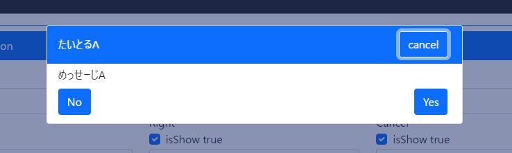
const ret = await Dialog.Show(`めっせーじA`, `たいとるA`);
こんな感じで書いて↓みたいなダイアログを出したい!
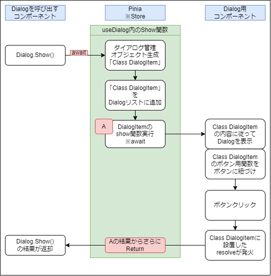
図にするとこんな感じ
実装
Class DialogItem
ダイアログの設定、ユーザーからのリアクション用関数など格納用クラス
export class DialogItem {
  public message: string;
  public title: string;
  //ボタン色やボタンの非表示などのオプション情報用
  public option: Dialog.Option;

  //optionは省略できるようにした
  constructor(message: string, title: string, option: Dialog.Option = Dialog.InitOption()) {
    this.message = message;
    this.title = title;
    this.option = option;
  }

  public show = () => {
    return new Promise<Dialog.Result>((resolve, reject) => {
      // ダイアログ用コンポーネントから実際に呼び出される関数
      this.leftClick = () => resolve(Dialog.Result.Left);
      this.rightClick = () => resolve(Dialog.Result.Right);
      this.cancelClick = () => resolve(Dialog.Result.Cancel);
    });
  };
  public leftClick = () => console.log();
  public rightClick = () => console.log();
  public cancelClick = () => console.log();
}
あとはResultの定義やら色設定の定義やらOptionの型定義と初期化関数
export namespace Dialog {
  //わかりやすいよう、右、左、キャンセル、という返却方法にした
  export const Result = {
    Right: 'right',
    Left: 'left',
    Cancel: 'cancel',
  } as const;
  export type Result = typeof Result[keyof typeof Result];

  export const Theme = {
    primary: 'primary',
    secondary: 'secondary',
    success: 'success',
    danger: 'danger',
    warning: 'warning',
    light: 'light',
    dark: 'dark',
    info: 'info',
  } as const;
  export type Theme = typeof Theme[keyof typeof Theme];

  export const BtnTheme = {
    primary: 'primary',
    secondary: 'secondary',
    success: 'success',
    danger: 'danger',
    warning: 'warning',
    light: 'light',
    dark: 'dark',
    info: 'info',
  } as const;
  export type BtnTheme = typeof BtnTheme[keyof typeof BtnTheme];

  /**
   * Option interface
   */
  export interface Option {
    theme: Theme;
    btnLeft: {
      isShow: boolean;
      label: string;
      btnTheme: BtnTheme;
    };
    btnRight: {
      isShow: boolean;
      label: string;
      btnTheme: BtnTheme;
    };
    btnCancel: {
      isShow: boolean;
      label: string;
      btnTheme: BtnTheme;
    };
  }
  /**
   * Option 初期化
   * Store経由で利用する
   */
  export const InitOption = (): Dialog.Option => {
    return {
      theme: Dialog.BtnTheme.primary,
      btnLeft: {
        isShow: true,
        label: 'No',
        btnTheme: 'primary',
      },
      btnRight: {
        isShow: true,
        label: 'Yes',
        btnTheme: 'primary',
      },
      btnCancel: {
        isShow: true,
        label: 'cancel',
        btnTheme: 'light',
      },
    };
  };
}

/**
 * Dialogを使用する際に使用するオブジェクト
 */
export interface Dialog {
  Show: (message: string, title: string, option?: Dialog.Option) => Promise<Dialog.Result>;
  InitOption: typeof Dialog.InitOption;
  Result: typeof Dialog.Result;
  BtnTheme: typeof Dialog.BtnTheme;
  Theme: typeof Dialog.Theme;
}
DialogItem を格納する用のPiniaのStore
Piniaのインストール
Piniaをインストールしていない場合インストール
npm i pinia
Vueをマウントする前にPiniaをVueに登録
import { createApp } from 'vue';
import { createPinia } from 'pinia';//←これ
import App from './script/root-view.vue';
const vueApp = createApp(App);
const pinia = createPinia();
vueApp.use(pinia);//←これ
vueApp.mount('#app');
PiniaのStore (storeDialog)
ストア側に上記DialogItemを格納する配列を用意
配列にしているのはDialogを複数呼び出したときに早い方から順番に表示させるため
import dayjs from 'dayjs';
import { defineStore } from 'pinia';
import { Dialog, DialogItem } from './dialog';
export interface StoreState {
  isInit: boolean;
  //DialogItemを格納する配列
  penndingList: {
    ts: string;//ダイアログ閉じたあと削除するための目印
    data: DialogItem;
  }[];
}
export const useStoreDialog = defineStore('storeDialog', {
  state: (): StoreState => {
    return {
      isInit: false,
      penndingList: [],
    };
  },
  actions: {
    useDialog(): Dialog {
      return {
        //このShowが実際にDialogを使用するときに呼び出される関数
        Show: async (message: string, title: string, option: Dialog.Option = Dialog.InitOption()) => {
          const daialogItem = new DialogItem(message, title, option);
          if (!option.btnLeft.isShow && !option.btnRight.isShow && !option.btnCancel.isShow) {
            console.error('閉じれるボタンが一つもありませんっ!!');
            return Dialog.Result.Cancel;
          }
          this.penndingList.push({ ts: dayjs().format('x') + '_' + Math.random(), data: daialogItem });
          return await daialogItem.show();
        },
        InitOption: Dialog.InitOption,
        Result: Dialog.Result,
        BtnTheme: Dialog.BtnTheme,
        Theme: Dialog.Theme,
      };
    },
    remove(ts: string) {
      this.penndingList = this.penndingList.filter((row) => row.ts !== ts);
    },
  },
});
ちなみにactionsのuseDialogはDialogを使いやすい形でコントロールできるオブジェクトを返却するようにしています。
色々なロジックを試した結果これに行き着いた・・・
useDialog(): Dialog {・・・
別に説明するけど使う時はこんな感じ
const storeDialog = useStoreDialog();
const Dialog = storeDialog.useDialog();
const ret = await Dialog.Show(`めっせーじA`, `たいとるA`);
Dialog用コンポーネント
表示するDialogItemを取得
computed便利です
const activeItem = computed(() => {
  if (storeDialog.penndingList.length !== 0) {
    return storeDialog.penndingList[0];
  } else {
    return null;
  }
});

//ダイアログが表示中かどうか
const hasPenndingList = computed(() => {
  return storeDialog.penndingList.length !== 0;
});
クリックイベントをDialogItemに紐づけ
activeItemのクリックイベントを発火させればOK
//クリックイベント
const clickLeft = () => {
  const item = activeItem.value;
  if (item === null) return;
  if (item.data.option.btnLeft.isShow === false) return;
  item.data.leftClick();
  storeDialog.remove(item.ts);
};
const clickRight = () => {
  const item = activeItem.value;
  if (item === null) return;
  if (item.data.option.btnRight.isShow === false) return;
  item.data.rightClick();
  storeDialog.remove(item.ts);
};

const clickCancel = () => {
  console.log('clickCancel');
  const item = activeItem.value;
  if (item === null) return;
  if (item.data.option.btnCancel.isShow === false) return;
  item.data.cancelClick();
  storeDialog.remove(item.ts);
};
Vueuseの「useFocusTrap」
フォーカスさんがDialogコンポーネントから逃げ出さないよう罠を仕掛けましょう。
const focusTrapElm = ref();
const { activate, deactivate } = useFocusTrap(focusTrapElm, {
  allowOutsideClick: true,
});
watch(hasPenndingList, async (value) => {
  console.log('hasPenndingList', value);
  await nextTick();
  if (value) {
    activate();
  } else {
    deactivate();
  }
});
「useFocusTrap」について詳しくは
色設定の挙動
とりあえず無意識にBootstarp使うの癖なので背景色に合わせて文字色を設定。
※やっぱcomputedベンリィーーー
const TitleColor = computed(() => {
  if (activeItem.value === null) return '';
  switch (activeItem.value.data.option.theme) {
    case Dialog.Theme.primary:
    case Dialog.Theme.secondary:
    case Dialog.Theme.success:
    case Dialog.Theme.danger:
    case Dialog.Theme.dark:
      return 'text-white';
    case Dialog.Theme.light:
    case Dialog.Theme.info:
    case Dialog.Theme.warning:
      return 'text-dark';
    default:
      return '';
  }
});
Template
activeItemからボタンラベルやら色、表示非表示やらを設置
ここは面白くもない工夫もない。
このままだとDialogを閉じる際に文字が消えてDialogが薄っぺらくなるのが一瞬見えます。
それが嫌ならDialogを閉じる制御を担うRefなどを用意して閉じるイベントの前にそれを操作、
その数秒後に閉じる制御を入れるなど何かしら配慮が必要です。
<template>
  <div
    class="window-cover"
    :class="{ isShow: hasPenndingList, hasCancelBtn: activeItem?.data.option.btnCancel.isShow }"
    @click="clickCancel()"
  >
    <div class="card" @click.stop ref="focusTrapElm">
      <div class="card-header" :class="[`bg-${activeItem?.data.option.theme}`, TitleColor]">
        <div class="dialog-title me-2">{{ activeItem?.data.title }}</div>
        <div class="ms-auto" v-if="activeItem?.data.option.btnCancel.isShow">
          <button
            class="btn me-1"
            :class="[`btn-outline-${activeItem.data.option.btnCancel.btnTheme}`]"
            @click="clickCancel()"
          >
            {{ activeItem.data.option.btnCancel.label }}
          </button>
        </div>
      </div>
      <div class="card-body py-1">
        <div class="dialog-message">{{ activeItem?.data.message }}</div>
        <div class="d-flex mt-2 mb-2">
          <div class="me-auto" v-if="activeItem?.data.option.btnLeft.isShow">
            <button
              class="btn btn-primary me-1"
              :class="[`btn-${activeItem.data.option.btnLeft.btnTheme}`]"
              @click="clickLeft()"
            >
              {{ activeItem.data.option.btnLeft.label }}
            </button>
          </div>
          <div class="ms-auto" v-if="activeItem?.data.option.btnRight.isShow">
            <button class="btn me-1" :class="[`btn-${activeItem.data.option.btnRight.btnTheme}`]" @click="clickRight()">
              {{ activeItem.data.option.btnRight.label }}
            </button>
          </div>
        </div>
      </div>
    </div>
  </div>
</template>
ダイアログ用のコンポーネントをRootコンポーネントにセット
import VcDialog from './vc-dialog.vue';
そういえばVue3系のteleport機能はModal系UIと相性最高ですね。
<teleport to="#teleport">
  <VcDialog></VcDialog>
</teleport>
使い方
使いたいコンポーネントでPiniaのStoreを呼び出して
Dialogコントロール用のオブジェクトを取得。
import { useStoreDialog } from './store-dialog';
const storeDialog = useStoreDialog();
const Dialog = storeDialog.useDialog();//Dialogコントロール用オブジェクト
ちなみにDialogの型定義は上のソースにもチラって出てきましたがこんな感じ
export interface Dialog {
  Show: (message: string, title: string, option?: Dialog.Option) => Promise<Dialog.Result>;
  InitOption: typeof Dialog.InitOption;
  Result: typeof Dialog.Result;
  BtnTheme: typeof Dialog.BtnTheme;
  Theme: typeof Dialog.Theme;
}
Dialogのオプション生成用関数とかResultのオブジェクトとか色設定のオブジェクトとか返すようにしています。
使用方法 オプション指定なし
const ret = await Dialog.Show(`めっせーじA`, `たいとるA`);
if (ret === Dialog.Result.Cancel) {
  console.log('Cancel Btn が押されました。');
} else if (ret === Dialog.Result.Left) {
  console.log('Left Btn が押されました。');
} else if (ret === Dialog.Result.Right) {
  console.log('Rigth Btn が押されました。');
}
使用方法 オプション指定あり
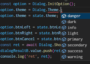
const option = Dialog.InitOption();
option.theme = Dialog.Theme.danger;
option.btnCancel.isShow = false;
const ret = await Dialog.Show(`めっせーじA`, `たいとるA`, option);
if (ret === Dialog.Result.Cancel) {
  console.log('Cancel Btn が押されました。');
} else if (ret === Dialog.Result.Left) {
  console.log('Left Btn が押されました。');
} else if (ret === Dialog.Result.Right) {
  console.log('Rigth Btn が押されました。');
}
ちなみにOptionオブジェクトはこれ
 export const InitOption = (): Dialog.Option => {
    return {
      theme: Dialog.BtnTheme.primary,
      btnLeft: {
        isShow: true,
        label: 'No',
        btnTheme: 'primary',
      },
      btnRight: {
        isShow: true,
        label: 'Yes',
        btnTheme: 'primary',
      },
      btnCancel: {
        isShow: true,
        label: 'cancel',
        btnTheme: 'light',
      },
    };
  };
実際に使うときにはDialog経由で定数を選べるようにした。
GitHubにサンプル上げてます
ついでにGitHubにデモページも・・・
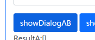
捕捉
デモページはオプションを選べるようにしたのと、
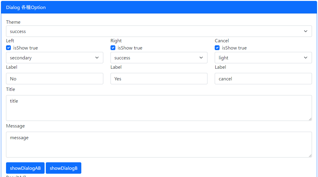
showDialogAB というボタンで同時に2つダイアログを出す挙動も含めてみた。
最後にClassをVueで使用する注意点
ClassをVueで使用する場合、以下のようなクラスの中でthis経由にプロパティを変更する方法はReactiveにUIが追従しない
import { ref } from 'vue';
class Test {
  public text: string;
  constructor(text: string) {
    this.text = text;
  }
  public setText = (text: string) => {
    this.text = text;
    console.log(this.text);
  };
}
const testData = ref(new Test('aaa'));
この要素をいくらクリックしても表示の値は初期値「aaa」のまま
<div class="" @click="testData.setText(dayjs().format('x'))">{{ testData.text }}</div>
ちなみに解決策は2種類
方法① Classの中身を変更
中身をrefオブジェクトやreactiveオブジェクトにする方法
import { ref, Ref } from 'vue';
class Test {
  public text: Ref<string>;
  constructor(text: string) {
    this.text = ref(text);
  }
  public setText = (text: string) => {
    this.text.value = text;
    console.log(this.text);
  };
}
const testData = ref(new Test('aaa'));
方法② 値をセットする方法を考える
これだとClassを使うメリットが・・・・・
<div class="" @click="testData.text = dayjs().format('x')">{{ testData.text }}</div>