初めに

javascriptベースで手軽に対話的な操作が可能な作図が出来るPlotly Express(公式サイト)というライブラリが少し前に公開されたのを見つけました。
今までの静的な作図とは明らかに異なる次元のポテンシャルを感じたので、備忘録を兼ねて基本的な可視化手法の描き方をまとめました。
参考までに、matplotlib+seabornで同様の図を書いたパターンと比較しています。
「基本的な可視化手法」は、以前書いた「探索的データ解析における正しい可視化手法の選び方と描き方」に準拠しています。
Plotly Expressとは
Plotly Expressは2019年の3月に公開されたplotlyの高レベルAPI群です。
インタラクティブで複雑な描画を簡単に書けるのが特徴です。
公式サイト: https://plot.ly/python/plotly-express/
API reference: https://www.plotly.express/plotly_express/#plotly_express.line
Github(plotlyの一部): https://github.com/plotly/plotly.py
Matplotlibを手軽に書くためのWrapperと言えばSeabornがありますが、どちらの方が良いのかPlotly ExpressとSeabornを比較してみます。
大まかに
- seabornはmatplotlibベースで楽に静的な作図をするライブラリ
- Plotly Expressはjavascriptベースで楽に動的な作図をするライブラリ
という対比構造です。
(参考)Anacondaが整理した2018年段階の描画ライブラリまとめ
plotlyとは
概要
plotlyはオープンソースでインタラクティブなデータ可視化ツールです。
Python以外にもRやjavascriptなどで使えます。
2019/1/11からplotly.pyのバージョンが4に上がりました。
MITライセンスです。
Github: https://github.com/plotly/plotly.py
plotly3までは気をつけないと作成したグラフが"オンライン"で処理されたり公開されちゃったりするなどより商用の匂いがしていたらしいです。
plotly4で"オフラインモード"がデフォルトになり、無料の枠内で出来ることが広がると共に使いやすくなりました。
plotly 4.0.0のアナウンス: https://community.plot.ly/t/introducing-plotly-py-4-0-0/25639
(参考)plotly社の製品群
無償
plotly: javascriptベースで対話的な操作が可能な可視化モジュール
有償(一部)
Chart Studio: plotlyのオンラインモードが切り離されて出来たサービス?ビジュアライゼーションシステム
DASH: javascriptの知識を必要とせずに、PythonやRによるダッシュボードアプリが作れる
モジュールのインストール
mac, jupyter labが入っている想定
jupyter labに対応するためにいくつかの設定が必要です
pip install plotly

# Avoid "JavaScript heap out of memory" errors during extension installation
# (OS X/Linux)
export NODE_OPTIONS=--max-old-space-size=4096

# Jupyter widgets extension
jupyter labextension install @jupyter-widgets/jupyterlab-manager@1.0 --no-build

# FigureWidget support
jupyter labextension install plotlywidget@1.2.0 --no-build

# and jupyterlab renderer support
jupyter labextension install jupyterlab-plotly@1.2.0 --no-build

# JupyterLab chart editor support (optional)
jupyter labextension install jupyterlab-chart-editor@1.2 --no-build

# Build extensions (must be done to activate extensions since --no-build is used above)
jupyter lab build

# Unset NODE_OPTIONS environment variable
# (OS X/Linux)
unset NODE_OPTIONS
詳細は公式サイトのinstallページを参照しましょう。
ライブラリのインポート
import matplotlib.pyplot as plt
import pandas as pd
import numpy as np
import seaborn as sns
import plotly.express as px
from plotly.subplots import make_subplots
import plotly.figure_factory as ff
import plotly.graph_objects as go
import plotly.io as pio
import japanize_matplotlib
import datetime
from matplotlib.dates import MonthLocator
from IPython.display import HTML

sns.set_style('darkgrid')
pio.templates.default = 'seaborn'
plt.rcParams['font.family'] = 'IPAexGothic'

%matplotlib inline
%config InlineBackend.figure_formats = {'png', 'retina'}

import matplotlib
import plotly
print(matplotlib.__version__) # 3.1.1
print(sns.__version__) # 0.9.0
print(plotly.__version__) # 4.2.1
# iris datasetを使います
iris = sns.load_dataset('iris')
iris.head()
| sepal_length | sepal_width | petal_length | petal_width | species | |
|---|---|---|---|---|---|
| 0 | 5.1 | 3.5 | 1.4 | 0.2 | setosa |
| 1 | 4.9 | 3.0 | 1.4 | 0.2 | setosa |
| 2 | 4.7 | 3.2 | 1.3 | 0.2 | setosa |
| 3 | 4.6 | 3.1 | 1.5 | 0.2 | setosa |
| 4 | 5.0 | 3.6 | 1.4 | 0.2 | setosa |
ヒストグラム
matplotlib+seaborn
fig, axes = plt.subplots(ncols=2, figsize=(16, 4))
sns.distplot(iris['sepal_length'], bins=np.arange(4,8,0.25), kde=False, label='all', ax=axes[0])
sns.distplot(iris.query('species=="setosa"')['sepal_length'], kde=False,
             bins=np.arange(4,8,0.25), label='setosa', hist_kws={'alpha':0.3}, ax=axes[1])
sns.distplot(iris.query('species=="versicolor"')['sepal_length'], kde=False,
             bins=np.arange(4,8,0.25), label='versicolor', hist_kws={'alpha':0.3}, ax=axes[1])
sns.distplot(iris.query('species=="virginica"')['sepal_length'], kde=False,
             bins=np.arange(4,8,0.25), label='virginica', hist_kws={'alpha':0.3}, ax=axes[1])
axes[0].set_title("がくの長さのヒストグラム(cm)")
axes[1].set_title("品種毎のがくの長さのヒストグラム(cm)")
axes[1].legend()
plt.show()

Plotly Express
# binの幅を明示的に指定できないが、nbinsの大きさを変えるとよしなにいい感じの幅にしてくれる
# plotly expressはfigを生成する
# subplotsの中に図を格納したい場合は、各々のfig.dataの中からtraceを取り出して格納できる
# が、marginalを指定した場合marginalの位置が崩れるので一旦放置
fig = px.histogram(iris, x='sepal_length', color='species',
                           nbins=19, range_x=[4,8], width=600, height=350,
                           opacity=0.4, marginal='box')
# histogram描画時にrange_yを指定すると、marginalのboxplotの描画位置が崩れる
fig.update_layout(barmode='overlay')
fig.update_yaxes(range=[0,20],row=1, col=1)
# htmlで保存
# fig.write_html('histogram_with_boxplot.html', auto_open=False)
fig.show()
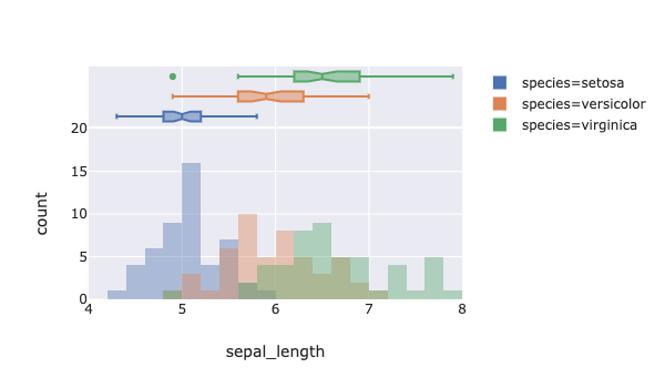
動くリンクはこちら: https://uchidehiroki.github.io/plotly_folders/Basic_Charts/histogram_with_boxplot_px.html
マウスを重ねると様々な情報がポップアップします。
marginal plotが簡単にかけます。
右側の項目から見たい品種をダブルクリックするとそれだけを見ることが出来ます。
plotly
plotly本体の関数を使って描いてみます
fig = make_subplots(rows=1, cols=2, subplot_titles=('がく片の長さ(cm)', '品種毎のがく片の長さ(cm)'))
fig.add_trace(go.Histogram(x=iris['sepal_length'], xbins=dict(start=4,end=8,size=0.25), hovertemplate="%{x}cm: %{y}個", name="全品種"), row=1, col=1)
for species in ['setosa', 'versicolor', 'virginica']:
    fig.add_trace(go.Histogram(x=iris.query(f'species=="{species}"')['sepal_length'],
                           xbins=dict(start=4,end=8,size=0.25), hovertemplate="%{x}cm: %{y}個", name=species), row=1, col=2)
fig.update_layout(barmode='overlay', height=400, width=900)
fig.update_traces(opacity=0.3, row=1, col=2)
fig.update_xaxes(tickvals=np.arange(4,8,0.5), title_text='sepal_length')
fig.update_yaxes(title_text='度数')
fig.write_html('../output/histogram_with_boxplot_plotly.html', auto_open=False)
fig.show()
https://uchidehiroki.github.io/plotly_folders/Basic_Charts/histogram_with_boxplot_plotly.html
箱ひげ図
matplotlib+seaborn
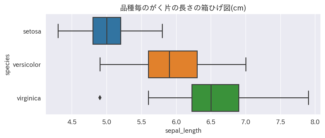
fig, ax = plt.subplots(figsize=(8,3))
sns.boxplot(x='sepal_length', y='species', data=iris, order=('setosa', 'versicolor', 'virginica'), ax=ax)
ax.set_title('品種毎のがく片の長さの箱ひげ図(cm)')
plt.show()
Plotly Express
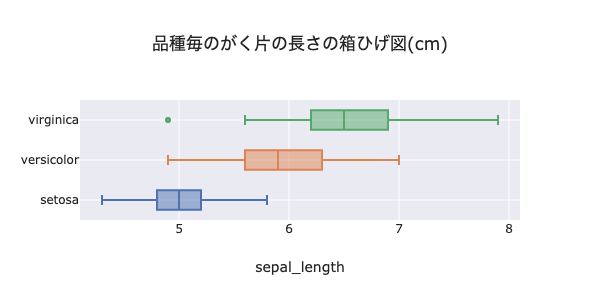
fig = px.box(iris, y='species', x='sepal_length', color='species', orientation='h',
       category_orders={'species': ['setosa', 'versicolor', 'virginica']},
       title='品種毎のがく片の長さの箱ひげ図(cm)', width=600, height=400)
fig.update_layout(showlegend=False)
fig.write_html('../output/boxplot_px.html', auto_open=False)
fig.show()
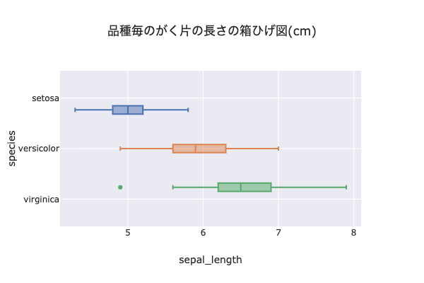
https://uchidehiroki.github.io/plotly_folders/Basic_Charts/boxplot_px.html
例えば、外れ値の点にカーソルを重ねると情報がポップアップします。
品種毎に横線上に乗ってくれないのがちょっと美しくないです...
plotly
fig = go.Figure()
for species in iris['species'].unique():
    fig.add_trace(go.Box(x=iris.query(f'species=="{species}"')['sepal_length'], name=species))
fig.update_layout(height=300, width=600, showlegend=False, title_text='品種毎のがく片の長さの箱ひげ図(cm)')
fig.update_xaxes(title_text='sepal_length')
fig.write_html('../output/boxplot_plotly.html', auto_open=False)
fig.show()
https://uchidehiroki.github.io/plotly_folders/Basic_Charts/boxplot_plotly.html
こちらはちゃんと箱ひげ図が線上に乗ってます
棒グラフ
matplotlib + seaborn
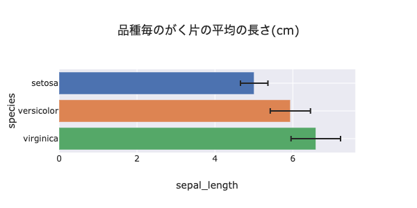
fig, ax = plt.subplots(figsize=(8,3))
sns.barplot(x='sepal_length', y='species', order=['setosa', 'versicolor', 'virginica'], ci='sd', data=iris, ax=ax)
ax.set_title('品種毎のがく片の平均の長さ(cm)')
plt.show()
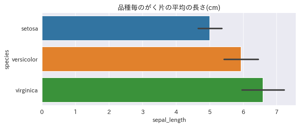
Plotly Express
# PlotlyはSeabornと違ってよしなに長さの平均や標準偏差を計算してくれない
agg_iris = iris.groupby(['species'])[['sepal_length']].agg([np.mean, np.std, 'count']).reset_index()
agg_iris.columns = ['species', 'sepal_length', 'std', 'count']
fig = px.bar(agg_iris, x='sepal_length', y='species', color='species', category_orders={'species': ['setosa', 'versicolor', 'virginica']},
       error_x='std', orientation='h', hover_data=['count'], height=300, width=600, title='品種毎のがく片の平均の長さ(cm)')
fig.update_layout(showlegend=False)
fig.write_html('../output/barplot_px.html', auto_open=False)
fig.show()
https://uchidehiroki.github.io/plotly_folders/Basic_Charts/barplot_px.html
(参考) ggplot見たいにfacetを利用したい場合
比較軸が複数ある場合に便利です
tips = px.data.tips()
fig = px.histogram(tips, x="sex", y="tip", histfunc="avg", color="smoker", barmode="group",
             facet_row="time", facet_col="day", category_orders={"day": ["Thur", "Fri", "Sat", "Sun"],
                                                                "time": ["Lunch", "Dinner"]},
                  height=400, width=800)
fig.write_html('../output/boxplot_with_facet_px.html', auto_open=False)
fig.show()
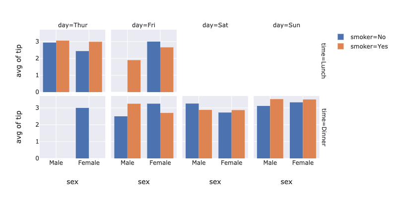
https://uchidehiroki.github.io/plotly_folders/Basic_Charts/boxplot_with_facet_px.html
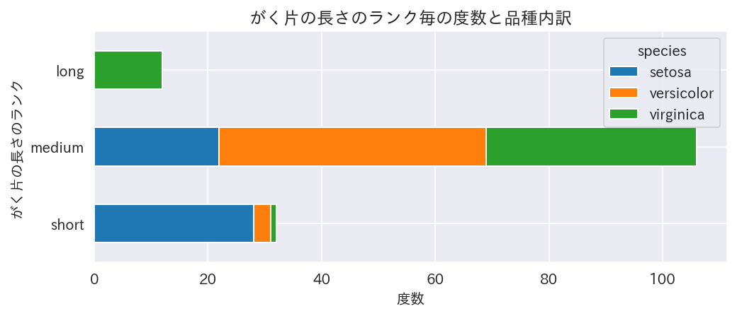
積み上げ棒グラフ
前処理
iris['sepal_length_rank'] = pd.cut(iris['sepal_length'], [4,5,7,8], labels=['short', 'medium', 'long'])
agg_iris = iris.groupby(['sepal_length_rank','species']).size().reset_index()
agg_iris.columns = ['sepal_length_rank', 'species', 'count']
pivot_iris = agg_iris.pivot(index='sepal_length_rank', columns='species', values='count')
matplotlib+seabornPandas Plot
# seabornにはstacked=Trueに該当する関数がないので、Pandas plotで書く
fig, ax = plt.subplots(figsize=(8,3))
pivot_iris.plot.barh(y=pivot_iris.columns, stacked=True, ax=ax)
ax.set_title('がく片の長さのランク毎の度数と品種内訳')
ax.set_xlabel('度数')
ax.set_ylabel('がく片の長さのランク')
plt.show()
Plotly Express
fig = px.bar(agg_iris, y='sepal_length_rank', x='count', color='species', orientation='h', barmode='relative',
      height=300, width=600, title='がく片の長さのランク毎の度数と品種内訳')
fig.update_xaxes(title_text='度数')
fig.update_yaxes(title_text='がく片の長さのランク')
fig.write_html('../output/stacked_barplot_px.html', auto_open=False)
fig
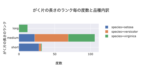
https://uchidehiroki.github.io/plotly_folders/Basic_Charts/stacked_barplot_px.html
任意の要素を選んで積み上げられます
散布図
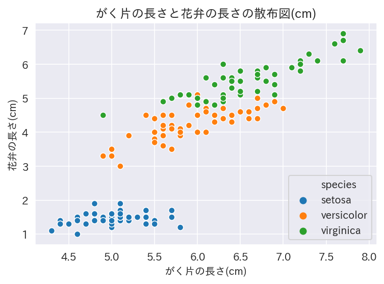
matplotlib + seaborn
# 2変数の相関を見たいとき
fig, ax = plt.subplots(figsize=(6,4))
sns.scatterplot(x='sepal_length', y='petal_length', hue='species', data=iris, ax=ax)
ax.legend(loc='lower right')
ax.set_title('がく片の長さと花弁の長さの散布図(cm)')
ax.set_xlabel('がく片の長さ(cm)')
ax.set_ylabel('花弁の長さ(cm)')
plt.show()
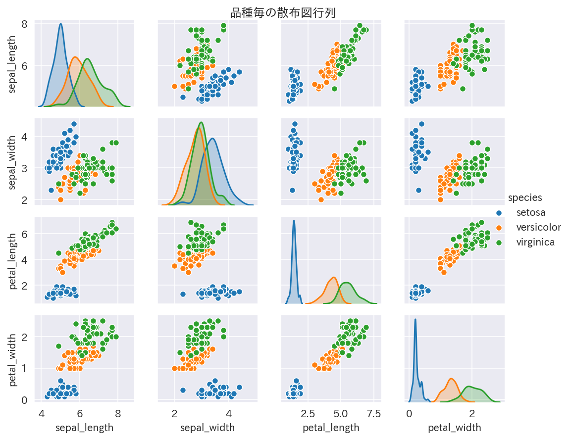
# 多変数の相関を見たいとき
g = sns.pairplot(iris, hue='species')
plt.subplots_adjust(top=0.95)
g.fig.suptitle('品種毎の散布図行列')
g.fig.set_size_inches(8,6)
Plotly Express
fig = px.scatter(px.data.iris(), x='sepal_length', y='petal_length', color='species', symbol='species',
                 marginal_x='box', marginal_y='histogram', trendline='ols',
           hover_data=['species_id'], width=800, height=600, title='がく片の長さと花弁の長さの散布図(cm)')
# rangeはscatterの中ではなく個別に指定しないと、marginalな図にも反映されてmarginalな図が見えなくなる
fig.update_xaxes(title_text='がく片の長さ(cm)', range=[4,8], row=1, col=1)
fig.update_yaxes(title_text='花弁の長さ(cm)', range=[0.5,8], row=1, col=1)
fig.write_html('../output/scatterplot_px.html', auto_open=False)
fig.show()
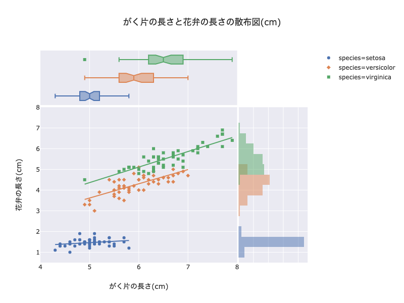
https://uchidehiroki.github.io/plotly_folders/Basic_Charts/scatterplot_px.html
fig = px.scatter_matrix(iris, dimensions=['sepal_length','sepal_width','petal_length','petal_width'],
                 color='species', size_max=1, title='品種毎の散布図行列', width=800,height=600)
fig.write_html('../output/scattermatrix_px.html', auto_open=False)
fig
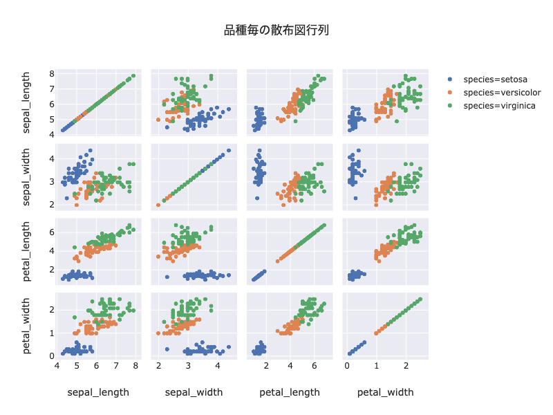
https://uchidehiroki.github.io/plotly_folders/Basic_Charts/scattermatrix_px.html
右上の投げ縄ツールを使って一部のデータを囲むと、全ての図においてそのデータに対応するデータのみが強調されます
"Toggle Spike Lines"をオンにすると、x座標とy座標の補助線を出してくれます
(参考)平行座標
変数が多すぎる場合は、散布図行列を見るより平行座標を使った方がよいです
# 軸の並び替えがインタラクティブに操作できる、これはヤバイ
# それぞれの軸でフィルタリングも可能、軸の値をクリックすると図示する幅を調整できる
# 散布図行列で各々の相関をみるより、こちらの平衡座標で見た方が複数の軸を考慮できるので良さそう
fig = px.parallel_coordinates(px.data.iris(),
                              color='species_id',
                              dimensions=['sepal_length','sepal_width','petal_length','petal_width', 'species_id'],
                              color_continuous_scale=px.colors.diverging.Portland,
                             height=400, width=800)
fig.write_html('../output/parallel_coordinates_px.html', auto_open=False)
fig.show()
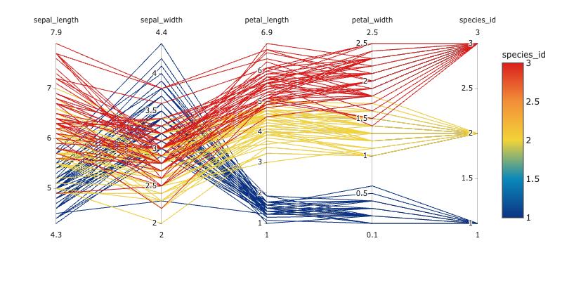
https://uchidehiroki.github.io/plotly_folders/Basic_Charts/parallel_coordinates_px.html
軸を並び替えられます
軸の中で値を選ぶとその値を通るデータのみにフィルタリングされます
# カテゴリ変数が軸にある場合はこんな風にもできる
fig = px.parallel_categories(iris, dimensions=['species', 'sepal_length_rank'], color='sepal_length',
                             labels={'species': 'あやめの品種', 'sepal_length_rank': 'がく片の長さの等級'},
                            height=400, width=600)
fig.write_html('../output/parallel_categories_px.html', auto_open=False)
fig.show()
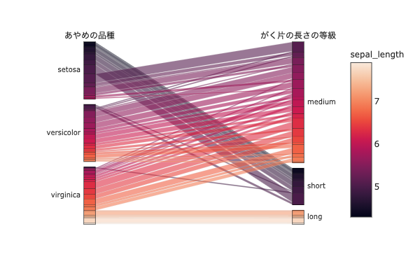
https://uchidehiroki.github.io/plotly_folders/Basic_Charts/parallel_categories_px.html
ヒートマップ
前処理
flights = sns.load_dataset("flights")
# クロス集計
crossed_flights = pd.pivot_table(flights, values="passengers", index="month", columns="year", aggfunc=np.mean)
# pd.crosstab(flights["month"], flights["year"], values=flights["passengers"], aggfunc=np.mean)でも可
matplotlib+seaborn
# ヒートマップ
fig, ax = plt.subplots(figsize=(8,6))
sns.heatmap(crossed_flights,annot=True, cmap="Oranges", fmt='.5g', ax=ax)
ax.set_title('乗客数のヒートマップ');
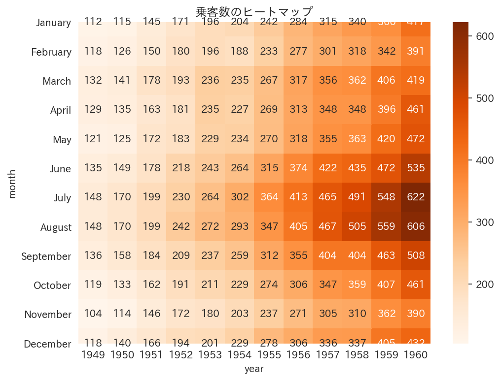
なんか数字が枠外にはみ出します...
昔はこうはならなかったのですが、謎です
Plotly Express
Plotly Expressには該当する関数がなかったので、plotly本体の関数を使います
plotly
fig = go.Figure()
fig.add_trace(go.Heatmap(z=crossed_flights, x=crossed_flights.columns, y=crossed_flights.index,
                        hovertemplate='%{x}-%{y}: %{z} passengers', colorscale='Oranges'))
fig.update_layout(height=400, width=600, title_text='乗客数のヒートマップ(ホバーありアノテートなし)')
fig.write_html('../output/heatmap_px.html', auto_open=False)
fig.show()
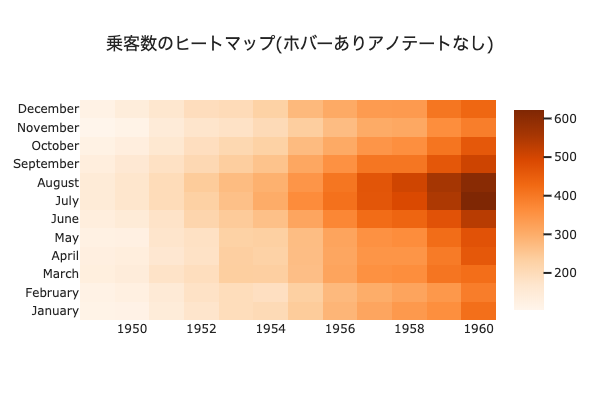
https://uchidehiroki.github.io/plotly_folders/Basic_Charts/heatmap_px.html
# heatmapはhoverをOFFにした方が見やすい
fig = ff.create_annotated_heatmap(z=crossed_flights.values, x=list(crossed_flights.columns),
                                  y=list(crossed_flights.index), colorscale='Oranges',
                                  hoverinfo='none')
fig.update_layout(height=400, width=600, showlegend=False, title_text='乗客数のヒートマップ(ホバーなしアノテートあり)')
fig.write_html('../output/heatmap_with_annotate_px.html', auto_open=False)
fig
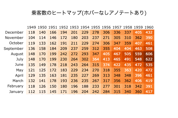
https://uchidehiroki.github.io/plotly_folders/Basic_Charts/heatmap_with_annotate_px.html
折れ線グラフ
前処理
# datetime型の列を準備
datetimes = []
for i, j in enumerate(flights.itertuples()):
    datetimes.append(datetime.datetime.strptime(f'{j[1]}-{j[2]}', '%Y-%B'))
flights['datetime'] = datetimes
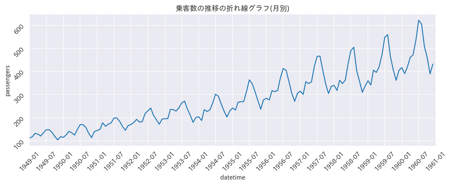
matplotlib+seaborn
fig, ax = plt.subplots(figsize=(12, 4))
sns.lineplot(x='datetime', y='passengers', data=flights, ax=ax)
ax.xaxis.set_major_locator(MonthLocator(interval=6))
ax.tick_params(labelrotation=45)
ax.set_xlim(datetime.datetime(1949,1,1,0,0,0),datetime.datetime(1961,1,1,0,0,0))
ax.set_title('乗客数の推移の折れ線グラフ(月別)')
plt.show()
Plotly Express
fig = px.line(flights, x='datetime', y='passengers',
              height=400, width=800, title='乗客数の推移の折れ線グラフ(月別)')
fig.update_layout(xaxis_range=['1949-01-01', '1961-01-01'], # datetime.datetimeで指定してもよい
                 xaxis_rangeslider_visible=True)
fig.update_xaxes(tickformat='%Y-%m', tickangle=45)
fig.write_html('../output/lineplot_px.html', auto_open=False)
fig.show()
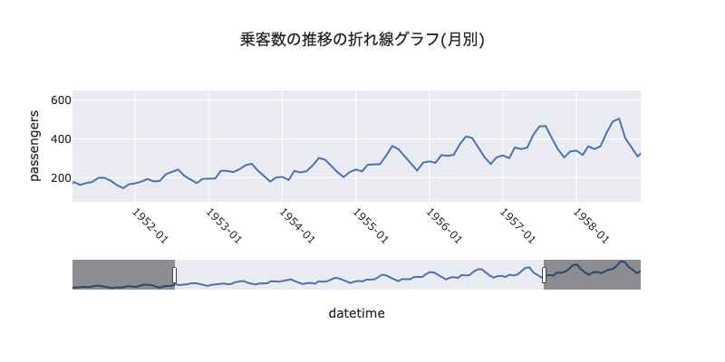
https://uchidehiroki.github.io/plotly_folders/Basic_Charts/lineplot_px.html
下のスライダーで指定した範囲の折れ線グラフを上で確認出来ます
複数の折れ線グラフを比較する場合は、比較したい項目のみを後から選択できます
他の面白いグラフたち
https://plot.ly/python/plotly-express/ を眺めていて面白かった図を並べてみました
Polar Coordinates
棒グラフでは単変量の長さの比較しか出来ませんでしたが、試験の成績など複数の軸でスコアを比較したい場合に使えそうです
melted_iris = iris.melt(id_vars=['species'], value_vars=['sepal_length', 'sepal_width', 'petal_length', 'petal_width'],
                       var_name='variable', value_name='value')
melted_iris = melted_iris.groupby(['species', 'variable']).mean().reset_index()
fig = px.line_polar(melted_iris, r='value', theta='variable', color='species', line_close=True,
                   height=500, width=500, title='あやめの品種毎のがく片と花弁の長さと幅')
fig.write_html('../output/line_polar_px.html', auto_open=False)
fig.show()
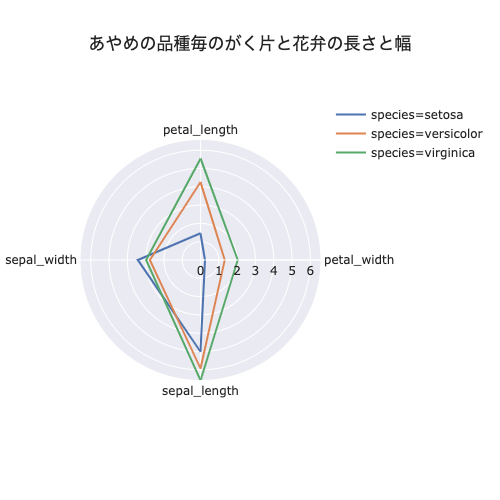
https://uchidehiroki.github.io/plotly_folders/Basic_Charts/line_polar_px.html
特にsetosaの花の形が違いそうですね
分布
fig = make_subplots(rows=1, cols=2, subplot_titles=('がく片の長さ(cm)', '品種毎のがく片の長さ(cm)'))
fig.add_trace(px.density_contour(iris, x="sepal_width", y="sepal_length").data[0],row=1, col=1)
fig2 = px.density_contour(iris, x="sepal_width", y="sepal_length", color='species')
[fig.add_trace(fig2.data[i], row=1, col=2) for i in range(len(fig2.data))] # fig2のtraceを全てfigに格納
fig.write_html('../output/densityplot_px.html', auto_open=False)
fig.show()
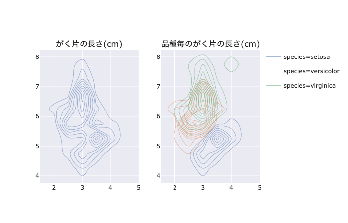
https://uchidehiroki.github.io/plotly_folders/Basic_Charts/densityplot_px.html
かっこいい
個々の等高線がどれくらいの高さを表しているのかをマウスで確認できます
アニメーション
gapminder = px.data.gapminder()
fig = px.scatter(gapminder, x="gdpPercap", y="lifeExp", animation_frame="year", animation_group="country",
           size="pop", color="continent", hover_name="country", facet_col="continent",
           log_x=True, size_max=45, range_x=[100,100000], range_y=[25,90])
fig.write_html('../output/scatter_animation_px.html', auto_open=False)
fig.show()
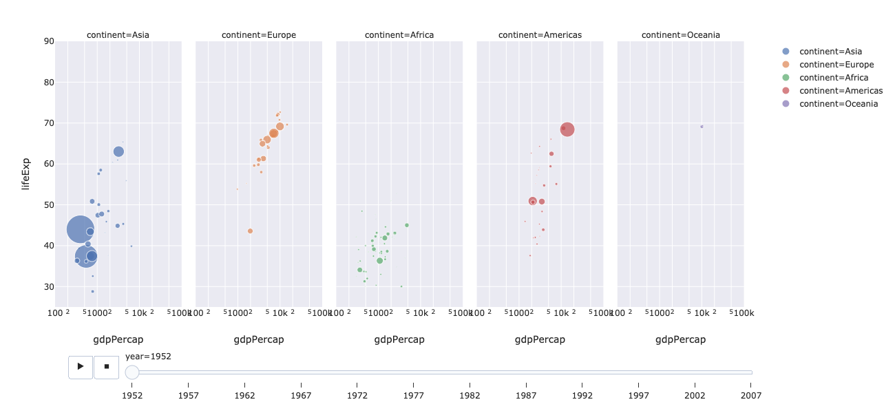
https://uchidehiroki.github.io/plotly_folders/Basic_Charts/scatter_animation_px.html
これはURLクリックして実際に動かしてみると面白いと思います
総評
独断と偏見でPlotly Expressとseaborn(matplotlib)を比較してみた結果をまとめます
◎: 使用を推奨
○: 特に問題無し
△: 不満
×: 実装無し
| グラフ | Plotly Express | matplotlib seaborn |
理由 |
|---|---|---|---|
| ヒストグラム | ◎ | ○ | seabornでも事足りるが、見たい品種の分布だけを選んで見れるのは利点 品種毎に同じコードを繰り返さなくてよいのもポイント |
| 箱ひげ図 | ○ | ○ | 特定の品種を選んで見たりホバーで追加するほどの情報はない Plotly Expressだとちょっと図が崩れる 気になる人はPlotly本体を使用すればひとまず大丈夫 |
| 棒グラフ | ○(※◎) | ◎ | seabornはよしなに平均や標準偏差を計算してくれるが、Plotly Expressは予め計算しておく必要がある (※2つ以上の軸で棒グラフを作りたい場合はfacetが使えるPlotly Express一択) |
| 積み上げ棒グラフ | ◎ | × | Plotly Expressは積み上げる要素を後から変更出来る seabornは積み上げ棒グラフの機能がない |
| 散布図 | ◎ | ○ | グループ毎に回帰線を入れられる 回帰線の傾きなどのメタ情報をホバーで確認できる marginal plotを簡単に組み込める 散布図の特定の箇所を拡大縮小出来る 個々のデータの識別番号などのメタ情報をホバー出来る 散布図行列においてある図の特定のデータを指定すると他の図全てで同じデータのみを強調してくれる データをグルーピングした場合特定のグループを選んで描画出来る |
| 平行座標 | ◎ | ? | 軸を並び替えたり特定の軸でフィルタリングをかけられる、カテゴリカル変数にも対応 平行座標は描画後に色々試行錯誤することで真の威力を発揮する |
| ヒートマップ | ○ | △ | 特に追加情報をホバーする必要がない場合はseabornで事足りる はずだが、手元の環境が悪いのかseabornは図が崩れた |
| 折れ線グラフ | ◎ | ○ | toggleでx軸やy軸から離れた所にある点でも座標の位置が直感的にわかる スライダーで任意の範囲を描画出来る 折れ線が複数あった場合(例えば47都道府県の人口推移など)、比較したい都道府県を選んでプロットできる |
Plotly Expressの圧勝です
他にもレーダーチャートや密度分布、アニメーションなど、上手く使えれば面白そうな描画がたくさんありました。
他にもSliderを使いこなせるとめっちゃかっこよくなります。
https://plot.ly/python/sliders/
https://uchidehiroki.github.io/plotly_folders/Basic_Charts/histogram_with_slider.html
(余談その1)Plotly Expressを使う上での留意事項
- データがドキュメントに保持される
- scriptタグ内にjson形式で埋め込まれるので公開する際は注意
- データ量が多いと重くなる
- ブラウザ+マシンに依存する
- クライアント側で処理するため
画像ファイルと比べると手間ですが、htmlファイルをローカルに置いたりオンラインでホストしてから参照した方が後々楽そうです
特に複数人に共有するときはオンラインでホストした方がいいでしょう
(余談その2)htmlファイルを後から参照する方法について
pngやjpegの画像ファイルと比べ、htmlファイルを表示するのには少しコツが要ります。
オフラインで表示する場合
htmlファイルのパスを指定すると描画できます
オンラインで表示する場合
plotlyの流儀: chart_studioを使います
plotlyのサーバー上にhtmlファイルをホストし、発行されたURLを参照すると描画できます
しかし、無料アカウントだとsecret linkを発行したりprivateな環境でホストすることが出来ません(むしろplotlyはそこで儲けている)。
htmlファイルのpublicなhostも合計100枚までしか対応していません。
そこで、github pagesを使用します。
githubのレポジトリにhtmlファイルを置き、 Settings→GitHub Pages→Sourceでmaster branchを選択し、Saveボタンを押します
あとは、username.github.io/path/to/html/filesにアクセスすればOKです
githubまんまなのでhtmlファイルの管理も楽チンです
公式サイト: https://pages.github.com/
参考: https://www.tam-tam.co.jp/tipsnote/html_css/post11245.html
privateなレポジトリでも、Github pages自体は公開できるみたいですね
パブリックに公開したくないデータで分析した場合は描画htmlファイルをプライベートレポジトリに保存して、URLだけ共有、といった形が良さそうです
(余談その3)jupyter labにおけるHTMLファイル参照
# htmlファイルを参照して埋め込む事ができます
HTML(filename='../output/histogram_with_boxplot_px.html')
# オンラインにおいた静的htmlを参照することもできます
HTML(url='https://uchidehiroki.github.io/plotly_folders/Basic_Charts/barplot_px.html')
終わりに
今までseaborn芸人をやっていたのに、あまり使う必要がなくなってしまいました。
少し寂しいですが、時代の流れに乗って行こうと思います。
PlotlyExpressのユーザーが増えてくれると嬉しいです。
以上、長くなってしまいましたがお付き合いありがとうございました。