まずはこちらを
Report Analyzer
開発者の記事です。
If you are a Power BI developer, I'm sure you are aware of the constant process of creating a model, creating a report and optimizing it. The optimization process is not so simple and is oftentimes frustrating and time consuming. It is for this reason that I built a new tool, called the Report Analyzer. The objective of this tool is to simplify the process for performance optimization, creating a more visual experience, and increase the probability that a Power BI developer creates a performant report.
Power BIの開発者であれば、モデルを作成し、レポートを作成し、最適化する、というプロセスを常に意識していると思います。最適化のプロセスはそれほど単純ではなく、しばしばフラストレーションと時間がかかるものです。このような理由から、私はReport Analyzerと呼ばれる新しいツールを作りました。このツールの目的は、パフォーマンス最適化のプロセスを簡素化し、より視覚的な体験を提供し、Power BI開発者がパフォーマンスの高いレポートを作成する確率を高めることです。
最適化のプロセスを簡素化する!
ということで実践してみたいと思います。
簡単な使い方。
- Power BI Desktop でレポートを表示する。
- パフォーマンスアナライザーを実行。
実践
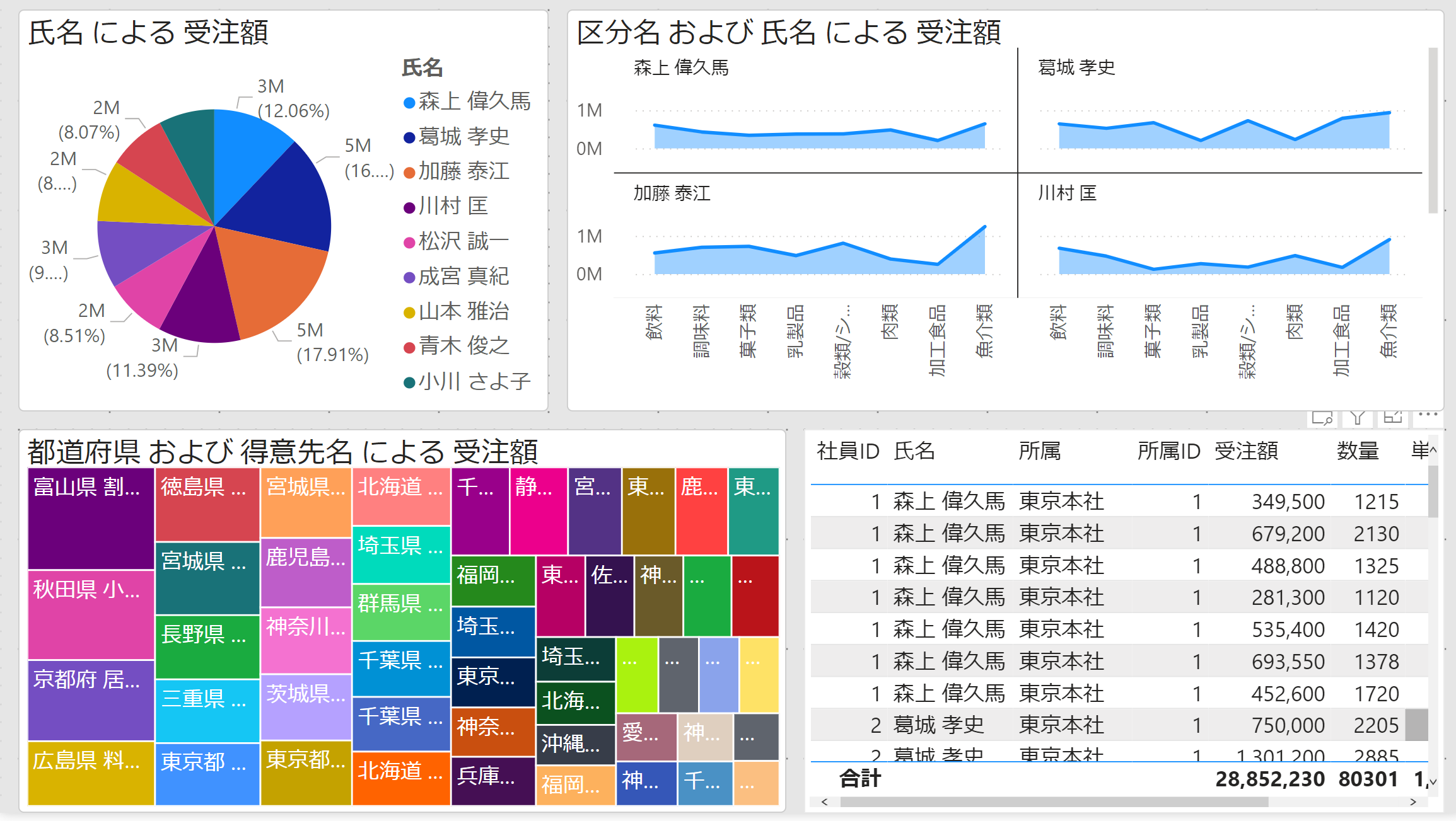
まずはレポートを作成
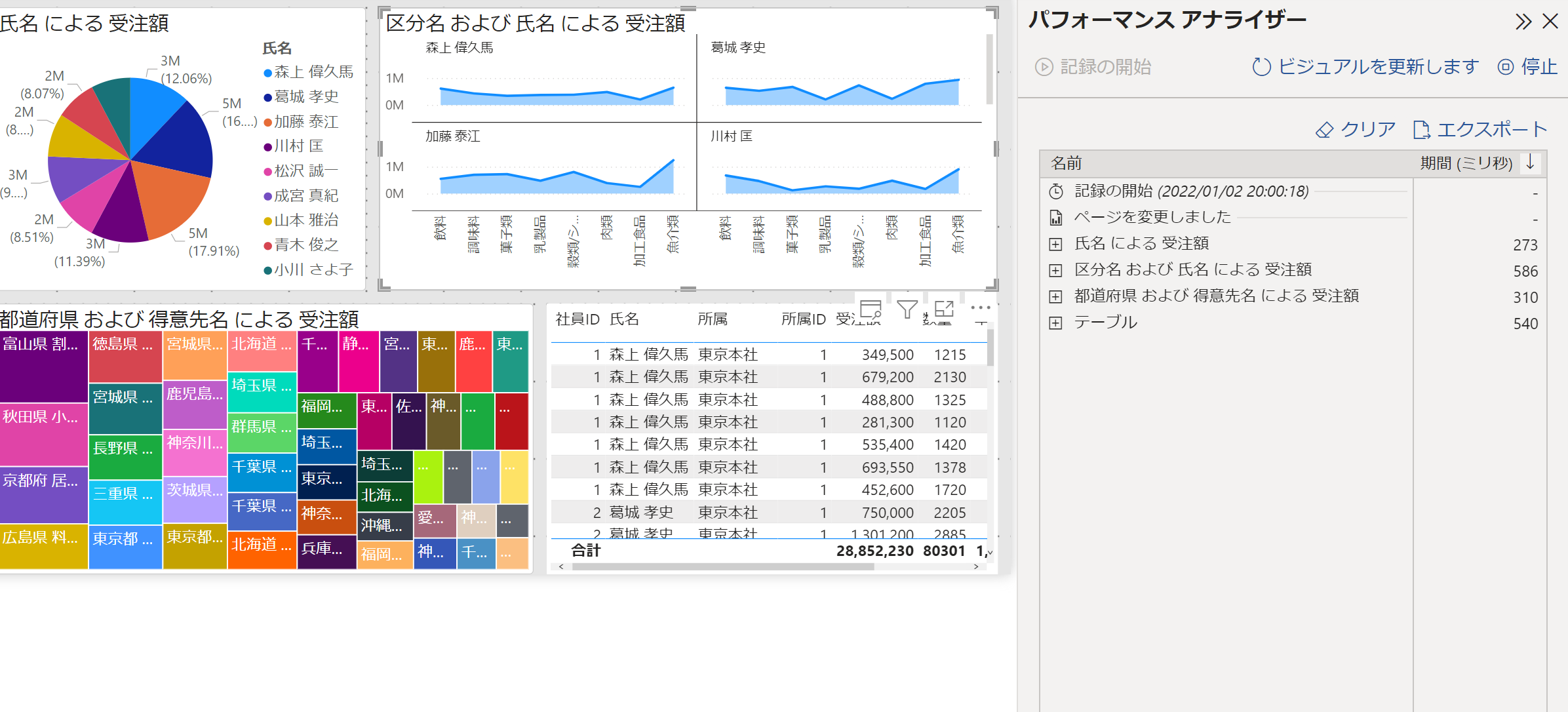
パフォーマンスアナライザーを実行
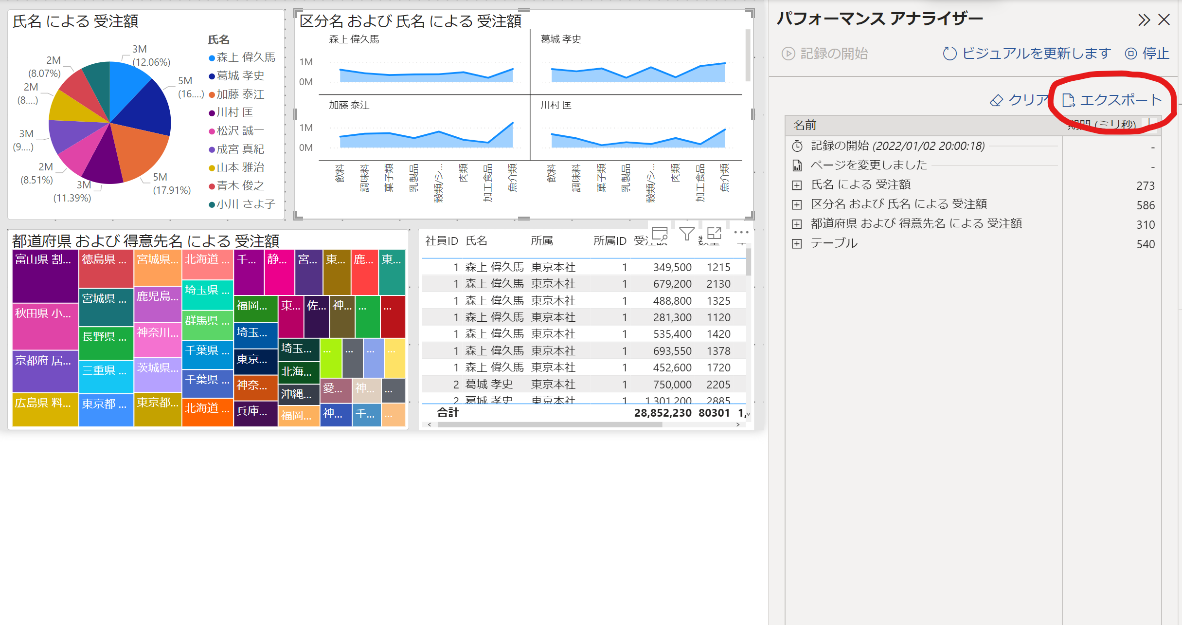
jsonファイルをダウンロード
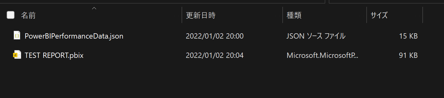
PBIXファイルとjsonファイルを同じフォルダに入れる
Report Analyzer を起動
先程作成したフォルダを選択すると、起動します。
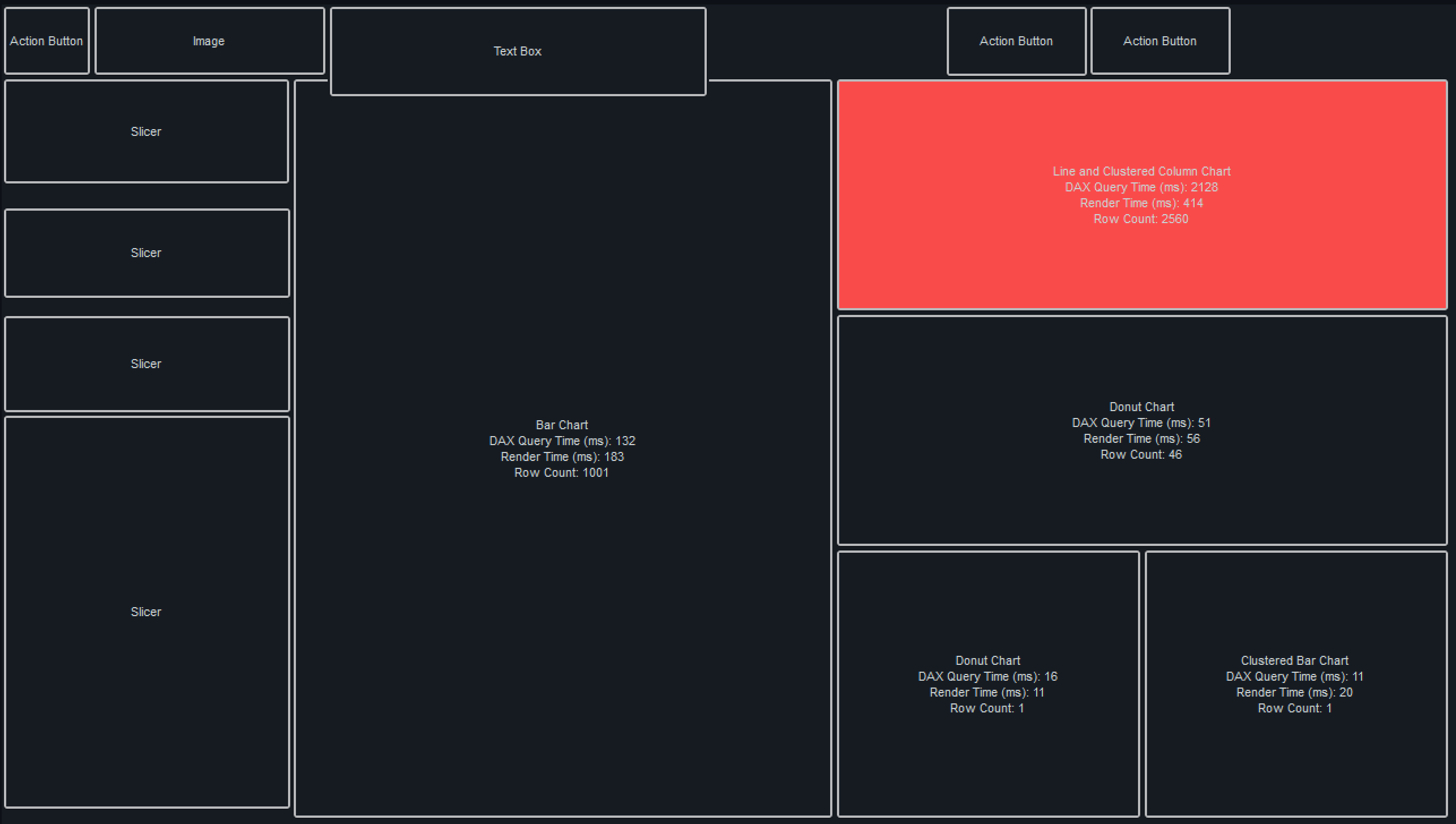
実際に重いビジュアルがあるレポートだとこういうこういう表示になります。

表示が遅いビジュアルが赤くなる!!
デフォルトの設定では、赤くなる閾値は 3秒 に設定されていました。
別のページに行くとここにも赤いビジュアルが・・!
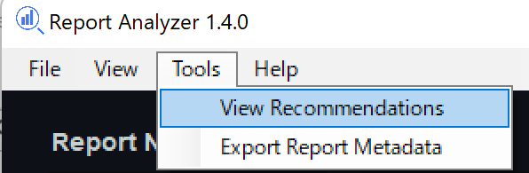
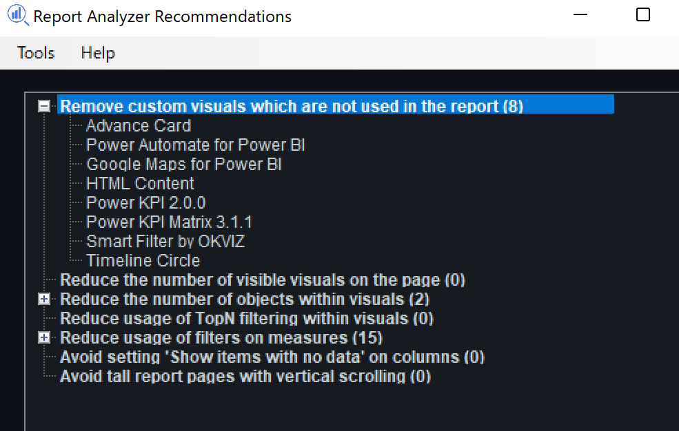
Recommendation 機能
ベストプラクティスに沿って、レポート内の問題点を指摘してくれます。
The Recommendations
Remove custom visuals which are not used in the report.Custom visuals which are not used in the report should be removed. Having them in the report may take up extra resources.
Reduce the number of visible visuals on the page.
Having too many visible visuals on a page is a classic reason for poor performing reports. Reducing this (where possible) may help improve performance.
Reduce the number of objects within visuals.
Sometimes there are tons of measures and columns on a single visual (usually a table or matrix). Having a plethora of such objects can make performance worse. Therefore, reducing the number of objects may improve the visual's performance.
Reduce usage of TopN filtering within visuals.
TopN filtering can be an expensive operation (depending on the measure and column cardinality).
Reduce usage of filters on measures.
Filtering on a measure within a visual can add a performance overhead tax. Reducing usage of such filters (where possible) may speed up your visual.
Avoid setting 'Show items with no data' on columns.
This setting should always be avoided as it creates a much larger table for Power BI's engine to scan and the resulting output is not necessarily useful.
The Recommendations レポート内で使用しないカスタムビジュアルを削除する。 レポート内で使用されていないカスタムビジュアルは削除する必要があります。レポート内でそれらを使用すると、余分なリソースを消費する可能性があります。 ページ上の可視ビジュアルの数を減らす。 ページ上に表示されるビジュアルが多すぎることは、レポートのパフォーマンスを低下させる典型的な原因です。可能であれば、これを減らすことがパフォーマンスの向上につながるかもしれません。 ビジュアル内のオブジェクトの数を減らす。 1つのビジュアル(通常は表や行列)上に大量の指標や列が存在することがあります。そのようなオブジェクトが大量にあると、パフォーマンスが悪化することがあります。したがって、オブジェクトの数を減らすことで、ビジュアルのパフォーマンスが向上する場合があります。 ビジュアル内のTopNフィルタリングの使用量を減らす。 TopN フィルタリングは、(メジャーと列のカーディナリティに依存する)高価な操作になることがあります。 メジャーに対するフィルタの使用量を削減する。 ビジュアル内のメジャーにフィルタをかけると、パフォーマンスのオーバーヘッド税が追加されることがあります。そのようなフィルタの使用を(可能な限り)減らすことで、ビジュアルを高速化することができます。 列の「データのない項目を表示する」設定は避けてください。 この設定は、Power BIのエンジンがスキャンするテーブルが非常に大きくなり、結果の出力が必ずしも有用ではないため、常に避ける必要があります。
フォルター関数や、TopN関数はビジュアルが重くなる原因ということですね。
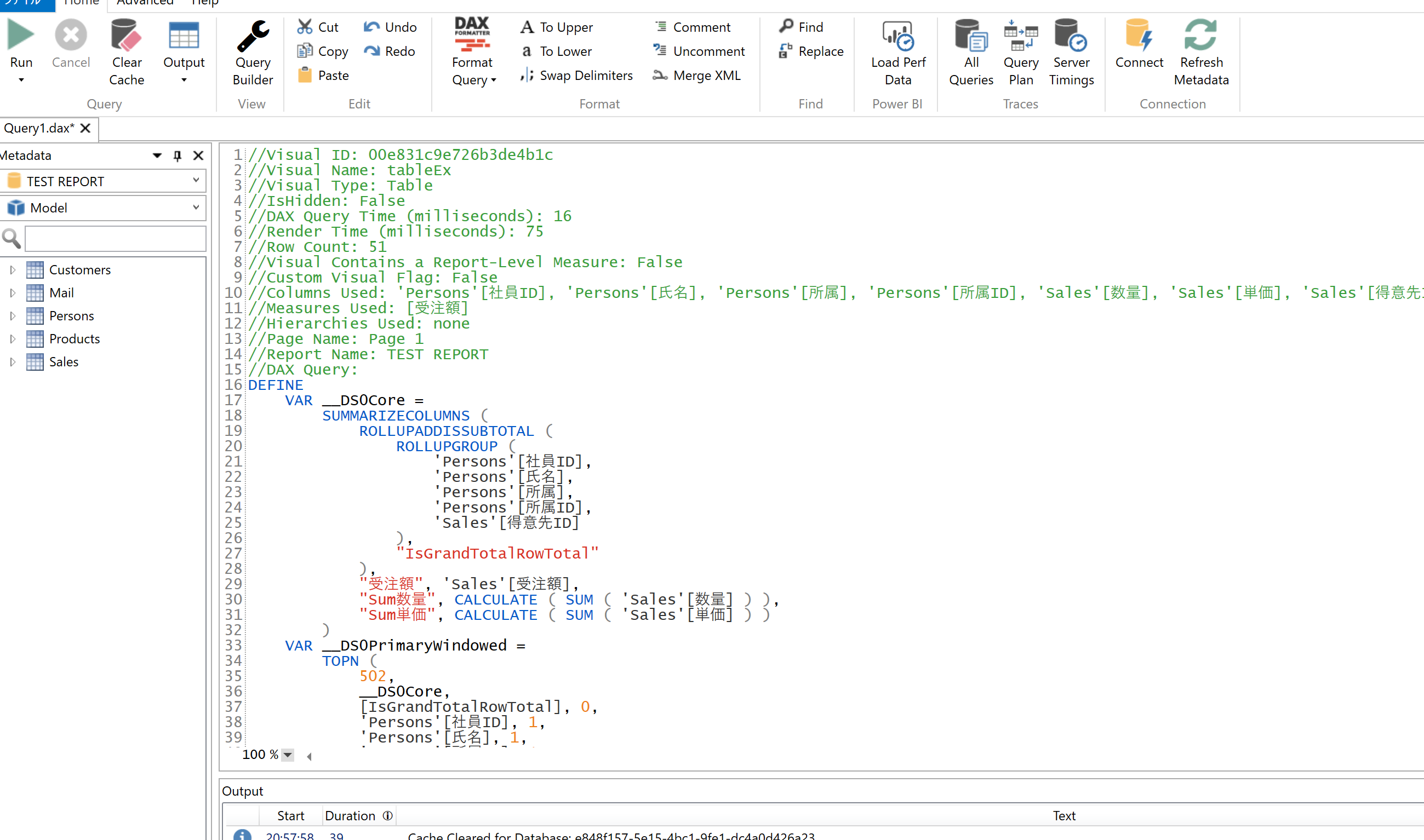
ビジュアルをクリックすると
DAX Studio などにすぐに貼り付けられるコードがコピーされるので、
さらに詳細な分析・最適化はそちらから行えるようです。
考えたこと
DAX Studio はなんか難しそう!だけどReport Analyzer はとっつきやすそう!と素直に思いました。
レポート最適化の入り口として最適なツールなのではないでしょうか。
さらに詳しく知りたい人のリンク集
Elegant BI
ReportAnalyzer紹介記事
ダウンロード
解説動画