前の記事でAlertDialogとNumberPickerの実装方法について書いたけど、
今回はAlertDialogのデザインや色の変更方法について残しておく
AlertDialogの
テキストカラー、メッセージカラー、背景色、ボタン背景色、ボタン位置
とかを変更していきたい!!!
前回記事(AlertDialog+NumberPickerの実装)はこれ↓
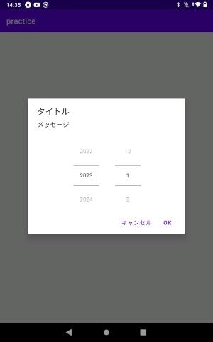
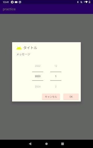
完成図
前回の記事で出来上がったダイアログがBeforeで、
今回色々いじった結果がAfterとなってる。
でも前回の記事見なくても、AlertDialogのデザインや色を変更する分には問題ない。
Before
After
テーマの追加
全体の流れ的にやりたいことは、themes.xmlにはデフォルトのテーマしかないので
そこにAlertDialog用のテーマを作りたい!
でも、まずは色をcolors.xmlに追加しないといけないので、先にcolors.xmlに色を追加!
colors.xmlに使いたい色を追加
 <color name="brawn">#806C68</color>
 <color name="pink">#FEE3D7</color>
 <color name="shiro">#FFFEF2</color>
まずは、res>values>colors.xml にいるcolors.xmlを開く。
既にデフォルトカラーはあるので、その下に上のコード書き足す感じ。
好きな色?使いたいカラーコードを調べてお好みで
themes.xmlでデザインを変更
<resources xmlns:tools="http://schemas.android.com/tools">
    <style name="Theme.Practice" parent="Theme.MaterialComponents.DayNight.DarkActionBar">
省略・・・
    <!-- 以下item追加 -->
       <item name="android:alertDialogTheme">@style/AlertDialog</item>
    </style>

  <!-- AlertDialogStyle -->
    <style name="AlertDialog" parent="ThemeOverlay.AppCompat.Dialog.Alert">
        <item name="buttonBarPositiveButtonStyle">@style/PositiveButtonStyle</item>
        <item name="buttonBarNegativeButtonStyle">@style/NegativeButtonStyle</item>
        <item name="android:background">@color/shiro</item>
        <item name="android:textColor">@color/brawn</item>
        <item name="android:textColorPrimary">@color/brawn</item>
    </style>
   <!-- AlertDialogPositiveButtonStyle -->
    <style name="PositiveButtonStyle" parent="Widget.AppCompat.ButtonBar.AlertDialog">
        <item name="android:textColor">@color/brawn</item>
        <item name="backgroundTint">@color/pink</item>
        <item name="android:layout_marginStart">20dp</item>
    </style>
    <!-- AlertDialogrNegativeButtonStyle -->
     <style name="NegativeButtonStyle" parent="Widget.AppCompat.ButtonBar.AlertDialog">
        <item name="android:textColor">@color/brawn</item>
        <item name="backgroundTint">@color/pink</item>
     </style>

    </resources>
手順
①AlertDialogStyleの部分でAlertDialogの全体的なスタイルを設定
buttonBarPositiveButtonStyle
OKボタンのスタイルを指定
buttonBarNegativeButtonStyle
キャンセルボタンのスタイルを指定
android:background
背景色
android:textColor
タイトルカラー
android:textColorPrimary
メッセージカラー
②AlertDialogPositiveButtonStyleで①で指定したOKボタンのスタイルを設定
android:textColor
テキストカラー
backgroundTint
ボタン背景色
android:layout_marginStart
左(キャンセルボタン)からどのくらい距離あけるのか
③AlertDialogNegativeButtonStyleで①で指定したキャンセルボタンのスタイルを設定
OKボタンと同じ
④デフォルトのテーマ書いてあるところが親テーマなので、そこに新しく追加したAlertDialog用テーマを追記
コメントの「以下item追加」の部分
追加したテーマをAlertDialogに反映させる
AlertDialogの実装クラスへ移動
Builderの第二引数に先程作ったテーマを指定する。R.style~で指定できる
val builder = AlertDialog.Builder(requireContext(),R.style.NumberPickerDialog)
前回の記事のコードを利用するとこんな感じ。
class NumberPickerDialog():DialogFragment(){

    //Dialogのレイアウト定義
    private lateinit var dialogView: View
    // OKキャンセルボタンが押された時のリスナー定義
    private lateinit var listener: NoticeDialogListener
    // 選択された年の定義
    private var selectedYearItem by Delegates.notNull<Int>()
    // 選択された月の定義
    private var selectedMonthItem by Delegates.notNull<Int>()

   //OK、キャンセルボタンがが押された時用のインターフェース
    interface NoticeDialogListener {
        fun onNumberPickerDialogPositiveClick(dialog: DialogFragment, selectedYearItem: Int, selectedMonthItem:Int)
        fun onNumberPickerDialogNegativeClick(dialog: DialogFragment)
    }

    override fun onAttach(context: Context) {
        super.onAttach(context)
        try{
            val fragment = parentFragment
     //親フラグメントがNoticeDialogListenerを継承していることを明示している
            this.listener = fragment as NoticeDialogListener
        }catch (e: ClassCastException){
            throw  ClassCastException("$context must implement NoticeDialogListener")
        }
    }

    override fun onCreateDialog(savedInstanceState: Bundle?): Dialog {
        //レイアウトの指定
        dialogView = LayoutInflater.from(requireContext()).inflate(R.layout.dialog_numberpicker,null)
-       val builder = AlertDialog.Builder(requireContext())
+        val builder = AlertDialog.Builder(requireContext(),R.style.AlertDialog)
        //現在日付の取得
        val current = LocalDateTime.now()

        builder.setView(dialogView)
        builder.setTitle("タイトル")
        builder.setMessage("メッセージ")

        //OKボタンが押された時の処理
        builder.setPositiveButton("OK"){_,_ -> this.listener.onNumberPickerDialogPositiveClick(this,selectedYearItem,selectedMonthItem)}
        //キャンセルボタンが押された時の処理
        builder.setNegativeButton("キャンセル"){_,_ -> this.listener.onNumberPickerDialogNegativeClick(this) }


        /**
         * 年のNumberpickerの初期化
         * デフォルト値:現在年
         * 最小値:現在年 - 1
         * 最大値:現在年 + 30
         */
        val yearNumberPicker = dialogView.findViewById<NumberPicker>(R.id.yearNumberPicker)
        //現在値の変更があった時に、現在フォーカスの当たっている値を取得し、selectedYearItemに格納
        yearNumberPicker.setOnValueChangedListener(object :NumberPicker.OnValueChangeListener{
            override fun onValueChange(picker: NumberPicker?, old: Int, new: Int) {
               selectedYearItem = new
            }
        })
        //最小値の設定
        yearNumberPicker.minValue = current.year-1
        //最大値の設定
        yearNumberPicker.maxValue = current.year+30
        //yearNumberPickerの初期値に今年を入れた
        yearNumberPicker.value = current.year
        //selectedYearItemにも同じく今年を入れておく
        selectedYearItem = yearNumberPicker.value

        /**
         * 月のNumberpickerの初期化
         * デフォルト値:今月
         * 最小値:1
         * 最大値:12
         */
        val monthNumberPicker = dialogView.findViewById<NumberPicker>(R.id.monthNumberPicker)
        monthNumberPicker.setOnValueChangedListener(object :NumberPicker.OnValueChangeListener{
            override fun onValueChange(picker: NumberPicker?, old: Int, new: Int) {
                selectedMonthItem = new
            }
        })
        monthNumberPicker.minValue = 1
        monthNumberPicker.maxValue = 12
        monthNumberPicker.value = current.monthValue
        selectedMonthItem = monthNumberPicker.value

        return builder.create()
    }
}
これで指定したスタイルのAlertDialogができたはず
ちなみに、完成図のようにタイトルの横にアイコン出したい!ってときは
以下をbuilderでタイトル文字やメッセージ文字を指定しているあたりで
builder.setIcon(R.drawable.ic_baseline_android_24)
と追記すれば良し (R.drawable.ic_baseline_android_24)で設定したいアイコンを指定してる。
アイコン自体を選びたい?追加したい?時は、
res>drawable、drawableを右クリック、New>VectorAssetのClipArtで選べる。
自分で作ったアイコンを選択したい場合は、New>VectorAssetではなく、New>ImageAssetで追加できるはず。
ボタンの背景などAlertDialogにテーマが反映されない場合
AlertDialogのimportが
androidx.appcompat.app.AlertDialog
これになっているかよく確認してみると良いかもしれません
まとめ
OKキャンセルボタンの詳細なデザインを変更したいなら、
ボタン自体のスタイルを持っておけよってことと理解
参考記事:https://qiita.com/nonkapibara/items/10bab79edbf733aa4d63